什么是原子化CSS?
- 原子化CSS是一种CSS的架构方式
- 倾向于使用小巧、用途单一的class定义样式
- 以class定义单一样式的方式,有效减少CSS包的体积
为什么选择Tailwindcss实现原子化CSS?
- Tailwindcss通过使用PurgeCSS来扫描打包产物并删除不需要的规则;
- 实现按需引入的Windicss原作者放弃,后续不看好
- 在尝试引入unocs时,发现在react tsx中使用className时使用
${}模板字符串会导致样式失效
PurgeCSS如何移除项目中不使用的CSS?
PurgeCSS要指定css会应用到哪些HTML文件中,会分析HTML中的CSS选择器,根据分析结果来删除没有用到的CSS
它一共会做两件事:
- 提取html中可能的CSS选择器,包括id、class、tag等;
- 分析CSS中的rule,根据选择器是否被使用,删除掉没用到的部分;
代码实现
首先,安装 Tailwindcss 到 devDependencies对象中:
pnpm i [email protected] postcss@latest autoprefixer@latest -D
生成tailwindcss的配置文件:
npx tailwindcss init -p
在刚生成的tailwindcss配置文件 tailwind.config.js中配置 content 来指定pages和components文件,使得tailwind可以在生产构建中对未使用的样式进行树摇优化:
module.exports = {
  ++++++    content: ["index.html", "./src/**/*.{react,js,ts,jsx,tsx}"],
  purge: [],
  darkMode: false, // or 'media' or 'class'
  theme: {
    extend: {},
  },
  variants: {
    extend: {},
  },
  plugins: [],
}
然后需要在css中引入tailwindcss;
在src文件夹下创建index.css文件,并使用tailwind指令来包含tailwind的base、components和utilities样式,替换掉原来对的文件内容:
// src/index.css
@tailwind base;
@tailwind components;
@tailwind utilities;
在src/index.tsx中引入src/index.css:
import React from "react";
import ReactDOM from "react-dom/client";
import SButton from "./Button/index";
// import {SButton} from '../dist/react-ui-teaching.esm';
import "./index.css"

ReactDOM.createRoot(document.getElementById("root") as HTMLElement).render(
  <React.StrictMode>
      <SButton color="green" round>
        灰色按钮
      </SButton>
  </React.StrictMode>
);
目前已经将tailwind引入到项目中,接下来我们设计一下组件SButton的样式,也就是设计一下API:
API
| Name | Description | Type | Default | Options |
|---|---|---|---|---|
| color | 有对颜色进行约束 | String | White | black | gray | red | yellow | green | blue | indigo | purple | pink |
| size | 目前只有三种,可自行覆盖样式 | String | medium | small | medium | large |
| plain | 对按钮朴素处理 | Boolean | false | true | false |
| round | 对按钮进行圆角处理 | Boolean | false | true | false |
| icon | 为按钮添加图标,或单独使用图标 | string | null | options如下 |
Icon Options
| Options | Description |
|---|---|
| juzhongduiqi | 居中对齐 |
| zuuoduiqi | 左对齐 |
| yiwen | 疑问 |
| xuanzewendnag | 选择文档 |
| youduiqi | 右对齐 |
| xunhuan | 循环 |
| bianji | 编辑 |
| xiugai | 修改 |
| xinhao | 信号 |
| xiaoxi | 消息 |
| xiazai2 | 下载2 |
| tianjiawenjian | 添加文件 |
| tianjiawendang | 添加文档 |
| tianjia2 | 添加2 |
| tianjia1 | 添加1 |
| tixing | 提醒1 |
| tishi | 提示 |
| suoxiao | 缩小 |
| gongzuotai | 工作台 |
| zhichuhetong | 支出合同 |
重写一下src/Button/index.tsx:
import React, { Component } from "react";

type ISize = "small" | "medium" | "large";
type IColor =
  | "black"
  | "gray"
  | "red"
  | "yellow"
  | "green"
  | "blue"
  | "indigo"
  | "purple"
  | "pink"
  | "white";
type IIcon =
  | ""
  | "juzhongduiqi"
  | "zuuoduiqi"
  | "yiwen"
  | "xuanzewendnag"
  | "youduiqi"
  | "xunhuan"
  | "bianji"
  | "xiugai"
  | "xinhao"
  | "xiaoxi"
  | "xiazai2"
  | "tianjiawenjian"
  | "tianjiawendang"
  | "tianjia2"
  | "tianjia1"
  | "tixing"
  | "tishi"
  | "suoxiao"
  | "gongzuotai"
  | "zhichuhetong";

interface ButtonProps {
  color?: IColor;
  icon?: IIcon;
  size?: ISize;
  round?: false | true;
  plain?: false | true;
  children?: string;
}

//上面这一部分用来限制输入的props的类型,比如color就只能是IColor中的其中一个,这样限制后,我们在写代码的时候,如果传入的值不在限制范围内,那么ts会直接报错;

const SButton= (props:ButtonProps) => {
  const sizeOptions: Record<string, Record<string, string>> = {
    small: {
      x: "1",
      y: "1",
      text: "sm",
    },
    medium: {
      x: "1.5",
      y: "2",
      text: "base",
    },
    large: {
      x: "2",
      y: "3",
      text: "lg",
    },
  };
  return (
    <button
      className={`
      mx-1          //原子css
      ${
      props.size
          ? `px-${sizeOptions[props.size].y} py-${
              sizeOptions[props.size].x
            } text-${sizeOptions[props.size].text}`
          : ""
      }
      ${props.round ? "rounded-full" : "rounded-lg"}
      bg-${props.color}-${props.plain ? "100" : "500"}
      ${
        props.plain
          ? `border-2 border-${props.color}-400 hover:bg-white-200 hover:text-${props.color} text-${props.color}-500 border-solid`
          : `hover:bg-${props.color}-400 hover:text-white text-white`
      }
      cursor-pointer transition duration-300 ease-in-out transform hover:scale-105
    `}
    >
      {props.children ? props.children : ""}
    </button>
  );
};

SButton.defaultProps = {//为函数组件的props添加默认值
  color: "white",
  icon: "",
  size: "medium",
  round: false,
  plain: false,
};
export default SButton;
最后,
做一下icon的处理:
本身Tailwindcss是带有icon库的,也就是 heroicons;
但是 heroicons无法通过tsx标签中的className来展示图标,故我们放弃使用herocions,选择引入阿里的iconfont;
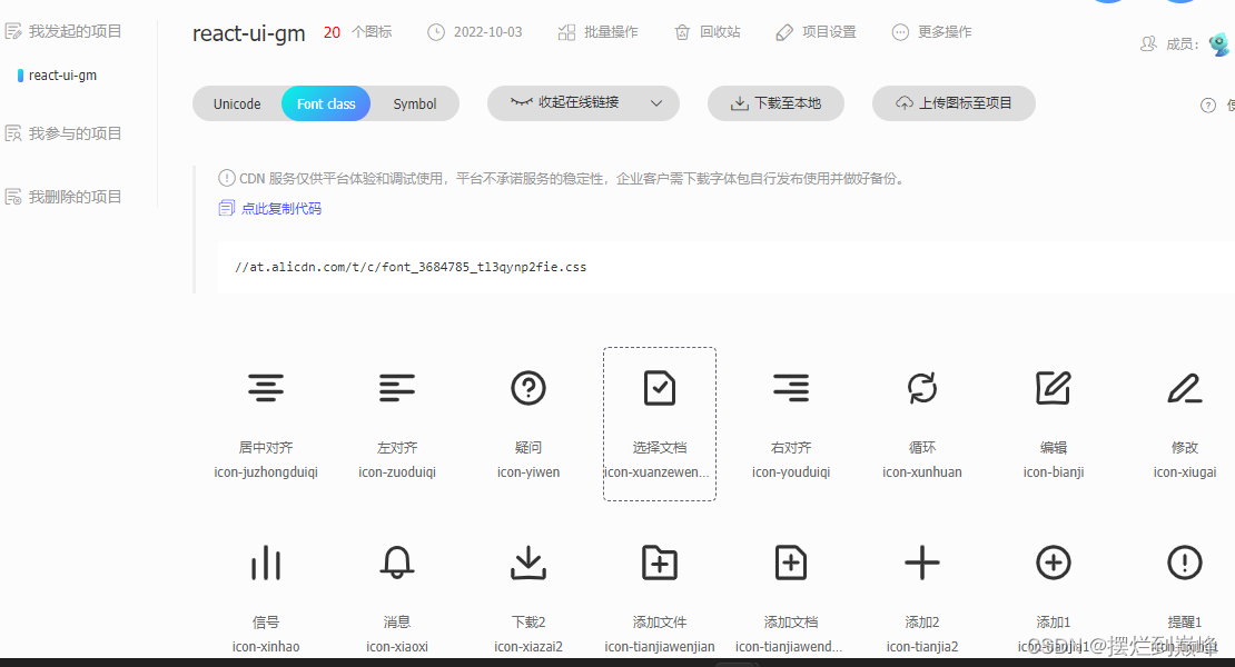
我们将想要引入支持的图标放到一个项目里,然后考虑引入方法;
这里是有直接下载和动态链接两种引入方式的;
由于动态连接受网速影响比较大,而且连接不稳定,故我们最后选择直接将需要的icon文件下载到本地;
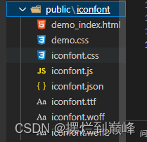
下载后在根目录下新建public文件夹,里面新建iconfont文件夹,把下载的icon文件放到里面:
在src/index.tsx中引入iconfont文件:
import React from "react";
import ReactDOM from "react-dom/client";
import SButton from "./Button/index";
// import {SButton} from '../dist/react-ui-teaching.esm';
import "./index.css"
++++++++     import "../public/iconfont/iconfont.css"

ReactDOM.createRoot(document.getElementById("root") as HTMLElement).render(
  <React.StrictMode>
      <SButton color="green" round>
        灰色按钮
      </SButton>
  </React.StrictMode>
);
在src下新建Icon文件夹,新建index.tsx文件:
import React,{ ReactElement } from "react";
import '../../public/iconfont/iconfont.css'

interface iconProps{
    iconName:string | undefined;
    customClassName?:string;
    onIconClick?:()=>void;
}

function Icon(props:iconProps):ReactElement {
    const {iconName,customClassName,onIconClick}=props;

    const handleIcon=()=> onIconClick?.();

    return (
        <span className={customClassName}>
            <i className={`iconfont icon-${iconName}`} onClick={handleIcon}></i>
        </span>
    );
}

export default Icon;
在SButton中引入Icon,修改src/Button/index.tsx:
import React, { Component } from "react";
++++++  import Icon from "../Icon";
···········································································
type ISize = "small" | "medium" | "large";
·····················································
  return (
    <button
    ·········································
    >
      {props.children ? props.children : ""}
+++     {props.icon!="" ? (
+++          <Icon
+++            iconName={props.icon}
+++            customClassName="p-1"
+++            onIconClick={() => {
+++            console.log("onClick 1");
+++          }}
+++          />
+++       ) : (
+++         ""
+++       )}
    </button>
  );
};

SButton.defaultProps = {
  color: "white",
  icon: "",
  size: "medium",
  round: false,
  plain: false,
};
export default SButton;
修改一下src/index.tsx:
import React from "react";
import ReactDOM from "react-dom/client";
import SButton from "./Button/index";
// import {SButton} from '../dist/react-ui-teaching.esm';
import "./index.css"
import "../public/iconfont/iconfont.css"

ReactDOM.createRoot(document.getElementById("root") as HTMLElement).render(
  <React.StrictMode>
      <div>
      <SButton color="red" size="small">红色按钮</SButton>
      <SButton color="green" size="medium">绿色按钮</SButton>
      <SButton color="blue" size="large">蓝色按钮</SButton>
      <SButton color="red" size="small" plain>红色按钮</SButton>
      <SButton color="green" size="medium" plain>绿色按钮</SButton>
      <SButton color="blue" size="large" plain>蓝色按钮</SButton>
    </div>
    <br/>
    <div>
      <SButton color="red" size="small" round>红色按钮</SButton>
      <SButton color="green" size="medium" round>绿色按钮</SButton>
      <SButton color="blue" size="large" round>蓝色按钮</SButton>
      <SButton color="red" size="small" plain round>红色按钮</SButton>
      <SButton color="green" size="medium" plain round>绿色按钮</SButton>
      <SButton color="blue" size="large" plain round>蓝色按钮</SButton>
    </div>
    <br/>
    <div>
      <SButton color="red" size="small" icon="bianji"></SButton>
      <SButton color="green" size="medium" icon="xiaoxi"></SButton>
      <SButton color="blue" size="large" icon="gongzuotai"></SButton>
      <SButton color="red" size="small" plain icon="bianji"></SButton>
      <SButton color="green" size="medium" plain icon="xiaoxi"></SButton>
      <SButton color="blue" size="large" plain icon="gongzuotai"></SButton>
    </div>
    <br/>
    <div>
      <SButton color="red" size="small" icon="bianji">红色按钮</SButton>
      <SButton color="green" size="medium" icon="xiaoxi">绿色按钮</SButton>
      <SButton color="blue" size="large" icon="gongzuotai">蓝色按钮</SButton>
      <SButton color="red" size="small" plain icon="bianji">红色按钮</SButton>
      <SButton color="green" size="medium" plain icon="xiaoxi">绿色按钮</SButton>
      <SButton color="blue" size="large" plain icon="gongzuotai">蓝色按钮</SButton>
    </div>
  </React.StrictMode>
);
命令行输入:
pnpm dev
效果如下:
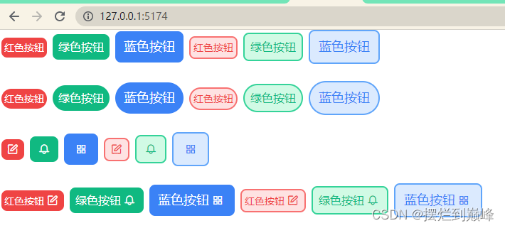
OK,到目前为止,Tailwindcss我们已经引入成功!