
目录:
一、什么是单元溢出
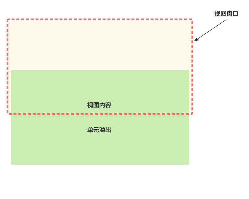
在说到这个问题之前我们先简单阐述一下视图窗口(Viewport)和视图内容(View Content)
视图窗口简单来说就是呈现内容的视口,浏览器就是一个窗口,其中所显示的内容就是视图内容。
而当元素里的内容(包括文本内容、图片、视频等内容)的大小超出窗口的大小区域时,内容会有一部分显示在盒子所在区域的外部,这就是单元溢出。
二、控制滚动条出现的属性
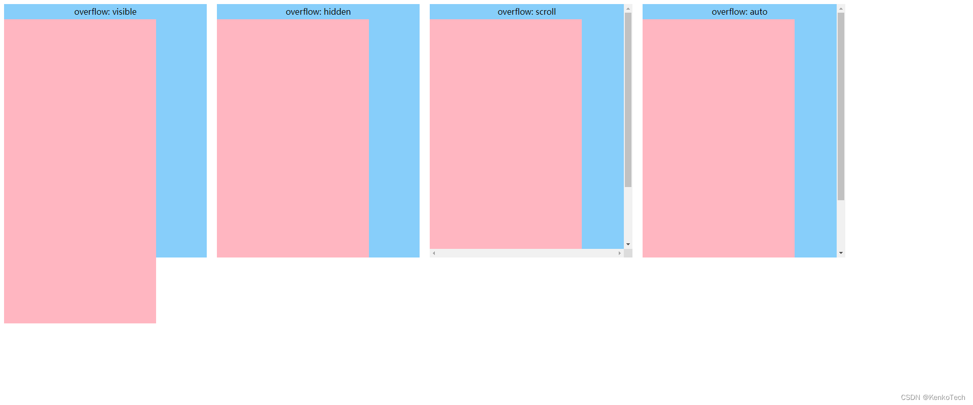
CSS中对单元溢出处理的属性是overflow属性,该属性是overflow-x和overflow-y属性的简写。该属性常用的值有如下4个:
示例代码如下所示:
<div class="app-layout">
    <div class="viewport overflow-visible">
        <p class="overflow-description">overflow: visible</p>
        <div class="view-content"></div>
    </div>
    <div class="viewport overflow-hidden">
        <p class="overflow-description">overflow: hidden</p>
        <div class="view-content"></div>
    </div>
    <div class="viewport overflow-scroll">
        <p class="overflow-description">overflow: scroll</p>
        <div class="view-content"></div>
    </div>
    <div class="viewport overflow-auto">
        <p class="overflow-description">overflow: auto</p>
        <div class="view-content"></div>
    </div>
</div>
.app-layout { width: 100%; height: 100%; display: flex; flex-flow: row nowrap; .viewport { width: 400px; height: 500px; background-color: #87CEFA; margin-right: 20px; &.overflow-visible { overflow: visible; } &.overflow-hidden { overflow: hidden; } &.overflow-scroll { overflow: scroll; } &.overflow-auto { overflow: auto; } .overflow-description { font-size: 16px; font-family: Microsoft YaHei; line-height: 30px; text-align: center; } .view-content { width: 300px; height: 600px; background-color: #FFB6C1; } } }
三、怎样能减少意外的滚动条出现
综上所述,滚动条的出现需要满足两个条件。第一,视窗的 overflow 被设定成允许滚动条出现的属性(scroll, auto)。第二,内容超出了视窗的显示区域。
只有当这两个条件都满足时才会出现滚动条。那么针对这两点有不同的解决方案。
一、视窗的 overflow 属性只在需要的时候才设定为 auto 或者 scroll。根据设计要求,在允许滚动的视窗设定允许滚动条出现的属性。在不允许滚动条出现的地方可以设定 hidden 属性,并且严格控制视图内容的尺寸。
示例分析
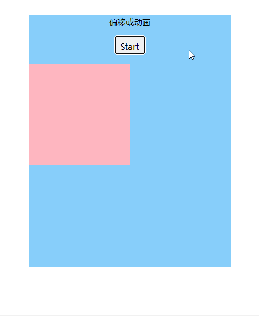
1. 当内容出现偏移时
示例代码如下所示:
<div class="app-layout">
    <div class="viewport">
        <p class="overflow-description">偏移或动画</p>
        <button class="trigger" (click)="running = !running">Start</button>
        <div class="view-content" [ngClass]="{ 'content-translate': running }"></div>
    </div>
</div>
.app-layout { width: 100%; height: 100%; display: flex; justify-content: center; align-items: center; .viewport { width: 400px; height: 500px; background-color: #87CEFA; margin-right: 20px; overflow: auto; .overflow-description { font-size: 16px; font-family: Microsoft YaHei; line-height: 30px; text-align: center; } .trigger { width: 60px; height: 36px; display: block; line-height: 36px; font-size: 16px; font-family: Microsoft YaHei; text-align: center; border-radius: 5px; margin: 0 auto 20px; cursor: pointer; } .view-content { width: 200px; height: 200px; background-color: #FFB6C1; transition: all 1s ease-in-out; position: relative; left: 0; &.content-translate { left: 300px; } } } }import { Component } from '@angular/core'; @Component({ selector: 'extra-scroll-bar', templateUrl: './extraScrollBar.component.html', styleUrls: ['./extraScrollBar.component.less'] }) export class ExtraScrollBarComponent{ running = false; }方案:
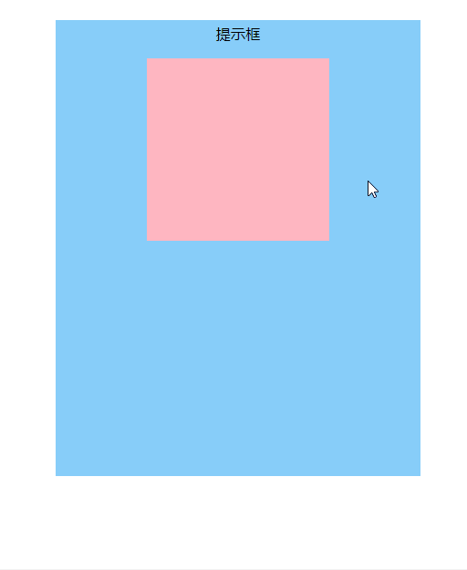
2. 鼠标悬停出现提示框
示例代码如下所示:
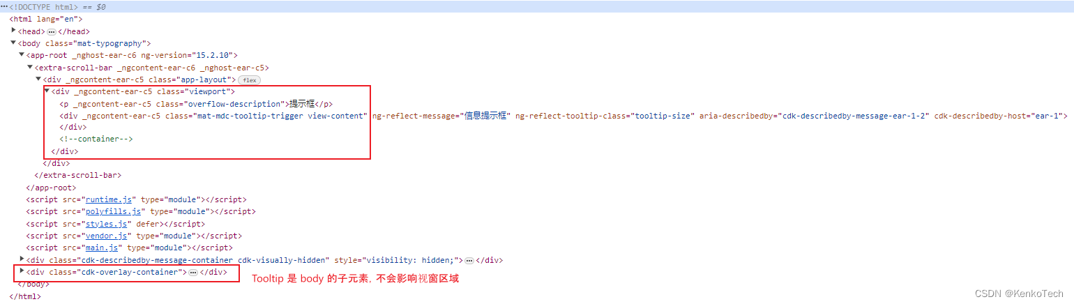
<div class="app-layout">
    <div class="viewport">
        <p class="overflow-description">提示框</p>
        <div class="view-content">
            <div class="tooltip">信息提示框</div>
        </div>
    </div>
</div>
.app-layout { width: 100%; height: 100%; display: flex; justify-content: center; align-items: center; .viewport { width: 400px; height: 500px; background-color: #87CEFA; overflow: auto; .overflow-description { font-size: 16px; font-family: Microsoft YaHei; line-height: 30px; text-align: center; } .view-content { width: 200px; height: 200px; background-color: #FFB6C1; position: relative; margin: 0 auto; &:hover { .tooltip { display: block; } } .tooltip { width: 120px; height: 80px; background-color: #FFFFFF; font-size: 14px; font-family: Microsoft YaHei; line-height: 80px; text-align: center; position: absolute; top: 0; left: 200px; display: none; } } } }1. 借助 UI 组件库,其中的 tooltip 不在目标区域层级,而是 body 的子元素,不影响视窗
图中使用的是 Angular Material,其它框架也有许多类似的 UI 库可供选择
2. 自己造轮子,完成一个类似于 UI 库的 tooltip 组件
3. 视图内容属性 box-sizing
示例代码如下所示:
<div class="app-layout">
    <div class="viewport">
        <p class="overflow-description">Box Sizing</p>
        <div class="view-content"></div>
    </div>
</div>
.app-layout { width: 100%; height: 100%; display: flex; justify-content: center; align-items: center; .viewport { width: 400px; height: 500px; background-color: #87CEFA; overflow: auto; .overflow-description { font-size: 16px; font-family: Microsoft YaHei; line-height: 30px; text-align: center; } .view-content { width: 380px; height: 400px; background-color: #FFB6C1; position: relative; margin: 0 auto; padding: 0 20px; } } }建议所有的 div 设定 box-sizing: border-box,效果如下:
另外,即便设置了 box-sizing: border-size。内容区域的 margin 也会对视窗产生类似的影响,这时候我们最好使用其它布局方式代替 margin,或者计算好尺寸。
4. 当内容部分缩放时
示例代码如下所示:
<div class="app-layout">
    <div class="viewport">
        <p class="overflow-description">缩放</p>
        <div class="view-content"></div>
    </div>
</div>
.app-layout { width: 100%; height: 100%; display: flex; justify-content: center; align-items: center; .viewport { width: 400px; height: 500px; background-color: #87CEFA; overflow: auto; .overflow-description { font-size: 16px; font-family: Microsoft YaHei; line-height: 30px; text-align: center; } .view-content { width: 380px; height: 400px; background-color: #FFB6C1; position: relative; margin: 0 auto; transform-origin: center center; transition: all 1s ease-in-out; &:hover { width: 450px; height: 450px; } } } }在内容缩放时为视窗设定 overflow: hidden 或者 overflow: visible
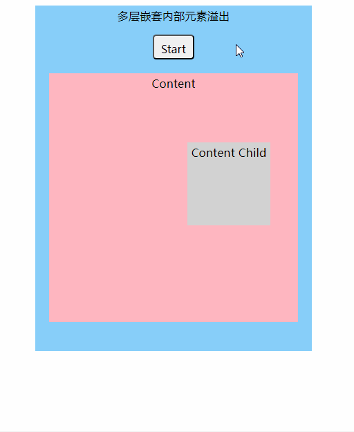
5. 多层嵌套内部元素溢出
示例代码如下所示:
<div class="app-layout">
    <div class="viewport">
        <p class="overflow-description">多层嵌套内部元素溢出</p>
        <button class="trigger" (click)="running = !running">Start</button>
        <div class="view-content">
            <p class="overflow-description">Content</p>
            <div class="view-child-content" [ngClass]="{ 'content-translate': running }">
                <p class="overflow-description">Content Child</p>
            </div>
        </div>
    </div>
</div>
.app-layout { width: 100%; height: 100%; display: flex; justify-content: center; align-items: center; .viewport { width: 400px; height: 500px; background-color: #87CEFA; margin-right: 20px; overflow: auto; .overflow-description { font-size: 16px; font-family: Microsoft YaHei; line-height: 30px; text-align: center; } .trigger { width: 60px; height: 36px; display: block; line-height: 36px; font-size: 16px; font-family: Microsoft YaHei; text-align: center; border-radius: 5px; margin: 0 auto 20px; cursor: pointer; } .view-content { width: 360px; height: 360px; background-color: #FFB6C1; margin: 0 auto; position: relative; .view-child-content { width: 120px; height: 120px; background-color: #D3D3D3; position: absolute; top: 100px; left: 200px; transition: all 1s ease-in-out; &.content-translate { left: 300px; } } } } }import { Component } from '@angular/core'; @Component({ selector: 'extra-scroll-bar', templateUrl: './extraScrollBar.component.html', styleUrls: ['./extraScrollBar.component.less'] }) export class ExtraScrollBarComponent{ running = false; }方案:
减少层级嵌套,明确每个 div 的用途,在有必要的地方加上 overflow: hidden


总结
虽然意外出现的滚动条是一个小问题,但是引发这个问题出现的原因却多种多样。上面的例子并不完全,只包含了我在平时工作中所遇到的情况。面对这种频发的小问题我们也是有一些可以尽量避免它的方法的:
- 理清 DOM 层级关系,尽量简化它。越简单的代码就越健壮,这是放在哪里都适用的道理。通过分析并明确视窗与内容的关系,我们不仅能有效避免上述情况的发生,还能降低其它问题出现的概率。
- 借助 UI 库来完成功能实现。
- 多使用自适应布局,在有动画或者渐变需求时多考虑视窗区域是否符合动画要求。
- 制定并遵循代码规范。规范的代码也是考察程序员能力的一个方面,清晰整洁的代码能够规避很多错误,并且也易于维护。