本篇博客介绍在微信小程序中自定义组件时需要的注意事项,以自定义select下拉选项卡为例
自定义组件官方文档介绍:https://developers.weixin.qq.com/miniprogram/dev/framework/custom-component/
Component组件官方文档介绍:https://developers.weixin.qq.com/miniprogram/dev/reference/api/Component.html
一、创建组件
1、新建组件文件
在components文件夹下新建目录select,创建select下拉选项卡组件

2、自定义组件样式及js
①select.wxml文件
<view class='com-selectBox'>
  <view class='com-sContent' bindtap='selectToggle'>
    <view class='com-sTxt'>{{nowText}}</view>
    <image src='/images/down.png' class='com-sImg' animation="{{animationData}}"></image>
  </view>
  <view class='com-sList' wx:if="{{selectShow}}">
    <view wx:for="{{propArray}}" data-index="{{index}}" wx:key="id"
    class='com-sItem {{showid==index?"check-style":""}}' bindtap='setText'>{{item.text}}</view>
  </view>
</view>
tips:
(1) animation="{{animationData}}" 这个是下箭头的动画效果
(2) data-index="{{index}}" 这个是当前元素被点击时的索引
(3) selectToggle是模仿下拉选项框隐藏和显示的事件。
(4) setText是模仿下拉选项框选择子项之后,设置内容的事件。
(5) selectShow是表示option选项显示与否
②select.wxss文件
.com-selectBox {
  width: 100%;
}
.com-sContent {
  border-top: 1px solid #e2e2e2;
  background: white;
  color: #7a7a7a;
  display: flex;
  align-items: center;
  justify-content: center;
  padding: 20rpx 0;
}
.com-sImg {
  width: 10%;
  height: 9px;
  transition: all 0.3s ease;
}
.com-sTxt {
  overflow: hidden;
  text-overflow: ellipsis;
  white-space: nowrap;
  font-size: 28rpx;
}
.com-sList {
  background: white;
  width: 33.3%;
  position: absolute;
  border: 1px solid #e2e2e2;
  border-top: none;
  box-sizing: border-box;
  z-index: 3;
  overflow: auto;
}
.com-sItem {
  height: 30px;
  line-height: 30px;
  border-top: 1px solid #e2e2e2;
  text-align: center;
  overflow: hidden;
  text-overflow: ellipsis;
  white-space: nowrap;
  font-size: 28rpx;
  color: #7a7a7a;
}
.com-sItem:first-child {
  border-top: none;
}
.check-style{
  color: red;
}
③selece.js
Component({
  // 组件的属性列表
  properties: {
    // 页面传入组件的数据
    propArray: {
      type: Array,
    },
    nowText: {
      type: null,
    }
  },
  // 组件的初始数据
  data: {
    selectShow: false, //初始option不显示
    firstText: '', //select的标题文字
    animationData: {}, //右边箭头的动画
    showid: 0,//当前选中索引
  },
  // 组件声明周期
  lifetimes: {
    attached: function() {
      // 在组件实例进入页面节点树时执行
      this.setData({
        firstText: this.properties.nowText,//将获取到的初始值存储起来
      });
    },
    detached: function() {
      // 在组件实例被从页面节点树移除时执行
    },
  },
  // 组件的方法列表
  methods: {
    //option的显示与否
    selectToggle: function() {
      var nowShow = this.data.selectShow; //获取当前option显示的状态
      //创建动画
      var animation = wx.createAnimation({
        timingFunction: "ease"
      })
      this.animation = animation;
      if (nowShow) {
        animation.rotate(0).step();
        this.setData({
          animationData: animation.export()
        })
      } else {
        animation.rotate(180).step();
        this.setData({
          animationData: animation.export()
        })
      }
      this.setData({
        selectShow: !nowShow
      })
    },
    //设置内容
    setText: function(e) {
      var nowData = this.properties.propArray; //引入组件的页面传过来的数据
      var nowIdx = e.target.dataset.index; //当前点击的索引
      var nowTexts = nowData[nowIdx].text; //当前点击的内容
      //再次执行动画,注意这里是this.animation来使用动画
      this.animation.rotate(0).step();
      //如果点击的是“全部”,显示标题文字
      if (nowIdx == "0") {
        this.setData({
          nowText: this.data.firstText,
          showid: nowIdx,
          selectShow: false,
          animationData: this.animation.export(),
        })
      } else {
        this.setData({
          nowText: nowTexts,
          showid: nowIdx,
          selectShow: false,
          animationData: this.animation.export(),
        })
      }
    }
  }
})
tips:
(1) 如果想对data里的数据做初始化,必须自己给他初始值。
(2) 不要把data和properties里的变量设置成同一个名字,如果他们名字相同,properties里的会覆盖data里的
(3) 组件声明周期中的 attached 方法在组件实例进入页面节点树时执行,我理解为和页面生命周期中的 onLoad 方法效果一致
二、使用组件
1、引入组件
在使用组件页面的json文件中配置
"usingComponents": {
    "select": "/components/select/select"
}
tips: 注意路径是否正确, / 单斜杠表示根目录,是绝对路径。
2、页面使用组件
<view class="top">
  <select prop-array='{{timeArray}}' now-text='{{invetime}}'></select>
  <select prop-array='{{termArray}}' now-text='{{term}}'></select>
  <select prop-array='{{moneybackArray}}' now-text='{{moneyback}}'></select>
</view>
tips: prop-array为自定义的属性名,和组件所在的 js 中properties中的属性是对应的。在 properties 定义的属性中,属性名采用驼峰写法(例如:propArray);在引入组件的 wxml 中,指定属性值时则对应使用连字符写法(例如:prop-array=”…”)。
3、传入组件所需数据
在引用组件页面的.js文件中的data中传入数据
data: {
    invetime: '投资时间',
    term: '标的期限',
    moneyback: '是否回款',
    timeArray: [{
      "id": "0",
      "text": "全部"
    }, {
      "id": "1",
      "text": "3个月内"
    }, {
      "id": "2",
      "text": "6个月内"
    }, {
      "id": "3",
      "text": "12个月内"
    }]
 }
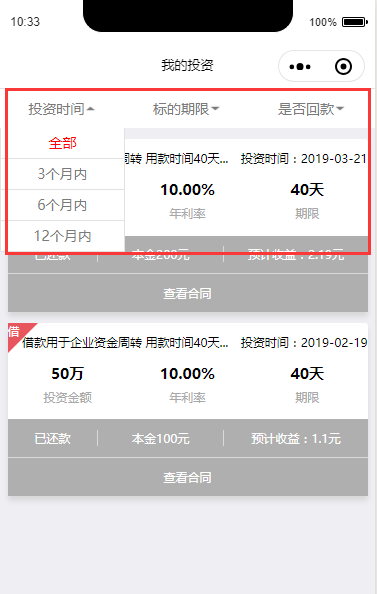
效果图:
END!