我们项目需要实现一个这样的效果: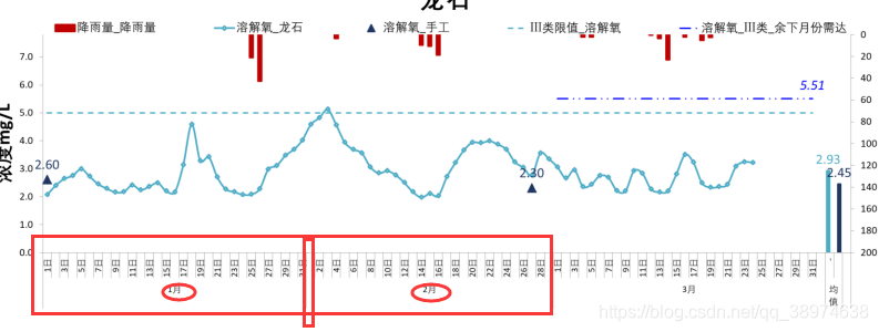
第一种方法:
原文地址:https://blog.csdn.net/u013270065/article/details/105073901/
代码:
option = {
    xAxis: [
    {
        type: 'category',
        data: ['Mon', 'Tue', 'Wed', 'Thu', 'Fri', 'Sat', 'Sun','Mon', 'Tue', 'Wed', 'Thu', 'Fri', 'Sat', 'Sun'],
        axisTick: {
            length:20
        },
    },

    {
        type: 'category',
        data: [
            {
                value: 'First week',
                textStyle: {
                    fontSize: 18,
                    lineHeight: 70
                }
            },{
                value: 'Second weeks',
                textStyle: {
                    fontSize: 18,
                    lineHeight: 70
                }
            }
        ],
        position : 'bottom',
        axisTick: {
            length:50
        }
    },

    ],
    yAxis: {
        type: 'value'
    },
    series: [{
        data: [220, 332, 301, 334, 690, 730, 720, 220, 332, 301, 334, 690, 730, 720],
        type: 'line'
    }]
};
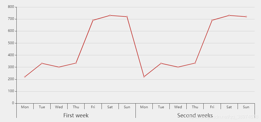
这种方法的缺陷是x轴第二级不能自己设置间隔,只会平均分配间隔,会出现和x轴第一级的刻度错开的情况。
于是我去找了ECharts官方的实例终于找到一个有用的。
第二种方法:
官方实例地址:https://gallery.echartsjs.com/editor.html?c=xnUHWTiDTY
代码:
let data = {
    xData: ['花溪区', '南明区', '观山湖区', '钟山区', '六枝特区', '红花岗区', '汇川区', '遵义县', '西秀区', '平坝县', '玉屏县'],
    yData: [0.1, 0.15, 0.18, 0.25, 0.23, 0.32, 0.33, 0.36, 0.57, 0.72, 0.45]
}
option = {
    tooltip: {},
    grid: [
        {
            top: 100,
            bottom: 101
        },
        {
            height: 60,
            bottom: 40
        }
    ],
    xAxis: [{
        type: 'category',
        data: data.xData,
        gridIndex: 0,
        axisLabel: {
            color: '#000'
        },
        axisLine: {
            lineStyle: {
                color: '#000'
            }
        },
        axisTick: {
            lineStyle: {
                color: '#000'
            }
        },
        zlevel: 2
    }, {
        type: 'category',
        gridIndex: 1,
        axisLine: {
            show: false
            ,
        },
        axisTick: {
            length:60,
        },
        zlevel: 1
    }],
    yAxis: [{
        type: 'value',
        gridIndex: 0,
        axisLabel: {
            color: '#333'
        },
        splitLine: {
            lineStyle: {
                type: 'dashed'
            }
        },
        axisLine: {
            lineStyle: {
                color: '#ccc'
            }
        },
        axisTick: {
            lineStyle: {
                color: '#ccc'
            }
        }
    },{
        type: 'value',
        gridIndex: 1,
        axisLabel: {
            show: false
        },
        axisLine: {
            show: false
        },
        splitLine: {
            show: false
        },
        axisTick: {
            show: false
        }
    }],
    series: [{
        data: data.yData,
        type: 'line',
        label: {
            show: true,
            position: 'bottom',
            textStyle: {
                color: '#000'
            }
        },
        xAxisIndex: 0,
        yAxisIndex: 0
    },{
        data: [{
            name: '贵阳市',
            value: 1
        }],
        label: {
            show: true,
            position: 'inside',
            formatter: '{b}',
            offset: [0, 10],
            textStyle: {
                color: '#000'
            }
        },
        type: 'bar',
        barGap: 0,
        barWidth: '27.2727%',
        itemStyle: {
            normal: {
                color: 'rgba(134,176,237, 0)',
                borderColor:'#000',
                borderWidth:0.5,
            },

        },
        xAxisIndex: 1,
        yAxisIndex: 1
    },{
        data: [{
            name: '六盘水市',
            value: 1
        }],
        label: {
            show: true,
            position: 'inside',
            formatter: '{b}',
            offset: [0, 10],
            textStyle: {
                color: '#000'
            }
        },
        type: 'bar',
        barGap: 0,
        barWidth: '18.1818%',
        itemStyle: {
            normal: {
                color: 'rgba(40,191,126, 0)',
                 borderColor:'#000',
                 borderWidth:0.5,
            }
        },
        xAxisIndex: 1,
        yAxisIndex: 1
    },{
        data: [{
            name: '遵义市',
            value: 1
        }],
        label: {
            show: true,
            position: 'inside',
            formatter: '{b}',
            offset: [0, 10],
            textStyle: {
                color: '#000'
            }
        },
        type: 'bar',
        barGap: 0,
        barWidth: '27.2727%',
        itemStyle: {
            normal: {
                color: 'rgba(237,124,47, 0)',
                borderColor:'#000',
                borderWidth:0.5,
            }
        },
        xAxisIndex: 1,
        yAxisIndex: 1
    },{
        data: [{
            name: '安顺市',
            value: 1
        }],
        label: {
            show: true,
            position: 'inside',
            formatter: '{b}',
            offset: [0, 10],
            textStyle: {
                color: '#000'
            }
        },
        type: 'bar',
        barGap: 0,
        barWidth: '18.1818%',
        itemStyle: {
            normal: {
                show:false,
                color: 'rgba(242,169,59, 0)',
                borderColor:'#000',
                borderWidth:0.5,
            }
        },
        xAxisIndex: 1,
        yAxisIndex: 1
    },{
        data: [{
            name: '铜仁市',
            value: 1
        }],
        label: {
            show: true,
            position: 'inside',
            formatter: '{b}',
            offset: [0, 10],
            textStyle: {
                color: '#000'
            }
        },
        type: 'bar',
        barCategoryGap: 0,
        barGap: 0,
        barWidth: '9.0909%',
        itemStyle: {
            normal: {
                color: 'rgba(249,207,54, 0',
                borderColor:'#000',
                borderWidth:0.5,
            }
        },
        xAxisIndex: 1,
        yAxisIndex: 1
    }]
};
效果图:
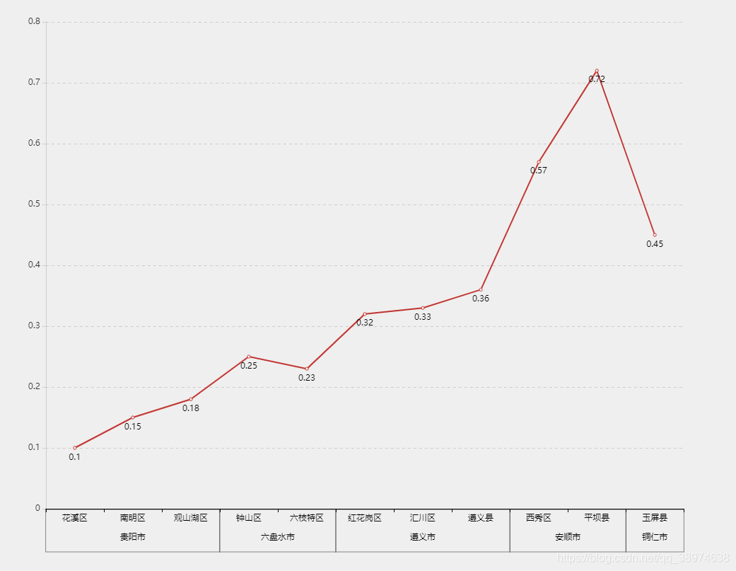
这种方法的缺陷在于柱形图虽然能加边框,但是边框不能只设置某一个方向的边框,只能四个方向的边框全部设置。
