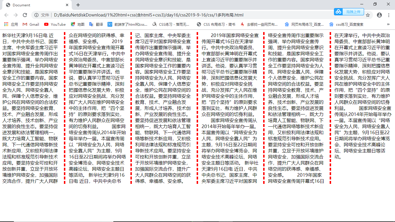
1、多列布局
1     <style>
2         .box {
3             column-width: 200px; /*栏目宽度*/
4             column-rule: 5px dashed red; /*栏目边框 column-rule-width column-rule-style column-rule-color*/
5             column-gap: 28px; /*栏目间距*/
6             /* column-count: 7; 栏目数*/
7         }
8     </style>
    <div class="box">
        新华社天津9月16日电 近日,中共中央总书记、国家主席、中央军委主席习对国家网络安全宣传周作出重要指示强调,举办网络安全宣传周、提升全民网络安全意识和技能,是国家网络安全工作的重要内容。国家网络安全工作要坚持网络安全为人民、网络安全靠人民,保障个人信息安全,维护公民在网络空间的合法权益。要坚持网络安全教育、技术、产业融合发展,形成人才培养、技术创新、产业发展的良性生态。要坚持促进发展和依法管理相统一,既大力培育人工智能、物联网、下一代通信网络等新技术新应用,又积极利用法律法规和标准规范引导新技术应用。要坚持安全可控和开放创新并重,立足于开放环境维护网络安全,加强国际交流合作,提升广大人民群众在网络空间的获得感、幸福感、安全感。

  2019年国家网络安全宣传周开幕式16日在天津举行。中共中央政治局委员、中宣部部长黄坤明在开幕式上宣读习的重要指示并讲话。他说,要认真学习贯彻习总书记重要指示精神,深刻把握信息化发展大势,积极应对网络安全挑战,充分发挥广大人民在维护网络安全中的主体作用,把“四个坚持”的原则要求落到实处,有力维护人民群众在网络空间的切身利益。

  国家网络安全宣传周从2014年开始每年举办一届。本届宣传周以“网络安全为人民,网络安全靠人民”为主题,9月16日至22日期间将举办网络安全博览会、网络安全技术高峰论坛、网络安全主题日等活动。
新华社天津9月16日电 近日,中共中央总书记、国家主席、中央军委主席习对国家网络安全宣传周作出重要指示强调,举办网络安全宣传周、提升全民网络安全意识和技能,是国家网络安全工作的重要内容。国家网络安全工作要坚持网络安全为人民、网络安全靠人民,保障个人信息安全,维护公民在网络空间的合法权益。要坚持网络安全教育、技术、产业融合发展,形成人才培养、技术创新、产业发展的良性生态。要坚持促进发展和依法管理相统一,既大力培育人工智能、物联网、下一代通信网络等新技术新应用,又积极利用法律法规和标准规范引导新技术应用。要坚持安全可控和开放创新并重,立足于开放环境维护网络安全,加强国际交流合作,提升广大人民群众在网络空间的获得感、幸福感、安全感。

  2019年国家网络安全宣传周开幕式16日在天津举行。中共中央政治局委员、中宣部部长黄坤明在开幕式上宣读习的重要指示并讲话。他说,要认真学习贯彻习总书记重要指示精神,深刻把握信息化发展大势,积极应对网络安全挑战,充分发挥广大人民在维护网络安全中的主体作用,把“四个坚持”的原则要求落到实处,有力维护人民群众在网络空间的切身利益。

  国家网络安全宣传周从2014年开始每年举办一届。本届宣传周以“网络安全为人民,网络安全靠人民”为主题,9月16日至22日期间将举办网络安全博览会、网络安全技术高峰论坛、网络安全主题日等活动。
    </div>
2、弹性盒子
布局模式
CSS2 盒模型+浮动+定位
CSS3 弹性盒子
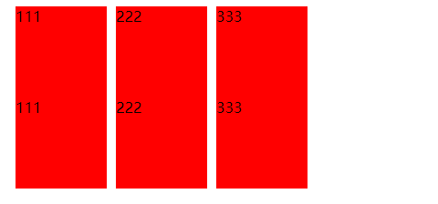
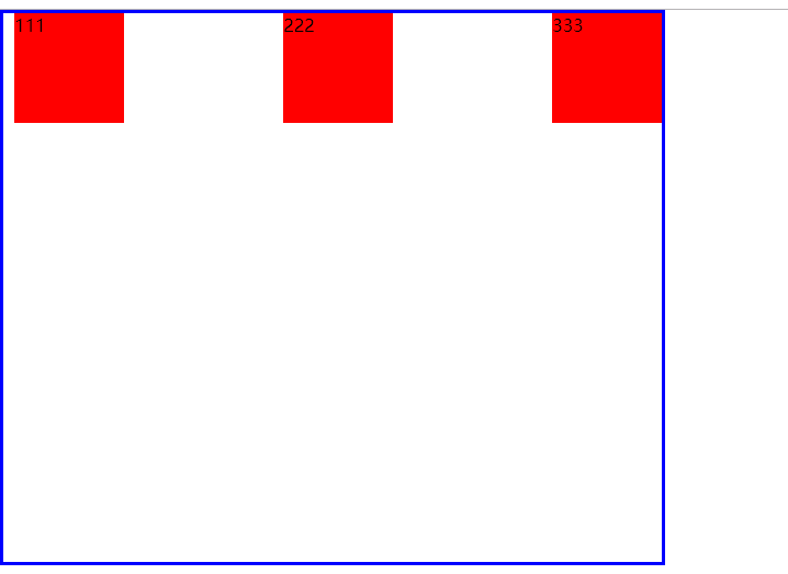
 1     <style>
 2         /*
 3           inline-flex 内联弹性盒
 4         */
 5         .box1 {
 6             display: flex;
 7             /*在父亲中设置 表示该盒子是弹性盒*/
 8         }
 9
10         .box1 div,.box2 span {
11             width: 100px;
12             height: 100px;
13             background-color: red;
14             margin-left: 10px;
15         }
16
17         .box2 {
18             display: flex;
19         }
20     </style>
    <div class="box1">
        <div>111</div>
        <!--项目-->
        <div>222</div>
        <div>333</div>
    </div>
    <div class="box2">
        <span>111</span>
        <!--项目-->
        <span>222</span>
        <span>333</span>
    </div>
扫描二维码关注公众号,回复:
10823070 查看本文章

 1     <style>
 2         /*
 3           inline-flex 内联弹性盒
 4         */
 5         .box1 {
 6             display: inline-flex;
 7             /*在父亲中设置 表示该盒子是弹性盒*/
 8         }
 9
10         .box1 div,.box2 span {
11             width: 100px;
12             height: 100px;
13             background-color: red;
14             margin-left: 10px;
15         }
16
17         .box2 {
18             display: inline-flex;
19         }
20     </style>
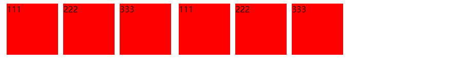
 1     <style>
 2         .box1 {
 3             height: 200px;
 4             display: flex;
 5             /* 容器属性
 6             flex-direction 设置主轴的方向
 7             默认值row 此时是水平方向 起点在左
 8             row-reverse 此时主轴是水平方向 起点在右
 9             column 此时主轴是垂直方向 起点在上沿
10             column-reverse 此时主轴是垂直方向 起点在下沿
11             */
12             flex-direction: row;
13             /* flex-direction: row-reverse;
14             flex-direction: column;
15             flex-direction: column-reverse; */
16             /*在父亲中设置 表示该盒子是弹性盒*/
17         }
18
19         .box1 div {
20             width: 100px;
21             height: 100px;
22             background-color: red;
23             margin-left: 10px;
24         }
25
26         .box2 {
27             display: flex;
28         }
29     </style>
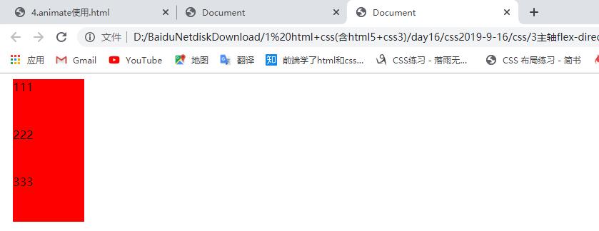
    <div class="box1">
        <div>111</div>
        <!--项目-->
        <div>222</div>
        <div>333</div>
    </div>

 1     <style>
 2         .box1 {
 3             height: 200px;
 4             display: flex;
 5             /* 容器属性
 6             flex-direction 设置主轴的方向
 7             默认值row 此时是水平方向 起点在左
 8             row-reverse 此时主轴是水平方向 起点在右
 9             column 此时主轴是垂直方向 起点在上沿
10             column-reverse 此时主轴是垂直方向 起点在下沿
11             */
12             flex-direction: row;
13             flex-direction: row-reverse;       后面的覆盖前面的,所以上一行可以不注释
14             /* flex-direction: column;
15             flex-direction: column-reverse; */
16             /*在父亲中设置 表示该盒子是弹性盒*/
17         }
18
19         .box1 div {
20             width: 100px;
21             height: 100px;
22             background-color: red;
23             margin-left: 10px;
24         }
25
26         .box2 {
27             display: flex;
28         }
29     </style>

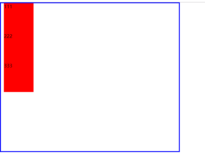
 1     <style>
 2         .box1 {
 3             height: 200px;
 4             display: flex;
 5             /* 容器属性
 6             flex-direction 设置主轴的方向
 7             默认值row 此时是水平方向 起点在左
 8             row-reverse 此时主轴是水平方向 起点在右
 9             column 此时主轴是垂直方向 起点在上沿
10             column-reverse 此时主轴是垂直方向 起点在下沿
11             */
12             flex-direction: row;
13             flex-direction: row-reverse;
14             flex-direction: column;
15             /* flex-direction: column-reverse; */
16             /*在父亲中设置 表示该盒子是弹性盒*/
17         }
18
19         .box1 div {
20             width: 100px;
21             height: 100px;
22             background-color: red;
23             margin-left: 10px;
24         }
25
26         .box2 {
27             display: flex;
28         }
29     </style>
 1     <style>
 2         .box1 {
 3             height: 200px;
 4             display: flex;
 5             /* 容器属性
 6             flex-direction 设置主轴的方向
 7             默认值row 此时是水平方向 起点在左
 8             row-reverse 此时主轴是水平方向 起点在右
 9             column 此时主轴是垂直方向 起点在上沿
10             column-reverse 此时主轴是垂直方向 起点在下沿
11             */
12             flex-direction: row;
13             flex-direction: row-reverse;
14             flex-direction: column;
15             flex-direction: column-reverse;
16             /*在父亲中设置 表示该盒子是弹性盒*/
17         }
18
19         .box1 div {
20             width: 100px;
21             height: 100px;
22             background-color: red;
23             margin-left: 10px;
24         }
25
26         .box2 {
27             display: flex;
28         }
29     </style>

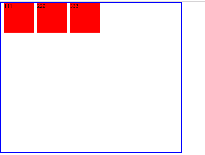
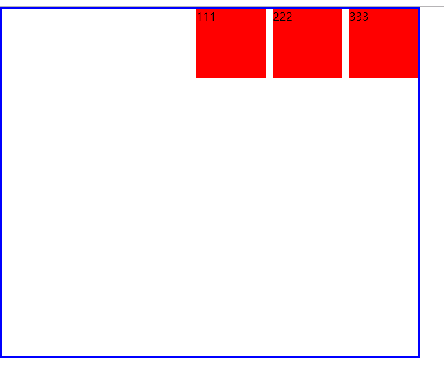
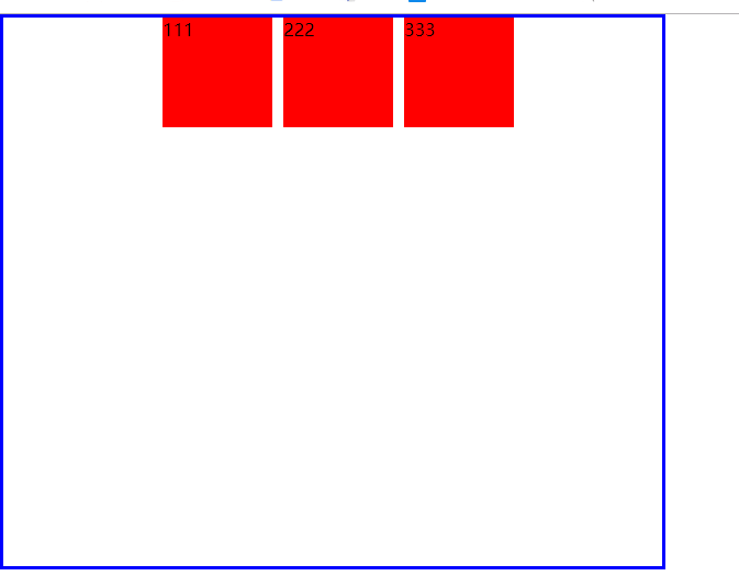
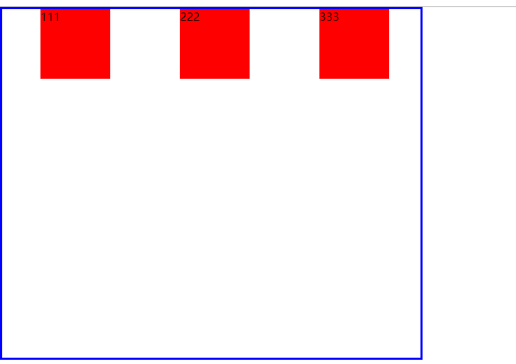
项目在主轴对齐方式
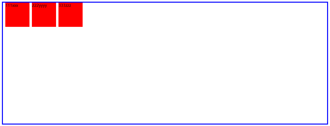
 1     <style>
 2         * {
 3             padding: 0;
 4             margin: 0;
 5         }
 6         .box1 {
 7             width: 600px;
 8             border: 3px solid blue;
 9             height: 500px;
10             display: flex;
11             /* flex-direction: column; */
12             /*
13               容器属性 设置子元素在主轴方向对齐方式
14             */
15             justify-content: flex-start; 起始位置对齐
16             /* justify-content: flex-end; 末端位置对齐 */
17             justify-content: center; /*居中对齐*/
18             /* justify-content: space-around; 分散对齐
19             justify-content: space-between; 两端对齐*/
20         }
21
22         .box1 div {
23             width: 100px;
24             height: 100px;
25             background-color: red;
26             margin-left: 10px;
27         }
28
29         .box2 {
30             display: flex;
31         }
32     </style>
    <div class="box1">
        <div>111</div>
        <!--项目-->
        <div>222</div>
        <div>333</div>
    </div>
 1     <style>
 2         * {
 3             padding: 0;
 4             margin: 0;
 5         }
 6         .box1 {
 7             width: 600px;
 8             border: 3px solid blue;
 9             height: 500px;
10             display: flex;
11             /* flex-direction: column; */
12             /*
13               容器属性 设置子元素在主轴方向对齐方式
14             */
15             /* justify-content: flex-start; 起始位置对齐 */
16             justify-content: flex-end; 末端位置对齐
17             justify-content: center; /*居中对齐*/
18             /* justify-content: space-around; 分散对齐
19             justify-content: space-between; 两端对齐*/
20         }
21
22         .box1 div {
23             width: 100px;
24             height: 100px;
25             background-color: red;
26             margin-left: 10px;
27         }
28
29         .box2 {
30             display: flex;
31         }
32     </style>
 1     <style>
 2         * {
 3             padding: 0;
 4             margin: 0;
 5         }
 6         .box1 {
 7             width: 600px;
 8             border: 3px solid blue;
 9             height: 500px;
10             display: flex;
11             /* flex-direction: column; */
12             /*
13               容器属性 设置子元素在主轴方向对齐方式
14             */
15             /* justify-content: flex-start; 起始位置对齐 */
16             /* justify-content: flex-end; 末端位置对齐 */
17             justify-content: center; /*居中对齐*/
18             /* justify-content: space-around; 分散对齐
19             justify-content: space-between; 两端对齐*/
20         }
21
22         .box1 div {
23             width: 100px;
24             height: 100px;
25             background-color: red;
26             margin-left: 10px;
27         }
28
29         .box2 {
30             display: flex;
31         }
32     </style>
 1     <style>
 2         * {
 3             padding: 0;
 4             margin: 0;
 5         }
 6         .box1 {
 7             width: 600px;
 8             border: 3px solid blue;
 9             height: 500px;
10             display: flex;
11             /* flex-direction: column; */
12             /*
13               容器属性 设置子元素在主轴方向对齐方式
14             */
15             /* justify-content: flex-start; 起始位置对齐 */
16             /* justify-content: flex-end; 末端位置对齐 */
17             justify-content: center; /*居中对齐*/
18             justify-content: space-around; 分散对齐
19             /* justify-content: space-between; 两端对齐 */
20         }
21
22         .box1 div {
23             width: 100px;
24             height: 100px;
25             background-color: red;
26             margin-left: 10px;
27         }
28
29         .box2 {
30             display: flex;
31         }
32     </style>
 1     <style>
 2         * {
 3             padding: 0;
 4             margin: 0;
 5         }
 6         .box1 {
 7             width: 600px;
 8             border: 3px solid blue;
 9             height: 500px;
10             display: flex;
11             /* flex-direction: column; */
12             /*
13               容器属性 设置子元素在主轴方向对齐方式
14             */
15             /* justify-content: flex-start; 起始位置对齐 */
16             /* justify-content: flex-end; 末端位置对齐 */
17             justify-content: center; /*居中对齐*/
18             /* justify-content: space-around; 分散对齐 */
19             justify-content: space-between; 两端对齐
20         }
21
22         .box1 div {
23             width: 100px;
24             height: 100px;
25             background-color: red;
26             margin-left: 10px;
27         }
28
29         .box2 {
30             display: flex;
31         }
32     </style>
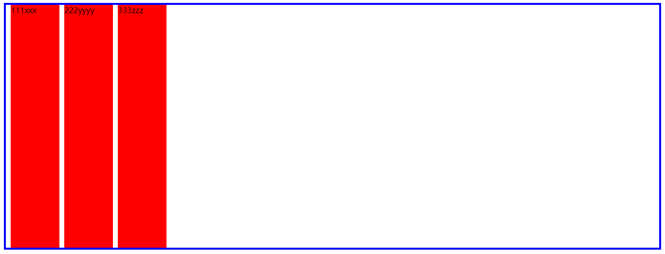
竖直方向 与横向相同
 1     <style>
 2         * {
 3             padding: 0;
 4             margin: 0;
 5         }
 6         .box1 {
 7             width: 600px;
 8             border: 3px solid blue;
 9             height: 500px;
10             display: flex;
11             flex-direction: column;
12             /*
13               容器属性 设置子元素在主轴方向对齐方式
14             */
15             justify-content: flex-start; 起始位置对齐
16             /* justify-content: flex-end; 末端位置对齐 */
17             justify-content: center; /*居中对齐*/
18             /* justify-content: space-around; 分散对齐 */
19             /* justify-content: space-between; 两端对齐 */
20         }
21
22         .box1 div {
23             width: 100px;
24             height: 100px;
25             background-color: red;
26             margin-left: 10px;
27         }
28
29         .box2 {
30             display: flex;
31         }
32     </style>
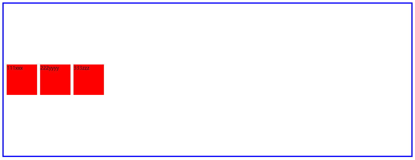
侧轴方向对齐方式 aline-items
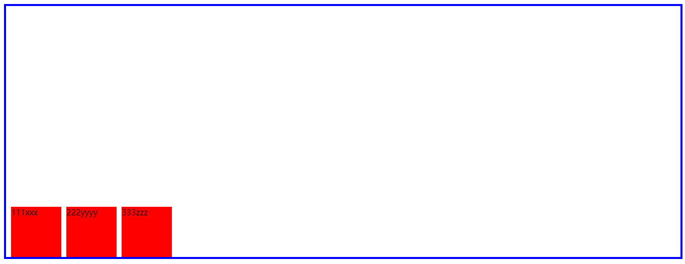
 1     <style>
 2         .box1 {
 3             height: 500px;
 4             /* height: auto; */
 5             border: 4px solid blue;
 6             display: flex;
 7             /* 侧轴方向对齐方式*/
 8             align-items: flex-start;
 9             /* align-items: flex-end; */
10             /* align-items: center; */
11             /*align-items: stretch;*/               /*拉伸沾满 子项目没有设置高度 子项目会拉伸沾满父亲*/
12             /* align-items: baseline; */
13         }
14
15         .box1 div {
16             width: 100px;
17             /* height: auto; */
18             height: 100px;
19             background-color: red;
20             margin-left: 10px;
21         }
22
23
24     </style>
    <div class="box1">
        <div>111xxx</div>
        <!--项目-->
        <div>222yyyy</div>
        <div>333zzz</div>
    </div>
 1     <style>
 2         .box1 {
 3             height: 500px;
 4             /* height: auto; */
 5             border: 4px solid blue;
 6             display: flex;
 7             /* 侧轴方向对齐方式*/
 8             /* align-items: flex-start; */
 9             align-items: flex-end;
10             /* align-items: center; */
11             /*align-items: stretch;*/               /*拉伸沾满 子项目没有设置高度 子项目会拉伸沾满父亲*/
12             /* align-items: baseline; */
13         }
14
15         .box1 div {
16             width: 100px;
17             /* height: auto; */
18             height: 100px;
19             background-color: red;
20             margin-left: 10px;
21         }
22
23
24     </style>
    <style>
        .box1 {
            height: 500px;
            /* height: auto; */
            border: 4px solid blue;
            display: flex;
            /* 侧轴方向对齐方式*/
            /* align-items: flex-start; */
            /* align-items: flex-end; */
            align-items: center;
            /*align-items: stretch;*/               /*拉伸沾满 子项目没有设置高度 子项目会拉伸沾满父亲*/
            /* align-items: baseline; */
        }

        .box1 div {
            width: 100px;
            /* height: auto; */
            height: 100px;
            background-color: red;
            margin-left: 10px;
        }


    </style>
 1     <style>
 2         .box1 {
 3             height: 500px;
 4             /* height: auto; */
 5             border: 4px solid blue;
 6             display: flex;
 7             /* 侧轴方向对齐方式*/
 8             /* align-items: flex-start; */
 9             /* align-items: flex-end; */
10             /* align-items: center; */
11             align-items: stretch;               /*拉伸沾满 子项目没有设置高度 子项目会拉伸沾满父亲*/
12             /* align-items: baseline; */
13         }
14
15         .box1 div {
16             width: 100px;
17             /* height: auto; */
18             /* height: 100px; */
19             background-color: red;
20             margin-left: 10px;
21         }
22
23
24     </style>
 1     <style>
 2         .box1 {
 3             height: 500px;
 4             /* height: auto; */
 5             border: 4px solid blue;
 6             display: flex;
 7             /* 侧轴方向对齐方式*/
 8             /* align-items: flex-start; */
 9             /* align-items: flex-end; */
10             /* align-items: center; */
11             /*align-items: stretch;               /*拉伸沾满 子项目没有设置高度 子项目会拉伸沾满父亲*/
12             align-items: baseline;
13         }
14
15         .box1 div {
16             width: 100px;
17             /* height: auto; */
18             /* height: 100px; */
19             background-color: red;
20             margin-left: 10px;
21             text-align:center;
22         }
23         .box2{
24             height: 100px;
25             line-height:80px;
26         }
27         .box3{
28             height: 200px;
29         }
30         .box4{
31             height: 300px;
32         }
33
34     </style>
    <div class="box1">
        <div class="box2">111xxx</div>
        <!--项目-->
        <div class="box3">222yyyy</div>
        <div class="box4">333zzz</div>
    </div>

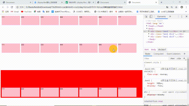
弹性盒项目换行
 1     <style>
 2         .box1 {
 3             height: 300px;
 4             display: flex;
 5         }
 6
 7         .box1 div {
 8             width: 200px;
 9             height: 100px;
10             background-color: pink;
11             margin: 10px 0 10px 10px;
12         }
13
14         .box1:nth-child(1) {
15             flex-wrap: nowrap;
16             /*flex-wrap 弹性盒项目在轴线上排不下 换行的方式 nowrap不换行*/
17         }
18
19         .div2 {
20             flex-wrap: wrap;
21             /*wrap换行*/
22         }
23
24         .div3 {
25             flex-wrap: wrap-reverse;
26             /*换行 起始位置在下*/
27             background-color: red;
28         }
29     </style>
    <div class="box1">
        <div>111</div>
        <!--项目-->
        <div>222</div>
        <div>333</div>
        <div>444</div>
        <div>555</div>
        <div>666</div>
        <div>777</div>
    </div>
    <div class="box1 div2">
        <div>111</div>
        <!--项目-->
        <div>222</div>
        <div>333</div>
        <div>444</div>
        <div>555</div>
        <div>666</div>
        <div>777</div>
    </div>
    <div class="box1 div3">
        <div>111</div>
        <!--项目-->
        <div>222</div>
        <div>333</div>
        <div>444</div>
        <div>555</div>
        <div>666</div>
        <div>777</div>
    </div>
设置项目的排列次序
 1     <style>
 2         .box1 {
 3             height: 300px;
 4             display: flex;
 5         }
 6
 7         .box1 div {
 8             width: 200px;
 9             height: 100px;
10             background-color: pink;
11             margin: 10px 0 10px 10px;
12         }
13
14         /*
15                order设置项目的排列次序 设置在项目中
16                默认值0
17                值越大越靠后
18                值相同 看结构 写在后的排在后面
19              */
20         .box1 div:nth-child(1) {
21             order: 1;
22         }
23
24         .box1 div:nth-child(3) {
25             order: -1;
26         }
27     </style>
    <div class="box1">
        <div>111</div>
        <!--项目-->
        <div>222</div>
        <div>333</div>
        <div>444</div>
        <div>555</div>
        <div>666</div>
        <div>777</div>
    </div>

3、2D/3D