CustomScrollView
一、SliverAppbar 控件介绍
SliverAppBar “应用栏” 相当于升级版的 appbar 于 AppBar 位置的固定的应用最上面的; 而 SliverAppBar 是可以跟随内容滚动的;
1、使用方法
- 与CustomScrollView、NestedScrollView集成的材质设计应用栏。应用栏由工具栏和其他小部件组成,例如 TabBar和FlexibleSpaceBar。应用栏通常会使用IconButton公开一个或多个常见操作,后者可选地后跟 PopupMenuButton以进行不太常见的操作
- 注意点:
通常结合 CustomScrollView 、 NestedScrollView 来使用它, NestedScrollView里面可以嵌套Listview 完成滑动
2、基本属性
const SliverAppBar({
    Key key,
    this.leading,         //在标题左侧显示的一个控件,在首页通常显示应用的 logo;在其他界面通常显示为返回按钮
    this.automaticallyImplyLeading = true,//? 控制是否应该尝试暗示前导小部件为null
    this.title,               //当前界面的标题文字
    this.actions,          //一个 Widget 列表,代表 Toolbar 中所显示的菜单,对于常用的菜单,通常使用 IconButton 来表示;对于不常用的菜单通常使用 PopupMenuButton 来显示为三个点,点击后弹出二级菜单
    this.flexibleSpace,        //一个显示在 AppBar 下方的控件,高度和 AppBar 高度一样, // 可以实现一些特殊的效果,该属性通常在 SliverAppBar 中使用
    this.bottom,         //一个 AppBarBottomWidget 对象,通常是 TabBar。用来在 Toolbar 标题下面显示一个 Tab 导航栏
    this.elevation,            //阴影
    this.forceElevated = false,
    this.backgroundColor,       //APP bar 的颜色,默认值为 ThemeData.primaryColor。改值通常和下面的三个属性一起使用
    this.brightness,   //App bar 的亮度,有白色和黑色两种主题,默认值为 ThemeData.primaryColorBrightness
    this.iconTheme,  //App bar 上图标的颜色、透明度、和尺寸信息。默认值为 ThemeData().primaryIconTheme
    this.textTheme,    //App bar 上的文字主题。默认值为 ThemeData().primaryTextTheme
    this.primary = true,  //此应用栏是否显示在屏幕顶部
    this.centerTitle,     //标题是否居中显示,默认值根据不同的操作系统,显示方式不一样,true居中 false居左
    this.titleSpacing = NavigationToolbar.kMiddleSpacing,//横轴上标题内容 周围的间距
    this.expandedHeight,     //展开高度
    this.floating = false,       //是否随着滑动隐藏标题
    this.pinned = false,  //是否固定在顶部
    this.snap = false,   //与floating结合使用
  })
3、常用属性
- 在标题前面显示的一个控件,在首页通常显示应用的logo;在其他界面通常显示为返回按钮。
leading: Icon(_selectedChoice.icon) ,
- 控制是否应该尝试暗示前导小部件为null(如果有 leading 这个不会管用 ,相当于忽略这个参数 ; 如果没有leading ,当有侧边栏的时候, false:不会显示默认的图片,true 会显示 默认图片,并响应打开侧边栏的事件)
automaticallyImplyLeading:true,
- 当前界面的标题文字
title: Text(_selectedChoice.title )
- 一个 Widget 列表,代表 Toolbar 中所显示的菜单,对于常用的菜单,通常使用 IconButton 来表示;对于不常用的菜单通常使用 PopupMenuButton 来显示为三个点,点击后弹出二级菜单
actions: <Widget>[
     new IconButton( // action button
         icon: new Icon(choices[0].icon),
         onPressed: () { _select(choices[0]); },
     ),
     new IconButton( // action button
         icon: new Icon(choices[1].icon),
         onPressed: () { _select(choices[1]); },
     ),
     new PopupMenuButton<Choice>( // overflow menu
         onSelected: _select,
         itemBuilder: (BuildContext context) {
            return choices.skip(2).map((Choice choice) {
               return new PopupMenuItem<Choice>(
                  value: choice,
                  child: new Text(choice.title),
               );
            }).toList();
         },
      )
   ],
- 一个显示在 AppBar 下方的控件,高度和 AppBar 高度一样,可以实现一些特殊的效果,该属性通常在 SliverAppBar 中使用
flexibleSpace: Container(
  color: Colors.blue,
  width: MediaQuery.of(context).size.width,
  child: Text("aaaaaaaaaa"),
    height: 10,
      )
- 一个 AppBarBottomWidget 对象,通常是 TabBar。用来在 Toolbar 标题下面显示一个 Tab 导航栏
bottom: new TabBar(
            isScrollable: true,
            tabs: choices.map((Choice choice) {
              return new Tab(
                text: choice.title,
                icon: new Icon(choice.icon),
              );
            }).toList(),
          )
- 标题居中显示
centerTitle: true,
- 此应用栏是否显示在屏幕顶部
primary: true,
- appbar是否随着滑动隐藏标题
floating: true,
- tab 是否固定在顶部(为true是固定,为false是不固定)
pinned: true,
- 与floating结合使用,如果snap和floating为true,则浮动应用栏将“捕捉”到视图中
snap: true,
- 可滚动视图的高度(默认高度是状态栏和导航栏的高度,如果有滚动视差的话,要大于前两者的高度)
expandedHeight: 200.0,
二、CustomScrollView控件介绍
1、使用方法
- CustomScrollView是可以使用sliver来自定义滚动模型(效果)的ScrollView类型的widget。它可以包含多种滚动模型,举个例子,假设有一个页面,顶部需要一个GridView,底部需要一个ListView,而要求整个页面的滑动效果是统一的,即它们看起来是一个整体,如果使用GridView+ListView来实现的话,就不能保证一致的滑动效果,因为它们的滚动效果是分离的,所以这时就需要一个"胶水",把这些彼此独立的可滚动widget(Sliver)"粘"起来,而CustomScrollView的功能就相当于“胶水”。
- CustomScrollView让你可以直接提供 slivers来创建不同的滚动效果,比如Lists,grids 以及 expanding headers。
- Sliver有细片、小片之意,在Flutter中,Sliver通常指具有特定滚动效果的可滚动块。可滚动widget,如ListView、GridView等都有对应的Sliver实现如SliverList、SliverGrid等。对于大多数Sliver来说,它们和可滚动Widget最主要的区别是Sliver不会包含Scrollable Widget,也就是说Sliver本身不包含滚动交互模型 ,正因如此,CustomScrollView才可以将多个Sliver"粘"在一起,这些Sliver共用CustomScrollView的Scrollable,最终实现统一的滑动效果。
2、基本属性
const CustomScrollView({
    Key key,
    Axis scrollDirection = Axis.vertical,
    bool reverse = false,
    ScrollController controller,
    bool primary,
    ScrollPhysics physics,
    bool shrinkWrap = false,
    Key center,
    double anchor = 0.0,
    double cacheExtent,
    this.slivers = const <Widget>[],
    int semanticChildCount,
    DragStartBehavior dragStartBehavior = DragStartBehavior.start,
  }) : super(
    key: key,
    scrollDirection: scrollDirection,
    reverse: reverse,
    controller: controller,
    primary: primary,
    physics: physics,
    shrinkWrap: shrinkWrap,
    center: center,
    anchor: anchor,
    cacheExtent: cacheExtent,
    semanticChildCount: semanticChildCount,
    dragStartBehavior: dragStartBehavior,
  );
三、CustomScrollView集成SLiverAppBar案例
import 'package:flutter/material.dart';
class CustomScrollViewTestRoute extends StatelessWidget {
@override
Widget build(BuildContext context) {
//因为本路由没有使用Scaffold,为了让子级Widget(如Text)使用
//Material Design 默认的样式风格,我们使用Material作为本路由的根。
return Material(
child: CustomScrollView(
slivers: <Widget>[
//AppBar,包含一个导航栏
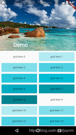
SliverAppBar(
pinned: true,
expandedHeight: 250.0,
flexibleSpace: FlexibleSpaceBar(
title: const Text('Demo'),
background: Image.asset(
"./images/avatar.png", fit: BoxFit.cover,),
),
),
SliverPadding(
padding: const EdgeInsets.all(8.0),
sliver: new SliverGrid( //Grid
gridDelegate: new SliverGridDelegateWithFixedCrossAxisCount(
crossAxisCount: 2, //Grid按两列显示
mainAxisSpacing: 10.0,
crossAxisSpacing: 10.0,
childAspectRatio: 4.0,
),
delegate: new SliverChildBuilderDelegate(
(BuildContext context, int index) {
//创建子widget
return new Container(
alignment: Alignment.center,
color: Colors.cyan[100 * (index % 9)],
child: new Text('grid item $index'),
);
},
childCount: 20,
),
),
),
//List
new SliverFixedExtentList(
itemExtent: 50.0,
delegate: new SliverChildBuilderDelegate(
(BuildContext context, int index) {
//创建列表项
return new Container(
alignment: Alignment.center,
color: Colors.lightBlue[100 * (index % 9)],
child: new Text('list item $index'),
);
},
childCount: 50 //50个列表项
),
),
],
),
);
}
}
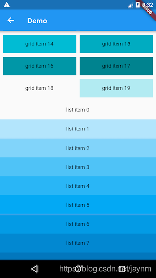
代码分为三部分:
- 头部SliverAppBar:SliverAppBar对应AppBar,两者不同之处在于SliverAppBar可以集成到CustomScrollView。SliverAppBar可以结合FlexibleSpaceBar实现Material Design中头部伸缩的模型,具体效果,读者可以运行该示例查看。
- 中间的SliverGrid:它用SliverPadding包裹以给SliverGrid添加补白。SliverGrid是一个两列,宽高比为4的网格,它有20个子组件。
- 底部SliverFixedExtentList:它是一个所有子元素高度都为50像素的列表。
