CSS布局系列
前言
一般布局前可以先重置一下样式,如这个仓库,使用normalize.css和reset一些常用的属性(如清除浮动等)
/**
 * 1. Avoid the IE 10-11 `min-height` bug.
 * 2. Set `flex-shrink` to `0` to prevent some browsers from
 *    letting these items shrink to smaller than their content's default
 *    minimum size. See http://bit.ly/1Mn35US for details.
 * 3. Use `%` instead of `vh` since `vh` is buggy in older mobile Safari.
 */
/*reset*/
*,
*::after,
*::before {
  box-sizing: border-box;
}
html {
  height: 100%;
  color: hsl(0,0%,25%);
  font: 400 1em/1.4 'Open Sans', sans-serif;
  text-rendering: optimizeLegibility;
}
......
/* 使用变量*/
:root {
  --space: 1.5em;
  --space-lg: 2em;
  --bg-color: hsl(150, 45%, 50%);
}
传统圣杯布局
参考:Holy Grail 圣杯布局详解
简单版本:
<!DOCTYPE html>
<html lang="en">
  <head>
    <meta charset="UTF-8" />
    <meta name="viewport" content="width=device-width, initial-scale=1.0" />
    <title>Document</title>
  </head>
  <body>
    <style>
      body {
        min-width: 550px; /* 2x LC width + RC width */
      }
      #container {
        padding-left: 200px; /* LC width */
        padding-right: 150px; /* RC width */
      }
      #container .column {
        float: left;
        position: relative;
      }
      #center {
        width: 100%;
      }
      #left {
        width: 200px;
        margin-left: -100%;
        right: 200px;
        /* left: -200px */
      }
      #right {
        width: 150px;
        margin-right: -150px;
      }
      #footer {
        clear: both;
        position: relative;
      }
      #header,
      #footer {
        font-size: large;
        text-align: center;
        padding: 0.3em 0;
        background: #999;
      }
      #container {
        background-color: yellow;
      }
      #left {
        background: #66f;
      }

      #center {
        background: #ddd;
      }

      #right {
        background: #f66;
      }
    </style>
    <div id="header">header</div>
    <div id="container">
      <div id="center" class="column">
        c
      </div>
      <div id="left" class="column">l</div>
      <div id="right" class="column">r</div>
    </div>
    <div id="footer">footer</div>
  </body>
</html>
完整代码如下:
<!DOCTYPE html PUBLIC "-//W3C//DTD XHTML 1.0 Strict//EN" "http://www.w3.org/TR/xhtml1/DTD/xhtml1-strict.dtd">
<html xmlns="http://www.w3.org/1999/xhtml" xml:lang="en" lang="en">
<head>
	<meta http-equiv="Content-Type" content="text/html; charset=UTF-8" />
	<title>The Holy Grail of Layouts: Example #4: A List Apart</title>
	<style type="text/css">

		/*** The Essential Code ***/

		body {
			margin: 0;
			padding-left: 200px;    /* LC fullwidth */
			padding-right: 190px;   /* RC fullwidth + CC padding */
			min-width: 240px;       /* LC fullwidth + CC padding */
		}

		#header, #footer {
			margin-left: -200px;    /* LC fullwidth */
			margin-right: -190px;   /* RC fullwidth + CC padding */
		}

		.column {
			position: relative;
			float: left;
		}

		#center {
			padding: 0 20px;
			width: 100%;
		}

		#left {
			width: 180px;           /* LC width */
			padding: 0 10px;        /* LC padding */
			right: 240px;           /* LC fullwidth + CC padding */
			margin-left: -100%;
		}

		#right {
			width: 130px;           /* RC width */
			padding: 0 10px;        /* RC padding */
			margin-right: -100%;
		}

		#footer {
			clear: both;
		}

		/*** IE Fix ***/
		* html #left {
			left: 150px;            /* RC fullwidth */
		}

		/*** Just for Looks ***/

		body {
			background: #FFF;
		}

		#header, #footer {
			font-size: large;
			text-align: center;
			padding: 0.3em 0;
			background: #999;
		}

		#left {
			background: #66F;
		}

		#center {
			background: #DDD;
		}

		#right {
			background: #F66;
		}

		.column {
			padding-top: 1em;
			text-align: justify;
		}

	</style>
</head>

<body>

	<div id="header">This is the header.</div>

	<div id="center" class="column">
		<h1>This is the main content.</h1>
		<p>Lorem ipsum dolor sit amet, consectetuer adipiscing elit, sed diam nonummy nibh euismod tincidunt ut laoreet dolore magna aliquam erat volutpat. Ut wisi enim ad minim veniam, quis nostrud exerci tation ullamcorper suscipit lobortis nisl ut aliquip ex ea commodo consequat. Duis autem vel eum iriure dolor in hendrerit in vulputate velit esse molestie consequat, vel illum dolore eu feugiat nulla facilisis at vero eros et accumsan et iusto odio dignissim qui blandit praesent luptatum zzril delenit augue duis dolore te feugait nulla.</p>
		<p>Lorem ipsum dolor sit amet, consectetuer adipiscing elit, sed diam nonummy nibh euismod tincidunt ut laoreet dolore magna aliquam erat volutpat. Ut wisi enim ad minim veniam, quis nostrud exerci tation ullamcorper suscipit lobortis nisl ut aliquip ex ea commodo consequat. Duis autem vel eum iriure dolor in hendrerit in vulputate velit esse molestie consequat, vel illum dolore eu feugiat nulla facilisis at vero eros et accumsan et iusto odio dignissim qui blandit praesent luptatum zzril delenit augue duis dolore te feugait nulla.</p>
	</div>

	<div id="left" class="column">
		<h2>This is the left sidebar.</h2>
		<p>Lorem ipsum dolor sit amet, consectetuer adipiscing elit, sed diam nonummy nibh euismod tincidunt ut laoreet dolore magna aliquam erat volutpat. Ut wisi enim ad minim veniam, quis nostrud exerci tation ullamcorper suscipit lobortis nisl ut aliquip ex ea commodo consequat. Duis autem vel eum iriure dolor in hendrerit in vulputate velit esse molestie consequat, vel illum dolore eu feugiat nulla facilisis at vero eros et accumsan et iusto odio dignissim qui blandit praesent luptatum zzril delenit augue duis dolore te feugait nulla.</p>
	</div>

	<div id="right" class="column">
		<h2>This is the right sidebar.</h2>
		<p>Lorem ipsum dolor sit amet, consectetuer adipiscing elit, sed diam nonummy nibh euismod tincidunt ut laoreet dolore magna aliquam erat volutpat. Ut wisi enim ad minim veniam, quis nostrud exerci tation ullamcorper suscipit lobortis nisl ut aliquip ex ea commodo consequat. Duis autem vel eum iriure dolor in hendrerit in vulputate velit esse molestie consequat, vel illum dolore eu feugiat nulla facilisis at vero eros et accumsan et iusto odio dignissim qui blandit praesent luptatum zzril delenit augue duis dolore te feugait nulla.</p>
	</div>

	<div id="footer">This is the footer.</div>

</body>

</html>

圣杯布局(flex) + 响应式
圣杯布局 是典型的 CSS 布局问题,有着众多的解决方案。如果你不熟悉圣杯布局的历史,这篇文章 能够提供很好的总结,并给出了几个众所周知的解决方案。
圣杯布局由页头 (header),中间部分 (center),页脚 (footer),和三栏组成。中间的一栏是主要内容,左边和右边提供如广告、导航的链接。

大部分的 CSS 解决方案都是以下列为目标:
-
边栏应流动居中,定宽。
-
中间一栏 (主要内容) 在 HTML 源码中应该首先元素出现。
-
所有栏同高,忽略实际高度。
-
使用的 HTML 标记尽量少。
-
当页面内容不够充满页面时,页脚应“粘”在底部。
不幸的是,这些自然的需求由于原生 CSS 的限制,当前经典的圣杯布局的解决方案都不能完美满足以上所有的要点。
有了 Flexbox 布局,终极的解决方案终于成为可能。
HTML 代码
<body class="HolyGrail">
    <header>…</header>
    <div class="HolyGrail-body">
        <main class="HolyGrail-content">…</main>
        <nav class="HolyGrail-nav">…</nav>
        <aside class="HolyGrail-ads">…</aside>
    </div>
    <footer>…</footer>
</body>
CSS 代码
让中间部分撑开并让页脚粘在底部的方法使用了 粘性页脚 中相同的技术。唯一的不同点是,圣杯布局的中间部分 (.HolyGrail-body) 需要指定 display:flex来控制子元素的布局。
总的来说就是通过order: -1控制顺序, flex: 1控制自适应。。。
.HolyGrail {
    display: flex;
    min-height: 100vh;
    flex-direction: column;
}

.HolyGrail-body {
    display: flex;
    flex: 1;
}
制造三个等高的,流式居中,定宽的边栏很简单:
.HolyGrail-content {
    flex: 1;
}

.HolyGrail-nav,
.HolyGrail-ads {
    /* 12em is the width of the columns */
    flex: 0 0 12em;
}

.HolyGrail-nav {
    /* put the nav on the left */
    order: -1;
}
注意: 该 demo 的 CSS 代码需要轻微修改才能跨浏览器工作。参考 源代码的注释。
响应式
圣杯布局来自于每个人都使用个人计算机冲浪的互联网时期的网页设计,但是随着移动设备的激增,圣杯布局已渐渐没落。
另一方面,使用 Flexbox 布局,创建一个移动设备优先和移动设备友好版本的圣杯布局很简单。其主旨就是把中间的部分默认指定为flex-direction:column,然后为拥有更宽屏幕的设备指定 flex-direction:row 。
这里是一个完整版的移动式被优先响应式示例。你可以调整浏览器大小来查看效果。
.HolyGrail,
.HolyGrail-body {
    display: flex;
    flex-direction: column;
}

.HolyGrail-nav {
    order: -1;
}

@media (min-width: 768px) {
    .HolyGrail-body {
        flex-direction: row;
        flex: 1;
    }
    .HolyGrail-content {
        flex: 1;
    }
    .HolyGrail-nav,
    .HolyGrail-ads {
        /* 12em is the width of the columns */
        flex: 0 0 12em;
    }
}
如果是PC优先响应的则使用媒体查询max-height就行。如,阮一峰博客的。
HTML代码
<body class="HolyGrail">
  <header>...</header>
  <div class="HolyGrail-body">
    <main class="HolyGrail-content">...</main>
    <nav class="HolyGrail-nav">...</nav>
    <aside class="HolyGrail-ads">...</aside>
  </div>
  <footer>...</footer>
</body>
CSS代码
.HolyGrail {
  display: flex;
  min-height: 100vh;
  flex-direction: column;
}

header,
footer {
  flex: 1;
}

.HolyGrail-body {
  display: flex;
  flex: 1;
}

.HolyGrail-content {
  flex: 1;
}

.HolyGrail-nav, .HolyGrail-ads {
  /* 两个边栏的宽度设为12em */
  flex: 0 0 12em;
}

.HolyGrail-nav {
  /* 导航放到最左边 */
  order: -1;
}
PC优先响应
如果是小屏幕,躯干的三栏自动变为垂直叠加。
@media (max-width: 768px) {
  .HolyGrail-body {
    flex-direction: column;
    flex: 1;
  }
  .HolyGrail-nav,
  .HolyGrail-ads,
  .HolyGrail-content {
    flex: auto;
  }
}
另外,可以复制粘贴下面代码看效果。
  <body class="holyGrail">
    <style>
      html,
      body {
        margin: 0;
        padding: 0;
        /*  1, 3 */
        /* height: 100%; */
      }
      /* 关键代码 start */
      .holyGrail {
        display: flex;
        flex-direction: column;
        min-height: 100vh;
        /* 1, 3 */
        /* height: 100%;  */
      }
      .main {
        flex: 1;
        display: flex;
        flex-direction: row;
        background-color: red;
      }
      .content {
        flex: 1;
        background-color: #ccc;
      }
      .nav {
        order: -1;
        background-color: rgb(172, 173, 66);
      }
      /* 关键代码 end */
      /* 响应式 PC优先 start */
      @media screen and (max-width: 768px) {
        .main {
          flex-direction: column;
        }
      }
      /* 响应式 end */
      .ads {
        background-color: yellow;
      }
      .nav,.ads {
        flex: 0 0 6em;
      }
      .header,
      .footer {
        flex: none;
        height: 100px;
      }
      .header {
        background-color: blue;
      }
      .footer {
        background-color: green;
      }
    </style>
    <header class="header">header</header>
    <main class="main">
      <div class="content">content</div>
      <div class="nav">nav</div>
      <div class="ads">ads</div>
    </main>
    <footer class="footer">footer</footer>
  </body>


两列布局(右边自适应布局)
BFC实现
  <body>
    <style>
      .left {
        background-color: blue;
        width: 100px;
        height: 80px;
        float: left;
      }
      .content {
        height: 100%;
        background-color: #ccc;
        overflow: hidden;
      }
    </style>
    <div class="left"></div>
    <div class="content">
      1start,nt,content,content,content,end.....
      start,nt,content,content,content,end.....
      start,nt,content,content,content,end.....
    </div>
  </body>
flex实现
参考下方 三列布局(中间自适应布局)-flex 去掉right就是了…
三列布局(中间自适应布局)
BFC-实现
这个一定要设置一个min-width,不然屏幕太小会错位。。。
  <body>
    <style>
      .outer {
        height: 100px;
        min-width: 300px;
      }
      .left {
        float: left;
        width: 100px;
        height: 100px;
        background: tomato;
      }

      .right {
        float: right;
        width: 200px;
        height: 100px;
        background: gold;
      }

      .center {
        height: 100px;
        /*利用外边距*/
        /* margin-left: 100px; */
        /* margin-right: 200px; */
        overflow: hidden;
        background: lightgreen;
      }
    </style>
    <div class="outer">
      <div class="left"></div>
      <div class="right"></div>
      <div class="center"></div>
    </div>
  </body>
flex实现
  <body>
    <style>
      html,body,.main {
        height: 100%;
        margin: 0;
      }
      .main {
        display: flex;
      }
      .left {
        background-color: blue;
        width: 100px;
      }
      .right {
        background-color: pink;
        width: 100px;
      }
      .content {
        flex: 1;
        background-color: #ccc;
      }
    </style>
    <div class="main">
      <div class="left"></div>
      <div class="content">content</div>
      <div class="right"></div>
    </div>
  </body>
上下固定中间自适应
使用 flex或者calc属性, 代码如下
<!DOCTYPE html>
<html lang="en">
<head>
  <meta charset="UTF-8">
  <meta name="viewport" content="width=device-width, initial-scale=1.0">
  <title>Document</title>
  <style>
    html, body {
      height: 100vh;
      background-color: #ccc;
      margin: 0;
    }
    body {
      /* display: flex; */
      /* flex-direction: column; */
      min-height: 500px;
    }
    main {
      background-color: blue;
      /* flex: 1; */
      height: calc(100vh - 100px);
    }
    header, footer {
      height: 50px;
      background-color: pink;
    }
  </style>
</head>
<body>
  <header>h</header>
  <main>m</main>
  <footer>f</footer>
</body>
</html>
网格布局
2.1 基本网格布局
最简单的网格布局,就是平均分布。在容器里面平均分配空间,跟上面的骰子布局很像,但是需要设置项目的自动缩放。

HTML代码
<div class="Grid">
  <div class="Grid-cell">...</div>
  <div class="Grid-cell">...</div>
  <div class="Grid-cell">...</div>
</div>
CSS代码
.Grid {
  display: flex;
}

.Grid-cell {
  flex: 1;
}
2.2 百分比布局
某个网格的宽度为固定的百分比,其余网格平均分配剩余的空间。
主要使用flex: 0 0 xx%;属性。
flex: auto; => flex: 1 1 auto;
flex: none; => flex: 0 0 auto;

HTML代码如下。
<div class="Grid">
  <div class="Grid-cell u-1of4">...</div>
  <div class="Grid-cell">...</div>
  <div class="Grid-cell u-1of3">...</div>
</div>
CSS代码
.Grid {
  display: flex;
}

.Grid-cell {
  flex: 1;
}

.Grid-cell.u-full {
  flex: 0 0 100%;
}

.Grid-cell.u-1of2 {
  flex: 0 0 50%;
}

.Grid-cell.u-1of3 {
  flex: 0 0 33.3333%;
}

.Grid-cell.u-1of4 {
  flex: 0 0 25%;
}
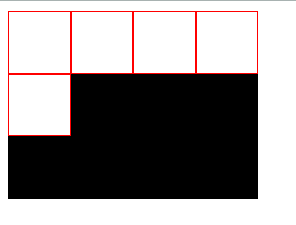
流式布局(flex)
每行的项目数固定,会自动分行。
  <body>
    <style>
      .parent {
        width: 200px;
        height: 150px;
        background-color: black;
        display: flex;
        flex-flow: row wrap;
        align-content: flex-start;
      }

      .child {
        box-sizing: border-box;
        background-color: white;
        flex: 0 0 25%;
        height: 50px;
        border: 1px solid red;
        padding: 5px;
      }
    </style>
    <div class="parent">
      <div class="child"></div>
      <div class="child"></div>
      <div class="child"></div>
      <div class="child"></div>
      <div class="child"></div>
    </div>
  </body>
参考
Flex 布局教程:实例篇
Solved by Flexbox推荐
Holy Grail 圣杯布局详解
传统圣杯布局解决方案
https://github.com/tinfengyee/solved-by-flexbox
https://davidwalsh.name/flexbox-dice
