元素的尺寸获取
- offset
- offsetWidth 可视宽度
- offsetHeight 可视高度
- offsetLeft 距离定位父级的left坐标
- offsetTop 距离定位父级的top坐标
offsetWidth 可视宽度
offsetHeight 可视高度
<!DOCTYPE html>
<html lang="en">
<head>
    <meta charset="UTF-8">
    <meta name="viewport" content="width=device-width, initial-scale=1.0">
    <meta http-equiv="X-UA-Compatible" content="ie=edge">
    <title>Document</title>
    <style>
        #box {
            margin: 50px auto;
            position: relative;
            width: 500px;
            height: 500px;
            border: 1px solid #000;
        }
        #div {
            position: absolute;
            left: 100px;
            top: 100px;
            width: 100px;
            height: 100px;
            background: red;
        }
    </style>
</head>
<body>
 <div id="box">
     <div id="div"></div>
 </div>
<script>
{
    let div = document.querySelector("#div");
    console.log(div.offsetWidth, div.offsetHeight);
}

</script>
</body>
</html>


padding上下左右各30,所以宽高增加60.
 #div {
     position: absolute;
     left: 100px;
     top: 100px;
     width: 100px;
     height: 100px;
     padding: 30px;
     background: red;
 }


增加border
 #div {
     position: absolute;
     left: 100px;
     top: 100px;
     width: 100px;
     height: 100px;
     padding: 30px;
     border: 5px solid #000;
     background: red;
 }


offsetLeft 距离定位父级的left坐标
offsetTop 距离定位父级的top坐标
可视宽高 = width(height) + padding + border
offsetTop/offsetLeft: 元素距离定位父级左上角的距离
<!DOCTYPE html>
<html lang="en">
<head>
    <meta charset="UTF-8">
    <meta name="viewport" content="width=device-width, initial-scale=1.0">
    <meta http-equiv="X-UA-Compatible" content="ie=edge">
    <title>Document</title>
    <style>
        #box {
            margin: 50px auto;
            position: relative;
            width: 500px;
            height: 500px;
            border: 1px solid #000;
        }
        #div {
            position: absolute;
            left: 100px;
            top: 100px;
            width: 100px;
            height: 100px;
            padding: 30px;
            border: 5px solid #000;
            background: red;
        }
    </style>
</head>
<body>
 <div id="box">
     <div id="div"></div>
 </div>
<script>
// offset  可见的、可视的
/*
    offsetWidth
    offsetHeight
    offsetTop
    offsetLeft
*/
{
    let div = document.querySelector("#div");
    console.log(div.offsetWidth,div.offsetHeight);
    console.log(div.offsetLeft,div.offsetTop);
}

</script>
</body>
</html>


我们可以PS再验证一下,offsetLeft: 元素距离定位父级左上角的距离是100px。

offsetTop: 元素距离定位父级左上角的距离是100px。

加上margin(上面加50像素)
 #div {
     position: absolute;
     left: 100px;
     top: 100px;
     margin: 50px 0 0 ;
     width: 100px;
     height: 100px;
     padding: 30px;
     border: 5px solid #000;
     background: red;
 }

我们可以PS再验证一下

margin 左侧也加上距离-100像素
<!DOCTYPE html>
<html lang="en">
<head>
<meta charset="UTF-8">
<meta name="viewport" content="width=device-width, initial-scale=1.0">
<meta http-equiv="X-UA-Compatible" content="ie=edge">
<title>Document</title>
<style>
#box {
margin: 50px auto;
position: relative;
width: 500px;
height: 500px;
border: 1px solid #000;
}
#div {
position: absolute;
left: 100px;
top: 100px;
margin: 50px 0 0 -100px;
width: 100px;
height: 100px;
padding: 30px;
border: 5px solid #000;
background: red;
}
</style>
</head>
<body>
<div id="box">
<div id="div"></div>
</div>
<script>
// offset 可见的、可视的
/*
offsetWidth
offsetHeight
offsetTop
offsetLeft
*/
{
let div = document.querySelector("#div");
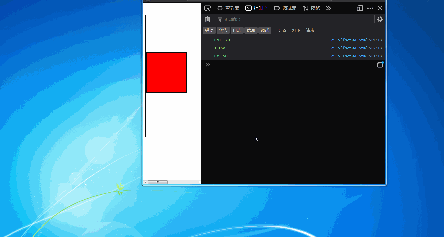
console.log(div.offsetWidth,div.offsetHeight);
console.log(div.offsetLeft,div.offsetTop);
let box = document.querySelector("#box");
console.log(box.offsetLeft,box.offsetTop);
}
</script>
</body>
</html>
浏览器变化,box也会变化,box上一级无定位,因此它的定位父级就是父级body。
(后续待补充)
