本人在做接口测试的过程中,使用了 python+plotly 统计接口信息,之前一直用Violin图表,今天就尝试了一中新的图表,distplot 图表,其实就是整数的柱形图,然后加上一个变化曲线。下面来分享一下代码,供大家参考。(接口响应时间存在一个本地的文件中了。)
#!/usr/bin/python
# coding=utf-8

import plotly.plotly
import plotly.figure_factory as fff
import numpy as np


class Distplots:
    def ___init__(self):
        print "distplots图标生成!"

    def makeDistplot(self, data, group):
        fig = fff.create_distplot(data, group)
        plotly.offline.plot(fig, filename="3333.html")


if __name__ == "__main__":
    x = np.random.randn(1000) * 10
    y = np.random.randn(1000) * 10 + 50
    z = np.random.randn(1000) * 10 + 100
    data = [x, y, z]
    group = ["one", "two", "three"]
    xy = []
    one = open("/Users/Vicky/Documents/workspace/fission/long.log", "r")
    for line in one.readlines():
        time = float(line)
        if time > 1:
            continue
        # print time
        xy.append(time)
    xy = [x * 100 for x in xy]
    data1 = [xy]
    group1 = ["test1"]
    drive = Distplots()
    drive.makeDistplot(data1, group1)
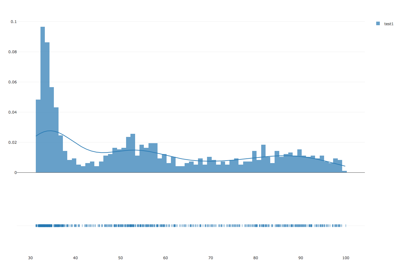
下面是制作完成的效果图:
末了宣传一下自己的 QQ群:群号:340964272