一一对应版
library(gcookbook)
library(ggplot2)
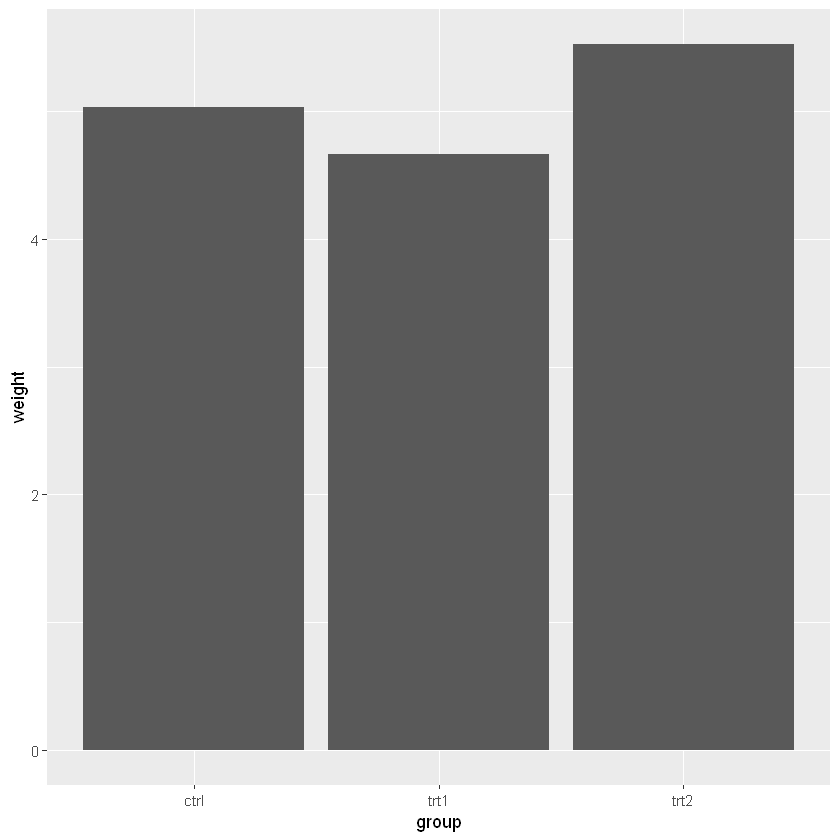
head(pg_mean)
| group | weight |
|---|---|
| <fct> | <dbl> |
| ctrl | 5.032 |
| trt1 | 4.661 |
| trt2 | 5.526 |
ggplot(pg_mean, aes(x = group, y = weight)) +
geom_bar(stat = 'identity')
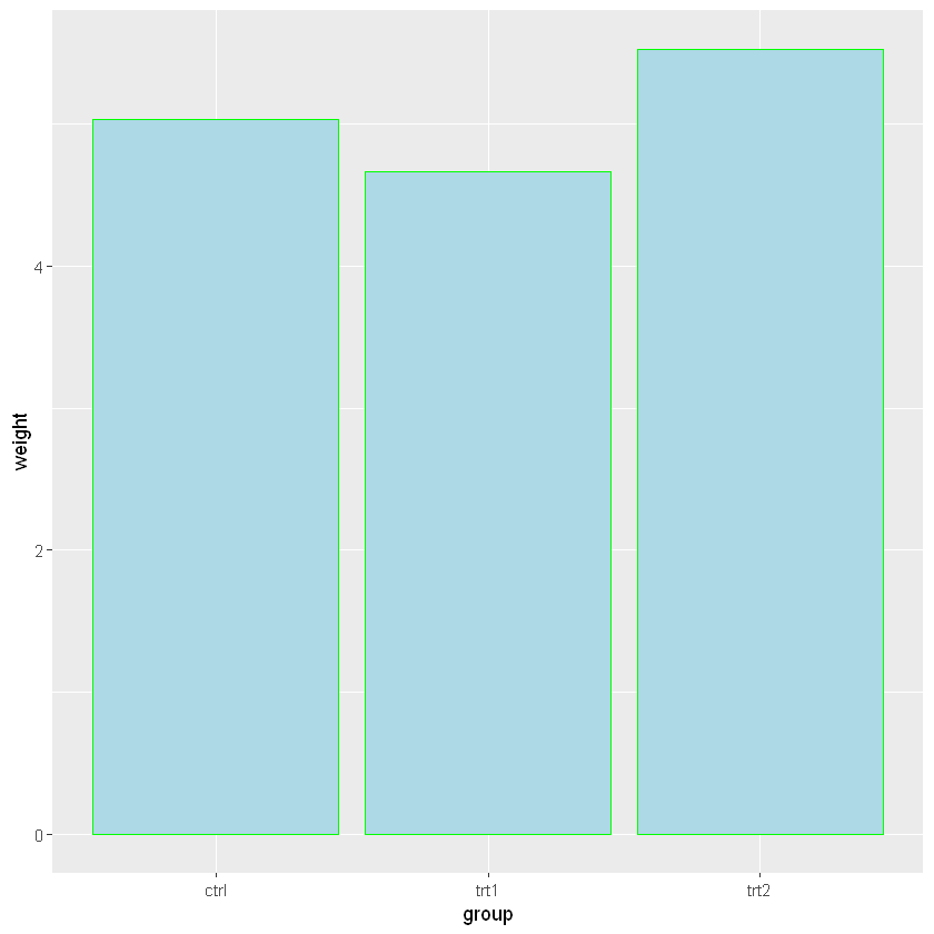
改变填充色和边框色
ggplot(pg_mean, aes(x = group, y = weight)) +
geom_bar(stat = 'identity', fill = 'lightblue', color = 'green')
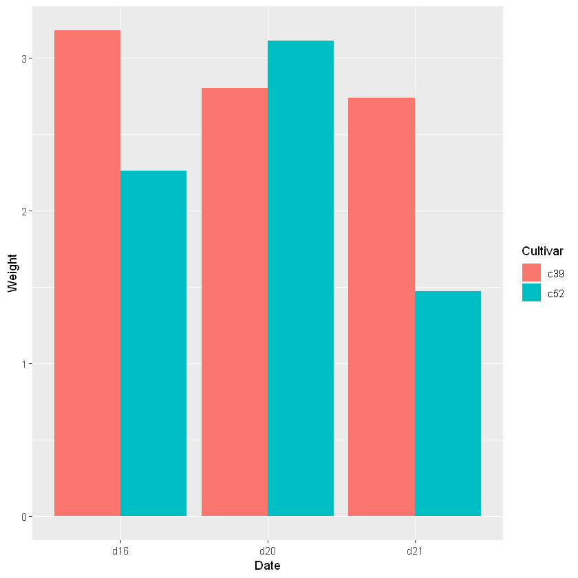
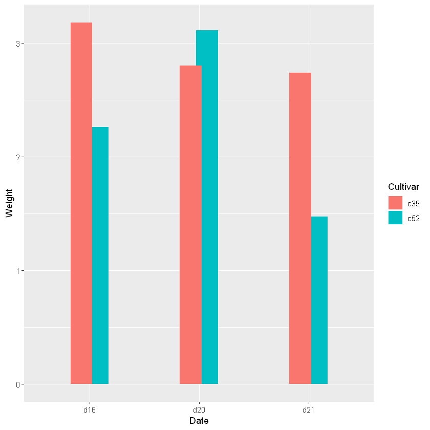
簇状条形图
head(cabbage_exp)
| Cultivar | Date | Weight | sd | n | se |
|---|---|---|---|---|---|
| <fct> | <fct> | <dbl> | <dbl> | <int> | <dbl> |
| c39 | d16 | 3.18 | 0.9566144 | 10 | 0.30250803 |
| c39 | d20 | 2.80 | 0.2788867 | 10 | 0.08819171 |
| c39 | d21 | 2.74 | 0.9834181 | 10 | 0.31098410 |
| c52 | d16 | 2.26 | 0.4452215 | 10 | 0.14079141 |
| c52 | d20 | 3.11 | 0.7908505 | 10 | 0.25008887 |
| c52 | d21 | 1.47 | 0.2110819 | 10 | 0.06674995 |
ggplot(cabbage_exp, aes(x = Date, y = Weight, fill = Cultivar)) +
geom_bar(position = 'dodge', stat = 'identity')
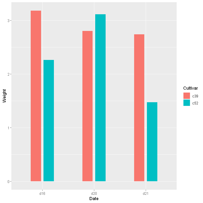
- geom_bar中的width位于0到1之间,默认为0.9,可以通过调整这个来调整宽度。
- 通过令position_dodge的值大于width来调整组内条形图之间的距离,否则就会重叠一部分
ggplot(cabbage_exp, aes(x = Date, y = Weight, fill = Cultivar)) +
geom_bar(stat = 'identity', width = 0.4, position = position_dodge(0.3))
ggplot(cabbage_exp, aes(x = Date, y = Weight, fill = Cultivar)) +
geom_bar(stat = 'identity', width = 0.4, position = position_dodge(0.5))
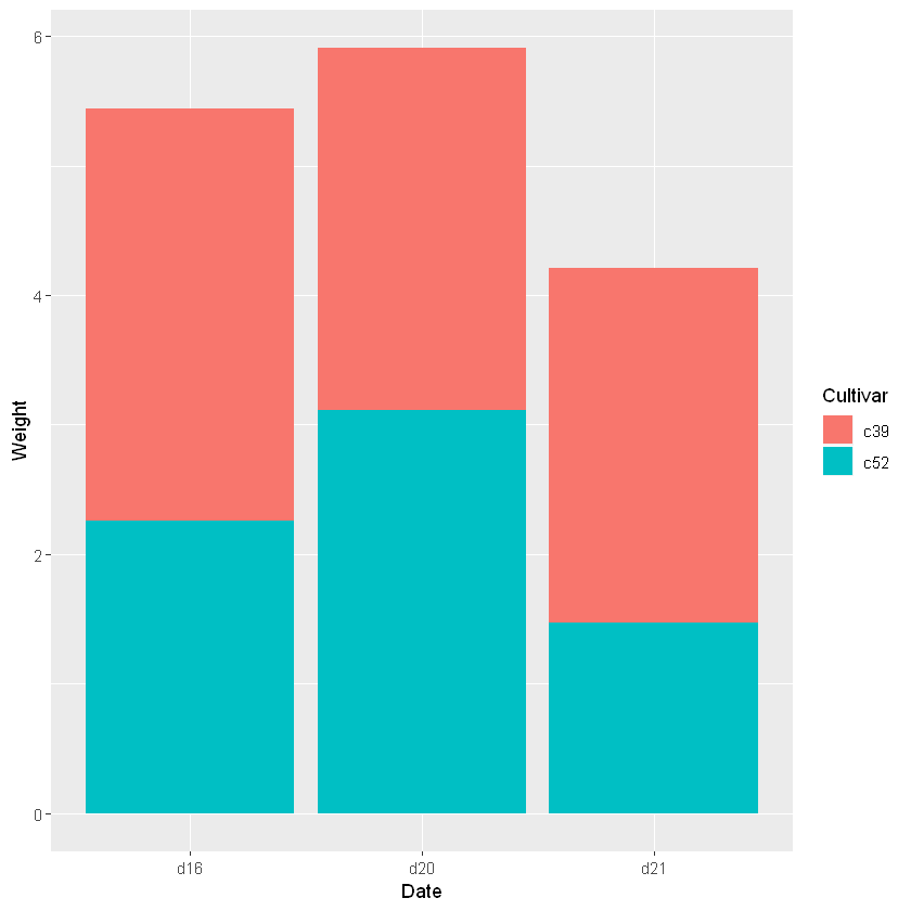
不加dodge条件就会生成堆积条形图
ggplot(cabbage_exp, aes(x = Date, y = Weight, fill = Cultivar)) +
geom_bar(stat = 'identity')
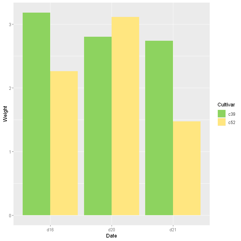
scale_fill_manual可以手动调整颜色
ggplot(cabbage_exp, aes(x = Date, y = Weight, fill = Cultivar)) +
geom_bar(position = 'dodge', stat = 'identity') +
scale_fill_manual(values = c('#8DD35F','#FFE680'))
分别在柱子顶端的上下位置加图例
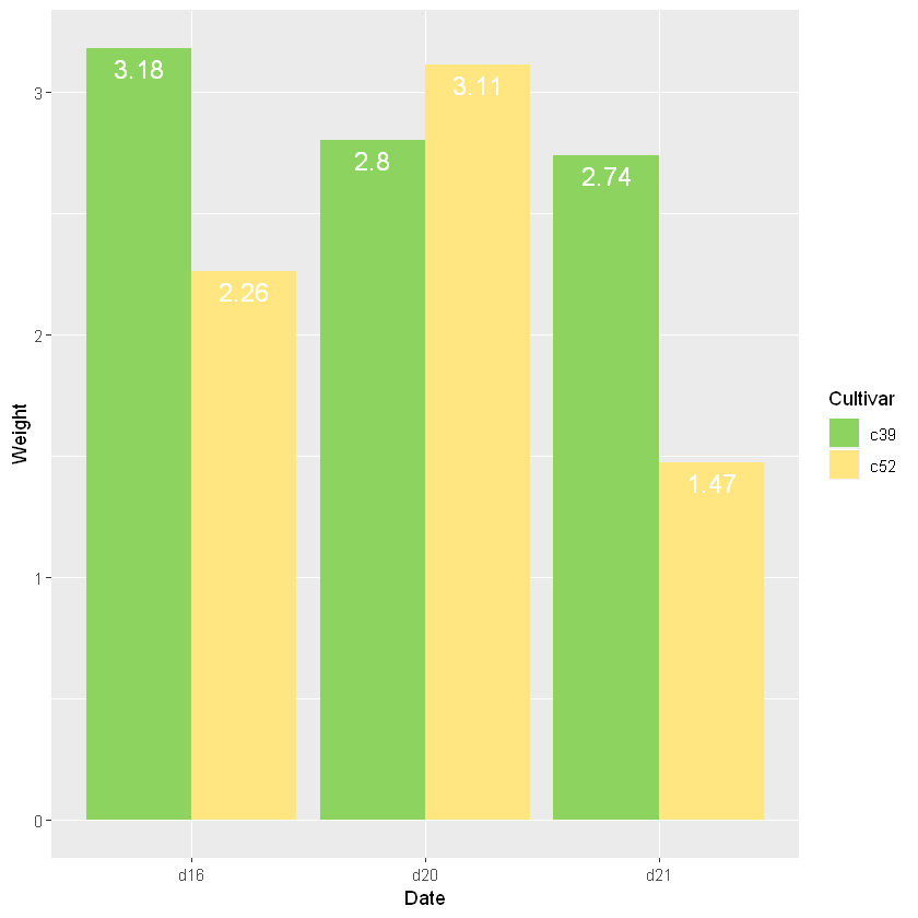
ggplot(cabbage_exp, aes(x = Date, y = Weight, fill = Cultivar)) +
geom_bar(position = 'dodge', stat = 'identity') +
scale_fill_manual(values = c('#8DD35F','#FFE680')) +
geom_text(aes(label = Weight), vjust = -0.5, position = position_dodge(0.9), size = 4, color = 'green')

ggplot(cabbage_exp, aes(x = Date, y = Weight, fill = Cultivar)) +
geom_bar(position = 'dodge', stat = 'identity') +
scale_fill_manual(values = c('#8DD35F','#FFE680')) +
geom_text(aes(label = Weight), vjust = 1.5, position = position_dodge(0.9), size = 5, color = 'white')
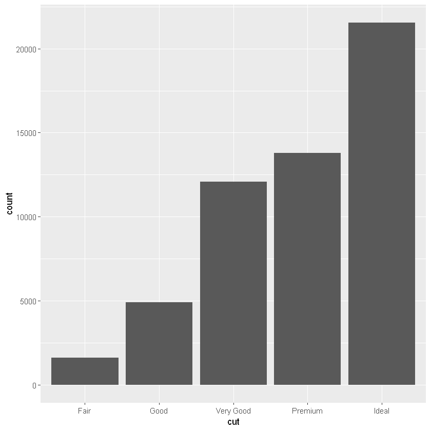
频数条形图
Note the documentation for each: they both use stat = “bin” (in current ggplot2 versions this stat has been split into stat_bin for continuous data and stat_count for discrete data) by default.
# 离散情况
ggplot(diamonds, aes(x = cut)) + geom_bar()
# 等价于ggplot(diamonds, aes(x = cut)) + geom_bar(stat = 'count')
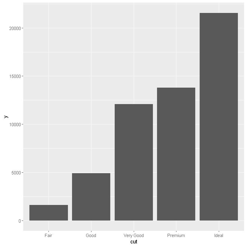
# 等价写法
ggplot(diamonds, aes(x = cut, y = 1)) +
geom_bar(stat = 'identity')
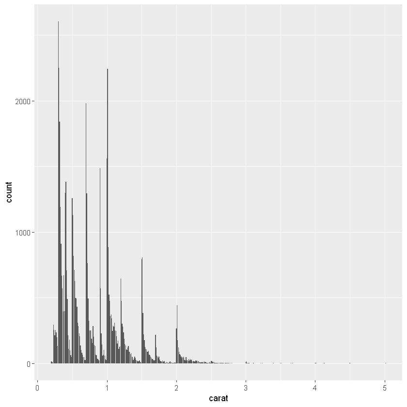
# 连续情况
ggplot(diamonds, aes(x = carat)) + geom_bar()
# 等价于ggplot(diamonds, aes(x = cut)) + geom_bar(stat = 'count')
# ggplot(diamonds, aes(x = cut)) + geom_bar(stat = 'bin')会得到不一样的结果
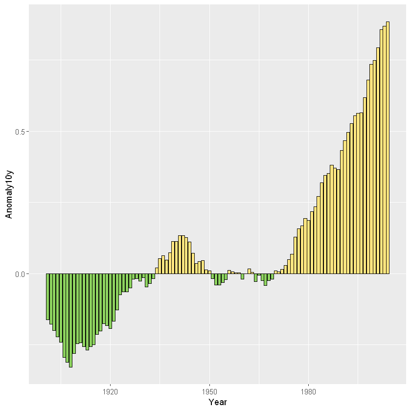
正负分开图
head(climate)
| Source | Year | Anomaly1y | Anomaly5y | Anomaly10y | Unc10y |
|---|---|---|---|---|---|
| <chr> | <dbl> | <dbl> | <dbl> | <dbl> | <dbl> |
| Berkeley | 1800 | NA | NA | -0.435 | 0.505 |
| Berkeley | 1801 | NA | NA | -0.453 | 0.493 |
| Berkeley | 1802 | NA | NA | -0.460 | 0.486 |
| Berkeley | 1803 | NA | NA | -0.493 | 0.489 |
| Berkeley | 1804 | NA | NA | -0.536 | 0.483 |
| Berkeley | 1805 | NA | NA | -0.541 | 0.475 |
csub <- subset(climate, Source == 'Berkeley' & Year > 1900)
csub$pos  <- csub$Anomaly10y >= 0
head(csub)
| Source | Year | Anomaly1y | Anomaly5y | Anomaly10y | Unc10y | pos | |
|---|---|---|---|---|---|---|---|
| <chr> | <dbl> | <dbl> | <dbl> | <dbl> | <dbl> | <lgl> | |
| 102 | Berkeley | 1901 | NA | NA | -0.162 | 0.109 | FALSE |
| 103 | Berkeley | 1902 | NA | NA | -0.177 | 0.108 | FALSE |
| 104 | Berkeley | 1903 | NA | NA | -0.199 | 0.104 | FALSE |
| 105 | Berkeley | 1904 | NA | NA | -0.223 | 0.105 | FALSE |
| 106 | Berkeley | 1905 | NA | NA | -0.241 | 0.107 | FALSE |
| 107 | Berkeley | 1906 | NA | NA | -0.294 | 0.106 | FALSE |
ggplot(csub, aes(x = Year, y = Anomaly10y, fill = pos)) +
# 设定边框颜色和宽度
geom_bar(stat = 'identity', color = 'black', size = 0.25) +
# 手动移除pos图例
scale_fill_manual(values = c('#8DD35F','#FFE680'), guide = FALSE)
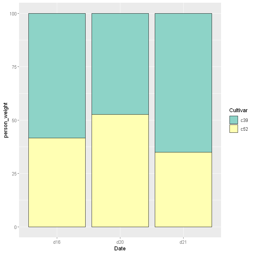
比例堆积图
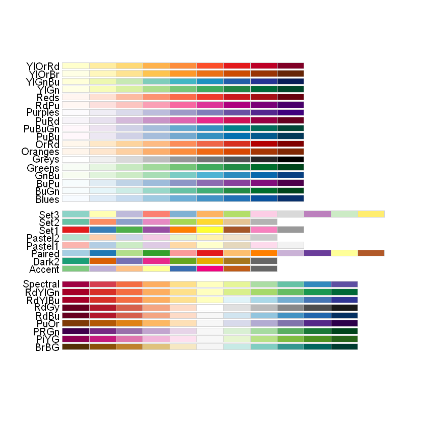
- 查看所有调色板
RColorBrewer::display.brewer.all()
- 以date为切割变量对数据进行transform操作
library(plyr)
ce <- ddply(cabbage_exp, "Date", transform, person_weight = Weight / sum(Weight) * 100)
ggplot(ce, aes(x = Date, y = person_weight, fill = Cultivar)) +
geom_bar(stat = 'identity', colour = 'black') +
# 换个调色板
scale_fill_brewer(palette = "Set3")
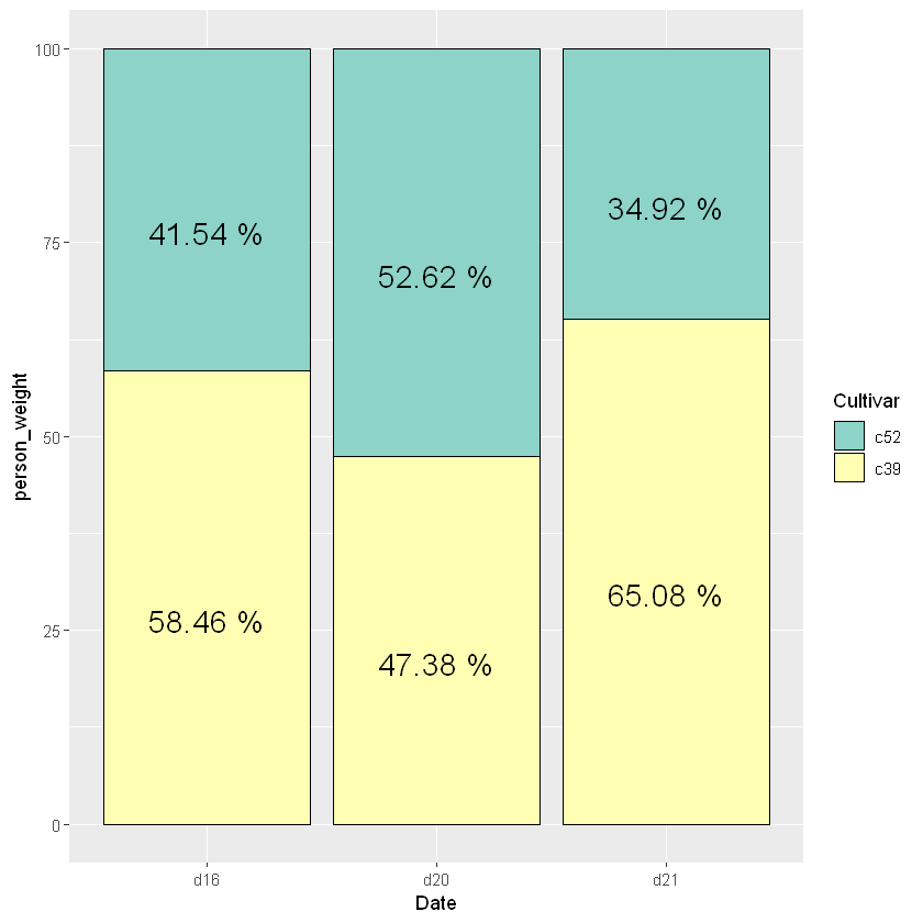
- 绘制堆积图的数字时,要先计算出两段的高度
cce <- ddply(ce, "Date", transform, text_height = cumsum(person_weight))
# 调整一下堆积图的顺序使之对应
cce$Cultivar <- factor(cce$Cultivar, levels = c("c52", "c39"))
ggplot(cce, aes(x = Date, y = person_weight, fill = Cultivar)) +
geom_bar(stat = 'identity', colour = 'black') +
# 换个调色板
scale_fill_brewer(palette = "Set3") +
geom_text(aes(y = text_height, label = person_weight), vjust = 1.5, color = "black")
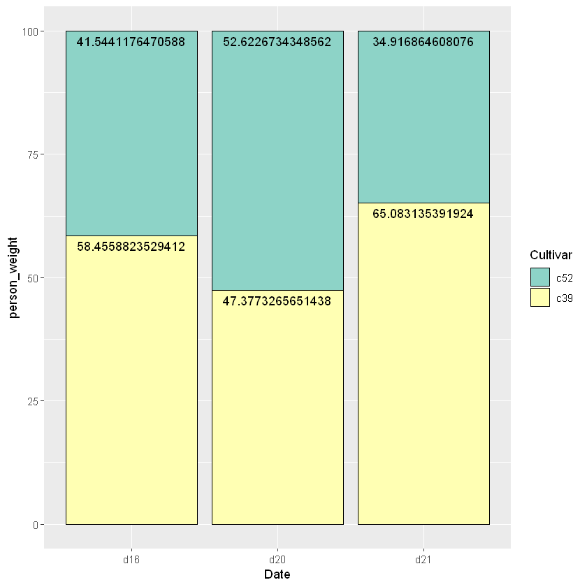
- 进一步美化标注,比如文字放中间,固定位数,加上单位等等
cce <- ddply(ce, "Date", transform, text_height = cumsum(person_weight)-0.5*person_weight)
# 调整一下堆积图的顺序使之对应
cce$Cultivar <- factor(cce$Cultivar, levels = c("c52", "c39"))
ggplot(cce, aes(x = Date, y = person_weight, fill = Cultivar)) +
geom_bar(stat = 'identity', colour = 'black') +
# 换个调色板
scale_fill_brewer(palette = "Set3") +
geom_text(aes(y = text_height, label = paste(round(person_weight, 2), "%")), vjust = 1.5, color = "black", size = 6)