文章目录
CSS布局
overflow属性
CSS overflow 属性可以控制内容溢出元素框时在对应的元素区间内添加滚动条。
<!DOCTYPE html>
<html lang="en">
<head>
    <meta charset="UTF-8">
    <meta name="viewport" content="width=device-width, initial-scale=1.0">
    <title>Document</title>
    <style>
        body {
            margin: 0px;
            padding: 0px;
        }
        #overflowtest {
            background-color: green;
            height: 100px;
            padding: 15px;
            border: 1px white solid;
            overflow: scroll;
        }
        #overflowtest > p {
            margin: 0px;
            line-height: 25px;
        }
    </style>
</head>
<body>
    <div id="overflowtest">
        <p>这里的文本内容是可以滚动的,滚动条方向是垂直方向。</p>
        <p>这里的文本内容是可以滚动的,滚动条方向是垂直方向。</p>
        <p>这里的文本内容是可以滚动的,滚动条方向是垂直方向。</p>
        <p>这里的文本内容是可以滚动的,滚动条方向是垂直方向。</p>
        <p>这里的文本内容是可以滚动的,滚动条方向是垂直方向。</p>
        <p>这里的文本内容是可以滚动的,滚动条方向是垂直方向。</p>
        <p>这里的文本内容是可以滚动的,滚动条方向是垂直方向。</p>
        <p>这里的文本内容是可以滚动的,滚动条方向是垂直方向。</p>
        <p>这里的文本内容是可以滚动的,滚动条方向是垂直方向。</p>
    </div>
</body>
</html>

overflow属性有以下值:
visible 默认值。内容不会被修剪,会呈现在元素框之外。
hidden 内容会被修剪,并且其余内容是不可见的。
scroll 内容会被修剪,但是浏览器会显示滚动条以便查看其余的内容。
注意: overflow 属性只工作于指定高度的块元素上。
浮动
CSS 的 Float(浮动),会使元素向左或向右移动,其周围的元素也会重新排列。
Float(浮动),往往是用于图像,但它在布局时一样非常有用。
<!DOCTYPE html>
<html lang="en">
<head>
    <meta charset="UTF-8">
    <meta name="viewport" content="width=device-width, initial-scale=1.0">
    <title>Document</title>
    <style>
        img {
            width: 200px;
            height: 300px;
            margin-left: 60px;
            margin-right: 60px;
            margin-bottom: 20px;
            float: left;
        }
    </style>
</head>
<body>
    <h3>图片库</h3>
    <p>试着调整窗口,看看当图片没有足够的空间会发生什么。</p>
    <img src="img/girl1.jpg" alt="">
    <img src="img/girl2.jpg" alt="">
    <img src="img/girl3.jpg" alt="">
    <img src="img/girl4.jpg" alt="">
    <img src="img/girl1.jpg" alt="">
    <img src="img/girl2.jpg" alt="">
    <img src="img/girl3.jpg" alt="">
    <img src="img/girl4.jpg" alt="">
</body>
</html>
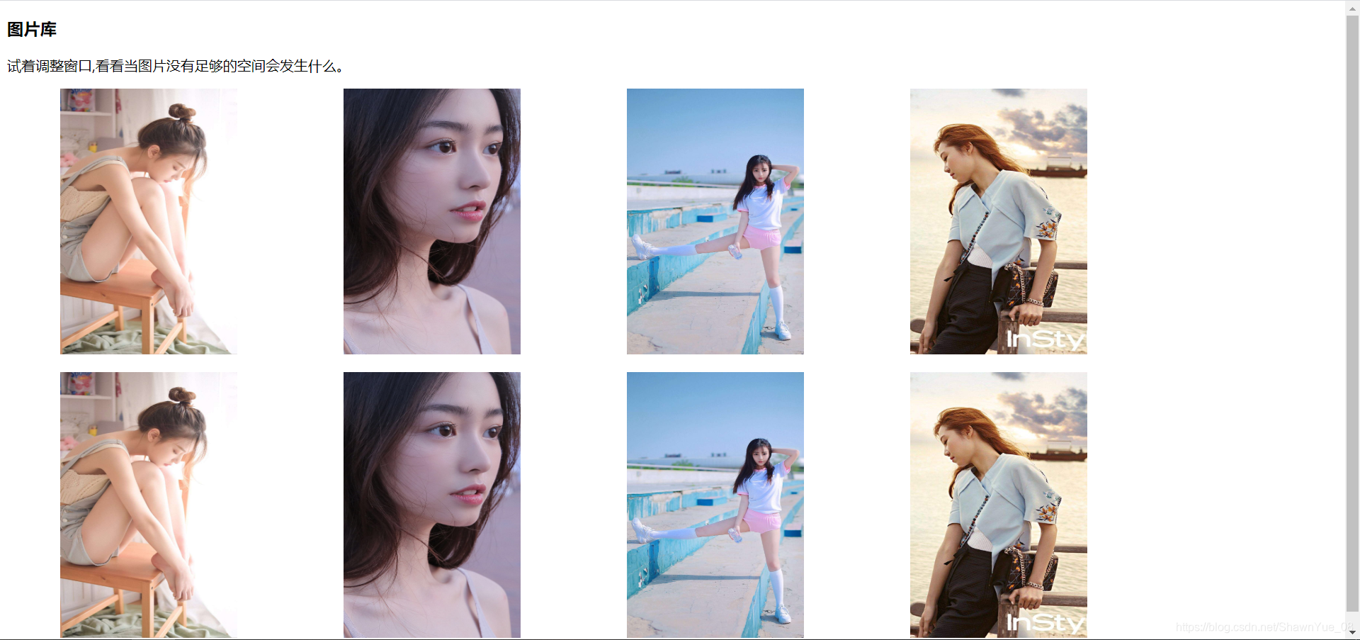
当图片没有足够的空间就会向下移动。
清除浮动:
<!DOCTYPE html>
<html lang="en">
<head>
    <meta charset="UTF-8">
    <meta name="viewport" content="width=device-width, initial-scale=1.0">
    <title>Document</title>
    <style>
        img {
            width: 125px;
            height: 250px;
            margin-left: 50px;
            margin-right: 50px;
            margin-bottom: 30px;
            float: left;
        }
        h3:nth-of-type(2) {
            clear: both;
        }
    </style>
</head>
<body>
    <h3>图片库</h3>
    <p>试着调整窗口,看看当图片没有足够的空间会发生什么。</p>
    <img src="img/girl1.jpg" alt="">
    <img src="img/girl2.jpg" alt="">
    <img src="img/girl3.jpg" alt="">
    <img src="img/girl4.jpg" alt="">
    <h3>第二行</h3>
    <img src="img/girl1.jpg" alt="">
    <img src="img/girl2.jpg" alt="">
    <img src="img/girl3.jpg" alt="">
    <img src="img/girl4.jpg" alt="">
</body>
</html>
扫描二维码关注公众号,回复:
11575135 查看本文章

浮动的练习
<!DOCTYPE html>
<html lang="en">
<head>
<meta charset="UTF-8">
<meta name="viewport" content="width=device-width, initial-scale=1.0">
<title>Document</title>
<style>
* {
box-sizing: border-box;
}
body {
margin: 0px;
}
.header {
background-color: rgb(30, 103, 212);
color: white;
text-align: center;
padding: 15px;
}
.footer {
background-color: rgba(61, 53, 53, 0.856);
color: white;
padding: 15px;
}
.topmenu {
list-style-type: none;
/* 列表的样式类型 */
margin: 0px;
padding: 0px;
background-color: grey;
overflow: hidden;
}
.topmenu li {
float: left;
}
.topmenu li a {
text-decoration: none;
text-align: center;
display: inline-block;
/* 只有display属性改为块元素,才可以有padding属性 */
padding: 16px;
color: white;
}
/* 伪类选择器 */
.topmenu li a:hover {
background-color: black;
}
.topmenu li a.active {
background-color: green;
}
.column {
float: left;
padding: 15px;
}
.clearfix::after {
/* 伪元素,工具人,在主体内容的后面插入,没有内容,只是清除浮动 */
clear: both;
content: "";
display: block;
}
.sidemenu {
width: 25%;
}
.content {
width: 75%;
}
.sidemenu ul {
list-style-type: none;
margin: 0px;
padding: 0px;
}
.sidemenu ul a {
text-align: center;
text-decoration: none;
margin-bottom: 4px;
display: block;
padding: 8px;
background-color: gray;
color: white
}
.sidemenu li a:hover {
background-color: black;
}
.sidemenu li a.active {
background-color: green;
}
</style>
</head>
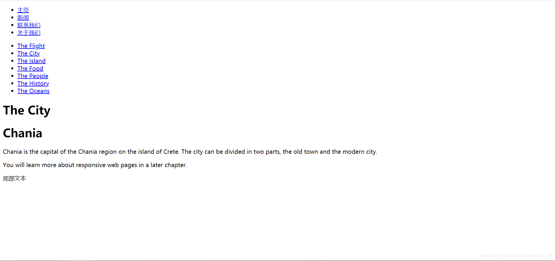
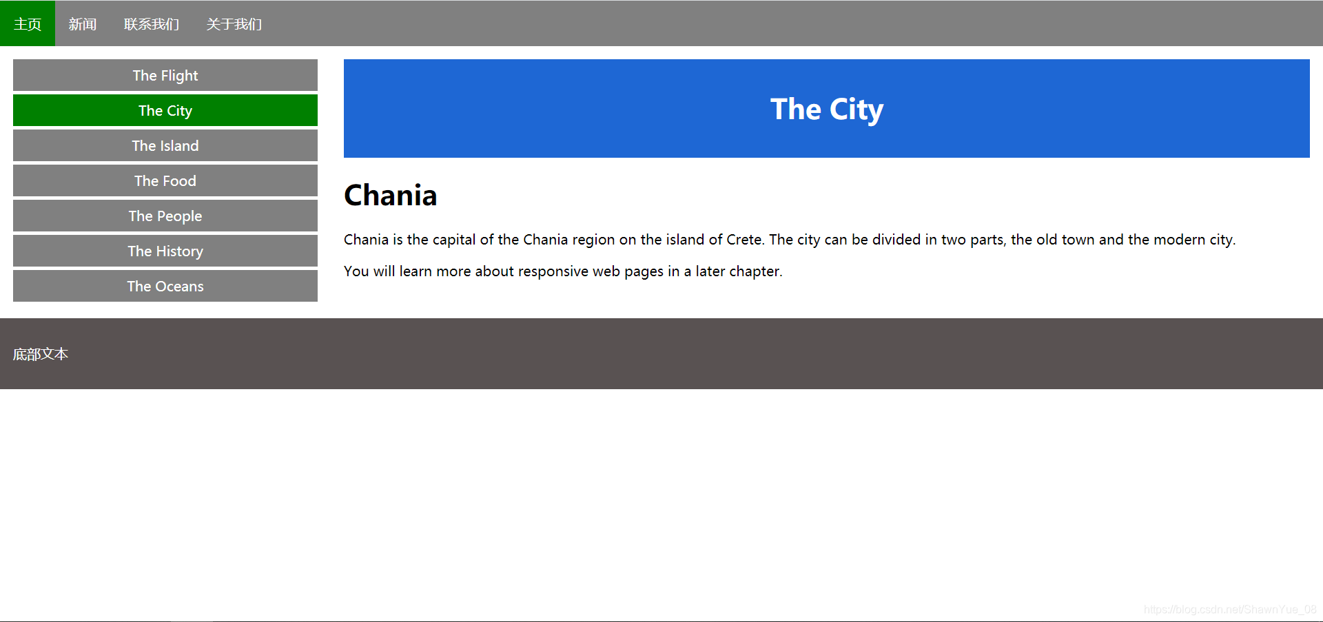
<body>
<ul class="topmenu">
<li><a href="#home" class="active">主页</a></li>
<li><a href="#news">新闻</a></li>
<li><a href="#contact">联系我们</a></li>
<li><a href="#about">关于我们</a></li>
</ul>
<div class="clearfix">
<div class="column sidemenu">
<ul>
<li><a href="#flight">The Flight</a></li>
<li><a href="#city" class="active">The City</a></li>
<li><a href="#island">The Island</a></li>
<li><a href="#food">The Food</a></li>
<li><a href="#people">The People</a></li>
<li><a href="#history">The History</a></li>
<li><a href="#oceans">The Oceans</a></li>
</ul>
</div>
<div class="column content">
<div class="header">
<h1>The City</h1>
</div>
<h1>Chania</h1>
<p>Chania is the capital of the Chania region on the island of Crete. The city can be divided in two parts,
the old town and the modern city.</p>
<p>You will learn more about responsive web pages in a later chapter.</p>
</div>
</div>
<div class="footer">
<p>底部文本</p>
</div>
</body>
</html>
最初的HTML页面
添加CSS修饰后
水平 & 垂直对齐
元素居中对齐
<!DOCTYPE html>
<html lang="en">
<head>
<meta charset="UTF-8">
<meta name="viewport" content="width=device-width, initial-scale=1.0">
<title>Document</title>
<style>
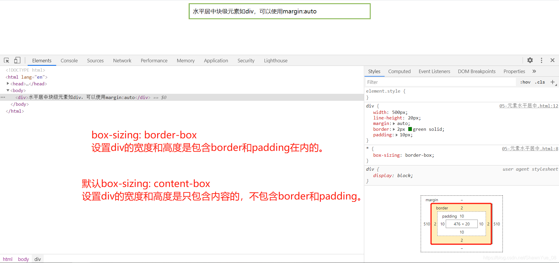
* {
box-sizing: content-box;
/* 默认盒子模型,指定元素的width和height为内容的宽度和高度,不包括内边距、边框 */
}
div {
width: 500px;
line-height: 20px;
margin: auto;
border: 2px green solid;
padding: 10px;
}
</style>
</head>
<body>
<div>水平居中块级元素如div,可以使用margin:auto</div>
</body>
</html>
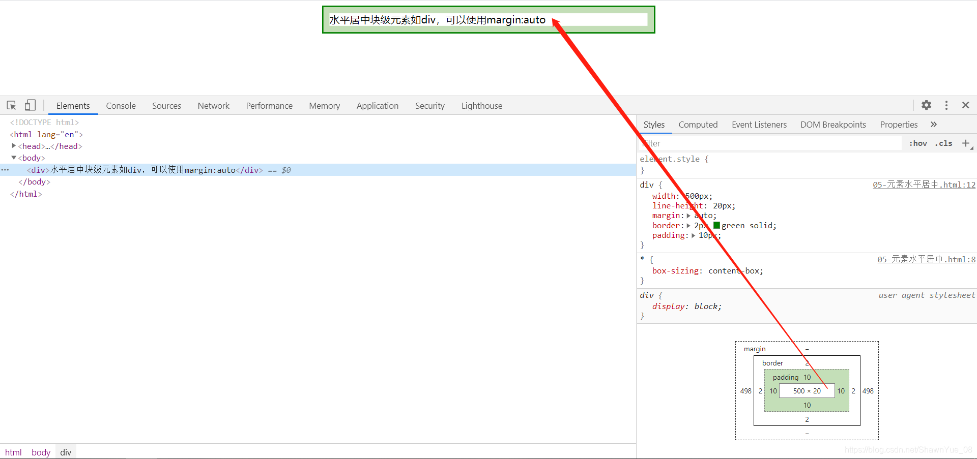
注意: 如果没有设置 width 属性(或者设置 100%),居中对齐将不起作用。
<!DOCTYPE html>
<html lang="en">
<head>
    <meta charset="UTF-8">
    <meta name="viewport" content="width=device-width, initial-scale=1.0">
    <title>Document</title>
    <style>
        * {
            box-sizing: border-box;
        }
        div {
            width: 500px;
            line-height: 20px;
            margin: auto;
            border: 2px green solid;
            padding: 10px;
        }
    </style>
</head>
<body>
    <div>水平居中块级元素如div,可以使用margin:auto</div>
</body>
</html>
文本居中对齐
如果仅仅是为了文本在元素内居中对齐,可以使用 text-align: center;
图片居中对齐
要让图片居中对齐, 可以使用 margin: auto; 并将它放到 块 元素中:
img {
    display: block;
    width: 60%;
    margin: auto;
}
垂直居中
使用line-height。
伪元素
<!DOCTYPE html>
<html lang="en">
<head>
    <meta charset="UTF-8">
    <meta name="viewport" content="width=device-width, initial-scale=1.0">
    <title>Document</title>
    <style>
        h2::before {
            content: "哈喽";
        }
        h2::after {
            content: "我在你后面";
        }
    </style>
</head>
<body>
    <h2>在标题二的前面插入一条内容。</h2>
</body>
</html>
导航栏
导航栏=链接列表
下面的例子中的代码是垂直和水平导航栏使用的标准代码。
<!DOCTYPE html>
<html lang="en">

<head>
    <meta charset="UTF-8">
    <meta name="viewport" content="width=device-width, initial-scale=1.0">
    <title>Document</title>
    <style>
        /* 1、清除列表样式,清除边距和填充 */
        ul {
            list-style-type: none;
            margin: 0px;
            padding: 0px;
        }
    </style>
</head>

<body>
    <ul>
        <li><a href="#home">主页</a></li>
        <li><a href="#news">新闻</a></li>
        <li><a href="#contact">联系</a></li>
        <li><a href="#about">关于</a></li>
    </ul>
</body>

</html>
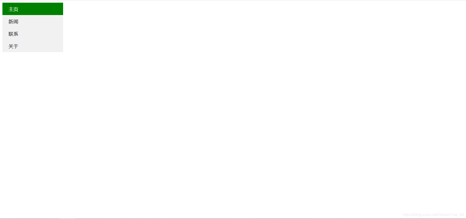
垂直导航栏
<!DOCTYPE html>
<html lang="en">
<head>
    <meta charset="UTF-8">
    <meta name="viewport" content="width=device-width, initial-scale=1.0">
    <title>Document</title>
    <style>
        ul {
            list-style-type: none;
            margin: 0px;
            padding: 0px;
            width: 200px;
            background-color: #f1f1f1;
        }
        ul li a {
            display: block;
            /* 行内标签转换为块标签 */
            text-decoration: none;
            padding: 10px 20px;
            /* 上下 左右 */
            color: black;
        }
        ul li a:hover {
            /* 鼠标移动到选项上 */
            color: white;
            background-color: black;
        }
        ul li a.active {
            background-color: green;
            color: white;
        }
    </style>
</head>
<body>
    <ul>
        <li><a href="#home" class="active">主页</a></li>
        <li><a href="#news">新闻</a></li>
        <li><a href="#contact">联系</a></li>
        <li><a href="#about">关于</a></li>
    </ul>
</body>
</html>
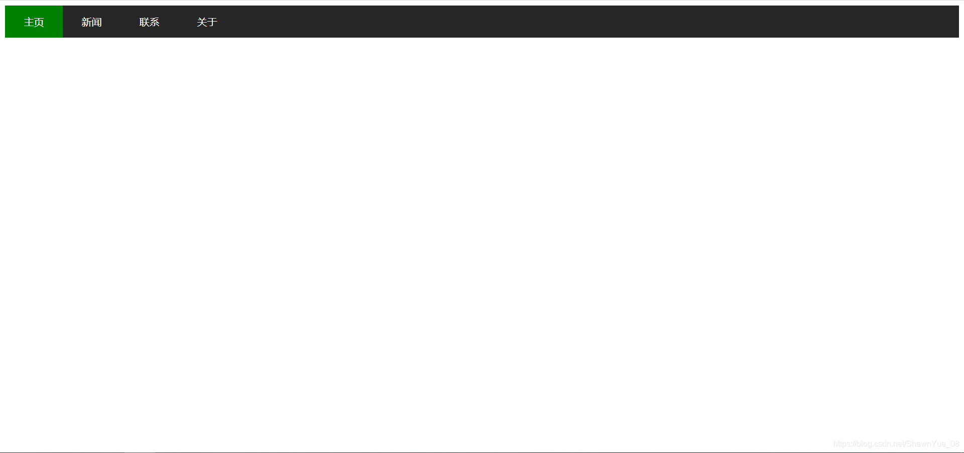
水平导航栏
有两种方法创建横向导航栏。使用**内联(inline)或浮动(float)**的列表项。
ul {
	list-style-type:none;
	margin:0;
	padding:0;
}
li {
    display:inline;
}
浮动
<!DOCTYPE html>
<html lang="en">
<head>
    <meta charset="UTF-8">
    <meta name="viewport" content="width=device-width, initial-scale=1.0">
    <title>Document</title>
    <style>
        ul {
            list-style-type: none;
            margin: 0px;
            padding: 0px;
            background-color: rgb(39, 38, 38);
            overflow: hidden;
        }
        ul li {
            float: left;
        }
        ul li a {
            text-decoration: none;
            color: white;
            text-align: center;
            display: block;
            padding: 15px 30px;
            /* 上下 左右 */
        }
        ul li a:hover {
            background-color: black;
        }
        ul li a.active {
            background-color: green;
        }
    </style>
</head>
<body>
    <ul>
        <li><a class="active" href="#home">主页</a></li>
        <li><a href="#news">新闻</a></li>
        <li><a href="#contact">联系</a></li>
        <li><a href="#about">关于</a></li>
      </ul>
</body>
</html>
固定导航栏
ul {
    list-style-type: none;
    margin: 0;
    padding: 0;
    overflow: hidden;
    background-color: #333;
    position: fixed;
    top: 0;
    width: 100%;
}
下拉菜单
<!DOCTYPE html>
<html lang="en">

<head>
    <meta charset="UTF-8">
    <meta name="viewport" content="width=device-width, initial-scale=1.0">
    <title>Document</title>
    <style>
        ul {
            list-style-type: none;
            margin: 0;
            padding: 0;
            overflow: hidden;
            background-color: #333;
        }

        li {
            float: left;
        }

        li a{
            display: inline-block;
            color: white;
            text-align: center;
            padding: 15px 30px;
            text-decoration: none;
        }

        li a:hover{
            background-color: #111;
        }

        .dropdown-content {
            display: none;
            position: absolute;
            background-color: #f9f9f9;
            width: 123px;
            box-shadow: 0px 8px 16px 0px rgba(0, 0, 0, 0.2);
        }

        .dropdown-content a {
            color: black;
            padding: 12px 16px;
            text-decoration: none;
            display: block;
        }

        .dropdown-content a:hover {
            background-color: red
        }

        .dropdown:hover .dropdown-content {
            display: block;
        }
    </style>
</head>

<body>
    <ul>
        <li><a class="active" href="#home">主页</a></li>
        <li><a href="#news">新闻</a></li>
        <li class="dropdown">
            <a href="#" class="dropbtn">下拉菜单</a>
            <div class="dropdown-content">
                <a href="#">链接 1</a>
                <a href="#">链接 2</a>
                <a href="#">链接 3</a>
            </div>
        </li>
    </ul>
</body>

</html>
CSS3过渡
过渡div的宽度和高度
<!DOCTYPE html>
<html lang="en">
<head>
    <meta charset="UTF-8">
    <meta name="viewport" content="width=device-width, initial-scale=1.0">
    <title>Document</title>
    <style>
        div {
            width: 300px;
            height: 150px;
            background-color: red;
            transition-property: width,height;
            /* 规定应用过渡的 CSS 属性的名称 */
            transition-duration: 1s;
            /* 定义过渡效果花费的时间。默认是 0 */
            transition-delay: 0s;
            /* 规定过渡效果何时开始。默认是 0 */
            transition-timing-function: linear;
            /* 规定过渡效果的时间曲线。默认是 "ease" */
        }
        div:hover {
            width: 500px;
            height: 300px;
        }
    </style>
</head>
<body>
    <div>

    </div>
</body>
</html>
旋转过渡
<!DOCTYPE html>
<html lang="en">
<head>
    <meta charset="UTF-8">
    <meta name="viewport" content="width=device-width, initial-scale=1.0">
    <title>Document</title>
    <style>
        div {
            margin: auto;
            width: 100px;
            height: 50px;
            border: 1px greenyellow solid;
            background-color: greenyellow;
            text-align: center;
            line-height: 25px;
            transition: transform 1s;
        }

        div:hover {
            transform: rotate(360deg);
        }
    </style>
</head>
<body>
    <div>CSS3 <br>过渡</div>
</body>
</html>
位移过渡
<!DOCTYPE html>
<html lang="en">
<head>
    <meta charset="UTF-8">
    <meta name="viewport" content="width=device-width, initial-scale=1.0">
    <title>Document</title>
    <style>
        div {
            width: 300px;
            height: 150px;
            background-color: red;
            transition: transform 1s;
        }
        div:hover {
            transform: translate(100px, 50px);
            /* 位移动画,100px:左右 50px 上下 */
        }
    </style>
</head>
<body>
    <div></div>
</body>
</html>
缩放过渡
<!DOCTYPE html>
<html lang="en">
<head>
    <meta charset="UTF-8">
    <meta name="viewport" content="width=device-width, initial-scale=1.0">
    <title>Document</title>
    <style>
        div {
            width: 300px;
            height: 150px;
            background-color: red;
            transition: transform 1s;
        }
        div:hover {
            transform: scale(0.5);
        }
    </style>
</head>
<body>
    <div>

    </div>
</body>
</html>
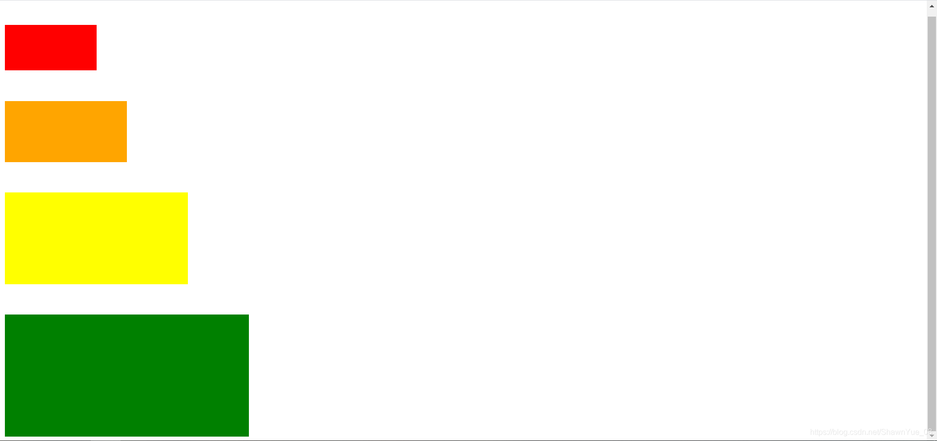
伪类选择器
<!DOCTYPE html>
<html lang="en">
<head>
    <meta charset="UTF-8">
    <meta name="viewport" content="width=device-width, initial-scale=1.0">
    <title>Document</title>
    <style>
        div {
            margin-top: 50px;
        }
        div:first-child {
            width: 150px;
            height: 75px;
            background-color: red;
        }
        div:nth-child(2) {
            width: 200px;
            height: 100px;
            background-color: orange;
        }
        div:nth-of-type(3) {
            width: 300px;
            height: 150px;
            background-color: yellow;
        }
        div:last-child {
            width: 400px;
            height: 200px;
            background-color: green;
        }
    </style>
</head>
<body>
    <div></div>
    <div></div>
    <div></div>
    <div></div>
</body>
</html>
CSS3动画
动画是使元素从一种样式逐渐变化为另一种样式的效果。
您可以改变任意多的样式任意多的次数。
请用百分比来规定变化发生的时间,或用关键词 “from” 和 “to”,等同于 0% 和 100%。
0% 是动画的开始,100% 是动画的完成。
from-to
<!DOCTYPE html>
<html lang="en">
<head>
    <meta charset="UTF-8">
    <meta name="viewport" content="width=device-width, initial-scale=1.0">
    <title>Document</title>
    <style>
        div {
            width: 300px;
            height: 150px;
            background-color: red;
            animation-name: myfirst;
            /* 规定 @keyframes 动画的名称 */
            animation-duration: 2s;
            /* 规定动画完成一个周期所花费的秒或毫秒。默认是 0 */
            animation-timing-function: linear;
            /* 规定动画的速度曲线。默认是 "ease" */
            animation-iteration-count: 4;
            /* 规定动画播放的次数 */
            animation-direction: alternate;
            /* 规定动画是否在下一周期逆向地播放。默认是 "normal" */
        }
        @keyframes myfirst {
            /* 自定义动画的关键字@keyframes */
            from {
                background-color: red;
            }
            to {
                background-color: yellow;
            }
        }
    </style>
</head>
<body>
    <div>

    </div>
</body>
</html>
%形式
<!DOCTYPE html>
<html lang="en">
<head>
    <meta charset="UTF-8">
    <meta name="viewport" content="width=device-width, initial-scale=1.0">
    <title>Document</title>
    <style>
        div {
            width: 100px;
            height: 100px;
            position: absolute;
            background-color: red;
            animation-name: mysecond;
            animation-duration: 4s;
            animation-direction: alternate;
            animation-iteration-count: infinite;
            /* 无穷的次数 */
        }
        @keyframes mysecond {
            0% {
                background-color: red;
                top: 0px;
                left: 0px;
            }
            25% {
                background-color: yellow;
                top: 0px;
                left: 200px;
            }
            50% {
                background-color: blue;
                top: 200px;
                left: 200px;
            }
            75% {
                background-color: green;
                top: 200px;
                left: 0px;
            }
            100% {
                background-color: red;
                top: 0px;
                left: 0px;
            }
        }
    </style>
</head>
<body>
    <div></div>
</body>
</html>
漂浮广告页
<!DOCTYPE html>
<html lang="en">
<head>
    <meta charset="UTF-8">
    <meta name="viewport" content="width=device-width, initial-scale=1.0">
    <title>Document</title>
    <style>
        div#out {
            width: 150px;
            height: 300px;
            background-image: url(../img/girl1.jpg);
            background-size: cover;
            /* 铺满整个div */
            position: absolute;
            animation-name: ad;
            animation-duration: 10s;
            /* 周期 */
            animation-iteration-count: infinite;
            /* 无穷次 */
            animation-play-state: running;
            animation-direction: alternate;
        }
        div#out:hover {
            /* 当鼠标悬浮时,暂停动画 */
            animation-play-state: paused;
            /* 修改鼠标箭头为小手 */
            cursor: pointer;
        }
        #out > #in {
            /* 子元素选择器 */
            height: 18px;
            color: white;
        }
        /* 动画 */
        @keyframes ad {
            25% {
                background-image: url(../img/girl2.jpg);
                background-size: cover;
                top: 100px;
                left: 100px;
            }
            50% {
                background-image: url(../img/girl3.jpg);
                background-size: cover;
                top: 200px;
                left: 200px;
            }
            75% {
                background-image: url(../img/girl4.jpg);
                background-size: cover;
                top: 300px;
                left: 300px;
            }
            100% {
                background-image: url(../img/girl5.jpg);
                background-size: cover;
                top: 400px;
                left: 400px;
            }
        }
    </style>
</head>
<body>
    <div id="out">
        <div id="in">
            <span onclick="closeAd()">关闭</span>
        </div>
    </div>

    <script type="text/javascript">
        function closeAd() {
            document.getElementById("out").style.display = "none";
        }
    </script>
</body>
</html>