我做项目的时候经常使用display+position+float这些属性来给盒子模型布局样式,当时每次调试出来样式总是会飘,而且无法适配多种不同尺寸的屏幕。
在上网查询资料后,发现有一个很好的解决方式,就是flex布局。它可以简便,完美的解决以前很难实现的布局,而且仅仅使用了几行的css,可谓是我的福音啊!所以在后面的页面编写中,我大量的使用了flex属性,提高了写样式的速度和质量。而且它已经得到了几乎所有的浏览器的支持。记录一下我的使用心得,方便复习。
参考文章:作者,阮一峰

本文的目录
一,flex介绍
flex是Flexible Box的缩写,任何的一个容器都能被当成一个盒子来使用,而且盒子具有强大的灵活性,操作性高。
只需要在对应的容器上css加上display:flex;即可使用flex布局。
二,flex的使用
1,父容器属性
(1)flex-direction
这个决定了父容器主轴的方向,一共有4个值
row(默认),主轴为水平方向,从左到右
row-reverse,从右到左
column,主轴为垂直方向,从上到下
column-reverse,从下到上
.box{
	flex-direction: row;
}

(2)flex-wrap
默认情况下,flex布局会把所有的子元素都给挤在一个主轴线上,即使超过,也会平均缩小,直到挤在一个主轴上。那么如何让它换行呢,使用flex-wrap,它一共有三个值。
.box{
	flex-wrap: nowrap;
}
nowrap(默认),不换行

wrap,换行
wrap-reverse,换行且从下往上

(3)flex-content
最好用,且最常用的一个属性之一,规定了主轴上的对齐方式。一共有5个值。
flex-start,flex-end,center,space-between,space-around
.box{
	flex-content: flex-start;
}
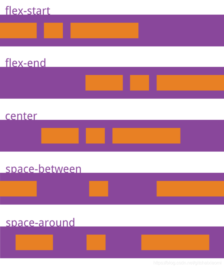
(4)align-items
也是最好用,且最常用的一个属性之一,规定了交叉轴上的对齐方式。一共有5个值。
flex-start,flex-end,center,stretch,baseline
.box{
	align-items: flex-start;
}

(5)align-content
如果主轴上你有多个行,那么这个属性能够让这多行具有丰富的对其方式。但是如果只有一个行,那么这个属性就会失效。一共有六个值。
flex-start,flex-end,center,stretch,space-between,space-around
.box{
	align-content: flex-start;
}

2,子容器属性
(1)order
定义了子元素的优先级,当order的数值越小,就会排在主轴的最开始的位置。
.item{
	order: 1;
}

(2)flex-grow
规定了子元素的放大比例,如果设置一个子元素为2,其余的子元素为1.那么这个2是其他元素空间的两倍。
.item{
	flex-grow: 1;
}

(3)flex-shrink
相对于flex-grow,这是子元素的缩小比例。默认为1,即主轴上空间不够,该子元素就会等比例缩小,当设置为0时,不会缩小。负数属性无效。
.item{
	flex-shrink: 1;
}

(4)flex-basis
该属性是用来计算主轴上是否有空余空间,子元素的默认大小就是这个,它的默认值为auto。
.item{
	flex-shrink: 1;
}
(5)flex
flex属性是flex-grow, flex-shrink 和 flex-basis的简写,默认值为0 1 auto。后两个属性可选。
.item {
  flex: none | [ <'flex-grow'> <'flex-shrink'>? || <'flex-basis'> ]
}
该属性有两个快捷值:auto (1 1 auto) 和 none (0 0 auto)。
建议优先使用这个属性,而不是单独写三个分离的属性,因为浏览器会推算相关值。
(6)align-self
align-self属性允许单个项目有与其他项目不一样的对齐方式,可覆盖align-items属性。默认值为auto,表示继承父元素的align-items属性,如果没有父元素,则等同于stretch。

三,实际效果
1,盒子内的垂直居中
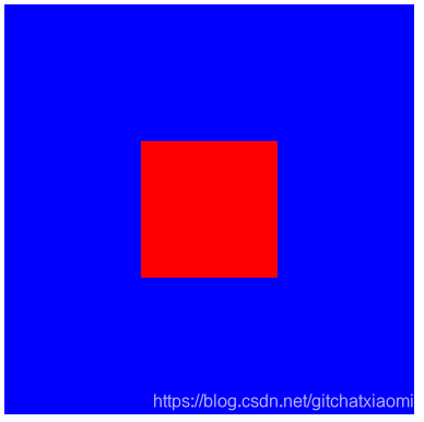
<!DOCTYPE html>
<html lang="en">
<head>
  <title>flex</title>
  <style>
    .box{
      display: flex;
      justify-content: center;  /* 水平方向 */
      align-items: center;	 /* 垂直方向 */
      height: 300px;
      width: 300px;
      background-color: blue;
    }
    .item{
      height: 100px;
      width: 100px;
      background-color: red;
    }
  </style>
</head>
<body>
  <div class="box">
    <div class="item"></div>
  </div>
</body>
</html>
2,常用item栏

<!DOCTYPE html>
<html lang="en">
<head>
  <title>flex</title>
  <style>
    .box{
      display: flex;
      /* flex-direction: row-reverse; */
      justify-content: space-around;
      align-items: center;
      height: 100px;
      width: 300px;
      background-color: blue;
    }
    .item-left{
      height: 80px;
      width: 80px;
      background-color: red;
    }
    .item-right{
      height: 80px;
      width: 150px;
      background-color: red;
    }
  </style>
</head>
<body>
  <div class="box">
    <div class="item-left">图像</div>
    <div class="item-right">文字</div>
  </div>
</body>
</html>
3,常用tab栏

<!DOCTYPE html>
<html lang="en">
<head>
  <title>flex</title>
  <style>
    .box{
      display: flex;
      /* flex-direction: row-reverse; */
      justify-content: space-around;
      align-items: center;
      height: 60px;
      width: 320px;
      background-color: blue;
    }
    .item{
      height: 60px;
      width: 80px;
      background-color: red;
      border: 1px solid white;
      text-align: center;
    }
  </style>
</head>
<body>
  <div class="box">
    <div class="item">首页</div>
    <div class="item">通讯录</div>
    <div class="item">发现</div>
    <div class="item">我</div>
  </div>
</body>
</html>
持续更新…