一、角度
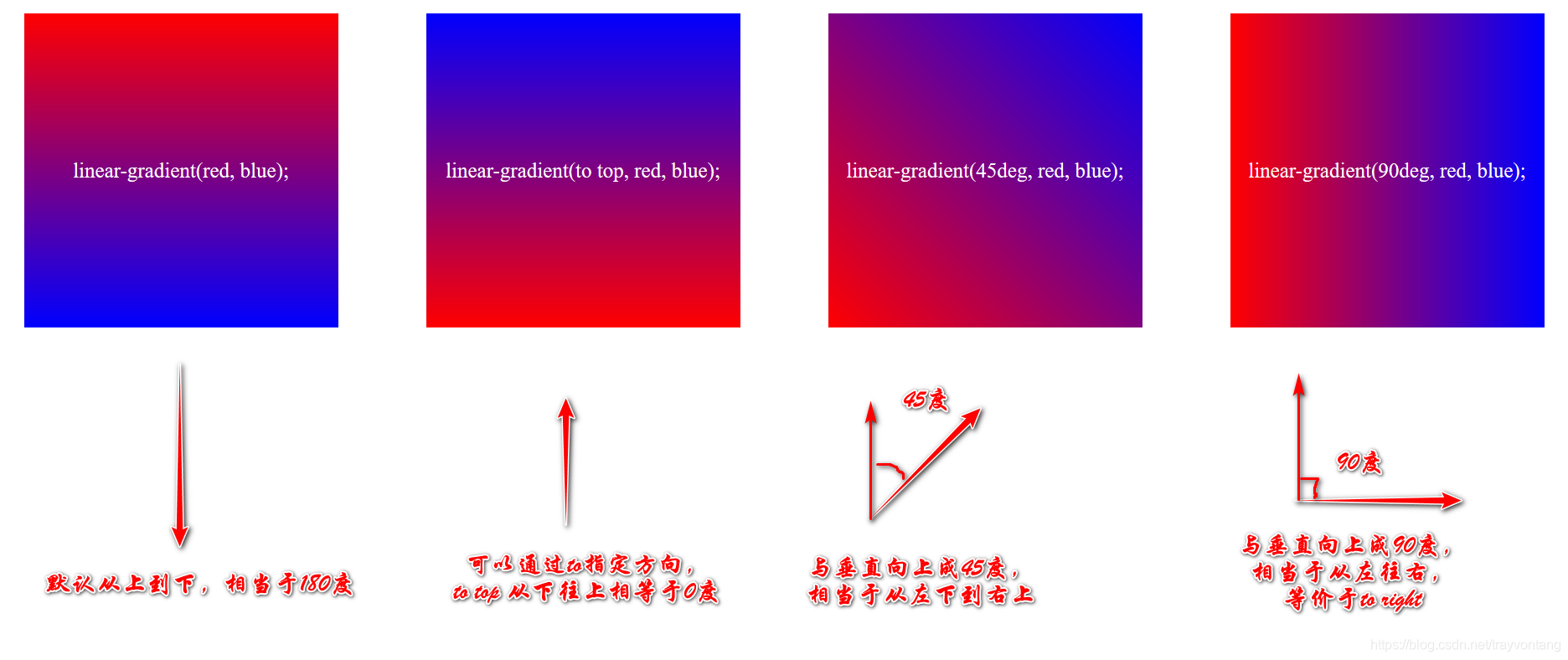 垂直向上方向是0度,顺时针方向选中与垂直向上形成的夹角是角度。
注意,标准的语法是不支持起使方向,例如:
background: linear-gradient(top, red, blue);
如果要使用起使角度,家私用前缀:
background: -ms-linear-gradient(top, red, blue);
background: -webkit-linear-gradient(top, red, blue);
background: -o-linear-gradient(top, red, blue);
background: --moz-linear-gradient(top, red, blue);
这样渐变方向就是从上往下,等价于:
background: linear-gradient(bottom, red, blue);
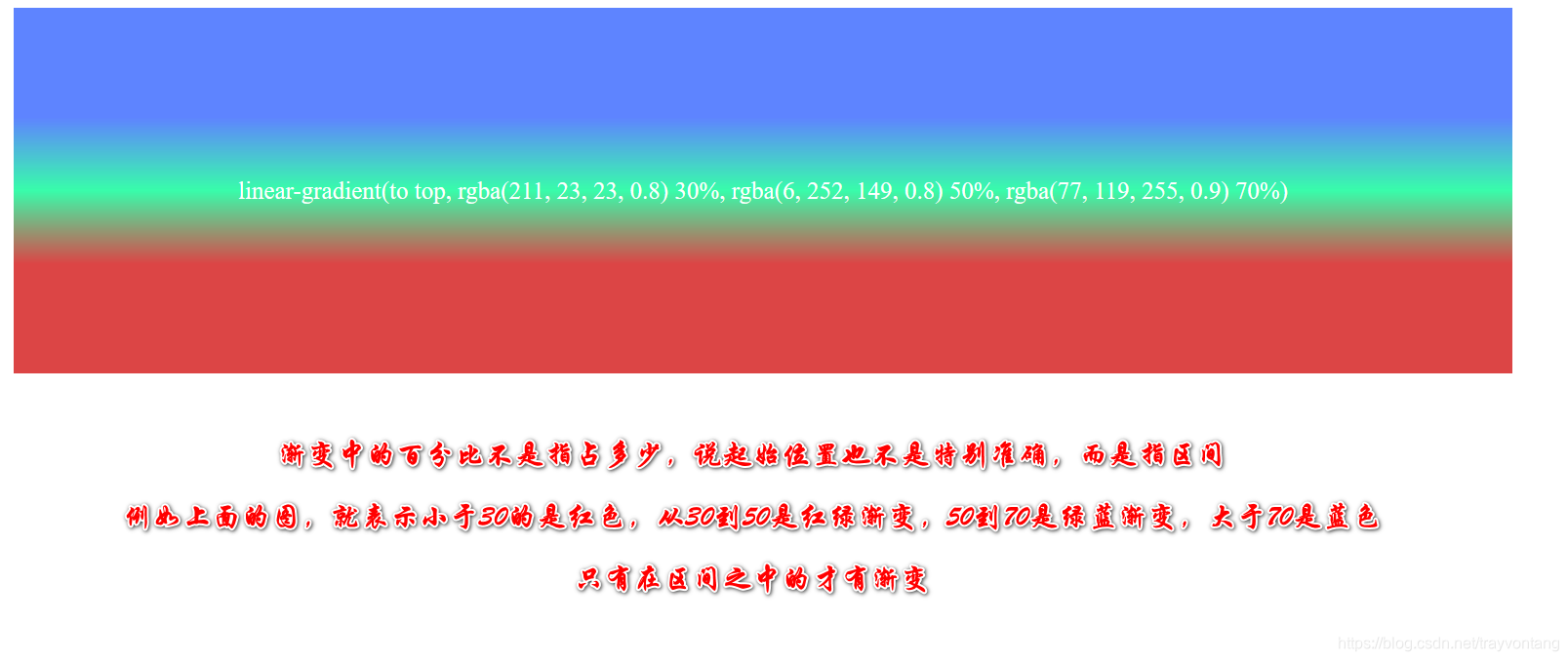
二、百分比
三、测试代码
<!DOCTYPE html>
<html lang="en">

<head>
    <meta charset="UTF-8">
    <meta name="viewport" content="width=device-width, initial-scale=1.0">
    <title>Document</title>
    <style>
        #container {
            display: flex;
            flex-direction: row;
            justify-content: center;
            margin: 0 auto;
            width: 100vw;
        }

        .item {
            width: 300px;
            height: 300px;
            line-height: 300px;
            margin: 10px auto;
            font-size: 20px;
            color: white;
            text-align: center;
        }

        .lg1 {
            background: linear-gradient(red, blue);
        }

        .lg2 {
            background: linear-gradient(to top, red, blue);
        }

        .lg3 {
            background: linear-gradient(45deg, red, blue);
        }

        .lg4 {
            background: linear-gradient(90deg, red, blue);
        }
    </style>
</head>

<body>
    <div id="container">
        <div class="item lg1">linear-gradient(red, blue);</div>
        <div class="item lg2">linear-gradient(to top, red, blue);</div>
        <div class="item lg3">linear-gradient(45deg, red, blue);</div>
        <div class="item lg4">linear-gradient(90deg, red, blue);</div>
    </div>
</body>
</html>
---------------------
作者:trayvontang
来源:CSDN
原文:https://blog.csdn.net/trayvontang/article/details/106980984
版权声明:本文为作者原创文章,转载请附上博文链接!