vue-element-admin 列表页面超出滚动改为满屏显示。
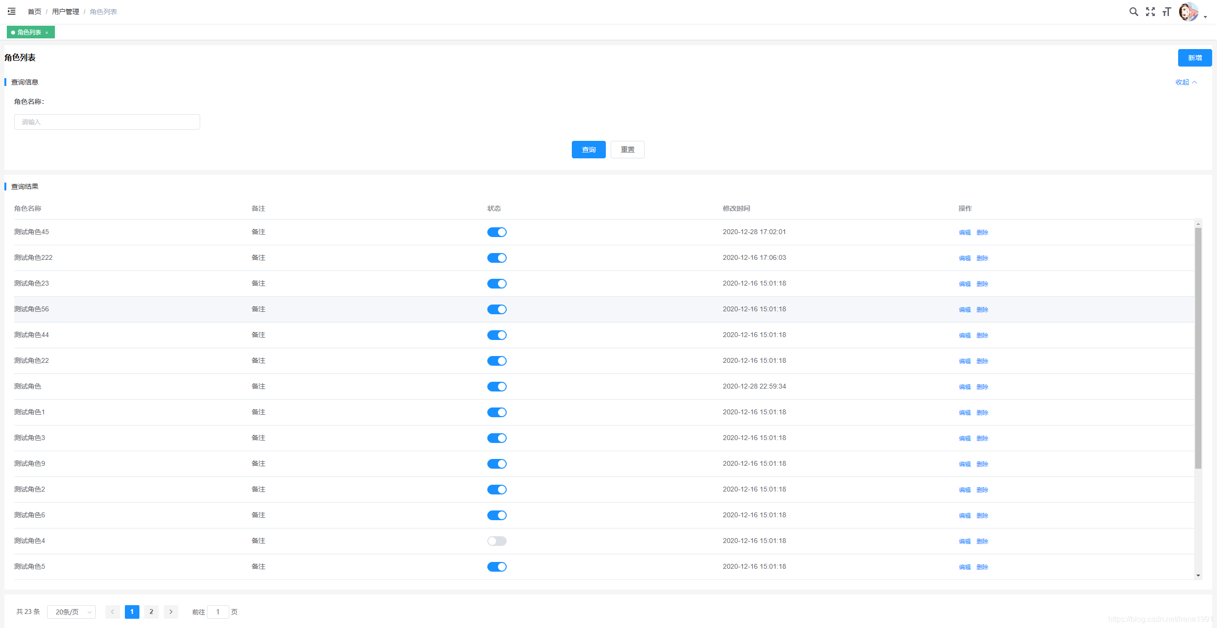
效果如下:
列表页面,屏幕自适应始终一屏显示,外层无滚动条,设置表格超出滚动。
核心 css
父级元素设置
display: flex;
flex-direction: column;
子级元素设置
flex: 1;
特别注意
display: flex; 没有继承性,从最外层的父级元素,一级级的设置到表格的父级元素。

表格父级元素
.screen-card-result {
display: flex;
flex-direction: column;
flex:1 1 auto;
overflow: hidden;
margin-bottom: 0;
}
表格
<el-table :data="tableData" :fit=true :show-header=true height="100%">
知识点总结:
flex:1; 自动撑满父级元素剩余的空间。
flex属性是flex-grow, flex-shrink 和 flex-basis的简写,默认值为0 1 auto。后两个属性可选。
该属性有两个快捷值:auto (1 1 auto) 和 none (0 0 auto)。
flex-shrink属性定义了项目的缩小比例,默认为1,即如果空间不足,该项目将缩小。
flex-grow属性定义项目的放大比例,默认为0,即如果存在剩余空间,也不放大。
框架样式修改
\src\layout\components\AppMain.vue
<style lang="scss" scoped>
.app-main {
/* navbar 50 */
/* 分页高度 72 */
min-height: calc(100vh - 122px);
width: 100%;
display: flex;
flex-direction: column;
position: relative;
overflow: hidden;
}
.fixed-header+.app-main {
padding-top: 50px;
}
.hasTagsView {
.app-main {
/* 84 = navbar + tags-view = 50 + 34 */
/* 84 = navbar + tags-view +分页 = 50 + 34 +72 */
min-height: calc(100vh - 156px);
}
.fixed-header+.app-main {
padding-top: 84px;
}
}
</style>
\src\styles\index.scss
.app-container {
width:100%;
box-sizing: border-box;
padding: 10px 10px 0 10px;
background: #f5f5f5;
display: flex;
flex-direction: column;
flex:1 1 auto;
overflow: hidden;
.el-table .cell{
padding:0;
}
}