一、行内元素垂直居中
注:行内元素不能设置宽高、但是可以设置padding,不能设置margin-top和margin-bottom但是可以设置margin-left和margin-right。
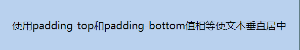
1.设置padding-top和padding-bottom为相同的值。
HTML
		.box{


            padding-top: 30px;
            padding-bottom: 30px;
            padding-right: 20px;
            padding-left:20px;
            background-color: #b9d1ee;
        }
HTML
    <span class="box">
        使用padding-top和padding-bottom使文本垂直居中
    </span>
2.父元素设置height和line-height值相同。
原理:line-height = 上间距+文字高+下间距,而上间距和下间距的高度是一样的,若line-height=height那么此时文字就会垂直居中。
CSS:
        .father{


            width: 1200px;
            height: 300px;
            line-height: 300px;
            margin:20px auto;
            background-color: #617e87;
            padding: 30px;
            text-align: center;
        }
        .child{


            background-color: #b9d1ee;
        }
HTML:
<p class="father">
    <span class="child">
        父元素设置line-height和height值相同。
    </span>
</p>

二、块元素垂直居中
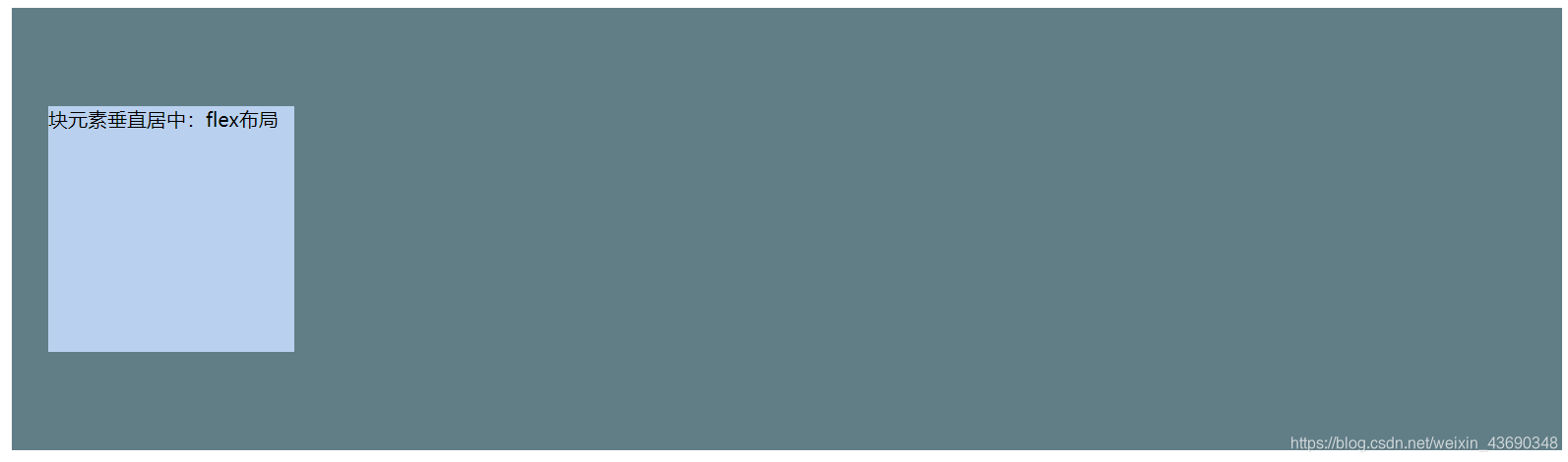
1、flex布局
给父元素设置:display:flex;align-items:center;
CSS
        .father{


            width: 1200px;
            height: 300px;
            margin:20px auto;
            background-color: #617e87;
            padding: 30px;
            display: flex;
            align-items:center;
        }
        .child{


            width: 200px;
            height: 200px;
            background-color: #b9d1ee;
        }
HTML:
<div class="father">
    <div class="child">
        块元素垂直居中:flex布局
    </div>
</div>
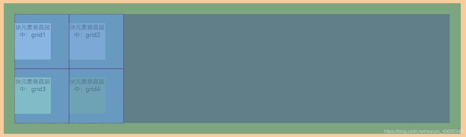
2、grid布局:
父元素设置: display: grid;grid-template-columns: 150px 150px ;grid-template-rows: 150px 150px;
子元素设置:align-self:center;
CSS:
        .father{


            width: 1200px;
            height: 300px;
            margin:20px auto;
            background-color: #617e87;
            padding: 30px;
            display: grid;
            grid-template-columns: 150px 150px ;
            grid-template-rows: 150px 150px;
        }
        .child{


            width: 100px;
            height: 100px;
            text-align: center;
            align-self:center;
        }
        .child:nth-child(1){


            background-color: #b9d1ee;
        }
        .child:nth-child(2){


            background-color: #95a9c4;
        }
        .child:nth-child(3){


            background-color: #a7e99f;
        }
        .child:nth-child(4){


            background-color: #6e9b66;
        }
HTML:
<div class="father">
    <div class="child">
        块元素垂直居中:grid1
    </div>
    <div class=" child">
        块元素垂直居中:grid2
    </div>
    <div class=" child">
        块元素垂直居中:grid3
    </div>
    <div class=" child">
        块元素垂直居中:grid4
    </div>
</div>
3.利用定位
(1) 子元素的高度确定
父元素相对定位,子元素绝对定位。子元设置 top:50% ;margin-top:-(子元素高度的一半)px; 因为top是相对于父容器的高度,所以要在减子元素高度的一半才可以实现垂直居中。
CSS:
        .father{


            width: 1200px;
            height: 300px;
            margin:20px auto;
            background-color: #617e87;
            padding: 30px;
            position: relative;
        }
        .child{


            width: 1000px;
            height: 100px;
            position: absolute;
            top: 50%;
            margin-top: -50px;
            background-color: paleturquoise;
        }
HTML:
<div class="father">
    <div class="child">
        利用定位,子元素的高度确定。
    </div>
</div>

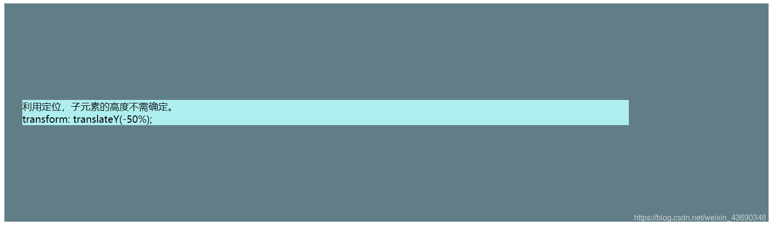
(2)子元素高度不确定
采用定位 margin-top:-50px改成transform: translateY(-50%); 向上移动元素自身的50%。
CSS:
        .father{


            width: 1200px;
            height: 300px;
            margin:20px auto;
            background-color: #617e87;
            padding: 30px;
            position: relative;
        }
        .child{


            width: 1000px;
            position: absolute;
            transform: translateY(-50%);
            top: 50%;
            background-color: paleturquoise;
        }
HTML:
<div class="father">
    <div class="child">
        <p>利用定位,子元素的高度不需确定。</p>
        <p>transform: translateY(-50%);</p>
    </div>
</div>
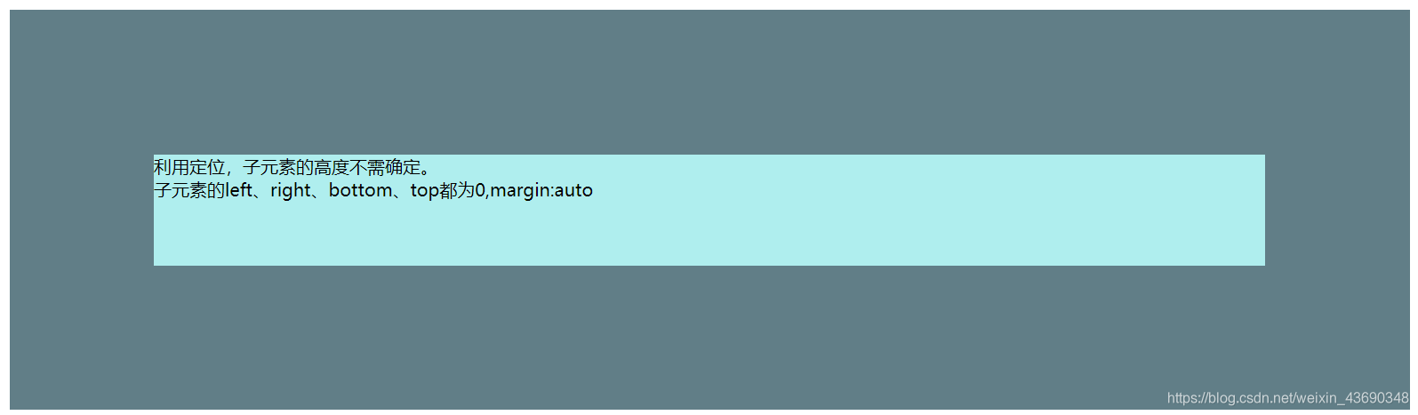
(3)子元素高度确定
子元素的left、right、bottom、top都为0,margin:auto
CSS
        .father{


            width: 1200px;
            height: 300px;
            margin:20px auto;
            background-color: #617e87;
            padding: 30px;
            position: relative;
        }
        .child{


            width: 1000px;
            height: 100px;
            position: absolute;
            left: 0;
            right: 0;
            top: 0;
            bottom: 0;
            margin:auto;
            background-color: paleturquoise;
        }
HTML:
<div class="father">
    <div class="child">
        <p>利用定位,子元素的高度不需确定。</p>
        <p>子元素的left、right、bottom、top都为0,margin:auto</p>
    </div>
</div>