HTML+CSS实现轮播图效果
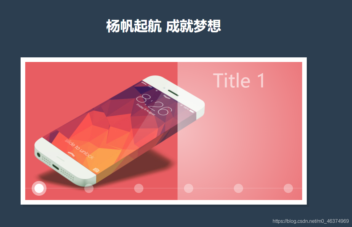
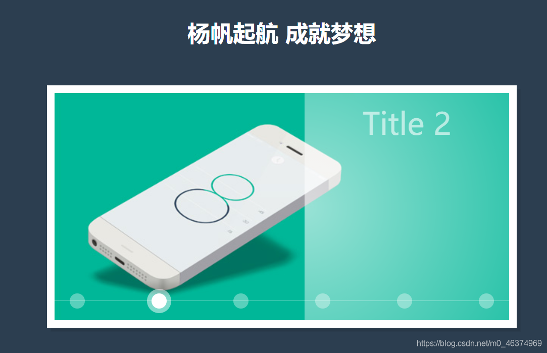
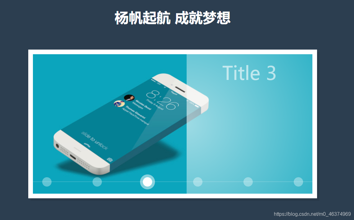
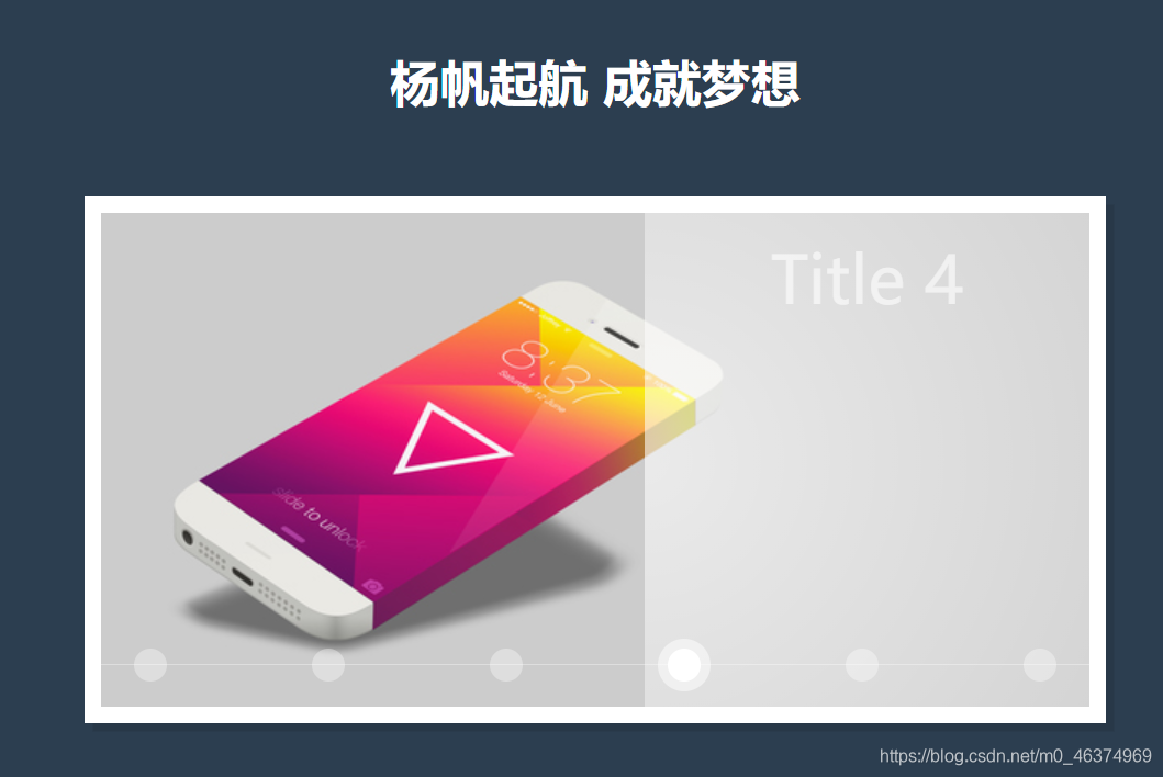
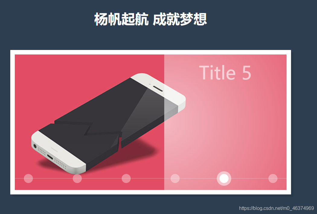
效果图如下(想要源码或者感兴趣的小伙伴可以评论区留言哦!)
HTML部分源代码如下:
<!DOCTYPE html>
<html >

<head>
    <meta charset="UTF-8">
    <meta name="viewport" content="width=device-width, initial-scale=1.0">
    <title>轮播图</title>
    <link rel="stylesheet" href="style.css">
</head>

<body>
    <div class="channel">
       杨帆起航 成就梦想
    </div>
    <div class="container">
        <div class="box">


            <div class="item">
                <!-- 默认第一个选中 -->
                <input type="radio" name="btn" id="btn1" checked>
                <label for="btn1" style="--i:1"></label>
                <div class="img">
                    <img src="1.jpg" alt="">
                    <div class="right"> Title 1 </div>
                </div>
            </div>


            <div class="item">
                <input type="radio" name="btn" id="btn2">
                <label for="btn2" style="--i:2"></label>
                <div class="img">
                    <img src="2.jpg" alt="">
                    <div class="right"> Title 2 </div>
                </div>
            </div>
            <div class="item">
                <input type="radio" name="btn" id="btn3">
                <label for="btn3" style="--i:3"></label>
                <div class="img">
                    <img src="3.jpg" alt="">
                    <div class="right"> Title 3 </div>
                </div>
            </div>
            <div class="item">
                <input type="radio" name="btn" id="btn4">
                <label for="btn4" style="--i:4"></label>
                <div class="img">
                    <img src="4.jpg" alt="">
                    <div class="right"> Title 4 </div>
                </div>
            </div>
            <div class="item">
                <input type="radio" name="btn" id="btn5">
                <label for="btn5" style="--i:5"></label>
                <div class="img">
                    <img src="5.jpg" alt="">
                    <div class="right"> Title 5 </div>
                </div>
            </div>
            <div class="item">
                <input type="radio" name="btn" id="btn6">
                <label for="btn6" style="--i:6"></label>
                <div class="img">
                    <img src="6.jpg" alt="">
                    <div class="right"> Title 6 </div>
                </div>
            </div>
        </div>
    </div>
</body>

</html>
CSS部分源代码如下:
:root {


    --background-color: #2c3e50;
    --border-color    : #7591AD;
    --text-color      : #34495e;
    --color1          : #EC3E27;
    --color2          : #fd79a8;
    --color3          : #0984e3;
    --color4          : #00b894;
    --color5          : #fdcb6e;
    --color6          : #e056fd;
    --color7          : #F97F51;
    --color8          : #BDC581;
}

* {


    margin : 0;
    padding: 0;
}

html {


    font-size: 14px;
}

body {


    width           : 100vw;
    height          : 100vh;
    background-color: var(--background-color);
    display         : flex;
    justify-content : center;
    align-items     : center;
    font-family     : 'Montserrat', sans-serif, Arial, 'Microsoft Yahei';
}

.channel {


    position   : absolute;
    width      : 80%;
    text-align : center;
    top        : 50%;
    left       : 50%;
    transform  : translate(-50%, -250px);
    font-size  : 30px;
    font-weight: bold;
    color      : #fff;
}

.box {


    position              : relative;
    width                 : 600px;
    height                : 300px;
    /* box-shadow         : ; */
    overflow           : hidden;
    /* background-color   : #e056fd; */
    z-index               : 0;
    box-shadow            :
        0 0 0 10px #fff,
        5px 5px 0 10px rgba(0, 0, 0, 0.1);

}

.box::after {


    position        : absolute;
    content         : '';
    width           : 100%;
    height          : 1px;
    background-color: rgba(255, 255, 255, .35);
    bottom          : 25px;
    z-index         : 8888;
}

/* 元素box相同大小 */
.box .item {


    position: absolute;
    width   : 600px;
    height  : 300px;
    top     : 0;
    left    : 0;

}

/* 让单选框离开显示区域 */
input[type=radio] {


    transform : translateY(-100px);
    /* opacity: 0; */
}

label {


    position              : absolute;
    width                 : 20px;
    height                : 20px;
    background-color      : rgba(255, 255, 255, .35);
    /* background-color   : #EC3E27; */
    /* 鼠标 */
    cursor                : pointer;
    bottom                : 15px;
    border-radius         : 50%;
    left                  : calc((var(--i) - 1) * 108px + 20px);
    z-index               : 9999;
    transition            : all 0.5s;
}

label:hover {


    background-color: rgba(255, 255, 255, .6);
}


input[type=radio]:checked+label {


    background-color: #fff;
    box-shadow      : 0 0 0 6px rgba(255, 255, 255, .5);
}

.img {


    position           : absolute;
    width              : 600px;
    height             : 300px;
    top                : 0;
    left               : 0;
    /* background-color: #F97F51; */
    overflow: hidden;
}

.img img {


    position  : absolute;
    transform : translateX(600px);
    /* z-index在动画中变化挺特殊这里直接用0s */
    transition: all .15s, z-index 0s;
}


input[type=radio]:checked~.img img {


    transform: translateX(0px);
    z-index  : 777;
}

.img .right {


    position           : absolute;
    width              : 270px;
    height             : 300px;
    /* background-color: #e056fd; */
    z-index            : 778;
    right              : 0;
    background-image   : radial-gradient(rgba(255, 255, 255, .6), transparent);
    background-size    : 600px 600px;
    background-repeat  : no-repeat;
    background-position: -300px -150px;
    transform          : translateX(300px);
    /* 这里时间比img要长一些 */
    transition         : all 0.35s;

    font-size: 40px;
    color: #ffffff99;
    text-align: center;
    line-height: 80px;
}

input[type=radio]:checked~.img .right {


    transform   : translateX(0px);
    /* z-index  : 777; */
}