目录

1.https://blog.csdn.net/weixin_37580235/article/details/82317240#comments_13391965
2.https://blog.csdn.net/XTXTXTXTYYYY/article/details/90747453
3.https://www.cnblogs.com/leena/p/6929846.html
4.(圣杯布局和双飞翼布局)https://blog.csdn.net/qq_38128179/article/details/86533976
1.水平居中
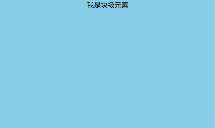
首先看它的父元素是不是块级元素,如果是,则直接给父元素设置 text-align: center;
<style>

#father {

width: 500px;

height: 300px;

background-color: skyblue;

text-align: center;

}

</style>


<div id="father">

    <span id="son">我是行内元素</span>

</div>
如果不是,则先将其父元素设置为块级元素,再给父元素设置 text-align: center;
效果:
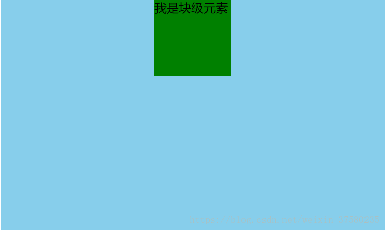
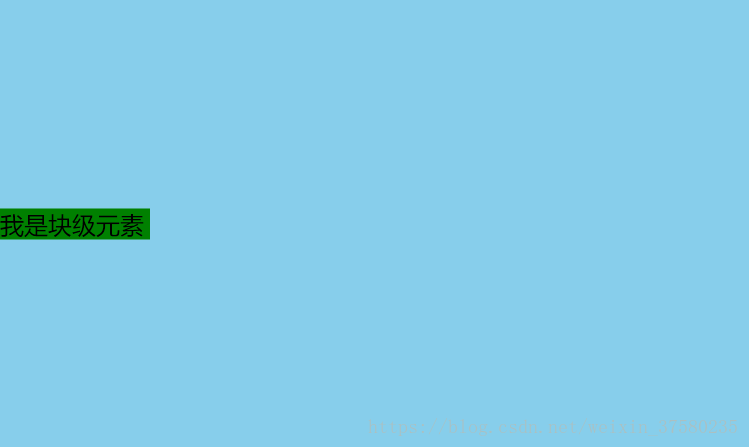
方案一:(分宽度定不定两种情况)
定宽度:需要谁居中,给其设置 margin: 0 auto; (作用:使盒子自己居中)
<style>
#father {
width: 500px;
height: 300px;
background-color: skyblue;
}
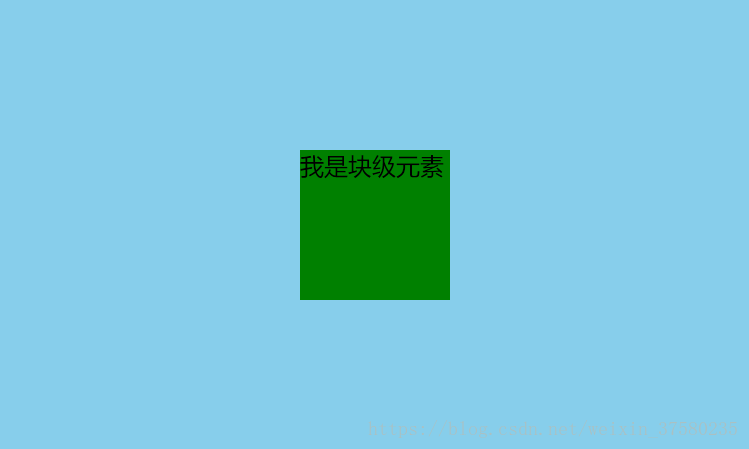
#son {
width: 100px;
height: 100px;
background-color: green;
margin: 0 auto;
}
</style>
<div id="father">
<div id="son">我是块级元素</div>
</div>
效果:
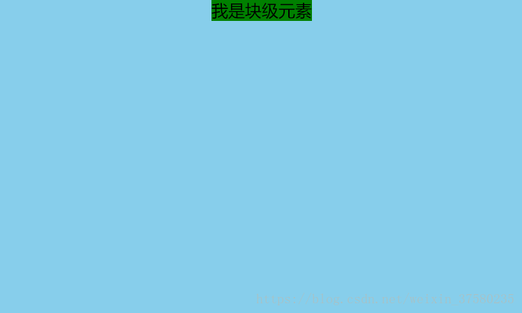
<style>
#father {
width: 500px;
height: 300px;
background-color: skyblue;
text-align: center;
}
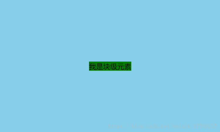
#son {
background-color: green;
display: inline;
}
</style>
<div id="father">
<div id="son">我是块级元素</div>
</div>
效果:(将#son转换成行内元素,内容的高度撑起了#son的高度,设置高度无用)
方案二:使用定位属性
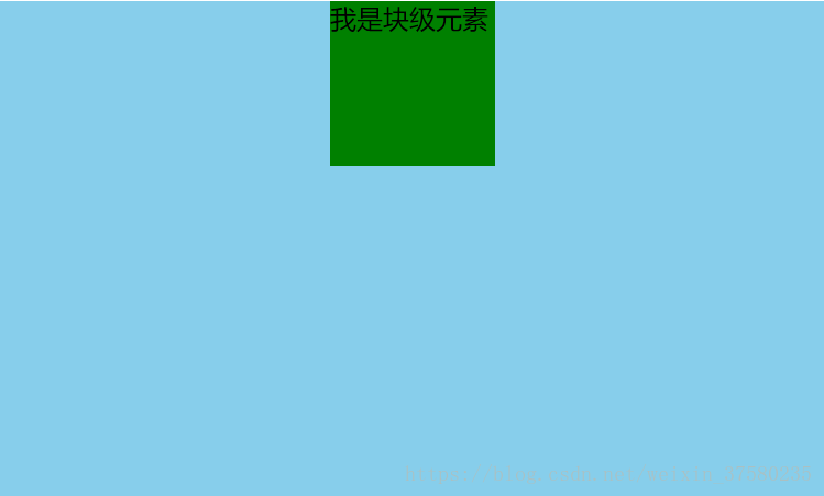
首先设置父元素为相对定位,再设置子元素为绝对定位,设置子元素的left:50%,即让子元素的左上角水平居中;定宽度:设置绝对子元素的 margin-left: -元素宽度的一半px; 或者设置transform: translateX(-50%);
<style>

#father {

width: 500px;

height: 300px;

background-color: skyblue;

position: relative;

}


#son {

width: 100px;

height: 100px;

background-color: green;

position: absolute;

left: 50%;

margin-left: -50px;

}

</style>


<div id="father">

<div id="son">我是块级元素</div>

</div>
不定宽度:利用css3新增属性transform: translateX(-50%);
<style>

#father {

width: 500px;

height: 300px;

background-color: skyblue;

position: relative;

}


#son {

height: 100px;

background-color: green;

position: absolute;

left: 50%;

transform: translateX(-50%);

}

</style>


<div id="father">

<div id="son">我是块级元素</div>

</div>
效果:
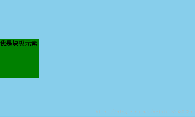
方案三:使用flexbox布局实现(宽度定不定都可以)
使用flexbox布局,只需要给待处理的块状元素的父元素添加属性 display: flex; justify-content: center;
<style>

#father {

width: 500px;

height: 300px;

background-color: skyblue;

display: flex;

justify-content: center;

}


#son {

width: 100px;

height: 100px;

background-color: green;

}

</style>


<div id="father">

<div id="son">我是块级元素</div>

</div>
效果:
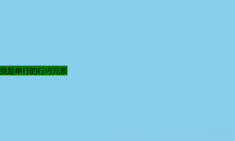
2.垂直居中
只需要设置单行行内元素的"行高等于盒子的高"即可;
<style>

#father {

width: 500px;

height: 300px;

background-color: skyblue;

}


#son {

background-color: green;

height: 300px;

}

</style>


<div id="father">

<span id="son">我是单行的行内元素</span>

</div>
效果:
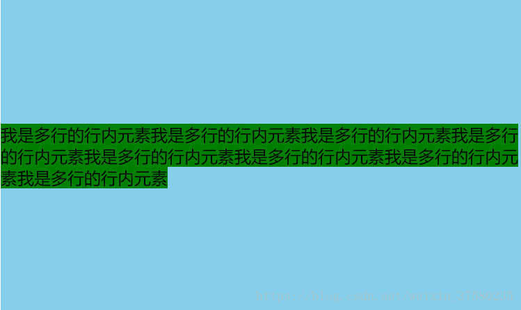
使用给父元素设置display:table-cell;和vertical-align: middle;属即可;
<style>

#father {

width: 500px;

height: 300px;

background-color: skyblue;

display: table-cell;

vertical-align:middle;

}


#son {

background-color: green;

}

</style>


<div id="father">

<span id="son">我是多行的行内元素我是多行的行内元素我是多行的行内元素我是多行的行内元素我是多行的行内元素我是多行的行内元素我是多行的行内元素我是多行的行内元素</span>

</div>
效果:
方案一:使用定位
首先设置父元素为相对定位,再设置子元素为绝对定位,设置子元素的top: 50%,即让子元素的左上角垂直居中;定高度:设置绝对子元素的 margin-top: -元素高度的一半px; 或者设置transform: translateY(-50%);
<style>

#father {

width: 500px;

height: 300px;

background-color: skyblue;

position: relative;

}


#son {

height: 100px;

background-color: green;

position: absolute;

top: 50%;

margin-top: -50px;

}

</style>


<div id="father">

<div id="son">我是块级元素</div>

</div>不定高度:利用css3新增属性transform: translateY(-50%);
<style>

#father {

width: 500px;

height: 300px;

background-color: skyblue;

position: relative;

}


#son {

width: 100px;

background-color: green;

position: absolute;

left: 50%;

transform: translateY(-50%);

}

</style>


<div id="father">

<div id="son">我是块级元素</div>

</div>
效果:
方案二:使用flexbox布局实现(高度定不定都可以)
使用flexbox布局,只需要给待处理的块状元素的父元素添加属性 display: flex; align-items: center;
<style>

#father {

width: 500px;

height: 300px;

background-color: skyblue;

display: flex;

align-items: center;

}


#son {

width: 100px;

height: 100px;

background-color: green;

}

</style>


<div id="father">

<div id="son">我是块级元素</div>

</div>
效果:
3.水平垂直居中
方案一:设置父元素为相对定位,给子元素设置绝对定位,top: 0; right: 0; bottom: 0; left: 0; margin: auto;
<style>

#father {

width: 500px;

height: 300px;

background-color: skyblue;

position: relative;

}


#son {

width: 100px;

height: 100px;

background-color: green;

position: absolute;

top: 0;

right: 0;

bottom: 0;

left: 0;

margin: auto;

}

</style>


<div id="father">

<div id="son">我是块级元素</div>

</div>
效果:
方案二:设置父元素为相对定位,给子元素设置绝对定位,left: 50%; top: 50%; margin-left: --元素宽度的一半px; margin-top: --元素高度的一半px
<style>

#father {

width: 500px;

height: 300px;

background-color: skyblue;

position: relative;

}


#son {

width: 100px;

height: 100px;

background-color: green;

position: absolute;

left: 50%;

top: 50%;

margin-left: -50px;

margin-top: -50px;

}

</style>


<div id="father">

<div id="son">我是块级元素</div>

</div>
;效果:
方案一:使用定位属性
设置父元素为相对定位,给子元素设置绝对定位,left: 50%; top: 50%; transform: translateX(-50%) translateY(-50%);
<style>

#father {

width: 500px;

height: 300px;

background-color: skyblue;

position: relative;

}


#son {

background-color: green;

position: absolute;

left: 50%;

top: 50%;

transform: translateX(-50%) translateY(-50%);

}

</style>


<div id="father">

<div id="son">我是块级元素</div>

</div>
效果:
方案二:使用flex布局实现
设置父元素为flex定位,justify-content: center; align-items: center;
<style>

#father {

width: 500px;

height: 300px;

background-color: skyblue;

display: flex;

justify-content: center;

align-items: center;

}


#son {

background-color: green;

}

</style>


<div id="father">

<div id="son">我是块级元素</div>

</div>
效果:
4.两列布局,左边固定,右边自适应
1. float基本方式
固定端float,自适应端不设置width;
2. css计算属性calc实现
固定端float,自适应端width为calc(100%-固定端width)
3. table布局实现
父容器display:talble,两端都以display:table-cell,固定端设置width,自适应端不设置width
4. 相对定位绝对定位实现
父容器相对定位,固定端于父容器绝对定位,自适应端margin-left设置为固定端width
5. flex布局实现
父容器flex布局,固定端固定width,自适应端flex:1实现自适应实例代码:
<html>
<head>
<style type="text/css">
.box{
height: 100px;
width:100%;
background: red;
margin-bottom: 20px;
}
.box1{
width: 100px;
height: 100px;
background: yellow;
float: left;
}
.box2{
height: 100px;
background: green;
}
.box11{
width: 100px;
height: 100px;
background: yellow;
float: left;
}
.box12{
height: 100px;
background: green;
width: calc(100%-100px);
}
.box111{
width: 100px;
height: 100px;
background: yellow;
display: table-cell;
}
.box112{
height: 100px;
background: green;
display: table-cell;
}
.box1111{
width: 100px;
height: 100px;
background: yellow;
position:absolute;
}
.box1112{
height: 100px;
background: green;
margin-left: 100px;
}
.box11111{
width: 100px;
height: 100px;
background: yellow;
}
.box11112{
height: 100px;
background: green;
flex: 1;
}
</style>
</head>
<body>
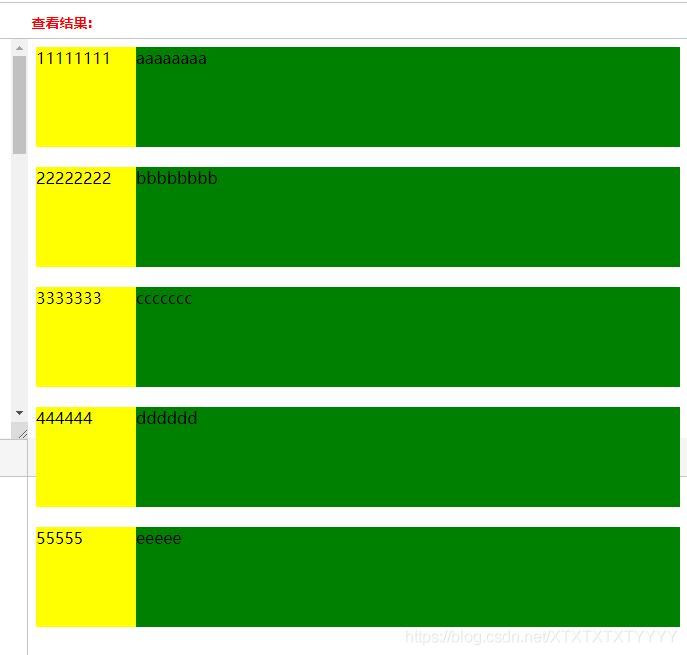
<div class='box'>
//固定端float,自适应端不设置width
<div class='box1'>11111111</div>
<div class='box2'>aaaaaaaa</div>
</div>
<div class='box'>
//固定端float,自适应端width为calc(100%-固定端width)
<div class='box11'>22222222</div>
<div class='box12'>bbbbbbbb</div>
</div>
<div class='box' style='display:table'>
//父容器display:talble,两端都以display:table-cell,固定端设置width,自适应端不设置width
<div class='box111'>3333333</div>
<div class='box112'>ccccccc</div>
</div>
<div class='box' style='position: relative'>
//父容器相对定位,固定端于父容器绝对定位,自适应端margin-left设置为固定端width
<div class='box1111'>444444</div>
<div class='box1112'>dddddd</div>
</div>
<div class='box' style='display: flex'>
//父容器flex布局,固定端固定width,自适应端flex:1实现自适应
<div class='box11111'>55555</div>
<div class='box11112'>eeeee</div>
</div>
</body>
</html>
效果截图:
改变窗口宽度后效果截图:

5.三列布局:
三列布局:左右定款,中间自适应。
方法一:使用负外边距
<style>

* {

    margin: 0;

    padding: 0;

}


.main,.left,.right {

    height: 300px;

    font: 20px/300px;

    color: #fff;

    text-align: center;

}


.main {

    width: 100%;

    float: left;

}


.main .content {

    margin: 0 300px 0 200px;

    background-color: black;

}


.left {

    width: 200px;

    float: left;

    margin-left: -100%;

    background-color: red;

}


.right {

    width: 300px;

    float: left;

    margin-left: -300px;

    background-color: blue;

}

</style>

<div class="main">

   <div class="content">

    中间主体区域宽度自适应

   </div>

  </div>

  <div class="left">

   左侧定宽200px

  </div>

  <div class="right">

   右侧定宽300px

</div>
优点:兼容IE7+,考虑到页面优化,中间内容区先加载
- 缺点:多一层div嵌套,不易理解
方法二:使用绝对定位
<style>

body {

    margin: 0px;

}

#left {

    background-color: #E8F5FE;

    border: 1px solid #A9C9E2;

    height: 400px;

    width: 100px;

    position: absolute;

    top: 0px;

    left: 0px;

}


#center {

    background-color: #F2FDDB;

    border: 1px solid #A5CF3D;

    height: 400px;

    margin-right: 102px;

    margin-left: 102px;

}


#right {

    background-color: #FFE7F4;

    border: 1px solid #F9B3D5;

    height: 400px;

    width: 100px;

    position: absolute;

    top: 0px;

    right: 0px;

}

</style>

 <div id="center">

   中列

  </div>

  <div id="left">

   左列

  </div>

  <div id="right">

   右列

  </div>
优点:代码结构简单,考虑到了页面优化,中间内容去先加载
- 缺点:目测没有
方法三:使用flex布局
补充:
<style>

.HolyGrail-body {

    display: flex;

    flex: 1;

}


.HolyGrail-content {

    flex: 1;

    background-color: green;

}


.HolyGrail-nav, .HolyGrail-ads {

  /* 两个边栏的宽度设为12em */

    flex: 0 0 200px;

    background-color: blue;

}


.HolyGrail-nav {

  /* 导航放到最左边 */

    order: -1;

    background-color: grey;

}

</style>

<div class="HolyGrail-body">

   <main class="HolyGrail-content">

    ...

   </main>

   <nav class="HolyGrail-nav">

    ...

   </nav>

   <aside class="HolyGrail-ads">

    ...

   </aside>

  </div>
优点:高大上
- 缺点:仅支持IE11+
6.两列等高布局:
利用padding-bottom的正值与margin-bottom的负值相互抵消即可,同时最外层设置overflow:hidden;即可.
补充:
 代码如下:
代码如下:
<html xmlns="http://www.w3.org/1999/xhtml">

 <head>

  <meta http-equiv="Content-Type" content="text/html; charset=utf-8" />

  <title>两列等高布局,利用padding-bottom的正值与margin-bottom的负值相互抵消即可</title>

  <style>


.main{ width:600px; margin:0 auto; overflow:hidden;}


.left{background:red; width:300px; float:left; padding-bottom:2000px; margin-bottom:-2000px;}


.right{background:green; width:300px;float:left;padding-bottom:2000px; margin-bottom:-2000px;}


</style>

 </head>

 <body>

  <div class="main">

   <div class="left">

    <p>we are good friend</p>

   </div>

   <div class="right">

    <p>we are good friend</p>

    <p>we are good friend</p>

    <p>we are good friend</p>

    <p>we are good friend</p>

   </div>

  </div>

 </body>

</html>
7.三列布局---圣杯布局:
关于7,8补充:


圣杯布局和双飞翼布局一直是前端面试的高频考点,圣杯布局的出现是来自由 Matthew Levine 在 2006 年写的一篇文章 《In Search of the Holy Grail》。 比起双飞翼布局,它的起源不是源于对页面的形象表达。在西方,圣杯是表达“渴求之物”的意思。而双飞翼布局则是源于淘宝的UED,可以说是灵感来自于页面渲染。
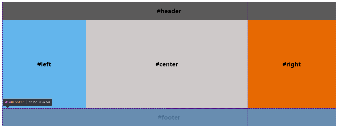
效果图
原本录制了一个小视频,奈何不能上传到博客中,视频中通过缩放页面可以发现随着页面的宽度的变化,这三栏布局是中间盒子优先渲染,两边的盒子框子宽度固定不变,即使页面宽度变小,也不影响我们的浏览。注意:为了安全起见,最好还是给body加一个最小宽度!
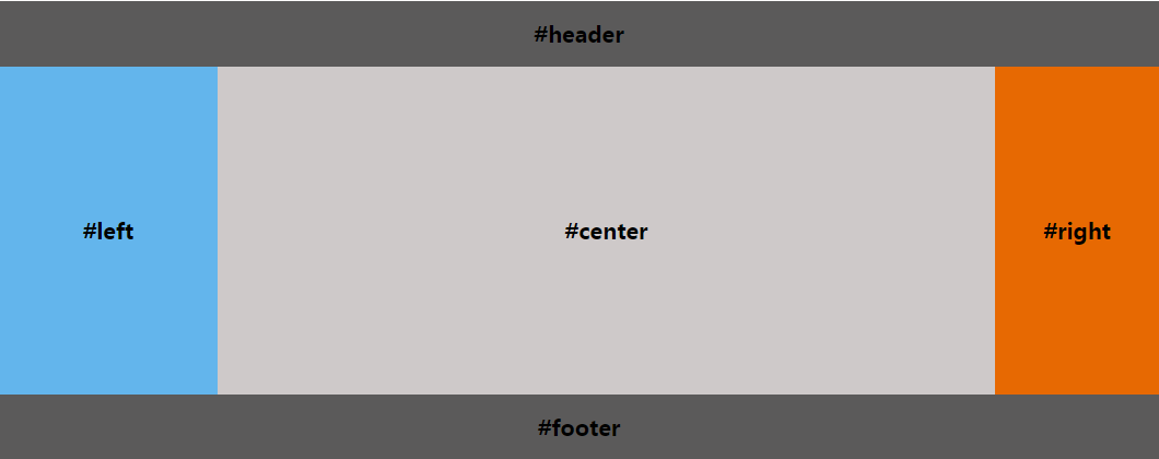
圣杯布局要求
|
圣杯布局的三种实现
【1】浮动
- 先定义好header和footer的样式,使之横向撑满。
- 在container中的三列设为浮动和相对定位(后面会用到),center要放在最前面,footer清除浮动。
- 三列的左右两列分别定宽200px和150px,中间部分center设置100%撑满
- 这样因为浮动的关系,center会占据整个container,左右两块区域被挤下去了
- 接下来设置left的
margin-left: -100%;,让left回到上一行最左侧 - 但这会把center给遮住了,所以这时给外层的container设置
padding-left: 200px;padding-right: 150px;,给left和right空出位置 - 这时left并没有在最左侧,因为之前已经设置过相对定位,所以通过
left: -200px;把left拉回最左侧 - 同样的,对于right区域,设置
margin-right: -150px;把right拉回第一行 - 这时右侧空出了150px的空间,所以最后设置 right: -150px;把right区域拉到最右侧就行了。
<!DOCTYPE html>

<html>


<head>

<meta charset="utf-8">

<script src="http://lib.sinaapp.com/js/jquery/2.0.2/jquery-2.0.2.min.js"></script>

</head>

<style>

body {

min-width: 550px; /* 2x leftContent width + rightContent width */

font-weight: bold;

font-size: 20px;

}


#header, #footer {

background: rgba(29, 27, 27, 0.726);

text-align: center;

height: 60px;

line-height: 60px;

}

#footer {

clear: both;

}


#container {

padding-left: 200px; /* leftContent width */

padding-right: 150px; /* rightContent width */

overflow: hidden;

}


#container .column {

position: relative;

float: left;

text-align: center;

height: 300px;

line-height: 300px;

}


#center {

width: 100%;

background: rgb(206, 201, 201);

}


#left {

width: 200px; /* leftContent width */

right: 200px; /* leftContent width */

margin-left: -100%;//这里白分比是相对于父元素,这里不是父元素width不是整行,而是要排除父元素中的padding部分

background: rgba(95, 179, 235, 0.972);

}


#right {

width: 150px; /* rightContent width */

margin-right: -150px; /* rightContent width */

background: rgb(231, 105, 2);

}


</style>


<body>

<div id="header">#header</div>

<div id="container">

<div id="center" class="column">#center</div>

<div id="left" class="column">#left</div>

<div id="right" class="column">#right</div>

</div>

<div id="footer">#footer</div>


</body>


</html>
【2】flex弹性盒子
- header和footer设置样式,横向撑满。
- container中的left、center、right依次排布即可
- 给container设置弹性布局
display: flex; - left和right区域定宽,center设置
flex: 1;即可<!DOCTYPE html> <html> <head> <meta charset="utf-8"> <script src="http://lib.sinaapp.com/js/jquery/2.0.2/jquery-2.0.2.min.js"></script> </head> <style> body { min-width: 550px; font-weight: bold; font-size: 20px; } #header, #footer { background: rgba(29, 27, 27, 0.726); text-align: center; height: 60px; line-height: 60px; } #container { display: flex; } #container .column { text-align: center; height: 300px; line-height: 300px; } #center { flex: 1; background: rgb(206, 201, 201); } #left { width: 200px; background: rgba(95, 179, 235, 0.972); } #right { width: 150px; background: rgb(231, 105, 2); } </style> <body> <div id="header">#header</div> <div id="container"> <div id="left" class="column">#left</div> <div id="center" class="column">#center</div> <div id="right" class="column">#right</div> </div> <div id="footer">#footer</div> </body> </html>【3】grid布局
如上图所示,我们把body划分成三行四列的网格,其中有5条列网格线
- 给body元素添加
display: grid;属性变成一个grid(网格) - 给header元素设置grid-row: 1; 和 grid-column: 1/5; 意思是占据第一行网格的从第一条列网格线开始到第五条列网格线结束
- 给footer元素设置grid-row: 1; 和 grid-column: 1/5; 意思是占据第三行网格的从第一条列网格线开始到第五条列网格线结束
- 给left元素设置grid-row: 2; 和 grid-column: 1/2; 意思是占据第二行网格的从第一条列网格线开始到第二条列网格线结束
- 给center元素设置grid-row: 2; 和 grid-column: 2/4; 意思是占据第二行网格的从第二条列网格线开始到第四条列网格线结束
- 给right元素设置grid-row: 2; 和 grid-column: 4/5; 意思是占据第二行网格的从第四条列网格线开始到第五条列网格线结束
<!DOCTYPE html>

<html>


<head>

<meta charset="utf-8">

<script src="http://lib.sinaapp.com/js/jquery/2.0.2/jquery-2.0.2.min.js"></script>

</head>

<style>

body {

min-width: 550px;

font-weight: bold;

font-size: 20px;

display: grid;

}

#header,

#footer {

background: rgba(29, 27, 27, 0.726);

text-align: center;

height: 60px;

line-height: 60px;

}

#header {

grid-row: 1;

grid-column: 1/5;

}

#footer {

grid-row: 3;

grid-column: 1/5;

}

.column {

text-align: center;

height: 300px;

line-height: 300px;

}

#left {

grid-row: 2;

grid-column: 1/2;

background: rgba(95, 179, 235, 0.972);

}

#center {

grid-row: 2;

grid-column: 2/4;

background: rgb(206, 201, 201);

}

#right {

grid-row: 2;

grid-column: 4/5;

background: rgb(231, 105, 2);

}

</style>


<body>

<div id="header">#header</div>

<div id="left" class="column">#left</div>

<div id="center" class="column">#center</div>

<div id="right" class="column">#right</div>

<div id="footer">#footer</div>

</body>


</html>
8.三列布局-双飞翼布局
圣杯布局的出现是来自由 Matthew Levine 在 2006 年写的一篇文章 《In Search of the Holy Grail》,在国内最早是淘宝UED的工程师(玉伯大大)对圣杯布局改进并传播开来,在中国的叫法是双飞翼布局 。
圣杯布局和双飞翼布局达到的效果基本相同,都是侧边两栏宽度固定,中间栏宽度自适应。 主要的不同之处就是在解决中间部分被挡住的问题时,采取的解决办法不一样,圣杯布局是在父元素上设置了padding-left和padding-right,在给左右两边的内容设置position为relative,通过左移和右移来使得左右两边的内容得以很好的展现,而双飞翼则是在center这个div中再加了一个div来放置内容,在给这个新的div设置margin-left和margin-right 。
效果图
原本录制了一个小视频,奈何不能上传到博客中,视频中通过缩放页面可以发现随着页面的宽度的变化,这三栏布局是中间盒子优先渲染,两边的盒子框子宽度固定不变,即使页面宽度变小,也不影响我们的浏览。注意:为了安全起见,最好还是给body加一个最小宽度!
双飞翼布局要求
|
双飞翼布局的实现
- left、center、right三种都设置左浮动
- 设置center宽度为100%
- 设置负边距,left设置负边距为100%,right设置负边距为自身宽度
- 设置content的margin值为左右两个侧栏留出空间,margin值大小为left和right宽度
<!DOCTYPE html>

<html>


<head>

<meta charset="utf-8">

<script src="http://lib.sinaapp.com/js/jquery/2.0.2/jquery-2.0.2.min.js"></script>

</head>

<style>

body {

min-width: 550px;

font-weight: bold;

font-size: 20px;

}

#header,

#footer {

background: rgba(29, 27, 27, 0.726);

text-align: center;

height: 60px;

line-height: 60px;

}

#container {

overflow: hidden;

}

.column {

text-align: center;

height: 300px;

line-height: 300px;

}

#left, #right, #center {

float: left;

}

#center {

width: 100%;

background: rgb(206, 201, 201);

}

#left {

width: 200px;

margin-left: -100%;//这个百分比是相对于父元素的width,这里父元素width是整个宽度

background: rgba(95, 179, 235, 0.972);

}

#right {

width: 150px;

margin-left: -150px;

background: rgb(231, 105, 2);

}

.content {

margin: 0 150px 0 200px;

}

</style>


<body>

<div id="header">#header</div>


<div id="container">

<div id="center" class="column">

<div class="content">#center</div>

</div>

<div id="left" class="column">#left</div>

<div id="right" class="column">#right</div>

</div>


<div id="footer">#footer</div>

</body>


</html>
参考文献: