还记得我最开始啥都不知道的时候,写个按钮都不知道怎么去修改样式。。。你们有福利了,我把需要用到的一些常用按钮,给你们都写出来啦
老规矩,先看样式:
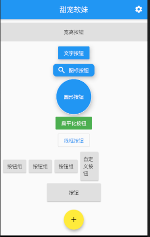
(一)效果图
(二)实现代码
import 'package:flutter/material.dart';

void main() => runApp(MyApp());

class MyApp extends StatelessWidget {
  @override
  Widget build(BuildContext context) {
    return MaterialApp(
      debugShowCheckedModeBanner: false,
      home: Buttonpage(),//入口函数
    );
  }
}

class Buttonpage extends StatelessWidget {
  @override
  Widget build(BuildContext context) {
    return Scaffold(
      appBar: AppBar(
        title: Text("甜宠软妹"),
        actions: <Widget>[
          //图标按钮
          IconButton(
              icon: Icon(Icons.settings),
              onPressed: () {
                print("图标按钮");
              }),
        ],
        centerTitle: true,
      ),
      //浮动按钮的位置
      floatingActionButton: FloatingActionButton(
        child: Icon(Icons.add, color: Colors.black),
        backgroundColor: Colors.yellow,
        onPressed: () {
          print("浮动按钮");
        },
      ),
      floatingActionButtonLocation: FloatingActionButtonLocation.centerFloat,
      body: Column(
        children: <Widget>[
          Padding(padding: EdgeInsets.only(top: 10)),
          Row(
            mainAxisAlignment: MainAxisAlignment.center,
            children: <Widget>[
              Expanded(
                child: Container(
                  width: 30,
                  height: 50,
                  //通过给container设置宽高,给按钮设置宽高
                  child: RaisedButton(
                      child: Text("宽高按钮"),
                      onPressed: () {
                        print("宽高按钮");
                      }),
                ),
              ),
            ],
          ),
          SizedBox(
            height: 10,
          ),
          //文字按钮
          RaisedButton(
              child: Text("文字按钮"),
              color: Colors.blue,
              textColor: Colors.white,
              elevation: 10, //阴影范围,值越大,越浓
              onPressed: () {
                print("文字按钮");
              }),
          //图标按钮
          RaisedButton.icon(
              label: Text("图标按钮"),
              icon: Icon(Icons.search),
              color: Colors.blue,
              textColor: Colors.white,
              elevation: 10, //阴影范围,值越大,越浓
              shape: RoundedRectangleBorder(
                  borderRadius: BorderRadius.circular(10) //圆角
                  ),
              onPressed: () {
                print("图标按钮");
              }),
          //圆形按钮
          Container(
            width: 200,
            height: 100,
            child: RaisedButton(
                child: Text("圆形按钮"),
                color: Colors.blue,
                textColor: Colors.white,
                elevation: 10, //阴影范围,值越大,越浓
                splashColor: Colors.green,
                shape: CircleBorder(side: BorderSide(color: Colors.white)),
                onPressed: () {
                  print("圆形按钮");
                }),
          ),
          //扁平化按钮
          FlatButton(
              color: Colors.green,
              textColor: Colors.white,
              onPressed: () {
                print("扁平化按钮");
              },
              child: Text("扁平化按钮")),
          //线框按钮
          OutlineButton(
              textColor: Colors.blue,
              onPressed: () {
                print("线框按钮");
              },
              child: Text("线框按钮")),
          //按钮组
          Row(
            children: [
              ButtonBar(
                children: [
                  RaisedButton(
                      child: Text("按钮组"),
                      onPressed: () {
                        print("按钮组");
                      }),
                  RaisedButton(
                      child: Text("按钮组"),
                      onPressed: () {
                        print("按钮组");
                      }),
                  RaisedButton(
                      child: Text("按钮组"),
                      onPressed: () {
                        print("按钮组");
                      }),
                  MyButton(
                      //调用
                      text: "自定义按钮",
                      pressed: () {
                        print("自定义按钮");
                      })
                ],
              ),
            ],
          ),
          //按钮
          Row(
            mainAxisAlignment: MainAxisAlignment.center,
            children: [
              Container(
                  width: 150,
                  height: 50,
                  child: Expanded(
                    child: RaisedButton(
                        child: Text("按钮"),
                        onPressed: () {
                          print("按钮");
                        }),
                  ))
            ],
          )
        ],
      ),
    );
  }
}

//自定义按钮组件
class MyButton extends StatelessWidget {
  final text;
  final pressed;
  final width;
  final double height;
  const MyButton(
      {this.text = '', this.pressed, this.height = 80, this.width = 50.0});
  @override
  Widget build(BuildContext context) {
    return Container(
      height: this.height,
      width: this.width,
      child: RaisedButton(child: Text(this.text), onPressed: this.pressed),
    );
  }
}
(三)总结
按钮要写事件,不然会有黄线(vscode)