文章目录
股票图
# 导入需要的库
import tushare as ts
import matplotlib.pyplot as plt
import matplotlib.finance as mpf
%matplotlib inline
# 设置历史数据区间
date1 = (2014, 12, 1) # 起始日期,格式:(年,月,日)元组
date2 = (2016, 12, 1) # 结束日期,格式:(年,月,日)元组
# 从雅虎财经中获取股票代码601558的历史行情
quotes = mpf.quotes_historical_yahoo_ohlc('601558.ss', date1, date2)
# 创建一个子图
fig, ax = plt.subplots(facecolor=(0.5, 0.5, 0.5))
fig.subplots_adjust(bottom=0.2)
# 设置X轴刻度为日期时间
ax.xaxis_date()
# X轴刻度文字倾斜45度
plt.xticks(rotation=45)
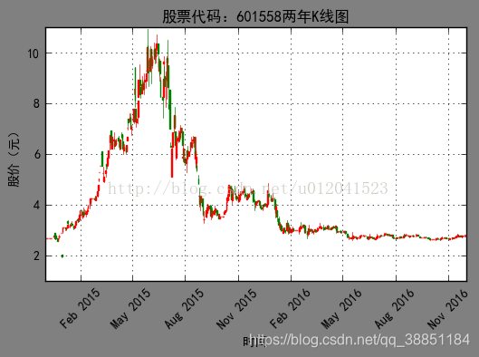
plt.title("股票代码:601558两年K线图")
plt.xlabel("时间")
plt.ylabel("股价(元)")
mpf.candlestick_ohlc(ax,quotes,width=1.2,colorup='r',colordown='green')
plt.grid(True)