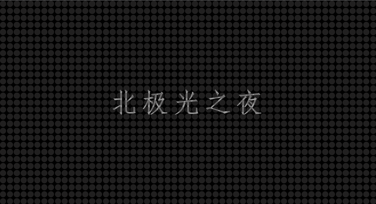
效果:
实现:
1. 定义标签,.main是底层盒子,.txt是文字,.dot是图中的小圆圈,用js动态大量添加。
 <div class="main">
        <h1 class="txt">北极光之夜</h1>
        <div class="dot" style="--color: red;"></div>
    </div>
style="- -color: red;" 这个是var函数的应用,点击链接文章的开头讲有。
2. 底层盒子的基本样式:
.main{


          position: fixed;
          top: 0;
          left: 0;
          width: 100%;
          height: 100%;
          background-color: rgb(0, 0, 0);
          display: flex;
          justify-content: space-around;
          flex-wrap: wrap;
          align-content: space-around;
          cursor: pointer;
        }
position: fixed;
top: 0;
left: 0;
width: 100%;
height: 100%; 相对于浏览器窗口进行定位,然后跟窗口一样大。
display: flex; flex布局;
justify-content: space-around; 主轴子元素平分剩余空间排列。
flex-wrap: wrap; 定义多行。
align-content: space-around; 侧轴子元素平分剩余空间排列。
cursor: pointer; 鼠标样式为小手。
3. 小圆圈的基本样式:
 .dot{


            position: relative;
            width: 20px;
            height: 20px;

        }
position: relative; 相对定位。
4. 用双伪类显示小圆圈:
 .dot::before{


            content: '';
            position: absolute;
            top: 1px;
            left: 1px;
            bottom: 1px;
            right: 1px;
            background-color: rgba(65, 64, 64,.5);
            border-radius: 50%;
            transition: all 120s ease-out;
        }
position: absolute; 绝对定位
background-color: rgba(65, 64, 64,.5); 颜色
border-radius: 50%;角弧度
transition: all 120s ease-out; 过渡效果。
5. 鼠标经过圆圈样式变化,颜色变,阴影变:
.dot:hover::before{


            background-color: var(--color);
            box-shadow: 0 0 2px var(--color),
            0 0 4px var(--color),
            0 0 6px var(--color),
             0 0 8px var(--color);
            transition: all 0s ease-out;
        }
var(- -color);中的var函数的应用,点击链接的文章的开头讲有。
box-shadow: 0 0 2px var(–color), 阴影。
transition: all 0s ease-out; 设置过渡效果为0秒。这样只有鼠标离开圆圈的时候才有过渡了。
6. 文本的样式:
.txt{


            position: absolute;
            left: 50%;
            top: 50%;
            transform: translate(-50%,-50%);
            font-family: 'fangsong';
            font-size: 80px;
            color: rgba(255, 255, 255,.6);
            letter-spacing: 10px;
        }
position: absolute;
left: 50%;
top: 50%;
transform: translate(-50%,-50%); 居中对齐。
letter-spacing: 10px; 字间距。
7. js 部分,实现动态大量小圆圈铺满浏览器可视区,看注释:
 <script>
        /* 获取底层盒子main元素 */
        var main = document.querySelector('.main');
        /* 得到main的宽度 */
        let width = main.offsetWidth;
        /* 得到main的高度 */
        let height = main.offsetHeight;
         /* 建一个颜色数组,放上几种颜色 */
        let color = ["#BBFF00","#FF3333","#FFFF77","#0044BB","#FF77FF","#99FFFF","#DDDDDD","#FF44AA"];
        /*  计算一行需要多少的小圆圈,圆圈是20*20的 */
        let chuang = Math.floor(width / 20);
        /*  计算一列需要多少的小圆圈 */
        let kuan = Math.floor(height / 20);
        /* 圆圈的总数 */
        let zong = chuang*kuan;
       /*   循环添加全部圆圈 */
        for(let i=1;i<zong;i++)
        {


            /* 创建div盒子 */
            let dot = document.createElement('div');
            /* 给新建的盒子添加类名为.dot的选择器 */
             dot.classList.add('dot');
              /* 给新建的盒子添加--color的值 */
             dot.style.cssText=` --color: ${

      color[Math.floor(Math.random() * 8) ]}; `
               /* 给底层盒子main添加这个新建的div */
            main.appendChild(dot);
        }
    </script>
Math.floor()
返回小于或等于一个给定数字的最大整数。
Math.random() 函数返回一个浮点数, 伪随机数在范围从0到小于1,也就是说,从0(包括0)往上,但是不包括1(排除1),然后您可以缩放到所需的范围。实现将初始种子选择到随机数生成算法;它不能被用户选择或重置。
而Math.floor(Math.random() * (max - min + 1)) + min;
得到一个两数之间(min和max之间)的随机整数,包括两个数在内。
Math.random() 函数
完整代码:
<!DOCTYPE html>
<html lang="zh-CN">
<head>
    <meta charset="zh-CN">
    <meta name="viewport" content="width=device-width, initial-scale=1.0">
    <title>Document</title>
    <style>
        *{


            margin: 0;
            padding: 0;

        }
        .main{


          position: fixed;
          top: 0;
          left: 0;
          width: 100%;
          height: 100%;
          background-color: rgb(0, 0, 0);
          display: flex;
          justify-content: space-around;
          flex-wrap: wrap;
          align-content: space-around;
          cursor: pointer;
        }
        .dot{


            position: relative;
            width: 20px;
            height: 20px;

        }
        .dot::before{


            content: '';
            position: absolute;
            top: 1px;
            left: 1px;
            bottom: 1px;
            right: 1px;
            background-color: rgba(65, 64, 64,.5);
            border-radius: 50%;
            transition: all 120s ease-out;

        }
        .dot:hover::before{


            background-color: var(--color);
            box-shadow: 0 0 2px var(--color),
            0 0 4px var(--color),
            0 0 6px var(--color),
             0 0 8px var(--color);
            transition: all 0s ease-out;
        }
        .txt{


            position: absolute;
            left: 50%;
            top: 50%;
            transform: translate(-50%,-50%);
            font-family: 'fangsong';
            font-size: 80px;
            color: rgba(255, 255, 255,.6);
            letter-spacing: 10px;
        }
    </style>
</head>
<body>
   <div class="main">
        <h1 class="txt">北极光之夜</h1>
        <div class="dot" style="--color: red;"></div>
    </div>

    <script>

        /* 获取底层盒子main元素 */
        var main = document.querySelector('.main');
        /* 得到main的宽度 */
        let width = main.offsetWidth;
        /* 得到main的高度 */
        let height = main.offsetHeight;
         /* 建一个颜色数组,放上几种颜色 */
        let color = ["#BBFF00","#FF3333","#FFFF77","#0044BB","#FF77FF","#99FFFF","#DDDDDD","#FF44AA"];
        /*  计算一行需要多少的小圆圈,圆圈是20*20的 */
        let chuang = Math.floor(width / 20);
        /*  计算一列需要多少的小圆圈 */
        let kuan = Math.floor(height / 20);
        /* 圆圈的总数 */
        let zong = chuang*kuan;
       /*   循环添加全部圆圈 */
        for(let i=1;i<zong;i++)
        {


            /* 创建div盒子 */
            let dot = document.createElement('div');
            /* 给新建的盒子添加类名为.dot的选择器 */
             dot.classList.add('dot');
              /* 给新建的盒子添加一个随机颜色 */
             dot.style.cssText=` --color: ${

       color[Math.floor(Math.random() * 8) ]}; `
               /* 给底层盒子main添加这个新建的div */
            main.appendChild(dot);
        }


    </script>
</body>
</html>
总结:
天空是蔚蓝色,窗外有千纸鹤~
敲代码听《MOM》这首歌贼有感觉~
其它文章:
炫彩流光文字 html+css
气泡浮动背景特效 html+css
简约时钟特效 html+css+js
赛博朋克风格按钮 html+css
响应式卡片悬停效果 html+css
水波加载动画 html+css
导航栏滚动渐变效果 html+css+js
书本翻页 html+css
3D立体相册 html+css
炫彩流光按钮 html+css
记一些css属性总结(一)
Sass总结笔记
…等