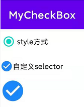
使用style方式
- style="@style/Widget.AppCompat.CompoundButton.RadioButton"
    <CheckBox
        style="@style/Widget.AppCompat.CompoundButton.RadioButton"
        android:layout_width="wrap_content"
        android:layout_height="wrap_content"
        android:text="style方式" />
自定义Selector
- 自定义Selector
selector_check_box.xml
<?xml version="1.0" encoding="utf-8"?>
<selector  xmlns:android="http://schemas.android.com/apk/res/android">
    <item android:drawable="@drawable/selector_check_true" android:state_checked="true"/>
    <item android:drawable="@drawable/selector_check_true" android:state_selected="true"/>
    <item android:drawable="@drawable/selector_check_true" android:state_pressed="true"/>
    <item android:drawable="@drawable/selector_check_false"/>
</selector>
- 隐藏默认的框
android:button="@null"
- 使用自定义的drawable
android:drawableStart="@drawable/selector_check_box"
    <CheckBox
        android:layout_width="wrap_content"
        android:layout_height="wrap_content"
        android:button="@null"
        android:drawableStart="@drawable/selector_check_box"
        android:text="自定义selector" />
如果没有文字把样式可以设置到background
- 设置背景
android:background="@drawable/selector_check_box"
- 隐藏默认框
android:button="@null"
    <CheckBox
        android:layout_width="wrap_content"
        android:layout_height="wrap_content"
        android:background="@drawable/selector_check_box"
        android:button="@null" />