一直以来有用FlexboxLayout, 但是没有对属性进行系统的整理, 现在整理下
主要参看文档
https://juejin.cn/post/6844903697500241928#heading-4
https://github.com/google/flexbox-layout
源码在Gitee上 https://gitee.com/you-zijun/androidlxc/tree/master/app/src/main/java/com/plbear/lxc/module/view
1. 引入
引入最新版本
implementation 'com.google.android:flexbox:2.0.1'
默认的布局文件如下
<?xml version="1.0" encoding="utf-8"?>
<layout>

    <com.google.android.flexbox.FlexboxLayout
    	xmlns:android="http://schemas.android.com/apk/res/android"
        android:layout_width="match_parent"
        android:layout_height="match_parent">
        <TextView
            android:layout_width="wrap_content"
            android:layout_height="wrap_content"
            android:background="#AAD155"
            android:padding="30dp"
            android:text="1"
            android:textSize="20sp" />
        <TextView
            android:layout_width="wrap_content"
            android:layout_height="wrap_content"
            android:background="#DD8BA7"
            android:padding="40dp"
            android:text="2"
            android:textSize="20sp" />
        <TextView
            android:layout_width="wrap_content"
            android:layout_height="wrap_content"
            android:background="#EFB684"
            android:padding="20dp"
            android:text="3"
            android:textSize="20sp" />
        <TextView
            android:layout_width="wrap_content"
            android:layout_height="wrap_content"
            android:background="#B08AE6"
            android:padding="70dp"
            android:text="4"
            android:textSize="20sp" />
    </com.google.android.flexbox.FlexboxLayout>
</layout>
2. FlexboxLayout属性
2.1 flexDirection 主轴方向
用于控制方向, 四个属性
- row效果如下 水平布局, 默认效果

- row_reverse 水平翻转布局, 水平布局, 只不过从右向左

- column 竖直布局

- column_reverse 列反向布局

flexWrap主轴换行
- nowrap 不换行
默认是不换行的, 看下效果

可以看到都挤不下了! - wrap 换行

放不下了之后自动换行 - wrap_reverse “逆向换行”?
这个有点不太好理解, 看下效果

可以看到他会先从底部布局, 然后换行依次向上换行. - 如果我们将row_reverse和wrap_reverse配合使用会如何
<com.google.android.flexbox.FlexboxLayout
    xmlns:android="http://schemas.android.com/apk/res/android"
    xmlns:app="http://schemas.android.com/apk/res-auto"
    android:layout_width="match_parent"
    android:layout_height="match_parent"
    app:flexDirection="row_reverse"
    app:flexWrap="wrap_reverse">
效果如下
2.2 justifyContent 主轴对齐规则
- flex_start 左对齐
- flex_end 右对齐
- center 居中对齐
- space_between 两端对齐, 项目之间的间隔相等
- space_around 平分间隔
- space_evenly 平分间隔, 响度与space_around, 两端的与左右编剧的间隔要大一点
2.2.1 flex_start
默认效果, 左对齐

2.2.2 flex_end 右对齐

2.2.3 center 居中对齐

2.2.4 space_between

2.2.5 space_around

2.2.6 space_evently
可以留意与space_around的区别. 两端据左右编剧的间隔要大一点

2.3 alignItems 各个元素之间的对齐方式
2.3.1 flex_start
默认, start对齐

2.3.2 flex_end
end对齐

2.3.3 center
居中对齐

2.3.4 baseline
baseline与center的区别, 如果熟悉TextView的就很容易理解, 我们将布局文件调整下, 将第一个TextView调整的比较大, 达到多行的目的
<TextView
    android:layout_width="70dp"
    android:layout_height="wrap_content"
    android:background="#AAD155"
    android:paddingVertical="30dp"
    android:text="1232323"
    android:textSize="20sp" />
看下baseline的效果

看下center的效果

以上是多行效果下的区别, 如果用特殊的字母文字, 如泰文, 意大利语等, 应该也可以看出区别, 不再列举
2.3.5 stretch 拉伸
这个好玩了, 将短的都拉伸

2.4 alignContent 副轴的对齐规则
2.4.1 flex_start 顶对齐

2.4.2 flex_end 底对齐

2.4.3 center 居中对齐

2.4.4 span_between 两端对齐

2.4.5 span_around 平分间隔

2.4.6 stretch 拉伸

2.5 showDividerHorizontal和dividerDrawableHorizontal
顾名思义, 这个是定义水平方向的分割图片
我们首先定义一张巨丑的图片
<?xml version="1.0" encoding="utf-8"?>
<shape xmlns:android="http://schemas.android.com/apk/res/android"
    android:shape="rectangle">
    <stroke
        android:width="1dp"
        android:color="#EF2C6E"
        android:dashWidth="10dp"
        android:dashGap="10dp" />
    <solid android:color="#F6EFB1"/>
    <size
        android:width="100dp"
        android:height="100dp" />
</shape>
然后定义水平方向的分割线
<com.google.android.flexbox.FlexboxLayout
    android:layout_width="match_parent"
    android:layout_height="match_parent"
    app:dividerDrawableHorizontal="@drawable/divide"
    app:flexWrap="wrap"
    app:justifyContent="space_around"
    app:showDividerHorizontal="middle">

如果定义
app:showDividerHorizontal="beginning"

2.6 showDividerVertical与dividerDrawableVertical
<com.google.android.flexbox.FlexboxLayout
    android:layout_width="match_parent"
    android:layout_height="match_parent"
    app:dividerDrawableVertical="@drawable/divide"
    app:flexWrap="wrap"
    app:justifyContent="space_around"
    app:showDividerVertical="middle">

如果定义到换个位置
app:showDividerVertical="beginning"

2.7 showDivider与dividerDrawable
<com.google.android.flexbox.FlexboxLayout
    android:layout_width="match_parent"
    android:layout_height="match_parent"
    app:dividerDrawable="@drawable/divide"
    app:flexWrap="wrap"
    app:justifyContent="space_around"
    app:showDivider="middle">

3 子元素属性
3.1 layout_order
手动定义子元素的顺序, 生效的规则是
- 默认所有元素的layout_order的取值是0
- 如果layout_order的值相同, 则按照view的默认添加顺序(或者xml中的定义顺序
- 如果layout_order值不同, 按照layout_order的定义顺序
我们手动调整下第2个控件的顺序, 给到layout_order的值是-1
<TextView
    android:layout_width="wrap_content"
    android:layout_height="wrap_content"
    android:background="#DD8BA7"
    android:padding="40dp"
    android:text="2"
    android:textSize="20sp"
    app:layout_order="-1" />

可以看到View2 被放到了View1的位置
3.2 layout_alignSelf
单独调整对齐方式, 同alignItems的效果
<TextView
    android:layout_width="wrap_content"
    android:layout_height="wrap_content"
    android:background="#DDC98B"
    android:padding="30dp"
    android:text="1"
    android:textSize="20sp"
    app:layout_alignSelf="center" />

3.3 layout_flexGrow
同LinearLayout的weight属性
<TextView
    android:layout_width="wrap_content"
    android:layout_height="wrap_content"
    android:background="#DDC98B"
    android:padding="30dp"
    android:text="1"
    android:textSize="20sp"
    app:layout_flexGrow="1" />

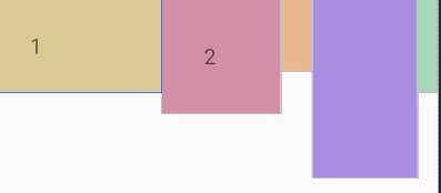
3.4 layout_flexShrink
缩小比例, 当空间不足的时候, 定义缩小的比例. 默认值是1, 值越大, 则缩小的越大
<TextView
    android:layout_width="wrap_content"
    android:layout_height="wrap_content"
    android:background="#DDC98B"
    android:padding="30dp"
    android:text="1"
    android:textSize="20sp"
    app:layout_flexShrink="10" />
可以看到View1被大范围缩小了
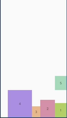
3.5 layout_flexBasisPercent
这个简直就是神器啊. 百分比布局,
<?xml version="1.0" encoding="utf-8"?>
<layout xmlns:android="http://schemas.android.com/apk/res/android"
    xmlns:app="http://schemas.android.com/apk/res-auto">

    <com.google.android.flexbox.FlexboxLayout
        android:layout_width="match_parent"
        android:layout_height="match_parent"
        app:flexWrap="wrap"
        app:showDivider="middle">

        <TextView
            android:layout_width="wrap_content"
            android:layout_height="wrap_content"
            android:background="#DDC98B"
            android:padding="30dp"
            android:text="1"
            android:textSize="20sp"
            app:layout_flexBasisPercent="50%" />

        <TextView
            android:layout_width="wrap_content"
            android:layout_height="wrap_content"
            android:background="#DD8BA7"
            android:padding="40dp"
            android:text="2"
            android:textSize="20sp"
            app:layout_flexBasisPercent="40%" />

        <TextView
            android:layout_width="wrap_content"
            android:layout_height="wrap_content"
            android:background="#EFB684"
            android:padding="20dp"
            android:text="3"
            android:textSize="20sp"
            app:layout_flexBasisPercent="20%" />

        <TextView
            android:layout_width="wrap_content"
            android:layout_height="wrap_content"
            android:background="#B08AE6"
            android:padding="70dp"
            android:text="4"
            android:textSize="20sp" />

        <TextView
            android:layout_width="wrap_content"
            android:layout_height="wrap_content"
            android:background="#96DAB7"
            android:padding="30dp"
            android:text="5"
            android:textSize="20sp" />

    </com.google.android.flexbox.FlexboxLayout>
</layout>

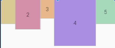
可以看到, 他会手动的划分百分比, 如果一行放不下, 就会自动放到下一行
如果不换行呢? 效果如下