基本形状
- 正方形和矩形
- 圆形和椭圆形
- 圆角矩形
- 线
- 三角形
正方形和矩形
正方形和矩形是最简单的形状,仅使用宽度和高度。
代码:
.square {
  width: 100px;
  height: 100px;
  background-color: black;
}
形成一个黑色正方形,接下来设置背景参数
.rect-wide {
  width: 500px;
  height: 100px;
  background-color: red;
}

.rect-tall {
  width: 100px;
  height: 500px;
  background-color: green;
}
圆形和椭圆形
border-radius: 50%;
一个黑圈:
.circle {
  width: 100px;
  height: 100px;
  background-color: black;
  border-radius: 50%;
}
椭圆形:
.oval-wide {
  width: 200px;
  height: 100px;
  background-color: red;
  border-radius: 50%;
}

.oval-tall {
  width: 100px;
  height: 200px;
  background-color: green;
  border-radius: 50%;
}
圆角矩形
只需一个矩形并设置属性:
border-radius: 50px;
线
你可以给<hr />元素进行样式设置:
hr {
  height: 10px;
  background-color: black;
}
这会使水平线高10像素
对于垂直线,我们可以将.vl类设为:
.vl {
  width: 1px;
  height: 10px; /*调整线条高度*/
  border-right: 1px solid black; /*边框线条属性*/
}
三角形
我们可以用该border属性制作三角形
.triangle {
  width: 0;
  height: 0;
  border-left: 5px solid transparent;
  border-right: 5px solid transparent;
  border-bottom: 5px solid black;
}
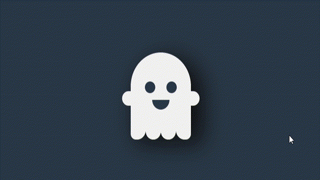
CSS代码:
body {
  margin: 0;
  padding: 0;
  background-color: #2c3a47;
  height: 100vh;
  display: flex;
  align-items: center;
  justify-content: center;
}

.ghost {
  width: 140px;
  height: 160px;
  background-color: #f2f2f2;
  border-radius: 70px 70px 0 0;
  position: relative;
  cursor: pointer;
  animation: floating 2s infinite ease-in-out;
  box-shadow: 20px 20px 50px 10px #121212;
}

@keyframes floating {
  50% {
    transform: translateY(-50px);
  }
}

.face {
  width: 100px;
  position: absolute;
  top: 60px;
  left: calc(50% - 50px);
}

.eyes {
  height: 24px;
  display: flex;
  justify-content: space-around;
  align-items: center;
  margin-bottom: 14px;
}

.eyes span {
  width: 24px;
  height: 24px;
  background-color: #2c3a47;
  border-radius: 50%;
  transition: 0.3s linear;
}

.ghost:hover .eyes span {
  height: 26px;
}

.mouth {
  width: 40px;
  height: 20px;
  background-color: #2c3a47;
  margin: auto;
  border-radius: 0 0 20px 20px;
  transition: 0.3s linear;
}

.ghost:hover .mouth {
  height: 30px;
}

.hands {
  width: 180px;
  position: absolute;
  left: -20px;
  top: 80px;
  display: flex;
  justify-content: space-between;
}

.hands span {
  width: 20px;
  height: 30px;
  background-color: #f2f2f2;
}

.hands span:first-child {
  border-radius: 20px 0 0 20px;
}

.hands span:last-child {
  border-radius: 0 20px 20px 0;
}

.feet {
  position: absolute;
  width: 100%;
  bottom: -20px;
  display: flex;
}

.feet span {
  flex: 1;
  height: 20px;
  background-color: #f2f2f2;
  border-radius: 0 0 20px 20px;
}

.feet span:first-child {
  border-radius: 0 0 20px 12px;
}

.feet span:last-child {
  border-radius: 0 0 12px 20px;
}
html代码:
<div class="ghost">
  <div class="face">
    <div class="eyes"><span></span><span></span></div>
    <div class="mouth"></div>
  </div>

  <div class="hands"><span></span><span></span></div>

  <div class="feet">
    <span></span>
    <span></span>
    <span></span>
    <span></span>
  </div>
</div>
效果展示:

万水千山总是情,点个【三连】行不行