元素的显示与隐藏
display显示(隐藏)
显示与隐藏
- display:none(隐藏)
- display:block(显示)
特点
先隐藏元素 不占位置
<!DOCTYPE html>
<html lang="en">

<head>
    <meta charset="UTF-8">
    <meta name="viewport" content="width=device-width, initial-scale=1.0">
    <title>Document</title>
    <style>
        * {
            margin: 0;
            padding: 0;
        }

        div {
            width: 200px;
            height: 200px;
            margin: 20px 20px;
            background-color: blue;
        }

        .box1 {

            display: none;
        }
    </style>
</head>

<body>
    <div class="box1"></div>
    <div class="box2"></div>
</body>

</html>

visibility(显示与隐藏)
- visibility:hidden(隐藏)
- visibility:visible(显示)
特点
先隐藏元素 占位置
<!DOCTYPE html>
<html lang="en">

<head>
    <meta charset="UTF-8">
    <meta name="viewport" content="width=device-width, initial-scale=1.0">
    <title>Document</title>
    <style>
        * {
            margin: 0;
            padding: 0;

        }

        div {
            width: 200px;
            height: 200px;
            margin: 20px 20px;
            background-color: blue;
        }

        .box1 {
            background-color: yellow;
            /* 设置元素的显示与隐藏 */
            visibility: hidden;
        }
    </style>
</head>

<body>
    <div class="box1"></div>
    <div class="box2"></div>
</body>

</html>

overflow(元素的显示与隐藏)
- overflow:visible 既不裁切内容也不显示滚动条
- overflow:hidden 超过内容则被剪裁掉
- overflow:scroll 总是显示滚动条
- overflow:auto 超出显示滚动条 不超出则不显示滚动条
<!DOCTYPE html>
<html lang="en">

<head>
    <meta charset="UTF-8">
    <meta name="viewport" content="width=device-width, initial-scale=1.0">
    <title>Document</title>
    <style>
        * {
            margin: 0;
            padding: 0;
        }

        .box {
            width: 400PX;
            height: 200PX;
            border: 1px solid red;
            /* 超出部分则自动剪裁 其它属性值请看说明  */
            overflow: hidden;
        }
    </style>
</head>

<body>
    <div class="box">
        缓慢地升起后小心地将树苗移向事先挖好的树坑里,随后两个工人把树苗扶正,另外一名工人挥锹填土。移栽、扶苗、填土、围堰、浇水,一个上午的时间,工人们共栽下国槐、西府海棠等树苗50余株。 据门头沟区城市管 理委员会相关负责人介绍,本次景观提升工程主要对S1线门头沟段沿线,设计总绿化面积约11万平方米,主要选择国槐、法桐、油松、西府海棠、紫薇、山桃、金叶女贞等植物,打造三季有花、四季有景的景观效果。 缓慢地升起后小心地将树苗移向事先挖好的树坑里,随后两个工人把树苗扶正,另外一名工人挥锹填土。移栽、扶苗、填土、围堰、浇水,一个上午的时间,工人们共栽下国槐、西府海棠等树苗50余株。
        据门头沟区城市管 理委员会相关负责人介绍,本次景观提升工程主要对S1线门头沟段沿线,设计总绿化面积约11万平方米,主要选择国槐、法桐、油松、西府海棠、紫薇、山桃、金叶女贞等植物,打造三季有花、四季有景的景观效果。

    </div>
</body>

</html>

显示与隐藏内容总结

显示与隐藏案例
分析:盒子里面原本有一个半透明的遮罩,设置隐藏,当鼠标经过a时显示。在特殊情况下,a链接可以放div标签
<!DOCTYPE html>
<html>

<head>
    <meta charset="utf-8">
    <title></title>
    <style>
        .box {
            position: relative;
            width: 222px;
            height: 220px;
            margin: auto;
            border: 1px solid red;
        }

        .box a {
            display: block;
        }

        .box img {
            width: 100%;
        }

        .box .mask {
            display: none;
            position: absolute;
            width: 222px;
            height: 220px;
            background: rgba(0, 0, 0, 0.3) url(img/arr.png) no-repeat center center;
        }

        .box a:hover .mask {
            display: block;
        }
    </style>
</head>

<body>
    <div class="box">
        <a href="">
            <!-- 遮罩层 -->
            <div class="mask"></div>
            <img src="./img/3.jpg" alt="">
        </a>
    </div>
</body>

</html>

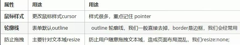
CSS用户界面样式
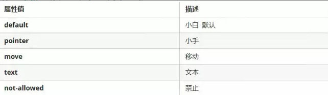
鼠标样式
<!DOCTYPE html>
<html>

<head>
    <meta charset="utf-8">
    <title></title>
    <style>
        * {
            margin: 0;
            padding: 0;
        }

        li {
            width: 200px;
            height: 200px;
            margin: 20px auto;
            list-style: none;
            line-height: 200px;
            text-align: center;
            font-weight: bold;
            color: white;
            background-color: #0000FF;
        }

        li:nth-child(1) {
            cursor: default;
        }

        li:nth-child(2) {
            cursor: pointer;
        }

        li:nth-child(3) {
            cursor: move;
        }

        li:nth-child(4) {
            cursor: text;
        }

        li:nth-child(5) {
            cursor: not-allowed;
        }
    </style>
</head>

<body>
    <ul>
        <li>默认的鼠标状态</li>
        <li>小手状态</li>
        <li>移动状态</li>
        <li>文本状态</li>
        <li>禁止状态</li>

    </ul>
</body>

</html>

轮廓线
在真正的实际开发中,轮廓线是直接去掉的
扫描二维码关注公众号,回复: 12939774 查看本文章
outline:none
<!DOCTYPE html>
<html>

<head>
    <meta charset="utf-8">
    <title></title>
    <style>
        * {
            margin: 0;
            padding: 0;
        }

        input {
            outline: none;
        }
    </style>
</head>

<body>
    账号:<input type="text">
</body>

</html>

防止文本域拖拽
resize:none
<!DOCTYPE html>
<html>
    <head>
        <meta charset="utf-8">
        <title></title>
        <style>
            * {
                margin: 0;
                paddding: 0;
            }

            textarea {
                width: 200px;
                height: 200px;
                outline: 0;
                resize: none;
            }
        </style>
    </head>
    <body>
        <h2>留言板</h2>
        <textarea rows="" cols="">

        </textarea>
    </body>
</html>

用户界面样式总结
垂直居中
注意只针对行内元素和行内块元素生效
vertical-align:top(顶线) middle(中线) baseline(基线) bottom(底线)
<!DOCTYPE html>
<html>
    <head>
        <meta charset="utf-8">
        <title></title>
        <style>
            img {
                vertical-align: middle;
            }

        </style>
    </head>
    <body>

        <img src="../CSS(4)/6.导航栏案例/image/button2.jpg" alt="" > hello word
    </body>
</html>

去除图片缝隙的两种方法
- 使用vertivcal-align的属性只要不是baseline便可以
- 使用display:block也可以解决这个问题
<!DOCTYPE html>
<html>

<head>
    <meta charset="utf-8">
    <title></title>
    <style>
        * {
            margin: 0;
            padding: 0;
        }

        .box {
            border: 1px solid red;
        }

        img {
            height: 600px;
            /* 去除图片底部缝隙的第一种方法 */
            /* vertical-align: bottom; */
            /* 去除图片底部缝隙的第二种方法 */
            display: block;
        }
    </style>
</head>

<body>
    <div class="box">
        <img src="./img/timg.jpg" alt="">
    </div>
</body>

</html>

文字省略方式
white-space:nowrap 强制一行显示 默认属性值为normal
overflow:hidden 隐藏元素
text-overflow:ellipsis文字溢出 默认属性值为ellipsis
注意:三个步骤一个也不能少
<!DOCTYPE html>
<html>

<head>
    <meta charset="utf-8">
    <title></title>
    <style>
        .box {
            width: 200px;
            height: 20px;
            border: 1px solid #ccc;
            white-space: nowrap;
            overflow: hidden;
            text-overflow: ellipsis;
        }
    </style>
</head>

<body>
    <div class="box">hello 我的名字叫做尧子陌 很高兴认识各位哦</div>
</body>

</html>

精灵技术
精灵图的优点
减轻了服务器请求和接受的次数 ,提高页面的加载速度
如何制作自己的精灵图呢
精确的测量每张背景图的大小和位置
给盒子设置宽高时,位置通常为负值
精灵图案例
拼出自己的名字

<!DOCTYPE html>
<html>

<head>
    <meta charset="utf-8">
    <title></title>
    <style>
        * {
            margin: 0;
            padding: 0;
        }

        div {
            float: left;
            background: url(img/name.jpg) no-repeat;
        }

        .box1 {
            width: 116px;
            height: 106px;
            background-position: -365px -557px;
        }

        .box2 {
            width: 110px;
            height: 110px;
            background-position: 0px -9px;
        }

        .box3 {
            width: 108px;
            height: 108px;
            background-position: -370px -280px;
        }
    </style>
</head>

<body>
    <div class="box1"></div>
    <div class="box2"></div>
    <div class="box3"></div>
</body>

</html>

制作自己的精灵图
每个精灵图之间要摆放整齐 且分辨率为72pt 背景设为透明并且格式要为png格式

滑动门技术
为了使各种特殊形状的背景能够适应文本内容的多少 便出现了滑动门技术
核心技术:利用css精灵和padding内边距
注意的几点
- a负责左侧-景 span负责右侧背景 有padding撑开合适宽度
- a包含着span 因为整个导航栏都是链接
<!DOCTYPE html>
<html>

<head>
    <meta charset="utf-8">
    <title></title>
    <style>
        * {
            margin: 0;
            padding: 0;
        }

        a {
            display: inline-block;
            height: 33px;
            line-height: 33px;
            padding-left: 15px;
            color: white;
            text-decoration: none;
            background: url(img/ao.png) no-repeat left center;
        }

        a span {
            display: inline-block;
            height: 33px;
            background: url(img/ao.png) no-repeat right center;
            padding-right: 15px;
        }
    </style>
</head>

<body>
    <a href="#">
        <span>首页 </span>
    </a>

</body>

</html>

微信导航栏案例
注意:用到滑动门技术
<!DOCTYPE html>
<html lang="en">

<head>
    <meta charset="UTF-8">
    <meta name="viewport" content="width=device-width, initial-scale=1.0">
    <title>Document</title>
    <style>
        * {
            margin: 0;
            padding: 0;
        }

        body {
            background: url(./img/wx.jpg) repeat-x;
        }

        .nav {
            margin-top: 20px;
        }

        .nav li {
            list-style: none;
            float: left;
            margin: 0px 20px;
        }

        .nav a {
            display: inline-block;
            height: 33px;
            color: white;
            line-height: 33px;
            padding-left: 15px;
            background: url(./img/to.png) no-repeat left;
        }

        .nav a span {
            display: inline-block;
            height: 33px;
            padding-right: 15px;
            background: url(./img/to.png) no-repeat right;
        }

        .nav a:hover {
            background-image: url(./img/ao.png);
        }

        .nav a:hover span {
            background-image: url(./img/ao.png);
        }
    </style>
</head>

<body>
    <div class="nav">
        <ul>
            <li>
                <a href="#">
                    <span>首页</span>
                </a>
            </li>
            <li>
                <a href="#">
                    <span>帮助与反馈</span>
                </a>
            </li>
            <li>
                <a href="#">
                    <span>公众平台</span>
                </a>
            </li>
            <li>
                <a href="#">
                    <span>首页</span>
                </a>
            </li>
        </ul>
    </div>
</body>

</html>

margin负值之美
<!DOCTYPE html>
<html>

<head>
    <meta charset="utf-8">
    <title></title>
    <style>
        * {
            margin: 0;
            padding: 0;
        }

        div {
            float: left;
            height: 400px;
            width: 400px;
            border: 1px solid red;
            /* 利用margin负值可以合并边框 */
            margin-left: -1px;
            margin-top: -1px;
        }
    </style>
</head>

<body>
    <div></div>
    <div></div>
    <div></div>
    <div></div>
    <div></div>
    <div></div>
    <div></div>
    <div></div>
</body>

</html>

margin负值可以突出显示某个盒子之美
- 定位可以将盒子提升到最高处
- 通过z-index可以显示margin负值的盒子

CSS三角之美
案例
步骤如下
宽高全为0 需要的三角形要保留颜色,不需要的三角形可以颜色设为透明即可
照顾兼容性,line-height:0 font-size:0
<!DOCTYPE html>
<html>
    <head>
        <meta charset="utf-8">
        <title></title>
        <style>
            div {
                width: 0;
                height: 0;
                border: 10px solid transparent;
                border-left: 10px solid #000000;
                /* 照顾兼容性 */
                line-height: 0;
                font-size: 0;
            }
        </style>
    </head>
    <body>
        <div></div>
    </body>
</html>

三角形案例
<!DOCTYPE html>
<html>

<head>
    <meta charset="utf-8">
    <title></title>
    <style>
        div {
            position: relative;
            width: 600px;
            height: 600px;
            background-color: #0000FF;
            margin: 200px auto;
        }

        p {
            position: absolute;
            left: 50%;
            /* 两个三角的距离的一半 所以-50px */
            margin-left: -50px;
            /* 两个三角的距离 所以-100px */
            margin-top: -100px;
            width: 0px;
            height: 0px;
            border: 50px solid transparent;
            border-bottom: 50px solid black;
        }
    </style>
</head>

<body>
    <div>
        <p></p>
    </div>
</body>

</html>
