效果图~~

早期关注的小伙伴,应该还记得我写过很多关于seaborn和matplotlib 的文章,没看过的可以去翻翻:
今天的主角cufflinks是plotly的高级封装版本,就如同seaborn和matplotlib的关系,可以非常简单的可视化pandas的DataFrame类型数据。
目录
1、cufflinks简介
-
cufflinks安装
pip install cufflinks -i https://pypi.tuna.tsinghua.edu.cn/simple #国内源加速安装-
cufflinks支持的图形
cf.help()Use 'cufflinks.help(figure)' to see the list of available parameters for the given figure. Use 'DataFrame.iplot(kind=figure)' to plot the respective figure Figures: bar box bubble bubble3d candle choroplet distplot heatmap histogram ohlc pie ratio scatter scatter3d scattergeo spread surface violin
-
查看某一类图的详细参数
例如bar图
cf.help('bar')BAR Bar Chart Supports categories and horizontal bar charts Parameters: =========== bargap : float Sets the gap between bars [0,1) bargroupgap : float Sets the gap between groups [0,1) barmode : string Bar mode group stack overlay categories : string Name of the column that contains the categories orientation : string Sets the orientation of the bars. h v sortbars : bool Sort bars in descending order colors : dict, list or string Trace color string : applies to all traces list : applies to each trace in the order specified dict : {column:value} for each column in the dataframe values colorname : see cufflinks.colors.cnames hex : '#ffffff' rgb : 'rgb(23,50,23)' rgba : 'rgba(23,50,23,.5) colorscale : string Color scale name If the color is preceded by a minus (-) then the scale is inversed. Only valid if 'colors' is null. see cufflinks.colors.scales() for all available scales data : figure Plotly Figure rangeslider : bool or dict Defines if a range slider is displayed. If True : displays a range slider If dict : defines a range slider object Example: {'bgcolor':('blue',.3),'autorange':True} text : string Name of the column that contains the text values width : int, list or dict Line width int : applies to all traces list : applies to each trace in the order specified dict : {column:value} for each column in the dataframe ERROR BARS error_color : string Color for error bars error_opacity : float [0,1] Color opacity for the error bars error_thickness : float Sets the line thickness of the error bars error_trace : string Name of the DataFrame column for which error should be plotted. If omitted then errors apply to all traces. error_type : string Type of error bars data constant percent sqrt continuous continuous_percent error_values_minus : int, float or list Values corresponding to the span of the error bars below the trace coordinate error_width : int or float Sets the width (in pixels) of the cross-bar at both ends of the error bars error_x : int, float or list Error values for the x axis error_y : int, float or list Error values for the y axis LAYOUT layout : Plotly Layout If defined, this Layout is explicitly used for the Figure generation dimensions : tuple Dimensions for image/chart (width,height) fontfamily : string HTML Font typeface that will be applied It needs to exist on the system on which it operates. Examples: 'Times New Roman' 'Open Sans' 'Monospace' gridcolor : string Sets the grid color colorname : see cufflinks.colors.cnames hex : '#ffffff' rgb : 'rgb(23,50,23)' rgba : 'rgba(23,50,23,.5) legend : string Defines where the legend should appear Values: bottom top margin : dict or tuple Sets the margin dimensions {'l':left,'r':right,'b':bottom,'t':top} (left,right,bottom,top) secondary_y : string Name of the column(s) to be charted on the secondary axis secondary_y_title : string Sets the title of the secondary axis showlegend : bool Defines if the legend should appear theme : string Layout theme solar pearl white see cufflinks.getThemes() for all available themes title : string Chart title xTitle : string X Axis Title yTitle : string Y Axis Title zerolinecolor : string Sets the zero line color colorname : see cufflinks.colors.cnames hex : '#ffffff' rgb : 'rgb(23,50,23)' rgba : 'rgba(23,50,23,.5) layout_update : dict The Layout will be explicitly modified with the values stated in the dictionary. Not valid when Layout is passed as a parameter ANNOTATIONS annotations : dict Dictionary of annotations {x_point : text} fontcolor : string Text color fontsize : int Text size textangle : int Text angle EXPORTS asFigure : bool If True then it returns a Plotly Figure asImage : bool If True then it returns an image (PNG) While in ONLINE mode: Image file is saved in the working directory Accepts: filename dimensions scale display_image While in OFFLINE mode: Image file is downloaded (downloads folder) and a regular plotly chart is displayed in Jupyter Accepts: filename dimensions asPlot : bool If True then the chart opens in a browser asURL : bool If True the chart url/path is returned. No chart is displayed. If ONLINE : The URL is returned If OFFLINE : the local path is returned display_image : bool If True, then the image is displayed after being saved. Only valid if 'asImage=True' filename : string Filename to be saved as online : bool If True then the chart/image is rendered on the server even when running in Offline mode scale : int Increase the resolution of the image by `scale` amount Only valid if 'asImage=True' sharing : string Sets the sharing level permission public - anyone can see the chart private - only you can see this chart secret - only people with the link can see the chart SHAPES hline : float, list or dict Draws a horizontal line at the indicated 'y' position(s). Extra parameters can be passed in the form of a dictionary (see 'shapes') hline=4 hline=[2,10] hline=[{'y':2,'color':'blue'},{'y':3,'color':'red'}] hspan : tuple, list or dict Draws a horizontal rectangle at the indicated (y0,y1) positions. Extra parameters can be passed in the form of a dictionary (see 'shapes') hspan=(1,5) hspan=[(1,4),(6,10)] hspan=[{'y0':2,'y1':5,'color':'blue','fill':True,'opacity':.4}] vline : float, list or dict Draws a vertical line at the indicated 'x' position(s). Extra parameters can be passed in the form of a dictionary (see 'shapes') vline=4 vline=[2,10] vline=[{'x':'2015-02-08','color':'blue'},{'x':'2015-03-08','color':'red'}] vspan : tuple, list or dict Draws a vertical rectangle at the indicated (x0,x1) positions. Extra parameters can be passed in the form of a dictionary (see 'shapes') vspan=('2015-02-08','2015-03-08') vspan=[(1,4),(6,10)] vspan=[{'x0':2,'x1':5,'color':'blue','fill':True,'opacity':.4}] shapes : list or dict List of dictionaries with the specification of a given shape. For more information see help(cufflinks.tools.get_shape) SUBPLOTS horizontal_spacing : float [0-1] Space between subplot columns shape : (int,int) Indicates the size of rows and columns. If ommitted, then the shape is automatically set * Only valid if subplots=True (rows,columns) shared_xaxes : bool If True, subplots in the same grid column have one common shared x-axis at the bottom of the grid. shared_yaxes : bool If True, subplots in the same grid row have one common shared y-axis at the left of the grid. subplot_titles : bool If True, chart titles are displayed at the top of each subplot. subplots : bool If True then each trace is placed in a subplot vertical_spacing : float [0-1] Space between subplot rows AXIS logx : bool Sets the x axis to be of logarithmic scale logy : bool Sets the y axis to be of logarithmic scale logz : bool Sets the z axis to be of logarithmic scale xrange : tuple Sets the range for the x axis (lower_bound,upper_bound) yrange : tuple Sets the range for the y axis (lower_bound,upper_bound) EXAMPLES >> cf.datagen.bars(10,5).iplot(kind='bar') >> cf.datagen.bars().iplot(kind='bar',orientation='h')
-
cufflinks 7类绘图风格
cf.getThemes() ['ggplot', 'pearl', 'solar', 'space', 'white', 'polar', 'henanigans']-
cufflinks颜色设置
通过colorscale参数修改调色盘;
通过colors传递色号,支持三类色号:
HEX "#db4052"
RGB "rgb(219, 64, 82)"
RGBA "rgba(219, 64, 82, 1.0)"
#支持的调色盘
cf.colors.scales()


导入依赖,标准设置
import cufflinks as cf
import pandas as pd
import numpy as np

%reload_ext autoreload
%autoreload 2
cf.set_config_file(world_readable=True,theme='henanigans',offline=False)#theme设置绘图风格,offline设置为true
2、cufflinks快速上手
cufflinks有一个很强大的函数iplot,可以很容易的将Pandas的可视化方法(见上篇)与Plotly 及Cufflinks的绘图方法结合起来。
#还是使用iris数据集
import seaborn as sns
pd_iris = sns.load_dataset("iris")
pd_iris.head(n=5)
一个例子说明iplot的强大之处:
#Pandas可视化方法
pd_iris.head(n=5).plot(kind='bar')
#iplot结合pandas可视化方法与ploty方法
pd_iris.head(n=5).iplot(kind='bar',colorscale='set1')
-
分面柱状图
#subplots绘制分面图
pd_iris.head(n=5).iplot(kind='bar',colorscale='set1',subplots=True)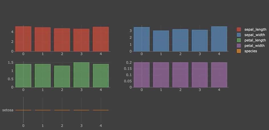
-
堆积柱状图
pd_iris.head(n=5).iplot(kind='bar',colorscale='set1',barmode='stack')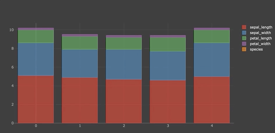
-
水平柱状图
pd_iris.head(n=5).iplot(kind='barh',colorscale='set1',barmode='stack')
-
箱图
df = pd.DataFrame(np.random.rand(10, 5), columns=['A', 'B', 'C', 'D', 'E'])
df.iplot(kind='box',colorscale='set1')
-
矩阵图
pd.DataFrame(np.random.randn(1000, 4), columns=['a', 'b', 'c', 'd']).scatter_matrix()
-
气泡图
pd_iris.iplot(kind='bubble',x='sepal_length',y='sepal_width',size='petal_length')
-
折线图
pd_iris.iplot(title='Cufflinks - Line Chart',colorscale='set1')
-
分面折线图
pd_iris.iplot(subplots=True,shape=(5,1),shared_xaxes=True,vertical_spacing=.02,fill=True)
-
填充折线图
pd_iris.iplot(title='Cufflinks - Filled Line Chart',colorscale='set1',fill=True)
-
折线图拟合线
pd_iris['sepal_length'].iplot(title='Cufflinks - Besfit Line Chart',
                         filename='Cufflinks - Bestfit Line Chart',bestfit=True,colors=['blue'],
                         bestfit_colors=['pink'])
-
散点图
pd_iris['sepal_length'].iplot(kind='scatter',mode='markers',size=10,symbol='bowtie-open',colorscale='set1',title='Cufflinks - Scatter Chart')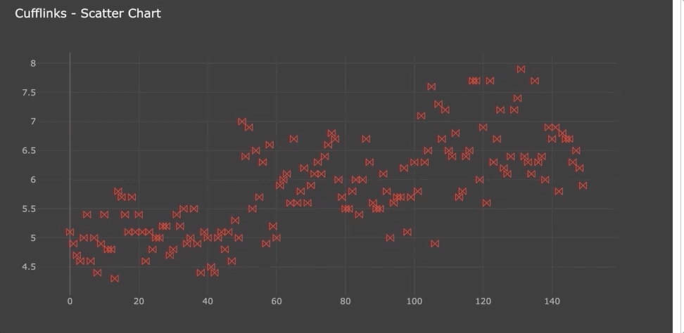
-
spread图
pd_iris.iplot(kind='spread',title='Cufflinks - Spread Chart')
-
histogram图
pd_iris.iplot(kind='histogram',opacity=.75,title='Cufflinks - Histogram',colorscale='set1')
-
3d图
pd_iris.iplot(kind='scatter3d',x='sepal_length',y='petal_length',z='sepal_width',size=15,categories='species',text='petal_width',
                             title='Cufflinks - Scatter 3D Chart',colors=['blue','pink','green'],width=0.5,margin=(0,0,0,0),
                             opacity=1)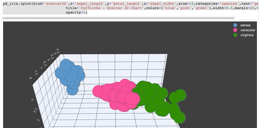
-
参考资料