文章目录
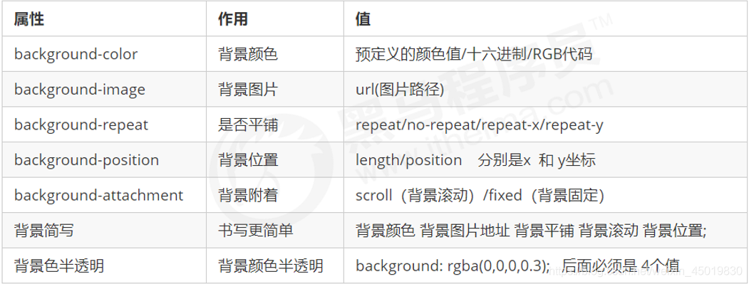
背景颜色background-color
background-color:颜色值;
一般情况下元素背景颜色默认值是 transparent(透明),我们也可以手动指定背景颜色为透明色。
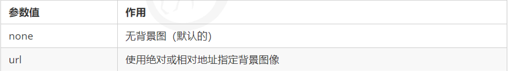
背景图像background-image
background-image 属性描述了元素的背景图像。实际开发常见于 logo 或者一些装饰性的小图片或者是超 大的背景图片, 优点是非常便于控制位置. (精灵图也是一种运用场景)
background-image : none | url (url)
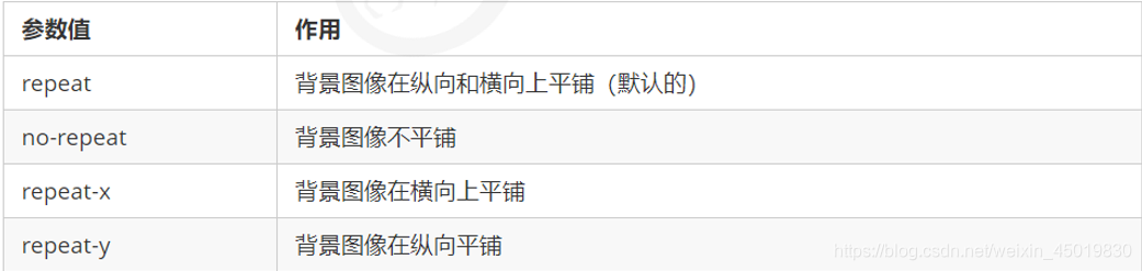
背景平铺background-repeat
background-repeat: repeat | no-repeat | repeat-x | repeat-y
背景位置background-position
利用 background-position 属性可以改变图片在背景中的位置。
background-position: x y;
参数代表的意思是:x 坐标和 y 坐标。 可以使用 方位名词 或者 精确单位
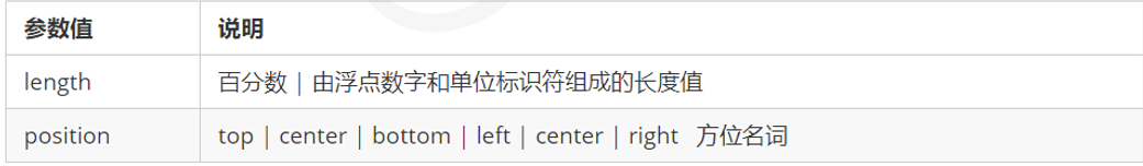
- 参数是方位名词
- 如果指定的两个值都是方位名词,则两个值前后顺序无关,比如 left top 和 top left 效果一致
- 如果只指定了一个方位名词,另一个值省略,则第二个值默认居中对齐
- 参数是精确单位
- 如果参数值是精确坐标,那么第一个肯定是 x 坐标,第二个一定是 y 坐标
- 如果只指定一个数值,那该数值一定是 x 坐标,另一个默认垂直居中
- 参数是混合单位
- 如果指定的两个值是精确单位和方位名词混合使用,则第一个值是 x 坐标,第二个值是 y 坐标
案例一
打开王者荣耀首页,用背景图片画出“成长守护平台”

<!DOCTYPE html>
<html lang="en">

<head>
    <meta charset="UTF-8">
    <meta name="viewport" content="width=device-width, initial-scale=1.0">
    <title>Document</title>
</head>
<style>
    h3 {


        font-size: 14px;
        line-height: 40px;
        width: 150px;
        height: 40px;
        text-indent: 4em;
        background-image: url(image.png);
        background-repeat: no-repeat;
        background-position: left center;
    }
</style>

<body>
    <h3>成长守护平台</h3>
</body>

</html>
效果:
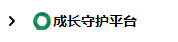
这里由于从源码里面爬出来的图片有点迷,所以emmm可能和界面上的不太一样
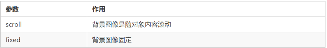
背景附着background-attachment
background-attachment 属性设置背景图像是否固定或者随着页面的其余部分滚动。
background-attachment 后期可以制作视差滚动的效果。
背景复合写法
为了简化背景属性的代码,我们可以将这些属性合并简写在同一个属性 background 中。从而节约代码量.
当使用简写属性时,没有特定的书写顺序,一般习惯约定顺序为:
background: 背景颜色 背景图片地址 背景平铺 背景图像滚动 背景图片位置;
background: transparent url(image.jpg) repeat-y fixed top ;
背景色半透明
background: rgba(0, 0, 0, 0.3);
- 最后一个参数是 alpha 透明度,取值范围在 0~1之间
- 我们习惯把 0.3 的 0 省略掉,写为 background: rgba(0, 0, 0, .3);
- 注意:背景半透明是指盒子背景半透明,盒子里面的内容不受影响
- CSS3 新增属性,是 IE9+ 版本浏览器才支持的
- 但是现在实际开发,我们不太关注兼容性写法了,可以放心使用
总结
背景图片:实际开发常见于 logo 或者一些装饰性的小图片或者是超大的背景图片, 优点是非常便于控制位置. (精灵图也是一种运用场景)
案例二——五彩导航栏
目标:
当鼠标点击时,导航栏还会变颜色

步骤:
1.由于这里是链接a,属于行内元素,但是明显这里要调整大小,又是排在一行,所以要用display:inline-block
2. 里面文字需要水平居中(text-align)和垂直居中(设置行高). 因此需要单行文字垂直居中的代码.
3. 链接里面需要设置背景图片.因此需要用到背景的相关属性设置.
4. 鼠标经过变化背景图片,因此需要用到链接伪类选择器.
这里偷懒,制作了第一个:
<!DOCTYPE html>
<html lang="en">
<head>
    <meta charset="UTF-8">
    <meta name="viewport" content="width=device-width, initial-scale=1.0">
    <title>Document</title>
</head>
<style>
    .nav a{


        display: inline-block;
        width: 120px;
        height: 58px;
        background-color: pink;
        text-align: center;
        line-height: 50px;
        text-decoration: none;
        color: white;
    }
    .nav .pic1{


        background: url(picture1.png) no-repeat;
    }

    .nav .pic1:hover{


        background: url(picture2.png) no-repeat;
    }
</style>
<body>
    <div class="nav">
        <a href="#" class="pic1">彩色导航</a>
        <a href="#">彩色导航</a>
        <a href="#">彩色导航</a>
        <a href="#">彩色导航</a>
        <a href="#">彩色导航</a>
    </div>
</body>
</html>
效果:
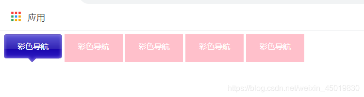
鼠标放置在导航栏上方时会变色(无奈无法截图)