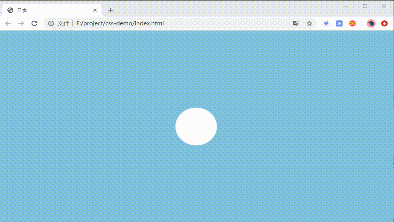
效果
源码
<!DOCTYPE html>
<html lang="en">
<head>
    <meta charset="UTF-8">
    <meta name="viewport" content="width=device-width, initial-scale=1.0">
    <title>日食</title>
    <style>
        *{


            margin: 0;
            padding: 0;
        }
        body{


            background-color: skyblue;
            animation: bgChange 5s linear infinite;
        }
        .eclipse{


            position: absolute;
            top:0;
            left:0;
            bottom: 0;
            right: 0;
            width: 100px;
            height: 100px;
            border-radius: 100%;
            margin:auto;
        }
        .eclipse-after{


            animation: eclipse 5s linear infinite;
        }
        .eclipse-before{


            background: #fff;
            animation: shadow 5s linear infinite;
        }

        @keyframes bgChange{


            0%,100%{


                background: skyblue;
            }
            45%,60%{


                background:#282c34;
            }
        }

        @keyframes shadow{


            50%{


                box-shadow: 0 0 10px 5px #fff;
            }
        }
        @keyframes eclipse{


            0%{


                left:300px;
                background-color: skyblue;
            }
            45%,60%{


                left:0;
                background: #282c34;
            }
            100%{


                left:-300px;
                background: skyblue;
            }
        }
    </style>
</head>
<body>
    <div class="eclipse eclipse-before"></div>
    <div class="eclipse eclipse-after"></div>
</body>
</html>