1.拿到设计稿,先确认整个项目的流程,确认项目步骤;
2.确定是用原生JS/JQ/VUE框架/UNIPP等;
3.建立rem.js文件夹控制转换px;
3.1说到rem自然就会想到em,我们知道em是相对于父元素的字体大小的单位,那么rem则是相对于根元素也就是元素的字体大小的单位。
3.1.1有时我们会看到有些使用rem的页面里会先给页面根元素一个样式:
html {font-size: 62.5%; /10 ÷ 16 × 100% = 62.5%/}
:以上是未引入js的转换时的font-size设定
3.1.2大多数浏览器的默认字号是16px,因此1rem=16px,这样不方便我们px和rem的换算,假设1rem=10px,那么100px=10rem,25px=0.25rem。这样就好换算很多,于是就有了上面的10/16。
:以上是未引入js的转换时的font-size设定
3.2.如果是640的设计稿,需要除以2转化为和iphone5屏幕等宽的320。所以设计稿px单位/2/10转为rem。之后再媒体查询设置每个屏幕大小的font-size百分比,页面会根据上面设置的根font-size适配。
最好用的自己写的一个rem.js和media查询一起使用,发现很好用,能适用所有移动端h5页面的自适应需求:
media媒体查询是看屏幕分辨率:根据设计稿来制定:320/640/750…
1.例子:375设计稿、16px字体、
@media only screen and (min-width: 320px) {
 html {
  font-size: 13.65px !important;
 }
}

@media only screen and (min-width: 360px) {
 html {
  font-size: 15.36px !important;
 }
}

@media only screen and (min-width: 375px) {
 html {
  font-size: 16px !important;
 }
}

@media only screen and (min-width: 390px) {
 html {
  font-size: 16.64px !important;
 }
}

@media only screen and (min-width: 414px) {
 html {
  font-size: 17.664px !important;
 }
}

@media screen and (min-width: 640px) {
 html {
  font-size: 27.31px !important;
 }
}
rem是px转换rem:
如果是640的设计稿:换算例子:100px = 1rem . 1px = 0.01rem需要除以2转化为和iphone5屏幕等宽的320。
rem.js(例子是375设计稿)
(function(doc, win) {
    var docEl = doc.documentElement,
        resizeEvt = 'orientationchange' in window ? 'orientationchange' : 'resize',
        recalc = function() {
            var clientWidth = docEl.clientWidth;
            if (!clientWidth) return;
            if(clientWidth>=375){//1.根据设计稿来填写/*例如:640/750.....*,2.高度自适应不用写固定的高度,如果有要求也可以写/
              docEl.style.fontSize = '100px'
            }else{
              docEl.style.fontSize = 100 * (clientWidth / 375) + 'px';
            }

        };
    if (!doc.addEventListener) return;
    win.addEventListener(resizeEvt, recalc, false);
    doc.addEventListener('DOMContentLoaded', recalc, false);
})(document, window);
一个简单的小案例:
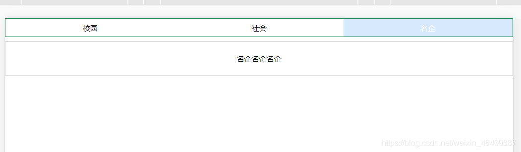
描述:通过导航按钮跳转当前对应的页面
实现效果:
代码如下:
A.html
<!DOCTYPE html>
<html lang="en">
<head>
<meta charset="UTF-8">
<meta name="viewport" content="width=device-width, initial-scale=1.0">
<title>Document</title>
</head>
<body>
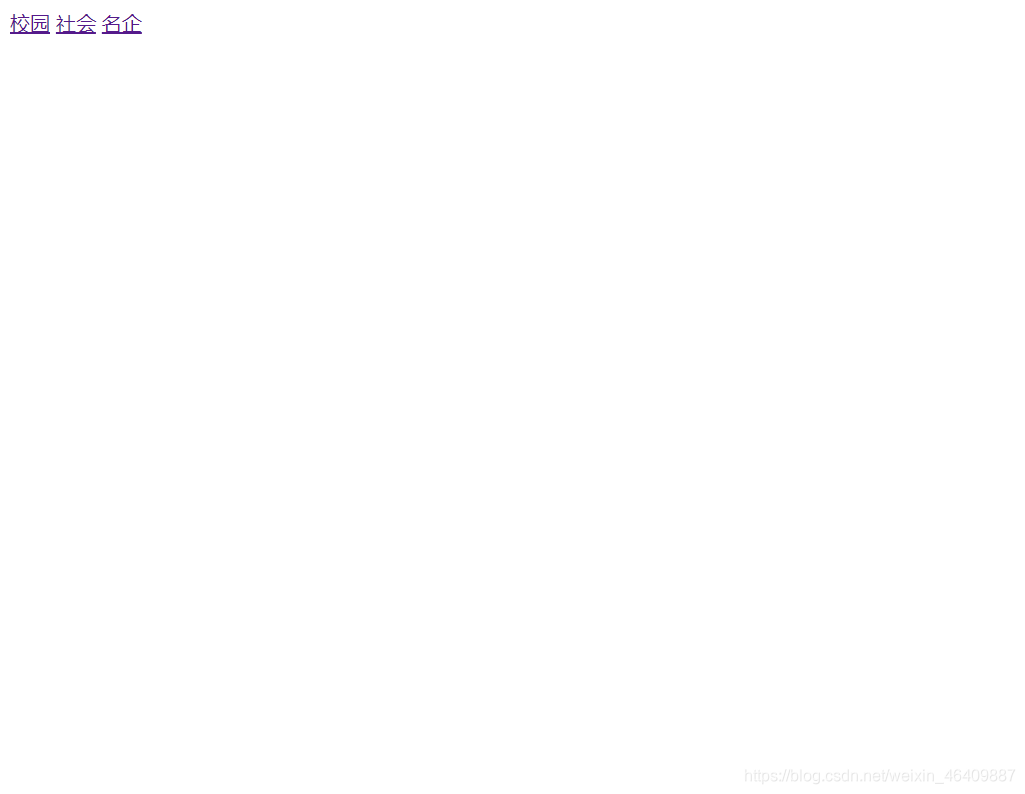
<a href="B.html?type=1">校园</a>
<a href="B.html?type=2">社会</a>
<a href="B.html?type=3">名企</a>
</body>
</html>
B.html
<!DOCTYPE html>
<html lang="en">
<head>
  <meta charset="UTF-8">
  <!-- 不允许缩放就不要放置minimum-scale=1.0,maximum-scale=1.0 -->
  <!-- 设备宽度等于浏览器宽度 不允许缩放 铺满整屏幕 -->
  <!-- 设备像素比/物理像素/css像素 -->
  <meta name="viewport" content="width=device-width,user-scalable=no,initial-scale=1"/>
  <!-- 让文档永远都是最新的 -->
  <meta http-equiv="X-UA-Compatible" content="IE=edge">
  <!-- 可以让用户缩放的metdia -->
  <!-- <meta name="viewport" content="width=device-width,initial-scale=1.0,minimum-scale=1.0,maximum-scale=1.0,user-scalable=no"/>   -->
  <!-- 解决pc运行在手机端的分辨率 -->
  <!-- <meta name="viewport" content="width=device-width,user-scalable=yes,initial-scale=0.3,maximum-scale=1.0,minnimum-scale=0.3">  -->
  <title>移动端页面</title>
  <style>
* {
        margin: 0;
        padding: 0;
        list-style: none;
        box-sizing:border-box;
}
body,html{height:100%;}
/* 移动端默认样式清除 */
body *{
 -webkit-text-size-adjust: 100%;/*横竖屏字体变化*/
 -webkit-user-select: none;/*去除用户选中*/
}
a,input,button{/*按下阴影*/
-webkit-tap-highlight-color: raba(0,0,0,0);
}
input,button{
    border:none;
    -moz-appearance: none;
    -webkit-appearance: none;/*解决ios上按钮的圆角问题*/
    border-radius: 0;/*解决ios上输入框圆角问题*/
    outline: medium;/*去掉鼠标点击的默认黄色边框*/
    background-color:transparent;/*透明色*/

}
html,body,ul,li,ol,dl,dd,dt,p,h1,h2,h3,h4,h5,h6,form,fieldset,legend,img,input,figure,figcaption{margin:0;padding:0;}
section,article,aside,header,footer,main,nav,hgroup{display:block;}
a,u{text-decoration:none;}
em,i{font-style:normal;}
b,strong{font-weight:normal;}
ul,ol,li{list-style:none;}
h1,h2,h3,h4,h5,h6{font-size:16px;font-weight:normal;}
body{font-family: "微软雅黑"}
input{outline:none;}
img{border:0;display:block;}
/* 媒体查询分辨率设定 */
 @media only screen and (min-width: 320px) {
 html {
  font-size: 13.65px !important;
 }
}

@media only screen and (min-width: 360px) {
 html {
  font-size: 15.36px !important;
 }
}

@media only screen and (min-width: 375px) {
 html {
  font-size: 16px !important;
 }
}

@media only screen and (min-width: 390px) {
 html {
  font-size: 16.64px !important;
 }
}

@media only screen and (min-width: 414px) {
 html {
  font-size: 17.664px !important;
 }
}
@media screen and (min-width: 640px) {
 html {
  font-size: 27.31px !important;
 }
}
/* 页面样式 */
#tit {
    width:100%;
    display: inline-block;
    border:1px seagreen solid;
}
#tit span {
        float: left;
        width:33.33333%;
        line-height: 1rem;
        font-size: .2rem;
        text-align: center;
        color: #000000;
        border-top: 1px solid #CCCCCC;
    }

#con li {
        display: none;
        border: 1px solid #CCCCCC;
        font-size: .3rem;
        line-height: 2rem;
        text-align: center;
}

 #tit span.select {
        background: #d6e9fd;
        color: #ffffff;
 }
 #con li.show {
        display: block;
}
</style>

</head>
<body>
<div id="wrap">
    <div id="tit">
        <span class="select">校园</span>
        <span>社会</span>
        <span>名企</span>
    </div>
    <ul id="con">
        <li id="1" class="show">校园校园校园</li>
        <li id="2">社会社会社会</li>
        <li id="3">名企名企名企</li>
    </ul>
</div>
<script src="js/rem.js"></script>
<script src="https://cdn.staticfile.org/jquery/1.10.2/jquery.min.js"></script>
<!-- 以下2个引入解决IE8不兼容css3和media标签的问题 -->
<script src="https://oss.maxcdn.com/libs/html5shiv/3.7.0/html5shiv.js"></script>
<script src="https://oss.maxcdn.com/libs/respond.js/1.3.0/respond.min.js"></script>
<script>
    // document.documentElement.style.fontSize = document.documentElement.clientWidth / 7.5 + 'px';
    // console.log(document.documentElement.style.fontSize = document.documentElement.clientWidth / 7.5 + 'px');
    //选项卡
    $('#tit span').click(function() {
        var i = $(this).index(); //下标第一种写法
        //var i = $('tit').index(this);//下标第二种写法
        $(this).addClass('select').siblings().removeClass('select');
        $('#con li').eq(i).show().siblings().hide();
    });

    // 获取 被访问时的 url
    var ur = location.href;
    // 获取该url  = 后面的数字 (id)
    var type = ur.split('?')[1].split("=")[1];

    // 使用传过来的 数字 (id) 来控制该选项卡的切换
    // 其实就是从页面 A 通过 URL ? 后面的参数 给页面B 传一个 index
    $('#tit span').eq(type - 1).addClass('select').siblings().removeClass('select');
    $('#con li').eq(type - 1).show().siblings().hide();
</script>
</body>
</html>
总结:我们用min-width时,小的放上面大的在下面,同理如果是用max-width那么就是大的在上面,小的在下面:
推荐vue插件自带的插件:参考文章
链接:https://segmentfault.com/a/1190000011883121#articleHeader2