文章目录
自定义字体图标(@font-face)
@font-face {


   /*申明字体名称*/
   font-family: 'wjs';
   /*引入字体文件*/
   src:
       url(lib/fonts/MiFie-Web-Font.svg) format('svg'),
       url(lib/fonts/MiFie-Web-Font.eot) format('embedded-opentype'),
       url(lib/fonts/MiFie-Web-Font.ttf) format('truetype'),
       url(lib/fonts/MiFie-Web-Font.woff) format('woff');
}
.font::before{


   font-family: 'wjs';
   content: "\e90e";
   font-size: 30px;
   color: #4e6ef2;
}

/*<span class="font"></span>*/

Vertical-align复习
| 值 | 描述 |
|---|---|
| baseline | 默认。元素放置在父元素的基线上 |
| sub | 垂直对齐文本的下标 |
| supper | 垂直对齐文本的上标 |
| top | 元素的顶端与行中最高元素的顶端对齐 |
| text-top | 元素的顶端与父元素字体的顶端对齐 |
| middle | 把此元素放在父元素的中部 |
| bottom | 元素的顶端与行中最低元素的顶端对齐 |
| text-bottom | 元素的底端与行中最低元素的底端对齐 |
| inherit | 从父元素继承vertical-align属性的值,任何版本的IE浏览器都不支持inherit |
| % | 使用 “line-height” 属性的百分比值来排列此元素。允许使用负值。 |
例:logo与name中线对齐
.wjs_nav .wjs_icon_logo{


    font-size: 50px;
    color:#e92322;
    vertical-align: middle;
}
.wjs_nav .wjs_icon_name{


    font-size: 36px;
    color: #333;
    vertical-align: middle;
}

模板引擎动态添加轮播图
需求分析
1.获取轮播图数据 ajax
2.根据数据动态渲染,分别适配移动端和PC端
2.1准备数据
2.2把数据转换成html格式的字符串(动态创建元素,字符串拼接,模板引擎【artTemplate】)
2.3把字符串渲染到页面当中
3.测试功能  页面尺寸发生改变重新渲染
4、移动端手势切换
ui框架&模板引擎
| 类型 | 框架 |
|---|---|
| ui框架 | boostrap,妹子UI,Jquery,easyUI,jqueryMobile,mui,framework7… |
| 关于移动端的UI框架 | boostrap,jqueryMobile,mui,framework7… |
| 模板引擎 | artTemplate,handlebars,mustache,baiduTemplate,velocity(淘宝),underscore (Awesomes->前端库->模板引擎) |
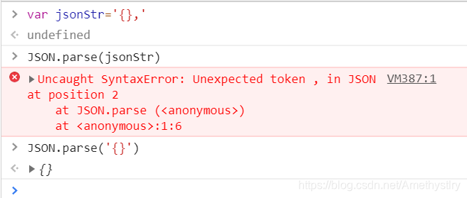
转JSON格式数据
获取轮播图数据(ajax)
- 数据准备
[
  {


    "pcUrl": "../images/slide_01_2000x410.jpg",
    "mUrl": "../images/slide_01_640x340.jpg"
  },
  {


    "pcUrl": "../images/slide_02_2000x410.jpg",
    "mUrl": "../images/slide_02_640x340.jpg"
  },
  {


    "pcUrl": "../images/slide_03_2000x410.jpg",
    "mUrl": "../images/slide_03_640x340.jpg"
  },
  {


    "pcUrl": "../images/slide_04_2000x410.jpg",
    "mUrl": "../images/slide_04_640x340.jpg"
  }
]
- 获取数据
$.ajax({


    type: 'get',
    url: 'js/data.json', /*路径从index.html出发*/
    /*强制转换后台返回的数据为json对象*/
    /*强制转换不成功程序报错,不会执行success,执行error回调*/
    dataType: 'json',
    data: '',
    success: function (data) {


        ...
    }
});
根据数据动态渲染
2.1 准备数据
2.2 把数据转换成html格式的字符串
2.3 html静态内容——>动态
/*点容器*/
var pointHtml=template('pointTemplate',{

    list:data});/*pointTemplate是点容器的id*/

/*图片容器*/
var imageHtml=template('imageTemplate',{

    list:data,isM:isMobile}); /*isMobile用于区分pc端和移动端,isMobile=$(window).width()<768*/

/*2.3 把字符渲染到页面当中*/
$('.carousel-indicators').html(pointHtml);
$('.carousel-inner').html(imageHtml);/*页面中的点容器*/
打印pointHtml如下:
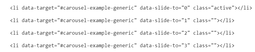
模板引擎在html中的使用(注意text/template)
<!--点-->
<ol class="carousel-indicators">

</ol>
<!--图片-->
<div class="carousel-inner" role="listbox">

</div>
<script type="text/template" id="pointTemplate">
    <% for(var i=0;i<list.length;i++){

     %>
        <li data-target="#carousel-example-generic" data-slide-to="<%=i%>" class="<%=i==0?'active':''%>"></li>
    <% } %>
</script>

<!--图片-->
<script type="text/template" id="imageTemplate">
    <% for(var i=0;i<list.length;i++){

     %>
        <div class="item <%=i==0?'active':''%>">
            <!--按需加载图片-->
            <% if(isM){

     %>
                <a href="#" class="m_imgBox hidden-lg hidden-md hidden-sm"><img src="<%=list[i].mUrl%>" alt=""></a>
            <% }else{

     %>
                <a href="#" style="background-image: url('<%=list[i].pcUrl%>')" class="pc_imgBox hidden-xs"></a>
            <% } %>
        </div>
    <% } %>
</script>
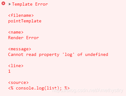
注意:模板引擎内不能使用全局变量
<!--<% console.log(list); %>-->
测试功能 resize-页面尺寸发生改变
$(window).on('resize',function () {


    render();
    /*trigger——>通过js主动触发某个事件——>完成页面初始化*/
}).trigger('resize');
移动端手势切换
- 结合通过touch事件判断是否发生滑动
startX=e.originalEvent.touches[0].clientX;/*originalEvent代表js原生事件*/
$('.carousel').carousel('next');/*下一张*/
$('.carousel').carousel('prev');/*上一张*/
var startX=0;
var distanceX=0;
var isMove=false;


/*originalEvent代表js原生事件*/
$('.wjs_banner').on('touchstart',function (e) {


    startX=e.originalEvent.touches[0].clientX;
}).on('touchmove',function (e) {


    var moveX=e.originalEvent.touches[0].clientX;
    distanceX=moveX-startX;
    isMove=true;
}).on('touchend',function (e) {


    /*距离足够50px 并且有滑动*/
    if(isMove&&Math.abs(distanceX)>50){


        /*手势*/
        /*左滑手势*/
        if(distanceX<0){


            /*左滑*/
            $('.carousel').carousel('next');
        }else{


            /*右滑*/
            $('.carousel').carousel('prev');
        }
    }
    distanceX=0;
    startX=0;
    isMove=false;
});
动态设置元素宽度(解决换行问题)&IScroll实现区域滑动
var initMobileTab=function () {


    /*1、解决换行问题*/

    /* width()  内容
	* innerWidth() 内容+内边距
	* outerWidth() 内容+内边距+边框
	* outerWidth(true) 内容+内边距+边框+外边距
	* */
    var width=0;
    var $navbar=$('.navbar-parent .nav-tabs');
    $navbar.find('li').each(function (i,item) {


        width+=$(this).outerWidth(true);
    })
    $navbar.width(width);
    $('.navbar-parent').css('overflow','hidden');

    /*自己实现滑动效果或者使用iscroll*/
    /*new IScroll(dom,{})   要将$('.navbar-parent')转换成js对象*/
    $('.navbar-parent')[0].addEventListener('touchmove',function (e) {


        e.preventDefault();
    });

    new IScroll($('.navbar-parent')[0],{


        scrollX:true,
        scrollY:false
    });
}
优化(做数据缓存)
- 问题:页面大小每改变一次,便要重新获取一次data
- 解决方法:第一次获取到data之后便做缓存,页面更改后直接拿缓存数据 (window.data=data;)
    /*做数据缓存*/
    var getData=function (callback) {


        /*缓存了数据*/
        if(window.data){


            callback&&callback(window.data);
        }else {


            /*1、获取轮播图数据  ajax*/
            $.ajax({


                type: 'get',
                url: 'js/data.json', /*路径从index.html出发*/
                /*强制转换后台返回的数据为json对象*/
                /*强制转换不成功程序报错,不会执行success,执行error回调*/
                dataType: 'json',
                data: '',
                success: function (data) {


                    window.data = data;
                    callback && callback(window.data);
                }
            });
        }
    }
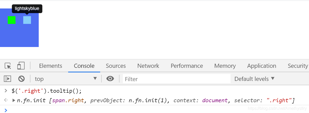
Bootstrap工具提示(要初始化)
<span class="left" data-toggle="tooltip" data-placement="bottom" title="lime"></span>
<span class="right" data-toggle="tooltip" data-placement="top" title="lightskyblue"></span>