demo 地址: https://github.com/iotjin/jh-vue-demo的
app1项目demo 地址: https://github.com/iotjin/jh-vue-demo的
app2项目(带登录、推荐这个)
本篇主要介绍如何使用vant的
navbar、tabbar和vue-router创建一个vue版的APP基础框架(适配刘海屏)
app的主界面一般由三部分构成:navbar + 主体内容 +tabbar,如下图:

所以需要创建navbar组件和tabbar组件,然后通过router-view映射组件,连通单个页面
1、首先要有Vue项目
2、vant安装
3、navbar组件实现
导航条一般由左侧item、中间的标题、右侧item组成,当页面跳转后左侧一般是个返回按钮,点击返回上一页面。左右item变动较大,所以需要设置slot,另外主页面一般就4、5个,所以设置左侧默认为返回按钮

3.1、对外暴露的属性 props
  props: {


    // 是否显示返回按钮,默认为true,优先级低于slot
    isBack: {

     type: [Boolean, String], default: true },
    // 默认返回按钮颜色
    backIconColor: {

     type: String, default: "white" },
    // 标题
    title: {

     type: String, default: "" },
    // 固定在顶部时,是否在标签位置生成一个等高的占位元素
    isPlaceholder: {

     type: Boolean, default: false },
  },
3.2、template
 <template>
  <div class="navBar">
    <van-nav-bar
      :title="title"
      fixed
      safe-area-inset-top
      @click-left="onClickLeft"
      @click-right="onClickRight"
    >
      <template v-if="$slots.left" slot="left">
        <slot name="left"></slot>
      </template>
      <template v-else-if="isBack" slot="left">
        <van-icon name="arrow-left" size="18" :color="backIconColor" />
      </template>
      <template slot="right">
        <slot name="right"></slot>
      </template>
    </van-nav-bar>
    <div class="nav-top-placeholder" v-if="isPlaceholder"></div>
  </div>
</template>
3.3、背景色、标题颜色和顶部占位
<style>
.van-nav-bar {


  background: white;
  background: #38bc9d;
}

.van-nav-bar__title {


  color: black;
  color: white;
}

.nav-top-placeholder {


  padding-top: constant(safe-area-inset-top);
  padding-top: env(safe-area-inset-top);
  height: 44px;
}
</style>
3.4、关于刘海屏的适配
vant的
navbar有个属性placeholder:固定在顶部时,是否在标签位置生成一个等高的占位元素,默认值为false。本篇没有使用默认的,但是如果不加占位,刘海屏会往上偏移,所以自定义了一个占位div
3.5、用法
<BaseNavBar :title="title" :isBack="isBack" :isPlaceholder="true">
  <van-icon name="cross" size="18" slot="left" />
  <van-icon name="circle" size="18" slot="right" />
</BaseNavBar>

import BaseNavBar from "../../components/BaseNavBar.vue";
export default {


  components: {


    BaseNavBar,
  },
  data() {


    return {


      title: "标题",
      isBack: false,
    };
  },
  methods: {

    },
  created() {

    },
};
或者在main.js全局引用navbar组件
import BaseNavBar from "./components/BaseNavBar.vue";

Vue.component('BaseNavBar',BaseNavBar)
4、tabbar组件实现
tabbar组件的每个item一般由
文字、默认图片、选中图片、小红点构成。另外要和页面绑定,需要一个路径参数。item切换也需要能在外部监听,
在主页进行页面跳转时,如果路由没有使用
children,tabbar需要处理隐藏显示。
在tabbar组件内添加:v-if="$route.meta.isShowTabBar",在路由配置里添加:meta: { isShowTabBar: true }

代码实现
<template>
  <div v-if="$route.meta.isShowTabBar">
    <van-tabbar
      v-model="currentSelected"
      :inactive-color="color"
      :active-color="selectedColor"
      @change="onChange"
      route
      placeholder
      safe-area-inset-bottom
    >
      <template v-for="item in tabBars">
        <van-tabbar-item
          :key="item.name"
          :to="item.name"
          :badge="item.badge"
          :dot="item.isShowRedDot"
          replace
        >
          <span>{

    {

     item.text }}</span>
          <template #icon="props">
            <img :src="props.active ? item.selectedIconPath : item.iconPath" />
          </template>
        </van-tabbar-item>
      </template>
    </van-tabbar>
  </div>
</template>

<script>
import {

     Tabbar, TabbarItem } from "vant";

export default {


  components: {


    [Tabbar.name]: Tabbar,
    [TabbarItem.name]: TabbarItem,
  },
  props: {


    // 选中tabbar
    selected: {

     type: Number, default: 0 },
    // 默认颜色
    color: {

     type: String, default: "#7d7e80" },
    // 选中颜色
    selectedColor: {

     type: String, default: "#38BC9D" },
    //item数组
    tabBars: {


      type: Array,
      default: () => [],
    },
  },
  data() {


    return {


      //是否选中
      active: 0,
      //当前选中
      currentSelected: this.selected,
    };
  },
  methods: {


    onChange(index) {


      // console.log("内部-切换到tabbar:" + index);
      this.$emit("onChange", index); //往外传值
    },
  },
  // 初始化页面选中状态
  created() {


    if (this.$route.path === "/Main" && this.tabBars.length) {


      this.$router.push(this.tabBars[this.currentSelected].name);
    }
  },
  mounted() {

    },
};
</script>

<style></style>
5、vue-router实现
5.1、安装
npm install vue-router
5.2、router配置
import Vue from "vue";
import VueRouter from "vue-router";
import Root from "../views/root/index.vue";
import Main from "../views/root/main.vue";
import Module1 from "../views/module1/index.vue";
import Module2 from "../views/module2/index.vue";
import Module3 from "../views/module3/index.vue";
import Module4 from "../views/module4/index.vue";

import DemoList from "../views/module2/DemoList";


Vue.use(VueRouter);

const routes = [
  {

     path: "/", name: "Root", component: Root },
  {

     path: "/Main", name: "Main", component: Main },
  {

     path: "/Module1", name: "Module1", component: Module1, meta: {

     isShowTabBar: true } },
  {

     path: "/Module2", name: "Module2", component: Module2, meta: {

     isShowTabBar: true } },
  {

     path: "/Module3", name: "Module3", component: Module3, meta: {

     isShowTabBar: true } },
  {

     path: "/Module4", name: "Module4", component: Module4, meta: {

     isShowTabBar: true } },
  {

     path: "/Module2/DemoList", name: "DemoList", component: DemoList, },
];

const router = new VueRouter({


  routes,
});

export default router;
6、app主界面实现
app主界面由三部分构成:
navbar+主体内容+tabbar,
其中navbar在主页面使用一次,如果单个页面需要自定义的话,在各个模块再使用一次
主体内容为<router-view></router-view>
底部为tabbar,主页面跳转隐藏tabbar在路由配置里设置meta: { isShowTabBar: true }
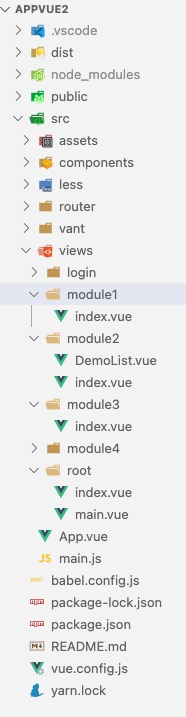
项目结构
6.1、main代码实现(主页面)
<template>
  <div class="bg">
    <BaseNavBar :title="title" :isBack="isBack" :isPlaceholder="true">
    </BaseNavBar>
    <router-view></router-view>
    <BaseTabBar
      :selected="selected"
      :tabBars="tabBars"
      @onChange="onChange"
    ></BaseTabBar>
  </div>
</template>

<script>
import BaseNavBar from "../../components/BaseNavBar.vue";
import BaseTabBar from "../../components/BaseTabBar.vue";
export default {


  components: {


    BaseNavBar,
    BaseTabBar,
  },
  data() {


    return {


      title: "标题",
      isBack: false,
      selected: 1,
      tabBars: [
        {


          name: "/Module1",
          isShowRedDot: false,
          badge: "",
          text: "首页",
          iconPath: require("@assets/tab/tab1.png"),
          selectedIconPath: require("@assets/tab/tab1_select.png"),
        },
        {


          name: "/Module2",
          isShowRedDot: false,
          badge: "",
          text: "Demo",
          iconPath: require("@assets/tab/tab2.png"),
          selectedIconPath: require("@assets/tab/tab2_select.png"),
        },
        {


          name: "/Module3",
          isShowRedDot: true,
          badge: "",
          text: "我的",
          iconPath: require("@assets/tab/tab3.png"),
          selectedIconPath: require("@assets/tab/tab3_select.png"),
        },
      ],
    };
  },
  methods: {


    onChange(index) {


      console.log("外部-切换到tabbar:" + index);
      this.tabBars[index].isShowRedDot = this.tabBars[index].isShowRedDot
        ? false
        : false;
    },
  },
  created() {

    },
};
</script>

<style></style>
6.2、module2代码实现(单页面)
<template>
  <div class="bg2" v-bind:class="{ bg10: isActive }">
    <BaseNavBar :title="title" :isBack="false"> </BaseNavBar>
    模块2
    <div class="button" @click="onClick">按钮</div>
  </div>
</template>

<script>
export default {


  components: {

    },
  data() {


    return {


      title: "模块2",
      isActive: false,
    };
  },
  methods: {


    onClick() {


      console.log("点击按钮");
      this.$router.push({

     name: "DemoList", params: {

     setid: 111222 } });
    },
    created() {


      console.log("模块2");
    },
  },
};
</script>

<style>
.bg2 {


  width: auto;
  height: 100vh;
  /* background: red; */
}
.button {


  width: 200px;
  height: 200px;
  background: palevioletred;
}
.bg10 {


  background: pink;
}
</style>