布局技巧——文字围绕浮动元素的巧应用
<style>
.box {
margin: 0 auto;
width: 270px;
height: 60px;
background-color: pink;
}
.box_1 {
float: left;
magin
width: 100px;
height: 60px;
}
.box_1 img {
width: 100%;
height: 60px;
}
</style>
</head>
<body>
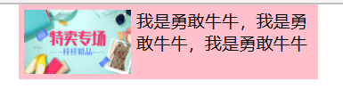
<div class="box">
<div class="box_1">
<img src="images/TB.jpg" alt="">
</div>
<p>我是勇敢牛牛,我是勇敢牛牛,我是勇敢牛牛</p>
</div>
</body>

修饰的好看一点
<!DOCTYPE html>
<html lang="en">

<head>
    <meta charset="UTF-8">
    <meta http-equiv="X-UA-Compatible" content="IE=edge">
    <meta name="viewport" content="width=device-width, initial-scale=1.0">
    <title>用户界面</title>
    <style>
        * {


            margin: 0;
            padding: 0;
        }
        .box {


            margin: 0 auto;
            padding: 5px;
            width: 270px;
            height: 60px;
            background-color: pink;
        }
        .box_1 {


            float: left;
            margin-right: 5px;
            width: 100px;
            height: 60px;
        }
        .box_1 img {


            width: 100%;
            height: 60px;
        }
    </style>
</head>
<body>
    <div class="box">
        <div class="box_1">
            <img src="images/TB.jpg" alt="">
        </div>
        <p>我是勇敢牛牛,我是勇敢牛牛,我是勇敢牛牛</p>
    </div>
</body>
</html>
行内块巧妙应用

<!DOCTYPE html>
<html lang="en">

<head>
    <meta charset="UTF-8">
    <meta http-equiv="X-UA-Compatible" content="IE=edge">
    <meta name="viewport" content="width=device-width, initial-scale=1.0">
    <title>用户界面</title>
    <style>
        .box {


            text-align: center;
        }
        .box a {


            display: inline-block;
            width: 36px;
            height: 36px;
            background-color: #f7f7f7;
            border: 1px solid #ccc;
            text-decoration: none;
            line-height: 36px;
            text-align: center;
        }
    </style>
</head>
<body>
    <div class="box">
        <a href="">1</a>
        <a href="">2</a>
        <a href="">3</a>
        <a href="">4</a>
        <a href="">5</a>
        <a href="">6</a>
        <a href="">7</a>
        <a href="">8</a>
    </div>
</body>
</html>
升级版本
<!DOCTYPE html>
<html lang="en">
<head>
<meta charset="UTF-8">
<meta http-equiv="X-UA-Compatible" content="IE=edge">
<meta name="viewport" content="width=device-width, initial-scale=1.0">
<title>用户界面</title>
<style>
.box {
text-align: center;
}
.box a {
display: inline-block;
width: 36px;
height: 36px;
background-color: #f7f7f7;
border: 1px solid #ccc;
text-decoration: none;
line-height: 36px;
text-align: center;
font-size: 14px;
}
.box .prov,
.box .next {
width: 86px;
}
.box a:hover {
background-color: transparent;
border: 1px solid transparent;
}
</style>
</head>
<body>
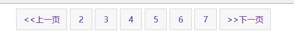
<div class="box">
<a href="" class="prov"><<上一页</a>
<a href="">2</a>
<a href="">3</a>
<a href="">4</a>
<a href="">5</a>
<a href="">6</a>
<a href="">7</a>
<a href="" class="next">>>下一页</a>
到
<input type="text" name="" id="">
页
</div>
</body>
</html>
CSS制作三角模块
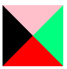
代码描述:
.bor {


          width: 0;
          height: 0;
          border-top: 100px solid pink;
          border-left: 100px solid #000;
          border-right: 100px solid springgreen;
          border-bottom: 100px solid red;
        }

.bor {


            width: 0;
            height: 0;
            border-top: 100px solid transparent;
            border-left: 0px solid #000;
            border-right: 50px solid springgreen;
            border-bottom: 0px solid red;
        }