推荐相关svg描边动画教程:
https://segmentfault.com/a/1190000017977613
SVG学习之stroke-dasharray 和 stroke-dashoffset 详解 - daisy,gogogo - 博客园
制作svg动画快速插件:
svg实现动画案例:
效果图:
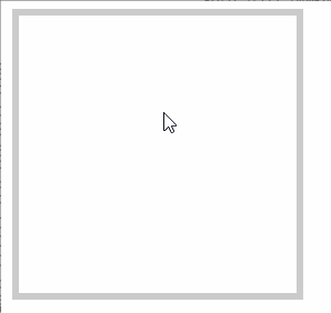
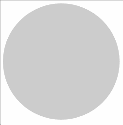
圆形边框的进度条只能使用svg才能做出来。
以下是练习的所有代码,代码:
<!DOCTYPE html>
<html lang="en">
<head>
    <meta charset="UTF-8">
    <meta name="viewport" content="width=device-width, initial-scale=1.0">
    <title>Document</title>
    <style>
        svg.box rect{
            stroke-dasharray:10,10;
            animation:move 2s infinite linear;
            animation-direction: reverse;
            stroke-dashoffset: 0;
        }
        svg.box:hover rect{
            /* animation-play-state: paused; */
             animation-direction: normal;
        }
        @keyframes move{
            from{
                stroke-dashoffset: 0;
            }
            to{
                stroke-dashoffset: 100;
            }
        }
        svg.box2 rect{
            transition:all 2s linear;
            stroke-dasharray:800,800;/*设置成周长*/
            stroke-dashoffset: 800;
        }
        svg.box2:hover rect{
            stroke-dashoffset: 0;
        }
        svg.box3{
            transform: rotate(-90deg);
        }
        svg.box3 circle{
            transition:all 2s linear;
            stroke-dasharray:603.185,603.185;/*设置成周长,圆的周长:2πr*/
            stroke-dashoffset: 603.185;
        }
        svg.box3:hover circle{
            stroke-dashoffset: 0;
        }

        svg.box4{
            transform: rotate(-90deg);
        }
        svg.box4 circle{
            /* transition:all calc((var(--i)) * 0.5s) linear; */
            transition:all 1s linear;
            stroke-dasharray:calc(var(--r) * 2 * 3.1415926),calc(var(--r) * 2 * 3.1415926);/*设置成周长,圆的周长:2πr*/
            stroke-dashoffset: calc(var(--r) * 2 * 3.1415926);
            /* transform: rotateZ(-90deg);
            transform-origin: center center; */
        }
        svg.box4:hover circle{
            stroke-dashoffset: 0;
        }

        svg.box5{
            transform: rotate(-90deg);
        }
        svg.box5 circle{
            /* transition:all calc((var(--i)) * 0.5s) linear; */
            transition:all 1s linear;
            stroke-dasharray:calc(var(--r) * 2 * 3.1415926),calc(var(--r) * 2 * 3.1415926);/*设置成周长,圆的周长:2πr*/
            stroke-dashoffset: calc(var(--r) * 2 * 3.1415926);
            transform: rotateZ(-90deg);
            transform-origin: center center;
        }
        .boxDiv:hover svg.box5 circle{
            stroke-dashoffset: 0;
        }
        .caihong{
            width:300px;
            height:300px;
            margin:auto;

            background:radial-gradient(#fff 80px,#6d35a6 80px, #6d35a6 90px,#00a8fe 90px,#00a8fe 100px,#98d6ec 100px,#98d6ec 110px,#91cf42 110px,#91cf42 120px,#ffff00 120px,#ffff00 130px,#ffa03d 130px,#ffa03d 140px, #fd2000 140px, #fd2000 150px, transparent 150px ) no-repeat 0 150px/300px 299px
    }
    </style>
</head>
<body>
    <h3>虚线滚动动画:</h3>
    <svg class="box" xmlns="http://www.w3.org/2000/svg" version="1.1" width="200" height="200" viewbox="0 0 200 200">
        <rect width="200" height="200" stroke-dasharray="10,10" style="fill:white;stroke-width:5px;stroke:red;"/>
    </svg>
    <h3>填充描边:</h3>
    <svg class="box2" xmlns="http://www.w3.org/2000/svg" version="1.1" width="200" height="200" viewbox="0 0 200 200">
        <rect width="200" height="200" style="fill:#ccc;stroke-width:5px;stroke:red;"/>
    </svg>
    <svg class="box3" xmlns="http://www.w3.org/2000/svg" version="1.1" width="200" height="200" viewbox="0 0 200 200">
        <circle cx="100" cy="100" r="96" style="fill:#ccc;stroke-width:5px;stroke:red;"/>
    </svg>
    <svg class="box4" xmlns="http://www.w3.org/2000/svg" version="1.1" width="200" height="200" viewbox="0 0 200 200">
        <circle cx="100" cy="100" r="96" style="fill:#ccc;stroke-width:5px;stroke:#FF0000;--i:7;--r:96;"/>
        <circle cx="100" cy="100" r="91" style="fill:#ccc;stroke-width:5px;stroke: #FF7D00;--i:6;--r:91;"/>
        <circle cx="100" cy="100" r="86" style="fill:#ccc;stroke-width:5px;stroke: #FFFF00;--i:5;--r:86;"/>
        <circle cx="100" cy="100" r="81" style="fill:#ccc;stroke-width:5px;stroke:#00FF00;--i:4;--r:81;"/>
        <circle cx="100" cy="100" r="76" style="fill:#ccc;stroke-width:5px;stroke: #00FFFF;--i:3;--r:76;"/>
        <circle cx="100" cy="100" r="71" style="fill:#ccc;stroke-width:5px;stroke:#0000FF;--i:2;--r:71;"/>
        <circle cx="100" cy="100" r="66" style="fill:#ccc;stroke-width:5px;stroke:#FF00FF;--i:1;--r:66;"/>
    </svg>
    <div class="boxDiv" style="display:inline-block;border:5px solid #ccc;position: relative;width: 200px;height: 200px;">
        <svg class="box5" xmlns="http://www.w3.org/2000/svg" version="1.1" width="200" height="200" viewbox="0 0 200 200" style="clip-path: inset(0 0 0 100px);position: absolute;
        top: 25%;">
            <circle cx="100" cy="100" r="96" style="fill:white;stroke-width:5px;stroke:#FF0000;--i:7;--r:96;"/>
            <circle cx="100" cy="100" r="91" style="fill:white;stroke-width:5px;stroke: #FF7D00;--i:6;--r:91;"/>
            <circle cx="100" cy="100" r="86" style="fill:white;stroke-width:5px;stroke: #FFFF00;--i:5;--r:86;"/>
            <circle cx="100" cy="100" r="81" style="fill:white;stroke-width:5px;stroke:#00FF00;--i:4;--r:81;"/>
            <circle cx="100" cy="100" r="76" style="fill:white;stroke-width:5px;stroke: #00FFFF;--i:3;--r:76;"/>
            <circle cx="100" cy="100" r="71" style="fill:white;stroke-width:5px;stroke:#0000FF;--i:2;--r:71;"/>
            <circle cx="100" cy="100" r="66" style="fill:white;stroke-width:5px;stroke:#FF00FF;--i:1;--r:66;"/>
        </svg>
    </div>
    <div class="caihong"></div>
</body>
</html>