<!DOCTYPE html>
<html lang="en">
<head>
    <meta charset="UTF-8">
    <meta http-equiv="X-UA-Compatible" content="IE=edge">
    <meta name="viewport" content="width=device-width, initial-scale=1.0">
    <title>animation拆分写法</title>
    <style>
        .box {


            width: 200px;
            height: 100px;
            background-color: pink;

            animation-name: change;
            animation-duration: 1s;
            animation-iteration-count: infinite;

        }

        .box:hover {


           /* 鼠标移入的时候暂停动画 */
           animation-play-state: paused;
        }


        @keyframes change {


            from {


                width: 200px;
            }
            to {


                width: 600px;
            }
        }
    </style>
</head>
<body>
    <div class="box"></div>
</body>
</html>
<!DOCTYPE html>
<html lang="en">
<head>
    <meta charset="UTF-8">
    <meta http-equiv="X-UA-Compatible" content="IE=edge">
    <meta name="viewport" content="width=device-width, initial-scale=1.0">
    <title>animation拆分写法</title>
    <style>
        .box {


            width: 200px;
            height: 100px;
            background-color: pink;

            animation-name: change;
            animation-duration: 1s;
            animation-iteration-count: infinite;

        }

        .box:hover {


           /* 鼠标移入的时候暂停动画 */
           animation-play-state: paused;
        }

        @keyframes change {


            from {


                width: 200px;
            }
            to {


                width: 600px;
            }
        }
    </style>
</head>
<body>
    <div class="box"></div>
</body>
</html>
animation-plya-stat
animation-play-state
animation-timing-function
animation-timing-function:速度曲线
animation-timing=-function
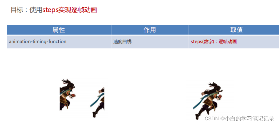
目标:使用steps实现逐帧动画
逐帧动画:帧动画。开发中,一般配合精灵图实现动画效果。
l animation-timing-function: steps(N); Ø 将动画过程等分成N份
帧动画,开发当中,一般配合精灵图实现动画效果
animation-timing-functio
animation-tming-function:stsp(N);
l 精灵动画制作步骤
Ø 准备显示区域
Ø 设置盒子尺寸是一张小图的尺寸,背景图为当前精灵图
Ø 定义动画
Ø 改变背景图的位置(移动的距离就是精灵图的宽度) Ø 使用动画
Ø 添加速度曲线steps(N),N与精灵图上小图个数相同 Ø 添加无限重复效果
移动的距离就是精灵图的宽度,使用动画,添加速度曲线steps(N)Ns使精灵图上小图的个数相同,添加无线重复效果
<!DOCTYPE html>
<html lang="en">
<head>
<meta charset="UTF-8">
<title>精灵动画</title>
<style>
.box {
position: absolute;
left: 0;
width: 140px;
height: 140px;
background-image: url(./images/bg.png);
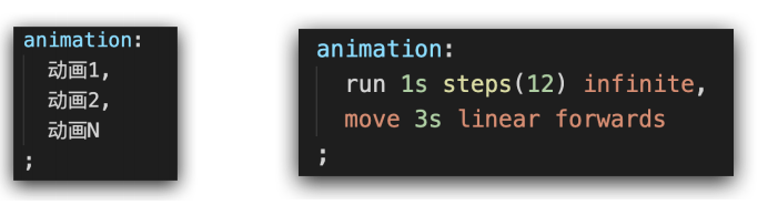
animation: run 1s steps(12) infinite,
translate 3s linear forwards;
}
@keyframes run {
100% {
background-position: -1680px 0;
}
}
@keyframes translate {
100% {
left: 600px;
}
}
</style>
</head>
<body>
<div class="box"></div>
</body>
</html>
<!DOCTYPE html>
<html lang="en">
<head>
    <meta charset="UTF-8">
    <meta http-equiv="X-UA-Compatible" content="IE=edge">
    <meta name="viewport" content="width=device-width, initial-scale=1.0">
    <title>网页时钟</title>
    <style>
        .clock {


            position: relative;
            width: 200px;
            height: 200px;
            margin: 100px auto;
            border: 8px solid #000;
            border-radius: 50%;
        }

        /* 刻度线 */
        .line {


            position: absolute;
            left: 50%;
            transform: translate(-50%);
            width: 3px;
            height: 200px;
            background-color: #ccc;
        }

        /* :nth-child() */
        .line:nth-child(2) {


            transform: translate(-50%) rotate(30deg);
        }

        .line:nth-child(3) {


            transform: translate(-50%) rotate(60deg);
        }

        .line:nth-child(4) {


            transform: translate(-50%) rotate(90deg);
        }
        .line:nth-child(5) {


            transform: translate(-50%) rotate(120deg);
        }
        .line:nth-child(6) {


            transform: translate(-50%) rotate(150deg);
        }

        /* 遮罩层 */
        .mask {


            position: absolute;
            left: 50%;
            top: 50%;
            transform: translate(-50%, -50%);
            width: 140px;
            height: 140px;
            background-color: #fff;
            border-radius: 50%;
        }

        /* 表针 */
        .hour,
        .minute,
        .second {


            position: absolute;
            left: 50%;
            bottom: 50%;
            /* transform: translate(-50%); */
            transform-origin: center bottom;
        }

        .hour {


            width: 6px;
            height: 40px;
            background-color: #000;
            transform: translate(-50%) rotate(45deg);
        }

        .minute {


            width: 4px;
            height: 50px;
            background-color: #000;
            transform: translate(-50%) rotate(90deg);
        }

        .second {


            width: 2px;
            height: 60px;
            background-color: red;
            transform: translate(-50%) rotate(225deg);
            animation: rotate 60s steps(60) infinite;
        }

        /* 螺丝 */
        .dotted {


            position: absolute;
            left: 50%;
            top: 50%;
            transform: translate(-50%, -50%);
            width: 12px;
            height: 12px;
            background-color: #000;
            border-radius: 50%;
        }

        @keyframes rotate {


            0% {


                transform: rotate(0);
            }
            100% {


                transform: rotate(360deg);
            }
        }
    </style>
</head>
<body>
    <div class="clock">
        <!-- 刻度线 -->
        <div class="line"></div>
        <div class="line"></div>
        <div class="line"></div>
        <div class="line"></div>
        <div class="line"></div>
        <div class="line"></div>

        <!-- 遮罩层 -->
        <div class="mask"></div>

        <!-- 表针 -->
        <div class="hour"></div>
        <div class="minute"></div>
        <div class="second"></div>

        <!-- 螺丝 -->
        <div class="dotted"></div>
    </div>
</body>
</html>
l 多组动画
l 思考:如果想让小人跑远一些,该如何实现?
Ø 答:精灵动画的同时添加盒子位移动画。
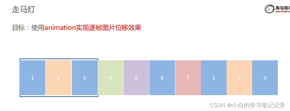
走马灯实现
<!DOCTYPE html>
<html lang="en">
  <head>
    <meta charset="UTF-8" />
    <meta name="viewport" content="width=device-width, initial-scale=1.0" />
    <title>Document</title>
    <style>
      * {


        padding: 0;
        margin: 0;
      }
      li {


        list-style: none;
      }

      img {


        width: 200px;
      }

      .box {


        width: 600px;
        height: 112px;
        border: 5px solid #000;
        margin: 100px auto;
        overflow: hidden;
      }

      .box ul {


        width: 2000px;
        animation: move 5s infinite linear;
      }

      .box li {


        float: left;
      }

      /* 定义动画:位移, ul 左侧使用  x -1400  */
      @keyframes move {


        to {


          transform: translateX(-1400px);
        }
      }

      /* 用户鼠标移入box,动画暂停 */
      .box:hover ul {


        animation-play-state: paused;
      }

    </style>
  </head>
  <body>
    <div class="box">
      <ul>
        <li><img src="./images/1.jpg" alt="" /></li>
        <li><img src="./images/2.jpg" alt="" /></li>
        <li><img src="./images/3.jpg" alt="" /></li>
        <li><img src="./images/4.jpg" alt="" /></li>
        <li><img src="./images/5.jpg" alt="" /></li>
        <li><img src="./images/6.jpg" alt="" /></li>
        <li><img src="./images/7.jpg" alt="" /></li>

        <!-- 第567移动的时候,显示区域不能留白 -->
        <li><img src="./images/1.jpg" alt="" /></li>
        <li><img src="./images/2.jpg" alt="" /></li>
        <li><img src="./images/3.jpg" alt="" /></li>
      </ul>
    </div>
  </body>
</html>
全民出游季
* {


    margin: 0;
    padding: 0;
}

html {


    height: 100%;
}

body {


    height: 100%;
    background: url(./../images/f1_1.jpg) no-repeat center 0;

    /* 缩放背景图 */

    /* 图片等比例缩放, 当宽度或高度和盒子尺寸相等, 图片就不再缩放 */
    /* background-size: contain; */

    /* 图片等比例缩放, 图片完全覆盖到整个盒子, 可能会导致图片显示不全 */
    background-size: cover;
}

/*
1. img 引入图片, 控制位置
2. 定义动画,使用动画
*/

.cloud img {


    position: absolute;
    left: 50%;
    top: 0;
}

.cloud img:nth-child(1) {


    margin-left: -300px;
    top: 20px;
    animation: cloud 1s infinite alternate;
}
.cloud img:nth-child(2) {


    margin-left: 400px;
    top: 100px;
    animation: cloud 1s infinite alternate 0.2s;
}
.cloud img:nth-child(3) {


    margin-left: -550px;
    top: 200px;
    animation: cloud 1s infinite alternate 0.4s;
}

/* 云彩动画 */
@keyframes cloud {


    to {


        transform: translateX(20px);
    }
}
<!DOCTYPE html>
<html lang="en">
<head>
    <meta charset="UTF-8">
    <meta http-equiv="X-UA-Compatible" content="IE=edge">
    <meta name="viewport" content="width=device-width, initial-scale=1.0">
    <title>Document</title>
    <link rel="stylesheet" href="./css/index.css">
</head>
<body>
    <!-- 云彩图片 -->
    <div class="cloud">
        <img src="./images/yun1.png" alt="">
        <img src="./images/yun2.png" alt="">
        <img src="./images/yun3.png" alt="">
    </div>
</body>
</html>
高度写100%,才能继承浏览器的百分之百
body{
background-size:contain;}
图片等比例缩放,图片会完全覆盖整个盒子,
img引入图片;控制位置定义动画使用动画
transform属性不能支持所有的六浏览器