一、Highcharts-实现饼图(含去水印)
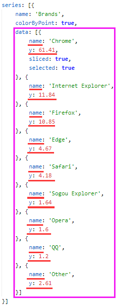
官方文档:https://www.highcharts.com.cn/demo/highcharts/pie-gradient
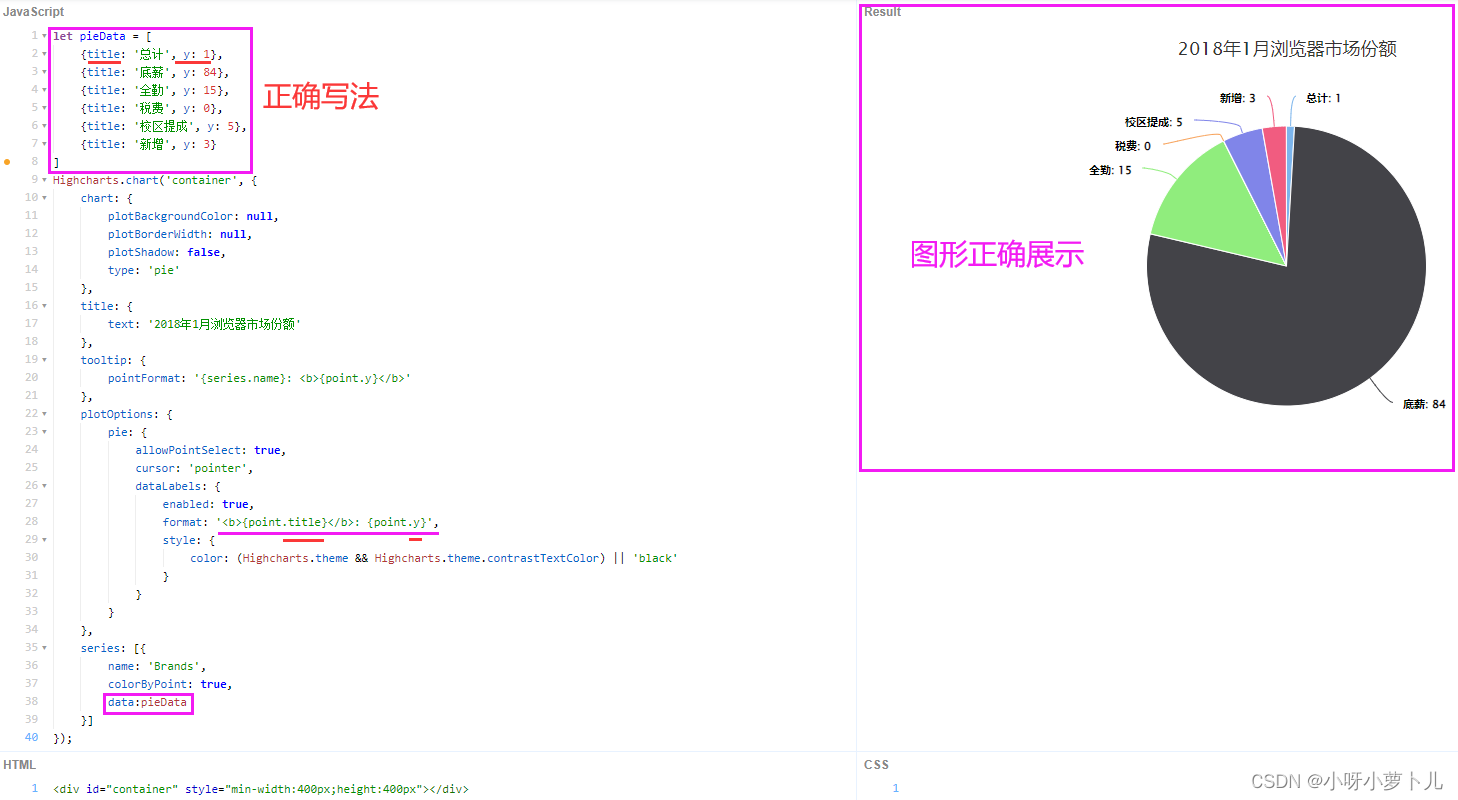
1、实现效果
2、实现步骤
第一步、引入 highcharts.js
<!-- 引入 highcharts.js -->
<script src="/static/js/highcharts/highcharts.js"></script>
第二步、代码
HTML
<!-- 图表容器 DOM -->
<div id="container" style="width: 600px;height:400px;margin:auto;"></div>
JS
let pieData = [ // 需要渲染的数据【注意:这儿有一个很大的坑,详情请往下看哟~】
    {

    title: '总计', y: 1},
    {

    title: '底薪', y: 84},
    {

    title: '全勤', y: 15},
    {

    title: '税费', y: 0},
    {

    title: '校区提成', y: 5},
    {

    title: '新增', y: 3}
  ]

  // 图表配置
  Highcharts.chart('container', {


    // 常规图表选项设置
    chart: {


      plotBackgroundColor: null, // 绘图区的背景颜色
      plotBorderWidth: null, // 绘图区边框宽度
      plotShadow: false, // 绘图区是否显示阴影
      type: 'pie' // 图标类型
    },
    // 图表的主标题
    title: {


      text: '总计'
    },
    // 去除水印
    credits: {


      enabled:false,
    },
    // 当鼠标经过时的提示设置
    tooltip: {


      pointFormat: '{series.name}: <b>{point.y}</b>'
    },
    // 每种图表类型属性设置
    plotOptions: {


      // 饼状图
      pie: {


        allowPointSelect: true,
        cursor: 'pointer',
        dataLabels: {


          enabled: true,
          // 通过 format 或 formatter 来格式化数据标签显示
          format: '<b>{point.title}</b>: {point.y}',
          style: {


            color: (Highcharts.theme && Highcharts.theme.contrastTextColor) || 'black'
          }
        }
      }
    },
    // 图表要展现的数据
    series: [{


      name: '值',
      colorByPoint: true,
      // data中的第二个属性值不能是字符串,应为number型
      data: pieData,
    }]
});
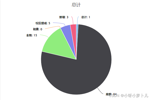
二、Highcharts-实现饼图遇到的大坑
1、series里data的数据
1-1、默认样式如下图:
1-2、遇到的大坑:
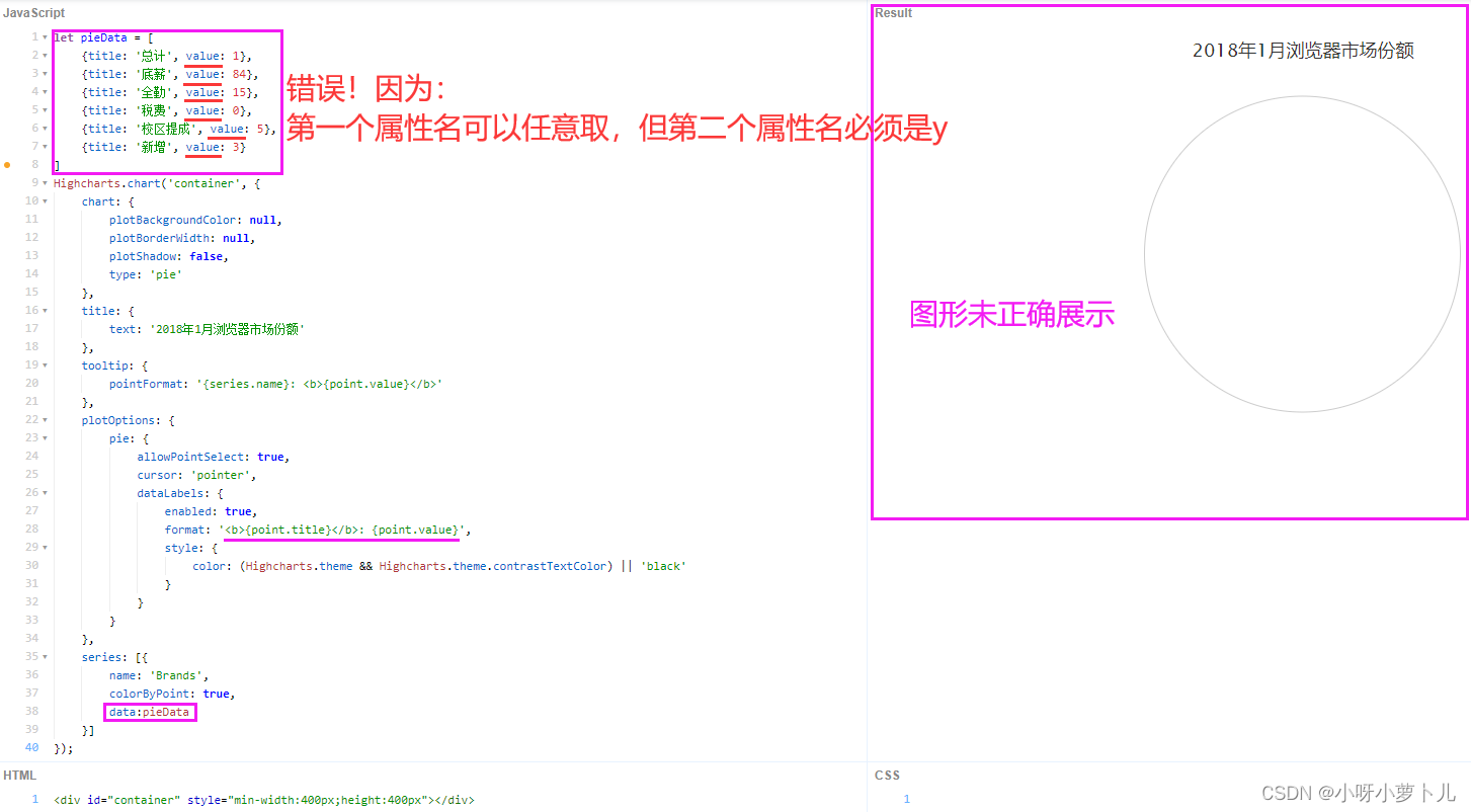
1、对象里的第二个属性值不能为字符串型,也不能为金额格式。
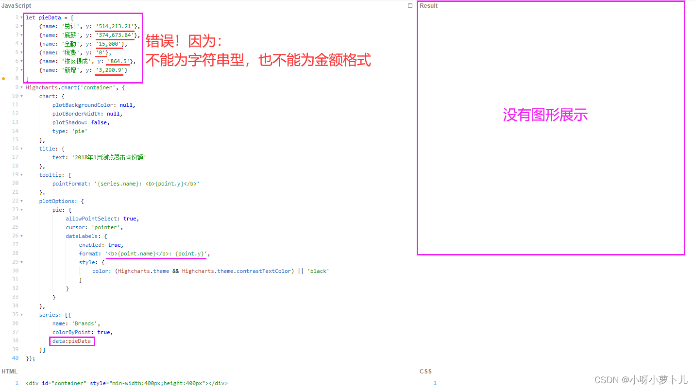
2、对象里的第一个属性名可以任意取,第二个属性名必须是
y。
3、正确写法✨