uni-app之 组件的使用
组件官网
视图组件
view (类似 div)
- hover-class
- 设置一个类名,就是点击的时候,触发类名的样式,默认为none
- hover-stop-propagation
- hover-start-time
- 按下后,根据设置的时间,时间达到后,加载对应的样式
- hover-stay-time Number 400
<template>
	<view>
		<view class="box1" hover-class="box1-active">我是view组件
			<view class="box2" hover-class="box2-active" hover-stop-propagation hover-start-time="1000" hover-stay-time="1000">
				我是子组件
			</view>
		</view>
	</view>
</template>

<script>
	export default {


		data() {


			return {


			}
		},
		methods: {


		}
	}
</script>

<style>
.box1 {


	width: 200px;
	height: 200px;
	background: orange;
}
.box2 {


	width: 100px;
	height: 100px;
	background: red;
}
.box1-active{


	background: blue;
}
.box2-active{


	background: yellow;
}
</style>
- 效果
点击box1的时候,触发对应的样式1
点击box2的时候,触发对应的样式2
基础内容组件
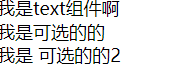
text组件
- 文本组件,用于存放文本的
- 效果
progress进度条组件
- 显示进度条的组件
- 效果

基础表单组件
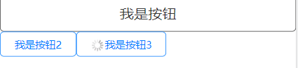
按钮
<template>
	<view>
		<button type="default" plain>我是按钮</button>
		<button size="mini" type="primary" plain>我是按钮2</button>
		<button size="mini" type="primary" loading plain>我是按钮3</button>
	</view>
</template>
- 效果
媒体组件
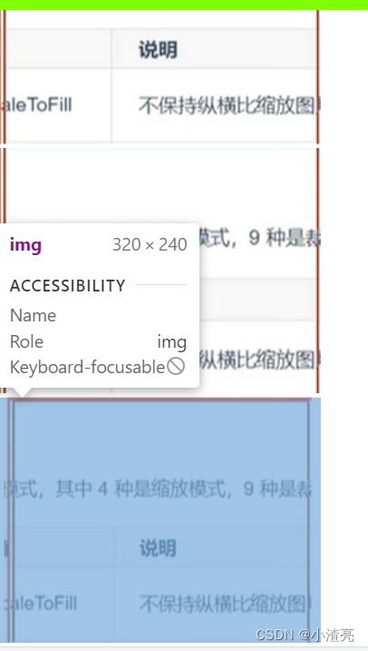
image组件
<template>
	<view>
		<image src="./img/222.png" ></image>
		<image src="./img/222.png" mode="aspectFill"></image>
		<image src="./img/222.png" mode="aspectFit"></image>
	</view>
</template>
- 效果