前言
本系列主要整理前端面试中需要掌握的知识点。本节介绍元素水平垂直居中的方法。
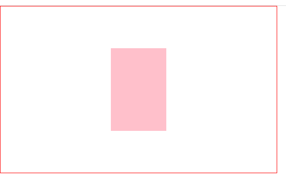
一、定位+margin:auto
<style>
   * {


       margin: 0;
       padding: 0;
   }

   .father {


       width: 500px;
       height: 300px;
       border: 1px solid red;
       position: relative;
   }

   .son {


       width: 100px;
       height: 150px;
       background-color: pink;
       position: absolute;
       top:0;
       left: 0;
       right: 0;
       bottom: 0;
       margin:auto;

   }
</style>

<body>
    <div class="father">
        <div class="son"></div>
    </div>
</body>
二、定位+margin:负值
.son {


    width: 100px;
    height: 150px;
    background-color: pink;
    position: absolute;
    left: 50%;
    top: 50%;
    margin-top: -75px;
    margin-left: -50px;
}
三、定位+transform(不知道子元素宽高可用)
.son {


    width: 100px;
    height: 150px;
    background-color: pink;
    position: absolute;
    left: 50%;
    top: 50%;
    transform: translate(-50%,-50%);
}
四、table布局
设置父元素为display:table-cell,子元素设置 display: inline-block。利用vertical和text-align可以让所有的行内块级元素水平垂直居中
.father {


    width: 500px;
    height: 300px;
    border: 1px solid red;
    display: table-cell;
    vertical-align: middle;
    text-align: center;
}

.son {


    display: inline-block;
    width: 100px;
    height: 150px;
    background-color: pink;
}
五、flex弹性布局
.father {


    width: 500px;
    height: 300px;
    border: 1px solid red;
    display: flex;
    justify-content: center;
    align-items: center;

}

.son {


    width: 100px;
    height: 150px;
    background-color: pink;
}
六、grid网格布局
.father {


    width: 500px;
    height: 300px;
    border: 1px solid red;
    display: grid;
    justify-content: center;
    align-items: center;

}

.son {


    width: 100px;
    height: 150px;
    background-color: pink;
}