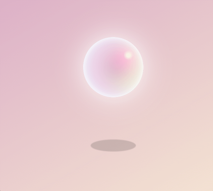
效果图
JS
import React from 'react';
import styles from './style.less'
const index = () =>
{


    return (
        <div className={

    styles.warp}>
            <div className={

    styles.container}>
                <div className={

    styles.bubble}></div>
                <div className={

    styles.shadow}></div>
            </div>
        </div>
    );
};
export default index
CSS
.warp {


  display: flex;
  justify-content: center;
  align-items: center;
  height: 100vh;
  //   阶梯渐变
  background: linear-gradient(150deg, #d299c2, #fef9d7);
  overflow: hidden;

  .container {


    position: relative;
    width: 200px;
    height: 200px;
  }

  // 泡泡
  .bubble {


    width: 100%;
    height: 100%;
    // 径向渐变
    background: radial-gradient(circle at 75% 30%, #fff 5px, #ff21c0 8%, #5b5b6b 60%, #ff21c0 100%);
    border-radius: 50%;
    box-shadow: inset 0 0 20px #fff,
      inset 10px 0 46px #eaf5fc,
      inset 80px 0 60px #efcde6,
      inset -20px -60px 100px #f9f6de,
      inset 0 50px 140px #f9f6de,
      0 0 90px #fff;
    //   执行动画 动画名称 时长 加速后减速 无限次播放
    animation: bubble 4s ease-in-out infinite;
  }

  .shadow {


    background-color: rgba((0), 0, 0, .15);
    width: 150px;
    height: 40px;
    border-radius: 50%;
    position: absolute;
    left: 50%;
    margin-left: -75px;
    bottom: -100px;
    // 一点点模糊效果
    -webkit-filter: blur(1px);
    filter: blur(1px);
    animation: shadow 4s ease-in-out infinite;
  }

  //   定义动画
  @keyframes bubble {


    0%,
    100% {


      transform: translateY(0);
    }

    50% {


      transform: translateY(-80px);
    }
  }

  @keyframes shadow {


    0%,
    100% {


      transform: scale(.5);
    }

    50% {


      transform: scale(1);
    }
  }

}