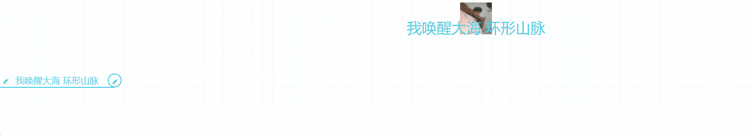
效果图
JS
import styles from './style.less'

const index = () =>
{


    return (
        <div className={

    styles.markdown}>
            <h1 className={

    styles.heading_h1}>
                我唤醒大海 环形山脉
            </h1>
            <h3 className={

    styles.heading_h3}>
                我唤醒大海 环形山脉
            </h3>
        </div>
    );
};
export default index
CSS
.markdown {
word-break: break-word;
line-height: 1.75;
font-weight: 400;
font-size: 15px;
overflow-x: hidden;
color: #2b2b2b;
font-family: -apple-system, system-ui, BlinkMacSystemFont, Helvetica Neue, PingFang SC, Hiragino Sans GB, Microsoft YaHei, Arial, sans-serif;
background-image: linear-gradient(90deg, rgba(159, 219, 252, .15) 3%, transparent 0), linear-gradient(1turn, rgba(159, 219, 252, .15) 3%, transparent 0);
background-size: 20px 20px;
background-position: 50%;
h1,
h2,
h3,
h4,
h5,
h6 {
padding: 30px 0;
margin-top: 35px;
margin-bottom: 10px;
color: #4dd0e1
}
// ! H1 标题
.heading_h1 {
font-size: 30px;
text-align: center;
position: relative;
width: max-content;
margin: 0 auto
}
.heading_h1:before {
position: absolute;
content: "";
z-index: -1;
top: -20px;
height: 100%;
width: 100px;
left: 0;
right: 0;
margin: 0 auto;
background: url('https://www.dataojocloud.com/dataeye/v1/data/image/get?imageid=617a5596fd73380b818dc300') no-repeat 50%;
background-size: 64px 64px;
opacity: .84
}
.heading_h1:after {
position: absolute;
content: "";
width: 150%;
left: -25%;
height: 50%;
bottom: 12px;
border-radius: 50%;
background: linear-gradient(transparent 80%, rgba(77, 208, 225, .8));
background-size: 400% 200%;
opacity: .6;
animation: h1Animate 6s linear infinite
}
@keyframes h1Animate {
0% {
background-position: 100% 100%
}
50% {
background-position: 100% 50%
}
to {
background-position: 100% 100%
}
}
.markdown-body h1,
.markdown-body h2,
.markdown-body h3,
.markdown-body h4,
.markdown-body h5,
.markdown-body h6 {
padding: 30px 0;
margin-top: 35px;
margin-bottom: 10px;
color: #4dd0e1;
}
// ! H3D 标题
.heading_h3 {
margin: 30px 0;
font-size: 18px;
position: relative;
padding: 4px 32px;
width: max-content;
}
.heading_h3::before {
border-bottom: 2px solid #4dd0e1;
width: 100%;
content: "";
display: block;
height: 28px;
position: absolute;
left: 0;
top: 0;
bottom: -2px;
margin: auto;
background-size: 28px 28px;
background-image: url(data:image/png;base64,iVBORw0KGgoAAAANSUhEUgAAACAAAAAgCAYAAABzenr0AAABRklEQVRYR2NkGGDAOMD2M4w6YDQERkNg+ITAppcfY/8zMv3wF+NdTUrZQpUQ2PT6cz8Dw/8CkMWMDIwNvqK8jcQ6gmIHNN19EaXPx1XPyMCghrCUKcpPlGc5MY6gyAE+Fx52MjL8j3cU5a1UYWXtZGBkEAVb+p8hxU+Mby5NHQCxnKEMaskzJ37uFmUetkmMjAzrfUX4woixHBJlZAA0y2EmPPYU4enLkhGeQIqRJDsAh+UgO7duNpD3IcVykkOA2paT5ABaWE60A2hlOdEO8D3/4CMDIyMfWvySFefoaYSoROh74eFXBgYGLiTNVLGc+BC48PAnAwMDG9QBVLOcaAd8P5ox+x/jf5AjGLgYfnwnKqv9/8/PwPO/kFF/MSj0cAKiouD/0bgYoixFU8RovWgJIX1EOYCQIZTIjzpgNARGQ2DAQwAAvHBaIdB7zxsAAAAASUVORK5CYII=);
background-repeat: no-repeat;
animation: h3AnimationBefore 2s infinite alternate;
}
.heading_h3::after {
content: "";
display: block;
width: 28px;
height: 28px;
position: absolute;
border: 2px solid #4dd0e1;
border-radius: 50%;
right: -15px;
top: 0;
bottom: 0;
margin: auto;
background-size: 28px 28px;
background-image: url(data:image/png;base64,iVBORw0KGgoAAAANSUhEUgAAACAAAAAgCAYAAABzenr0AAABRklEQVRYR2NkGGDAOMD2M4w6YDQERkNg+ITAppcfY/8zMv3wF+NdTUrZQpUQ2PT6cz8Dw/8CkMWMDIwNvqK8jcQ6gmIHNN19EaXPx1XPyMCghrCUKcpPlGc5MY6gyAE+Fx52MjL8j3cU5a1UYWXtZGBkEAVb+p8hxU+Mby5NHQCxnKEMaskzJ37uFmUetkmMjAzrfUX4woixHBJlZAA0y2EmPPYU4enLkhGeQIqRJDsAh+UgO7duNpD3IcVykkOA2paT5ABaWE60A2hlOdEO8D3/4CMDIyMfWvySFefoaYSoROh74eFXBgYGLiTNVLGc+BC48PAnAwMDG9QBVLOcaAd8P5ox+x/jf5AjGLgYfnwnKqv9/8/PwPO/kFF/MSj0cAKiouD/0bgYoixFU8RovWgJIX1EOYCQIZTIjzpgNARGQ2DAQwAAvHBaIdB7zxsAAAAASUVORK5CYII=);
animation: h3AnimationAfter 2s infinite alternate;
}
@keyframes h3AnimationBefore {
0% {
width: 28px
}
25% {
width: 100%
}
50% {
width: 100%
}
to {
width: 100%
}
}
@keyframes h3AnimationAfter {
0% {
transform: rotate(0)
}
10% {
transform: rotate(0)
}
50% {
transform: rotate(-1turn)
}
to {
transform: rotate(-1turn)
}
}
}
效果图

Main
import Caption from './Caption'
const index = () =>
{


    return (
        <Caption>我唤醒大海 环形山脉</Caption>
    );
};
export default index
JS
import styles from './style.less'
const index = ({

      children }) =>
{


    return (
        <h3 className={

    styles.heading_h3}>
            {

    children}
        </h3>

    );
};
export default index
CSS
 .heading_h3 {


   //    margin: 30px 0;
   font-size: 18px;
   position: relative;
   padding: 4px 32px;
   width: max-content;
   color: #4dd0e1
 }

 .heading_h3::before {


   border-bottom: 2px solid #4dd0e1;
   width: 100%;
   content: "";
   display: block;
   height: 28px;
   position: absolute;
   left: 0;
   top: 0;
   bottom: -2px;
   margin: auto;
   background-size: 28px 28px;
   background-image: url(data:image/png;base64,iVBORw0KGgoAAAANSUhEUgAAACAAAAAgCAYAAABzenr0AAABRklEQVRYR2NkGGDAOMD2M4w6YDQERkNg+ITAppcfY/8zMv3wF+NdTUrZQpUQ2PT6cz8Dw/8CkMWMDIwNvqK8jcQ6gmIHNN19EaXPx1XPyMCghrCUKcpPlGc5MY6gyAE+Fx52MjL8j3cU5a1UYWXtZGBkEAVb+p8hxU+Mby5NHQCxnKEMaskzJ37uFmUetkmMjAzrfUX4woixHBJlZAA0y2EmPPYU4enLkhGeQIqRJDsAh+UgO7duNpD3IcVykkOA2paT5ABaWE60A2hlOdEO8D3/4CMDIyMfWvySFefoaYSoROh74eFXBgYGLiTNVLGc+BC48PAnAwMDG9QBVLOcaAd8P5ox+x/jf5AjGLgYfnwnKqv9/8/PwPO/kFF/MSj0cAKiouD/0bgYoixFU8RovWgJIX1EOYCQIZTIjzpgNARGQ2DAQwAAvHBaIdB7zxsAAAAASUVORK5CYII=);
   background-repeat: no-repeat;
   animation: h3AnimationBefore 2s infinite alternate;
 }

 .heading_h3::after {


   content: "";
   display: block;
   width: 28px;
   height: 28px;
   position: absolute;
   border: 2px solid #4dd0e1;
   border-radius: 50%;
   right: -15px;
   top: 0;
   bottom: 0;
   margin: auto;
   background-size: 28px 28px;
   background-image: url(data:image/png;base64,iVBORw0KGgoAAAANSUhEUgAAACAAAAAgCAYAAABzenr0AAABRklEQVRYR2NkGGDAOMD2M4w6YDQERkNg+ITAppcfY/8zMv3wF+NdTUrZQpUQ2PT6cz8Dw/8CkMWMDIwNvqK8jcQ6gmIHNN19EaXPx1XPyMCghrCUKcpPlGc5MY6gyAE+Fx52MjL8j3cU5a1UYWXtZGBkEAVb+p8hxU+Mby5NHQCxnKEMaskzJ37uFmUetkmMjAzrfUX4woixHBJlZAA0y2EmPPYU4enLkhGeQIqRJDsAh+UgO7duNpD3IcVykkOA2paT5ABaWE60A2hlOdEO8D3/4CMDIyMfWvySFefoaYSoROh74eFXBgYGLiTNVLGc+BC48PAnAwMDG9QBVLOcaAd8P5ox+x/jf5AjGLgYfnwnKqv9/8/PwPO/kFF/MSj0cAKiouD/0bgYoixFU8RovWgJIX1EOYCQIZTIjzpgNARGQ2DAQwAAvHBaIdB7zxsAAAAASUVORK5CYII=);
   animation: h3AnimationAfter 2s infinite alternate;
 }

 @keyframes h3AnimationBefore {


   0% {


     width: 28px
   }

   25% {


     width: 100%
   }

   50% {


     width: 100%
   }

   to {


     width: 100%
   }
 }

 @keyframes h3AnimationAfter {


   0% {


     transform: rotate(0)
   }

   10% {


     transform: rotate(0)
   }

   50% {


     transform: rotate(-1turn)
   }

   to {


     transform: rotate(-1turn)
   }
 }