- border-radius 圆角
DOM文档中结构如下:
<div></div>
设置参数:各种长度单位都可以:px,%,…,%有时很方便,但宽高不一致时不太好
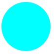
1、参数个数1:四个方向都一样-----------border-radius: 一样
当宽、高相同时,四个方向设置相同的数值可以将正方形转变成一个圆:
CSS样式如下:
div{
    width:100px;
    height:100px;
    background-color:#0FF;
    border-radius:50px;
}
效果图如下:
2、参数个数2:对角-----------border-radius: 左上&右下 右上&左下
CSS样式如下:
div{
    width:100px;
    height:100px;
    background-color:#0FF;
    border-radius:0 100px;
}
效果图如下:

3、参数个数3:斜对角-----------border-radius: 左上 右上&左下 右下
扫描二维码关注公众号,回复:
1449256 查看本文章

CSS样式如下:
div{
    width:100px;
    height:100px;
    background-color:#0FF;
    border-radius:50px 0 50px;
}
效果图如下:

4、参数个数4:全部,顺时针-----------border-radius: 左上 右上 右下 左下
CSS样式如下:
div{
    width:100px;
    height:100px;
    background-color:#0FF;
    border-radius:100px 0 0 100px;
}
效果图如下:

- transition 过渡(css3动画)
transition-property:要运动的样式(all || [attr] || none)
transition-duration:规定完成过渡效果需要多少秒或毫秒
transition-delay:定义动画延迟多久开始
transition-timing-function:运动速度曲线。
ease:(逐渐变慢)默认值;
linear:(匀速);
ease-in:(加速);
ease-out:(减速);
ease-in-out:(先加速后减速);
cubic-bezier 贝塞尔曲线( x1, y1, x2, y2 ),贝塞尔曲线链接
transition: property duration timing-function delay //集合样式
利用圆角画出半圆并排列成风车形状,再用过渡做出鼠标移上去时的旋转效果
DOM文档中结构如下:
<div class="div1">
    <div></div>
    <div></div>
    <div></div>
    <div></div>
</div>
CSS样式如下:
.div1{width:200px;height:200px;margin:100px auto;overflow:hidden;transition:all 6s;}
.div1:hover{transform:rotate(1080deg);}
.div1 div{overflow:hidden;background-color:#0FF;float:left}
.div1 div:nth-child(1){width:50px;height:100px;margin-left:50px;border-radius:100px 0 0 100px;}
.div1 div:nth-child(2){width:100px;height:50px;margin-top:50px;border-radius:100px 100px 0 0;}
.div1 div:nth-child(4){width:50px;height:100px;margin-right:50px;border-radius:0 100px 100px 0;}
.div1 div:nth-child(3){width:100px;height:50px;margin-bottom:50px;border-radius:0 0 100px 100px;}
效果图如下: