css3引入的弹性布局可以对容器中的条目更方便地排序,对齐和分配空间;弹性布局可以在容器不确定长宽的情况下进行填充,且可以根据窗口的大小来进行自适应.在正常的布局中是区分行内元素和块级元素,他们的排列方式有所不同,而在弹性布局上是不需要考虑元素的排列顺序.
弹性布局是对子元素有影响:
<style>
.content {
    border: 1px solid #ccc;
    box-shadow: 2px 2px 2px #ddd;
    padding: 40px 35px;
    display: flex;
    justify-content: space-between;
    align-items: center;
}

.content .box {
    width: 190px;
    height: 120px;
    border: 1px solid #03645a;
    border-radius: 5px;
    display: flex;
    justify-content: center;
    align-items: center;
    flex-direction: column;
}
.mt10 {
    margin-top: 10px;
}
</style>
<div class="content">
    <div class="box">
        <img src="{% static 'img/web/us/promotion/crispr-cas9-knockout-mice-au/20180604-process1.png' %}" alt=""/>
        <p class="mt10">Nuclease vector</p>
        <p>construction</p>
    </div>
    <img src="{% static 'img/web/us/promotion/crispr-cas9-knockout-mice-au/20180604-arrow.jpg' %}" alt="" class="arrow"/>
    <div class="box">
        <img src="{% static 'img/web/us/promotion/crispr-cas9-knockout-mice-au/20180604-process2.png' %}"
             alt=""/>
        <p class="mt10">Nuclease injection</p>
        <p>into mouse eggs</p>
    </div>
    <img src="{% static 'img/web/us/promotion/crispr-cas9-knockout-mice-au/20180604-arrow.jpg' %}" alt="" class="arrow"/>
    <div class="box">
        <img src="{% static 'img/web/us/promotion/crispr-cas9-knockout-mice-au/20180604-process3.png' %}"
             alt=""/>
        <p class="mt10">Founder screening</p>
    </div>
    <img src="{% static 'img/web/us/promotion/crispr-cas9-knockout-mice-au/20180604-arrow.jpg' %}" alt="" class="arrow"/>
    <div class="box">
        <img src="{% static 'img/web/us/promotion/crispr-cas9-knockout-mice-au/20180604-process4.png' %}"
             alt=""/>
        <p class="mt10">Breeding Founders</p>
        <p>to obtain F1</p>
    </div>
</div>
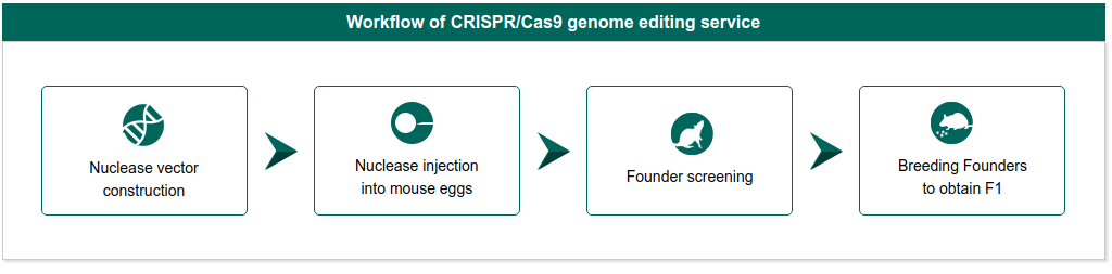
上图是效果就是用了弹性布局,在这段代码中,父级元素中定义的
display: flex;   //定义为弹性布局,对改容器的子级元素有效,而对子级的子级元素没有效果
justify-content: space-between;   //定义子级元素的对齐方式,其中默认的是flex-start(主轴初始方向上的边界对齐),fled-end(主轴结束方向的边界对齐),space-between(两边对齐),space-around(每个子元素空白空间一样,但是第一个和最后一个与该行的边界是其它元素空白空间的一半)
align-items: center;  //交叉轴上的对齐方式
在弹性布局中可以自定义布局的方向,从上而下,从下而上,从左到有右或者从右到左都可以,在父级元素中使用flex-deriction
属性定义.弹性布局中不分上下左右方向,以主轴和交叉轴来描述方向,默认从左到右为主轴方向,从上到下为交叉轴方向,但是我们
可以自定义主轴和交叉轴,主轴方向和交叉轴方向,通过在父级元素中定义flex-deriction来定义方向,一旦主轴方向确定下来了,交叉轴就默认为另外一个方向,
flex-deriction:row; //默认值,主轴为水平方向,方向从左到右
flex-deriction:row-reverse; //主轴为水平方向,方向从右到左
flex-deriction:column; //主轴为垂直方向,方向从上而下
flex-deriction:column-reverse; //主轴为垂直方向,方向从下而上
在弹性布局中常用的还有flex-wrap属性:
flex-warp:nowrap(不换行)/wrap(换行)/wrap-reverse(换行,但是第一行在下方)