今天继续进行基于barplot()命令的文章条形图仿制
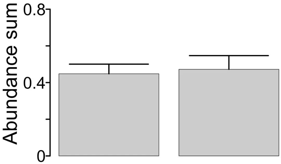
原图展示
之前看过一篇利用肠道菌群进行疾病诊断的文章,其中涉及到一个图形,作者将筛选出的marker微生物的总丰度与肠道菌群的alpha多样性指数在同一个图像利用对称的条形图进行展示,同时给出了健康和疾病样品间的差异检验结果。

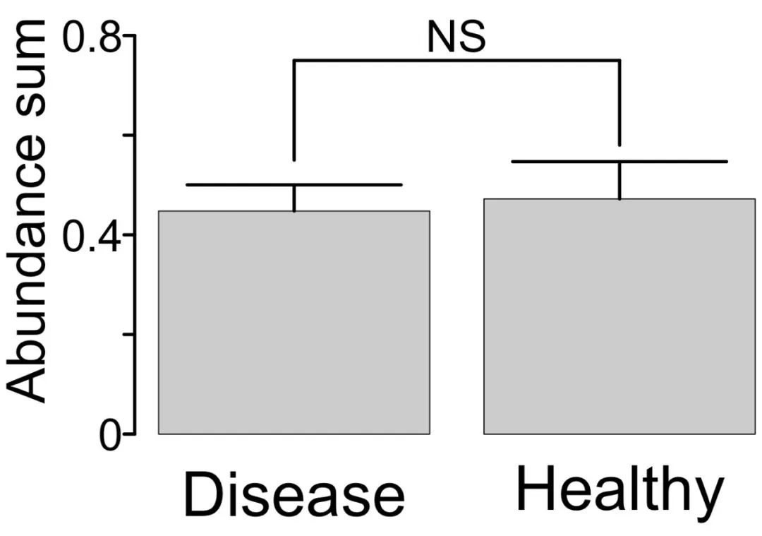
今天就来仿照绘制一下这幅图,我绘制出来的最终图像是下面这个样子。

还是照例先给出完成的绘图代码:
marker_abundance <- read.table("marker_abundance.txt",header = TRUE,row.names = 1,sep = "\t")diversity <- read.table("index.txt",header = TRUE,row.names = 1,sep = "\t")library(ggplot2)tiff(filename = "marker_abundance_diversity.tif",width = 5400,height = 7200,compression = "lzw",res = 600,type = "windows")par(mfrow = c(2,1))par(mar = c(5,7,1,1))par(xpd = TRUE)bar1 <- barplot(marker_abundance$Abundance,ylim = c(0,0.9),axes = FALSE,col = "grey80")axis(side = 2,at = c(0,0.2,0.4,0.6,0.8),labels = c("","","","",""),lwd = 3)text(x = 0.07,y = c(0,0.4,0.8),labels = c(0,0.4,0.8),cex = 2.5,adj = c(1,0.5))mtext(side = 2,text = "Abundance sum",line = 4,cex = 3)arrows(x0 = 0.7,y0 = 0.4478635,x1 = 0.7,y1 = 0.4478635+0.05248740,col = "black",angle = 90,length = 1,lwd = 3)arrows(x0 = 1.9,y0 = 0.4721783,x1 = 1.9,y1 = 0.4721783+0.07471587,col = "black",angle = 90,length = 1,lwd = 3)text(x = bar1,y = -0.12,labels = c("Disease","Healthy"),cex = 3.5)segments(x0 = 0.7,y0 = 0.55,x1 = 0.7,y1 = 0.75,col = "black",lwd = 3)segments(x0 = 0.7,y0 = 0.75,x1 = 1.9,y1 = 0.75,col = "black",lwd = 3)segments(x0 = 1.9,y0 = 0.75,x1 = 1.9,y1 = 0.58,col = "black",lwd = 3)text(x = 1.3,y = 0.8,labels = "NS",cex = 2.5)bar2 <- barplot(diversity$shannon,ylim = c(-12,0),axes = FALSE,col = "grey80")axis(side = 2,at = c(-12,-10,-8,-6,-4,-2,0),labels = c("","","","","","",""),lwd = 3)text(x = 0.07,y = c(-12,-8,-4,0),labels = c(-12,-8,-4,0),cex = 2.5,adj = c(1,0.5))mtext(side = 2,text = "Within-sample diversity",line = 4,cex = 3)arrows(x0 = 0.7,y0 = -8.946364,x1 = 0.7,y1 = -8.946364-0.5686171,col = "black",angle = 90,length = 1,lwd = 3)arrows(x0 = 1.9,y0 = -8.716364,x1 = 1.9,y1 = -8.716364-0.6158940,col = "black",angle = 90,length = 1,lwd = 3)segments(x0 = 0.7,y0 = -10,x1 = 0.7,y1 = -12,col = "black",lwd = 3)segments(x0 = 0.7,y0 = -12,x1 = 1.9,y1 = -12,col = "black",lwd = 3)segments(x0 = 1.9,y0 = -12,x1 = 1.9,y1 = -9.8,col = "black",lwd = 3)text(x = 1.3,y = -13,labels = "NS",cex = 2.5)dev.off()
绘制这个图像需要两个数据,一个是marker微生物总丰度,另一个是样品对应的alpha多样性指数,需要在绘图前先使用Excel分别计算实验和对照组中marker微生物总丰度和alpha多样性指数的平均值和标准偏差(sd),具体的绘图数据如下:


特别需要注意的是:用于绘制下方条形图的数据要手动改为负值,sd不需要改为负值。
绘图过程详解
定义绘图区域
首先要制定用于绘图的区域。
par(mfrow = c(2,1))将绘图区定义为两行一列,分别用于绘制两个互相对称的条形图。
par(mar = c(5,7,1,1))指定第一个绘图区即上方条形图的绘图边界,注意下方和左侧要留出大一点的区域,用于样品组的名称和纵坐标,而上方和右侧的边界要尽量小。
第二个绘图区即下方条形图的绘图边界无需设置。
par(xpd = TRUE)将绘图参数定义为可以在绘图区外显示,从而使得绘图参数的显示能够跨越上下两个绘图区。
上方条形图绘制
定义完绘图区之后,要首先进行上方条形图的绘制。
bar1 <- barplot(marker_abundance$Abundance,ylim = c(0,0.9),axes = FALSE,col = "grey80")
注意:y轴的范围要适当的大一些,为差异性检验结果的展示预留空间。
使用“axes = FALSE”隐藏默认的坐标轴信息。
axis(side = 2,at = c(0,0.2,0.4,0.6,0.8),labels = c("","","","",""),lwd = 3)
添加纵坐标,并将刻度标签设为空。
text(x = 0.07,y = c(0,0.4,0.8),labels = c(0,0.4,0.8),cex = 2.5,adj = c(1,0.5))
通过x的数值,调整标签与坐标轴刻度的间距。
添加纵坐标刻度标签,通过标签的数量和间隔实现坐标轴的主刻度和副刻度。
使用adj参数调整标签的对齐方式,使得长度不一的标签文本统一靠右居中对齐。
mtext(side = 2,text = "Abundance sum",line = 4,cex = 3)
添加纵坐标轴的标签,使用line参数调整标签与坐标轴的距离,cex调整标签字号的大小。

条形误差棒的添加
R默认的绘图命令中并不包含误差棒的绘制,这里使用arrows()命令以箭头的形式添加误差棒。
arrows(x0 = 0.7,y0 = 0.4478635,x1 = 0.7,y1 = 0.4478635+0.05248740,col = "black",angle = 90,length = 1,lwd = 3)arrows(x0 = 1.9,y0 = 0.4721783,x1 = 1.9,y1 = 0.4721783+0.07471587,col = "black",angle = 90,length = 1,lwd = 3)
箭头的x0位对应条形在x轴的位置,因为是竖直方向的,因而x1与x0一致。
y0为对应条形的绘图数值,y1为绘图数值+sd。
angle设置为90度,使得箭头的两边处于一条水平的直线,从而形成误差棒的形式。
使用length和lwd调整误差棒的长度和线宽。
差异性检验结果展示
使用线段的形式构成一个U型框连接两个条形,之后利用文本给出组间差异性检验结果。
segments(x0 = 0.7,y0 = 0.55,x1 = 0.7,y1 = 0.75,col = "black",lwd = 3)segments(x0 = 0.7,y0 = 0.75,x1 = 1.9,y1 = 0.75,col = "black",lwd = 3)segments(x0 = 1.9,y0 = 0.75,x1 = 1.9,y1 = 0.58,col = "black",lwd = 3)text(x = 1.3,y = 0.8,labels = "NS",cex = 2.5)
具体的参数数值根据绘图数据进行调整。
此时需要添加条形对应的样本组名称,因为如果在第二个条形绘制后再添加可能需要额为设置绘图区参数。
text(x = bar1,y = -0.12,labels = c("Disease","Healthy"),cex = 3.5)
注意:在第二个条形绘制完成之后,再返回此处调整标签在y轴的位置,使得标签位于两个条形图的中间。
对称条形的绘制
对称条形的绘制方法与第一个条形图基本一致。
bar2 <- barplot(diversity$shannon,ylim = c(-12,0),axes = FALSE,col = "grey80")axis(side = 2,at = c(-12,-10,-8,-6,-4,-2,0),labels = c("","","","","","",""),lwd = 3)text(x = 0.07,y = c(-12,-8,-4,0),labels = c(12,8,4,0),cex = 2.5,adj = c(1,0.5))mtext(side = 2,text = "Within-sample diversity",line = 4,cex = 3)arrows(x0 = 0.7,y0 = -8.946364,x1 = 0.7,y1 = -8.946364-0.5686171,col = "black",angle = 90,length = 1,lwd = 3)arrows(x0 = 1.9,y0 = -8.716364,x1 = 1.9,y1 = -8.716364-0.6158940,col = "black",angle = 90,length = 1,lwd = 3)segments(x0 = 0.7,y0 = -10,x1 = 0.7,y1 = -12,col = "black",lwd = 3)segments(x0 = 0.7,y0 = -12,x1 = 1.9,y1 = -12,col = "black",lwd = 3)segments(x0 = 1.9,y0 = -12,x1 = 1.9,y1 = -9.8,col = "black",lwd = 3)text(x = 1.3,y = -13,labels = "NS",cex = 2.5)
需要注意的是:
-
对称条形图因为是在下方展示,所以所有的数值均是负数;
-
在绘制下方条形图纵坐标标签时,要将标签设置为对应的正数;
-
由于此时误差棒的方向是向下,因而y1的数值为mean-sd。
原图展示
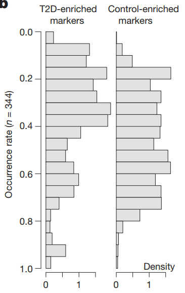
还是上一篇推文中介绍的对称条形图的文献,其中包含一个对疾病和健康marker微生物的丰度进行相关性分析,进而使用条形图展示其相关系数分布的图形。
今天就来仿照绘制一下这幅图,我绘制出来的最终图像是下面这个样子。

还是照例先给出完成的绘图代码:
disease <- read.table("Disease.txt",header = TRUE,row.names = 1,sep = "\t")healthy <- read.table("Healthy.txt",header = TRUE,row.names = 1,sep = "\t")disease <- t(disease)healthy <- t(healthy)cor.d <- cor(disease,method = "spearman")cor.h <- cor(healthy,method = "spearman")write.table(cor.d,"correlation_disease.xls",sep="\t",quote=F,col.names=NA)write.table(cor.h,"correlation_healthy.xls",sep="\t",quote=F,col.names=NA)library(reshape2)cor.d <- melt(cor.d)cor.h <- melt(cor.h)d.value <- cor.d$valued.value <- as.vector(d.value)d.value <- as.numeric(d.value)d.value <- d.value[d.value > 0]h.value <- cor.h$valueh.value <- as.vector(h.value)h.value <- as.numeric(h.value)h.value <- h.value[h.value > 0]hist1 <- hist(d.value,breaks = c(0,0.05,0.1,0.15,0.2,0.25,0.3,0.35,0.4,0.45,0.5,0.55,0.6,0.65,0.7,0.75,0.8,0.85,0.9,0.95,1),plot = FALSE)hist2 <- hist(h.value,breaks = c(0,0.05,0.1,0.15,0.2,0.25,0.3,0.35,0.4,0.45,0.5,0.55,0.6,0.65,0.7,0.75,0.8,0.85,0.9,0.95,1),plot = FALSE)tiff(filename = "correlation_density.tif",width = 5400,height = 7200,compression = "lzw",res = 600,type = "windows")par(mfrow = c(1,2))par(mar = c(3,8,6,2))par(xpd = TRUE)bar1 <- barplot(hist1$density,space = 0,horiz = TRUE,axes = FALSE,col = "grey80")axis(side = 1,at = c(0,0.5,1.0,1.5,2.0),labels = c("","","","",""),lwd = 3)text(x = c(0,1.0,2.0),y = -1.5,labels = c(0,1.0,2.0),cex = 2.5)axis(side = 2,line = 1,at = c(0,4,8,12,16,20),labels = c("","","","","",""),lwd = 3)text(x = -0.28,y = c(0,4,8,12,16,20),labels = c("0.0","0.2","0.4","0.6","0.8","1.0"),cex = 2.5,adj = c(1,0.5))mtext(side = 2,text = "Occurrence rate (n = 22)",line = 5.8,cex = 3)text(x = 0.8,y = 21,labels = "Disease-enriched\nmarkers",cex = 2.5)par(mar = c(3,0.5,6,9.5))bar2 <- barplot(hist2$density,space = 0,horiz = TRUE,axes = FALSE,col = "grey80")axis(side = 1,at = c(0,0.5,1.0,1.5,2.0),labels = c("","","","",""),lwd = 3)text(x = c(0,1.0,2.0),y = -1.5,labels = c(0,1.0,2.0),cex = 2.5)text(x = 1.2,y = 21,labels = "Healthy-enriched\nmarkers",cex = 2.5)text(x = 1.5,y = 0.5,labels = "Density",cex = 3)dev.off()
绘制图像所需的数据就是用于进行相关性的marker微生物在各样品中的丰度数据。
绘图过程详解
相关性分析
首先将绘图数据导入。
disease <- read.table("Disease.txt",header = TRUE,row.names = 1,sep = "\t")disease <- t(disease)
相关性分析要求行为样本,进行相关性统计的变量为列,因而有些数据可能需要转置处理。
cor.d <- cor(disease,method = "spearman")write.table(cor.d,"correlation_disease.xls",sep="\t",quote=F,col.names=NA)
使用cor()命令进行相关性分析,其可选方法包括spearman、pearson和kendall,输出结果为相关系数统计矩阵。
使用write.table()将相关性分析结果输出为xls表格,方便日后阅读和使用。
⚠️ cor()只能输出相关系数,而不同输出显著性p值,如果需要进行显著性检验,需要使用其它命令进行操作,相关内容会在之后的推文中介绍。
相关系数频率分布统计
首先要将“宽格式”的相关系数数据转化为“长格式”的数据。
library(reshape2)cor.d <- melt(cor.d)
之后将其中相关系数数值列提出来变为向量。
d.value <- cor.d$valued.value <- as.vector(d.value)d.value <- as.numeric(d.value)d.value <- d.value[d.value > 0]
⚠️ 因为本次绘图只是统计正相关的数据,因而使用[d.value > 0]值保留大于0的相关系数。
之后统计相关系数在不同范围内的分布频数。
hist1 <- hist(d.value,breaks = c(0,0.05,0.1,0.15,0.2,0.25,0.3,0.35,0.4,0.45,0.5,0.55,0.6,0.65,0.7,0.75,0.8,0.85,0.9,0.95,1),plot = FALSE)
使用hist()进行频数的统计,应用breaks定义统计的范围,治理以0.05为间隔统计相关系数的分布频数。
图像绘制
最后对统计的相关系数分布频数进行图像绘制。
par(mfrow = c(1,2))par(mar = c(3,8,6,2))par(xpd = TRUE)bar1 <- barplot(hist1$density,space = 0,horiz = TRUE,axes = FALSE,col = "grey80")axis(side = 1,at = c(0,0.5,1.0,1.5,2.0),labels = c("","","","",""),lwd = 3)text(x = c(0,1.0,2.0),y = -1.5,labels = c(0,1.0,2.0),cex = 2.5)axis(side = 2,line = 1,at = c(0,4,8,12,16,20),labels = c("","","","","",""),lwd = 3)text(x = -0.28,y = c(0,4,8,12,16,20),labels = c("0.0","0.2","0.4","0.6","0.8","1.0"),cex = 2.5,adj = c(1,0.5))mtext(side = 2,text = "Occurrence rate (n = 22)",line = 5.8,cex = 3)text(x = 0.8,y = 21,labels = "Disease-enriched\nmarkers",cex = 2.5)par(mar = c(3,0.5,6,9.5))bar2 <- barplot(hist2$density,space = 0,horiz = TRUE,axes = FALSE,col = "grey80")axis(side = 1,at = c(0,0.5,1.0,1.5,2.0),labels = c("","","","",""),lwd = 3)text(x = c(0,1.0,2.0),y = -1.5,labels = c(0,1.0,2.0),cex = 2.5)text(x = 1.2,y = 21,labels = "Healthy-enriched\nmarkers",cex = 2.5)text(x = 1.5,y = 0.5,labels = "Density",cex = 3)
图像绘制的命令与正常的条形图绘制基本一致,这里就不再赘述了,详细的参数用法可以参见之前的几篇推文。
⚠️ 因为图像的条形是横向分布,因而在绘制时要使用horiz = TRUE参数。
-
声明: 本号旨在传播、传递、交流,对相关文章内容观点保持中立态度。涉及内容如有侵权或其他问题,请与本号联系,第一时间做出撤回。推荐课程(点击进入联系详细了解):R语言回归及混合效应(多水平/层次/嵌套)模型及贝叶斯实现实践技术