最终效果
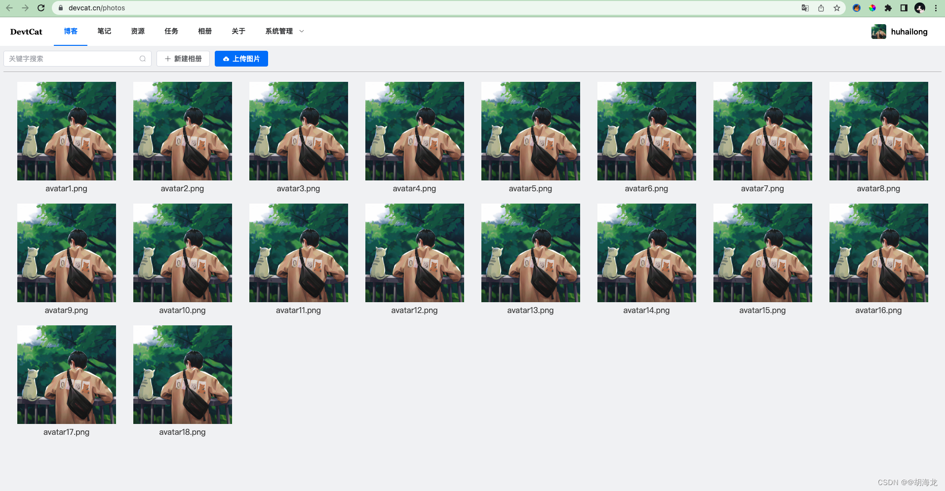
响应式均匀排列
实现思路
整体思路是将遍历元素的父布局设置为flex,并且将justify-content设置为space-around,但此时最后一行如果和上面均匀分布的数量不一样(少于),那么会出现剧中均匀分布,而不是想上面图片那样居左对齐排列。至于为什么不将justify-content设置为start,是因为如果设置为了start的话,右侧大概率会出现空白,导致两侧不是均匀分布的,影响体验。
我这里的解决方案是通过window得resize事件,监听屏幕的变化,在初始化页面的时候首先根据排列的元素宽度计算出当前宽度的屏幕中每一行会均匀排列多少个,然后再计算出最后一个行的元素有几个,那么这时候我们用每行均匀个数减去最后一行的个数就是我们需要补齐的个数,这里补齐的是空白的占位元素。
实现代码
Photos.vue :
<script setup>
import {

       Plus, Search, UploadFilled } from '@element-plus/icons-vue';
import {

       onMounted, reactive, ref } from 'vue';

const imageList = reactive(["https://www.devcat.cn/res/img/avatar.png","https://www.devcat.cn/res/img/smart-index.png","https://www.devcat.cn/res/img/avatar.png"])

const subCount = ref(0)

const initList = () => {


    let count = parseInt((window.innerWidth-10) / 220)
    subCount.value =  count - (18 - count*(parseInt(18 / count)))
}

onMounted(()=>{


    initList()
    window.addEventListener('resize',()=>{


        initList()
    })
})

</script>

<template>
    <main>
        <div class="toolBar">
            <el-input :suffix-icon="Search" placeholder="关键字搜索" style="width: 300px;"></el-input>
            <el-button :icon="Plus" type="default" style="margin-left:10px;">新建相册</el-button>
            <el-button :icon="UploadFilled" type="primary" style="margin-left:10px;">上传图片</el-button>
        </div>
        <div class="photoBox">
            <div class="photoItem" v-for="item in 18" :key="item">
                <el-image :initial-index="item-1" :preview-src-list="imageList" loading="lazy" style="width:200px; height:200px" fit="contain" src="https://www.devcat.cn/res/img/avatar.png"></el-image>
                <div class="info">avatar{

   { item }}.png</div>
            </div>
            <div style="width: 200px; height: 200px; margin: 10px;" v-for="item in subCount" :key="item"></div>
        </div>
    </main>
</template>

<style scoped>
main{


    padding: 10px;
}
.toolBar{


    border-bottom: 1px solid #bbb;
    padding-bottom: 10px;
}
.photoBox{


    width: calc(100% - 20px);
    display: flex;
    justify-content: space-around;
    flex-wrap: wrap;
    padding: 10px;

}
.photoItem{


    margin: 10px;
    cursor: pointer;
}
.info{


    text-align: center;
    color: #444;
}
.helpLayout{


    width: auto;
}
</style>
以上只针对这种需求的一种解决方案,如果有用的话===>** 点赞+收藏 **