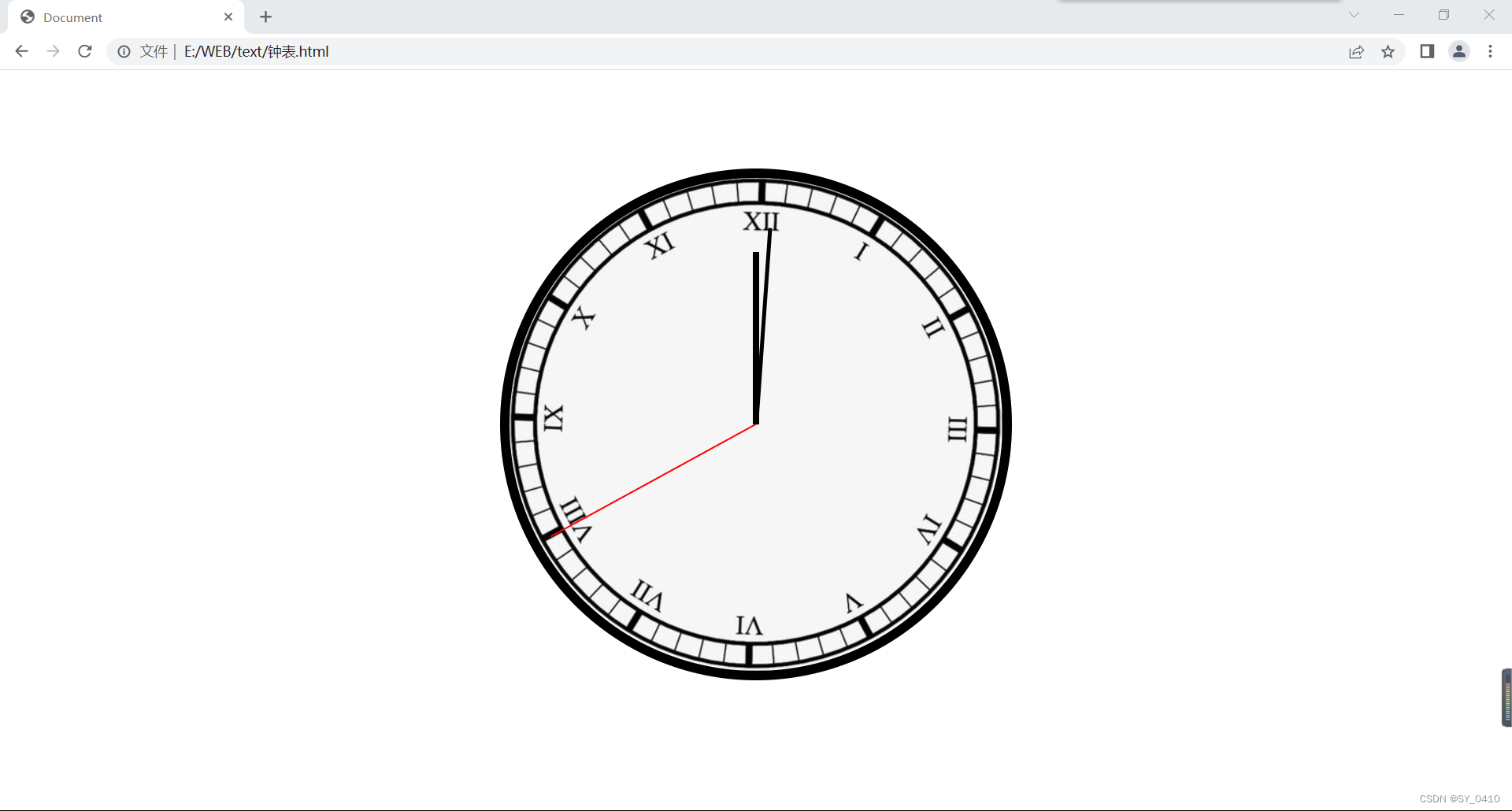
一、钟表
效果图
- 代码
<!DOCTYPE html>
<html lang="en">

<head>
    <meta charset="UTF-8">
    <meta http-equiv="X-UA-Compatible" content="IE=edge">
    <meta name="viewport" content="width=device-width, initial-scale=1.0">
    <title>Document</title>
    <style>
        * {


            margin: 0;
            padding: 0;
        }

        /*设置表的样式*/
        .clock {


            width: 500px;
            height: 500px;
            margin: 0 auto;
            margin-top: 100px;
            border-radius: 50%;
            border: 10px solid black;
            position: relative;
            background-image: url(../example/biaopan.png);

        }

        .clock>div {


            position: absolute;
            top: 0;
            left: 0;
            right: 0;
            bottom: 0;
            margin: auto;
        }

        .hour-wrapper {


            width: 70%;
            height: 70%;
            animation: colck 43200s  linear;
            animation-iteration-count: infinite;

        }

        .hour {


            height: 50%;
            width: 6px;
            background-color: black;
            margin: 0 auto;
        }

        /*设置分针*/
        .min-wrapper {


            height: 80%;
            width: 80%;
            animation: clock 3600s linear ;
            animation-iteration-count: infinite;

        }

        .min {


            height: 50%;
            width: 4px;
            background-color: black;
            margin: 0 auto;
        }

        /*设置秒针*/
        .sec-wrapper {


            height: 95%;
            width: 95%;
            animation:clock 60s linear;
            animation-iteration-count: infinite;

        }

        .sec {


            height: 50%;
            width: 2px;
            background-color: red;
            margin: 0 auto;
        }
        @keyframes clock {


            form{


                transform: rotateZ(0);
            }
            to{


                transform: rotateZ(360deg);
            }
        }

    </style>
</head>

<body>
    <!--创建表的容器-->
    <div class="clock">
        <!--创建时针-->
        <div class="hour-wrapper">
            <div class="hour"></div>
        </div>
        <!--创建分针-->
        <div class="min-wrapper">
            <div class="min"></div>
        </div>
        <!--创建分针-->
        <div class="sec-wrapper">
            <div class="sec"></div>
        </div>
    </div>
</body>

</html>
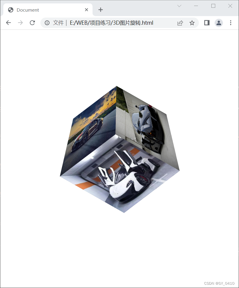
二、3D视图旋转
- 效果图:实现3D动态旋转
- 代码
<!DOCTYPE html>
<html lang="en">

<head>
    <meta charset="UTF-8">
    <meta http-equiv="X-UA-Compatible" content="IE=edge">
    <meta name="viewport" content="width=device-width, initial-scale=1.0">
    <title>Document</title>
    <link rel="stylesheet" href="./reset.css">
    <style>


        .cube {


            width: 200px;
            height: 200px;
            margin: 0 auto;
            perspective: 800px;
            margin-top: 200px;
            /*设置3d变形效果*/
            transform-style: preserve-3d;
            transform: rotateX(45deg) rotateZ(45deg);
            animation: rotate infinite 10s linear;
        }

        .cube> div {


            /*为元素设置透明效果*/
            /*opacity: 0.7;*/
            position: absolute;
        }

        img {


            vertical-align: top;
        }
        .box1{


            transform: rotateY(90deg) translateZ(100px);
        }
        .box2{


            transform: rotateY(-90deg) translateZ(100px);
        }
        .box3{


            transform: rotateX(90deg) translateZ(100px);
        }
        .box4{


            transform: rotateX(-90deg) translateZ(100px);
        }
        .box5{


            transform: rotateY(180deg)  translateZ(100px);
        }
        .box6{


            transform: rotateY(0deg) translateZ(100px);
        }

        @keyframes rotate {


            from{


                transform: rotateX(0) rotateZ(0);
            }
            to{


                transform: rotateX(1turn) rotateZ(1turn);
            }
        }
    </style>
</head>

<body>
    <!--创建外部容器-->
    <div class="cube">
        <!--引入图片-->
        <div class="box1">
            <img src="https://desk-fd.zol-img.com.cn/t_s960x600c5/g1/M03/03/06/ChMljV401HyID4kiAAlPTKlcxxwAAQJNwIKmV8ACU9k193.jpg" width="200px" height="200px">
        </div>
        <div class="box2">
            <img src="https://desk-fd.zol-img.com.cn/t_s960x600c5/g1/M03/03/06/ChMljV401HyID4kiAAlPTKlcxxwAAQJNwIKmV8ACU9k193.jpg" width="200px" height="200px">
        </div>

        <div class="box3">
            <img src="https://nimg.ws.126.net/?url=http%3A%2F%2Fdingyue.ws.126.net%2F2021%2F1010%2Febe6f0c5j00r0q3gk0029c000go009qc.jpg&thumbnail=650x2147483647&quality=80&type=jpg" width="200px" height="200px">
        </div>

        <div class="box4">
            <img src="http://inews.gtimg.com/newsapp_bt/0/13365450066/1000" width="200px" height="200px">
        </div>

        <div class="box5">
            <img src="http://5b0988e595225.cdn.sohucs.com/images/20190326/9fc3f6c45a0c4363b5cab693461b6cd8.jpeg" width="200px" height="200px">
        </div>

        <div class="box6">
            <img src="http://img.mp.itc.cn/q_mini,c_zoom,w_640/upload/20170503/d6969ce7653f4313bdd11a59cf7de41a" width="200px" height="200px">
        </div>
    </div>
</body>

</html>