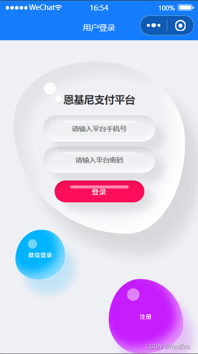
1. 页面效果
登陆页面一般都要酷炫好看一点,这里分享一个动态登录页面,页面有三个流动的小水滴。一个水滴放登录框。剩下两个水滴跳转页面和打开弹窗。
2. 代码内容
<template>
	<view class="login-page">
    <u-gap height="80" ></u-gap>
    <div class="container">
      <div class="drop">
        <div class="content">
          <h2 style="font-weight: bolder">XXXX平台</h2>
          <form>
            <div class="inputBox">
              <input type="text" v-model="loginForm.username" placeholder="请输入平台手机号">
            </div>
            <div class="inputBox" style="margin-top: 20rpx">
              <input type="password" v-model="loginForm.password" placeholder="请输入平台密码">
            </div>
            <div class="inputBox" style="margin-top: 30rpx;width: 80%;margin-left: 10%;text-align: center;" @click="submitLogin">
              <span class="submit" >登录</span>
            </div>
          </form>
        </div>
      </div>
    </div>
    <a href="#" class="btns" @click="openReg">注册</a>
    <a href="#" class="btns signup" @click="goToWechart">微信登录</a>
	</view>
</template>

<script>
	import UGap from "../../uview-ui/components/u-gap/u-gap.vue";
  export default {
    components: {UGap},
		data() {
			return {
        loginForm:{
          username:'',
          password:''
        },
			}
		},
		onLoad(option) {
      uni.hideHomeButton()
			// if (option.url) {
			// 	this.url = option.url;
			// }
		},
		methods: {
      submitLogin(){
        if(this.loginForm.phone==''){
          this.$interactive.toast('平台手机号不能为空')
          return;
        }else if(this.loginForm.password==''){
          this.$interactive.toast('平台密码号不能为空')
          return;
        }
      },
      isPhone(phone){
        const regMobile = /^(0|86|17951)?(13[0-9]|15[012356789]|17[678]|18[0-9]|14[57])[0-9]{8}$/;
        if (regMobile.test(phone)) {
          return true;
        }else{
          return false;
        }
      },
      goToWechart(){
        uni.clearStorageSync()
        uni.reLaunch({
          url: '/pages/index/index',
        });
      }
		}
	}
</script>
<style>
*
{
  margin: 0;
  padding: 0;
  box-sizing: border-box;
  font-family: 'Poppins', sans-serif;
}
body
{
  display: flex;
  justify-content: center;
  min-height: 100vh;
  background: #eff0f4;
}
.container
{
  position: relative;
  /*left: -80px;*/
  display: flex;
  justify-content: center;

}
.container .drop
{
  position: relative;
  width: 650rpx;
  height: 650rpx;
  box-shadow: inset 20px 20px 20px rgba(0,0,0,0.05),
  25px 35px 20px rgba(0,0,0,0.05),
  25px 30px 30px rgba(0,0,0,0.05),
  inset -20px -20px 25px rgba(255,255,255,0.9);
  transition: 0.5s;
  display: flex;
  justify-content: center;
  align-items: center;
  border-radius: 52% 48% 33% 67% / 38% 45% 55% 62%;
  animation: move 8s linear infinite forwards;
}
.container .drop:hover
{
  border-radius: 50%;
}
.container .drop::before
{
  content: '';
  position: absolute;
  top: 80rpx;
  left: 119rpx;
  width: 45rpx;
  height: 45rpx;
  border-radius: 50%;
  background: #fff;
  opacity: 0.9;
}
.container .drop::after
{
  content: '';
  position: absolute;
  top: 130rpx;
  left: 160rpx;
  width: 25rpx;
  height: 25rpx;
  border-radius: 50%;
  background: #fff;
  opacity: 0.9;
}
.container .drop .content
{
  position: relative;
  display: flex;
  justify-content: center;
  align-items: center;
  flex-direction: column;
  text-align: center;
  padding: 40px;
  gap: 15px;
}
.container .drop .content h2
{
  position: relative;
  color: #333;
  font-size: 1.5em;
}
.container .drop .content form
{
  display: flex;
  flex-direction: column;
  gap: 20px;
  justify-content: center;
  align-items: center;
}
.container .drop .content form .inputBox
{
  position: relative;
  width: 425rpx;
  box-shadow: inset 2px 5px 10px rgba(0,0,0,0.1),
  inset -2px -5px 10px rgba(255,255,255,1),
  15px 15px 10px rgba(0,0,0,0.05),
  15px 10px 15px rgba(0,0,0,0.025);
  border-radius: 25px;
  display: flex;
  font-weight: bolder;
  justify-content: center;
  align-items: center;
  flex-direction: column;
}
.container .drop .content form .inputBox::before
{
  content: '';
  position: absolute;
  top: 8px;
  left: 50%;
  transform: translateX(-50%);
  width: 65%;
  height: 5px;
  background: rgba(255,255,255,0.5);
  border-radius: 5px;
}
.container .drop .content form .inputBox input
{
  border: none;
  outline: none;
  background: transparent;
  width: 100%;
  font-size: 1em;
  padding: 10px 15px;
}
.container .drop .content form .inputBox .submit
{
  color: #fff;
  text-transform: uppercase;
  cursor: pointer;
  letter-spacing: 0.1em;
  font-weight: 500;
  border: none;
  outline: none;
  background: transparent;
  width: 100%;
  font-size: 1em;
  padding: 10px 15px;
}
.container .drop .content form .inputBox:last-child
{
  width: 300rpx;
  background: #ff0f5b;
  box-shadow: inset 2px 5px 10px rgba(0,0,0,0.1),
  15px 15px 10px rgba(0,0,0,0.05),
  15px 10px 15px rgba(0,0,0,0.025);
  transition: 0.5s;
}
.container .drop .content form .inputBox:last-child:hover
{
  width: 300rpx;
}
.btns
{
  position: absolute;
  right: 60rpx;
  bottom: 0;
  width: 120px;
  height: 120px;
  background: #c61dff;
  display: flex;
  justify-content: center;
  align-items: center;
  cursor: pointer;
  text-decoration: none;
  color: #fff;
  line-height: 1.2em;
  letter-spacing: 0.1em;
  font-size: 0.8em;
  transition: 0.25s;
  text-align: center;
  box-shadow: inset 10px 10px 10px rgba(190,1,254,0.05),
  15px 25px 10px rgba(190,1,254,0.1),
  15px 20px 20px rgba(190,1,254,0.1),
  inset -10px -10px 15px rgba(255,255,255,0.5);
  border-radius: 44% 56% 65% 35% / 57% 58% 42% 43%;
  animation: move2 8s linear infinite forwards;
  /*去掉蓝色色块*/
  -webkit-tap-highlight-color: rgba(0,0,0,0);
}
.btns::before
{
  content: '';
  position: absolute;
  top: 15px;
  left: 30px;
  width: 20px;
  height: 20px;
  border-radius: 50%;
  background: #fff;
  opacity: 0.45;
}
.btns.signup
{
  bottom: 280rpx;
  left: 60rpx;
  width: 80px;
  height: 80px;
  border-radius: 49% 51% 52% 48% / 63% 59% 41% 37%;
  background: #01b4ff;
  box-shadow: inset 10px 10px 10px rgba(1,180,255,0.05),
  15px 25px 10px rgba(1,180,255,0.1),
  15px 20px 20px rgba(1,180,255,0.1),
  inset -10px -10px 15px rgba(255,255,255,0.5);
  animation: move3 8s linear infinite forwards;
}
.btns.signup::before
{
  left: 20px;
  width: 15px;
  height: 15px;
}
.btns:hover
{
  border-radius: 50%;
}
@keyframes move {
  30% {
    border-radius: 30% 57% 36% 64% / 30% 52% 48% 70%;
  }

  60% {
    border-radius: 30% 57% 61% 39% / 30% 52% 48% 70%;
  }
}@keyframes move2 {
   30% {
     border-radius: 36% 64%  30% 60% / 48% 70% 30% 52% ;
   }

   60% {
     border-radius: 61% 39%  30% 60% / 48% 70%  30% 52%;
   }
}
@keyframes move3 {
  30% {
    border-radius: 60%  30% 64%  36% /52% 30% 70% 48% ;
  }

  60% {
    border-radius: 60%  30% 39% 61%  /52% 30% 70% 48% ;
  }
}
</style>