在使用机器学习算法解决一些分类问题的过程中,往往需要不同的模型评估指标,主要有一下三类指标:
1.混淆矩阵相关
1.1混淆矩阵
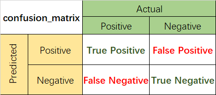
混淆矩阵是监督学习中的一种可视化工具,主要用于比较分类结果和实例的真实信息。矩阵中的每一行代表实例的预测类别,每一列代表实例的真实类别。
1.2准确率(Accuracy)
准确率是最常用的分类性能指标。
Accuracy = (TP+TN)/(TP+FN+FP+TN)
即正确预测的正反例数 /总数
1.3精确率(Precision)
精确率容易和准确率被混为一谈。其实,精确率只是针对预测正确的正样本而不是所有预测正确的样本。表现为预测出是正的里面有多少真正是正的。可理解为查准率。
Precision = TP/(TP+FP)
即正确预测的正例数 /预测正例总数
1.4召回率(Recall)
召回率表现出在实际正样本中,分类器能预测出多少。与真正率相等,可理解为查全率。
Recall = TP/(TP+FN),即正确预测的正例数 /实际正例总数
1.5F1 score
F值是精确率和召回率的调和值,更接近于两个数较小的那个,所以精确率和召回率接近时,F值最大。很多推荐系统的评测指标就是用F值的。
2/F1 = 1/Precision + 1/Recall
实例
# 评价指标1:混淆矩阵相关
from sklearn.metrics import confusion_matrix
result= confusion_matrix(test_y, test_pred)
print('confusion_matrix\n', result)
# 1.1综合评估
from sklearn.metrics import classification_report
result_report = classification_report(test_y,test_pred,digits=5)
print(result_report)
# 1.2分别查看
from sklearn.metrics import accuracy_score,precision_score,recall_score,f1_score
print('accuracy:{}'.format(accuracy_score(test_y, test_pred)))
print('precision:{}'.format(precision_score(test_y, test_pred)))
print('recall:{}'.format(recall_score(test_y, test_pred)))
print('f1-score:{}'.format(f1_score(test_y, test_pred)))
结果展示:

2.ROC曲线
2.1ROC曲线
逻辑回归里面,对于正负例的界定,通常会设一个阈值,大于阈值的为正类,小于阈值为负类。如果我们减小这个阀值,更多的样本会被识别为正类,提高正类的识别率,但同时也会使得更多的负类被错误识别为正类。为了直观表示这一现象,引入ROC。根据分类结果计算得到ROC空间中相应的点,连接这些点就形成ROC curve,横坐标为False Positive Rate(FPR假正率),纵坐标为True Positive Rate(TPR真正率)。一般情况下,这个曲线都应该处于(0,0)和(1,1)连线的上方。
2.2AUC值
AUC(Area Under Curve)被定义为ROC曲线下的面积(ROC的积分),通常大于0.5小于1。随机挑选一个正样本以及一个负样本,分类器判定正样本的值高于负样本的概率就是 AUC 值。AUC值(面积)越大的分类器,性能越好。
实例
# 评价指标2:roc
def plot_roc(test_y,test_prob):
    from sklearn.metrics import roc_curve,auc
    fpr,tpr,threshold=roc_curve(test_y,test_prob)
    roc_auc=auc(fpr,tpr)
    # 画roc曲线
    import matplotlib.pyplot as plt
    plt.figure(figsize=(10,10))
    plt.plot(fpr, tpr, color='darkorange',lw=2, label='ROC curve (area = %0.2f)' % roc_auc)
    plt.plot([0, 1], [0, 1], color='navy', lw=2, linestyle='--')
    plt.xlim([0.0, 1.0])
    plt.ylim([0.0, 1.05])
    plt.xlabel('False Positive Rate')
    plt.ylabel('True Positive Rate')
    plt.title('Receiver operating characteristic example')
    plt.legend(loc="lower right")
    plt.show()

if __name__ == '__main__':
    plot_roc(test_y,test_prob[:, 1])
结果展示:

3.PR曲线
PR曲线的横坐标是精确率P,纵坐标是召回率R。评价标准和ROC一样,先看平滑不平滑(蓝线明显好些)。一般来说,在同一测试集,上面的比下面的好(绿线比红线好)。当P和R的值接近时,F1值最大,此时画连接(0,0)和(1,1)的线,线和PRC重合的地方的F1是这条线最大的F1(光滑的情况下),此时的F1对于PRC就好像AUC对于ROC一样。一个数字比一条线更方便调型。
实例
# 评价指标3:pr曲线
def plot_pr(train_y, train_prob,test_y,test_prob):
    import matplotlib.pyplot as plt
    from sklearn.metrics import precision_recall_curve
    def draw_pr(y_true, y_pred, label=None):
        precision, recall, thresholds = precision_recall_curve(y_true, y_pred)
        plt.plot(recall, precision, linewidth=2, label=label)
        plt.plot([0, 1], [0, 1], 'k--')
        plt.axis([-0.05, 1.05, -0.05, 1.05])
        plt.xlabel("Recall Rate")
        plt.ylabel("Precision Rate")
    draw_pr(train_y, train_prob, 'rf_train')
    draw_pr(test_y, test_prob, 'rf_test')
    plt.legend()
    plt.show()
if __name__ == '__main__':
    plot_pr(train_y, train_prob[:, 1],test_y,test_prob[:, 1])
结果展示:
