先看效果吧

使用弹窗组件文件
代码如下
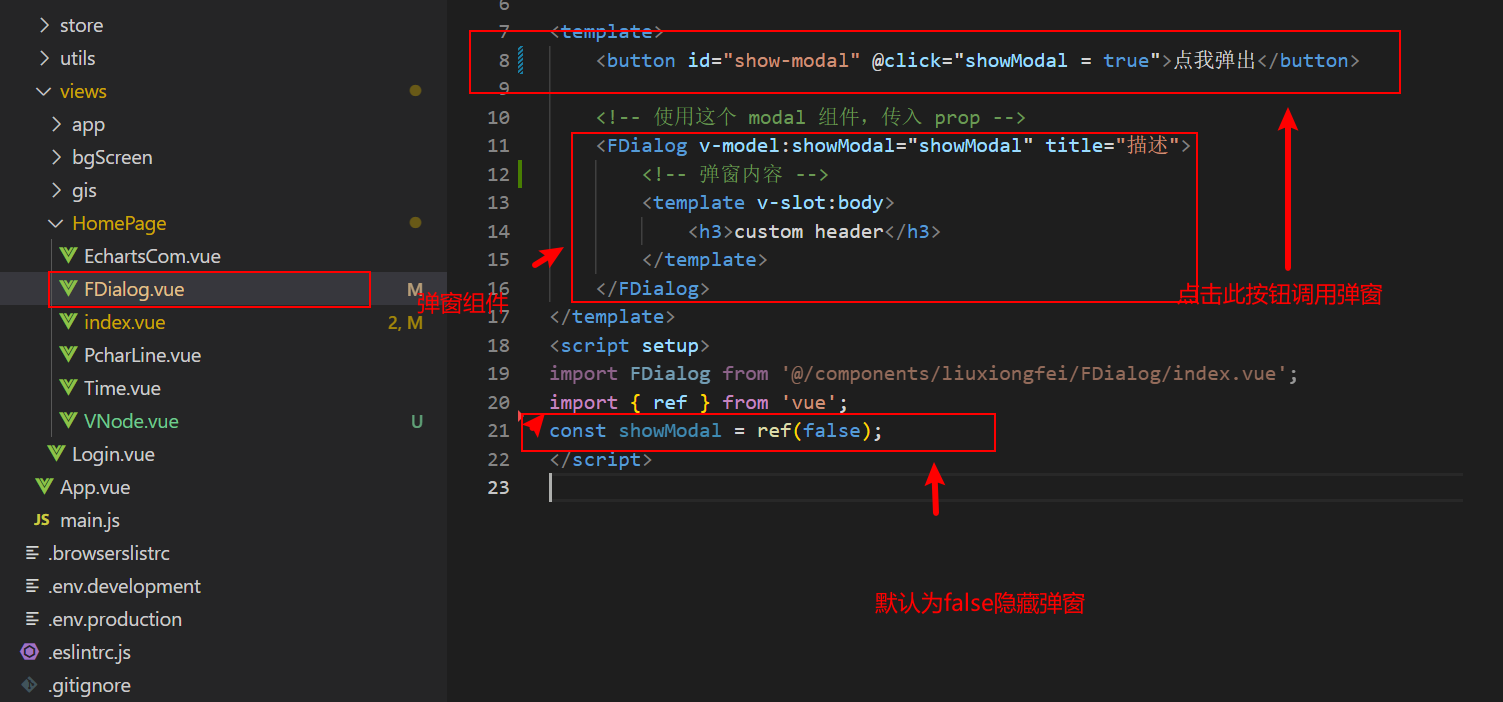
<template>
    <button id="show-modal" @click="showModal = true">点我弹出</button>

    <!-- 使用这个 modal 组件,传入 prop -->
    <FDialog v-model:showModal="showModal" title="描述">
        <!-- 弹窗内容 -->
        <template v-slot:body>
            <h3>custom header</h3>
        </template>
    </FDialog>
</template>
<script setup>
import FDialog from '@/components/liuxiongfei/FDialog/index.vue';
import { ref } from 'vue';
const showModal = ref(false);
</script>
FDialog组件代码如下
<template>
    <Teleport to="body">//默认在body层生成一个dom盒子覆盖整个页面
        <Transition>   //过度组件不用管
            <div v-if="showModal" class="modal-mask">
                <div class="modal-wrapper">
                    <div class="modal-container">
                        <div class="modal-header">
                            <span class="title-color">{

    { props.title }}</span>
                            <i
                                class="modal-header-close"
                                @click="$emit('update:showModal', false)"
                            ></i>
                        </div>
                        <div class="modal-body">
                            <slot name="body">default body</slot>
                        </div>

                        <div class="modal-footer">
                            <slot name="footer">
                                default footer
                                <button
                                    class="modal-default-button"
                                    @click="$emit('update:showModal', false)"
                                >
                                    OK
                                </button>
                            </slot>
                        </div>
                    </div>
                </div>
            </div>
        </Transition>
    </Teleport>
</template>
<script setup>
const props = defineProps({
    showModal: {
        type: Boolean,
        default: false
    }, // 弹窗的显示隐藏
    title: {
        type: [Number, String],
        default: ''
    }
});

const emit = defineEmits(['update:showModal']);
</script>

<style lang="scss" scoped>
// 背景色
.modal-mask {
    position: fixed;
    left: 0;
    right: 0;
    top: 0;
    bottom: 0;
    margin: auto;
    background: rgba(0, 0, 0, 0.5);
    z-index: 9998;
    // 中间弹窗居中
    display: flex;
    align-items: center;
    justify-content: center;
}
.title-color {
    color: #ccc;
}
// 弹框容器
.modal-container {
    box-sizing: border-box;
    min-width: 700px;
    min-height: 500px;
    margin: 0px auto;
    // padding: 20px 30px;
    background-color: #fff;
    border-radius: 2px;
    display: flex;
    flex-direction: column;
}

// 表头
.modal-header {
    box-sizing: border-box;
    padding: 10px;
    height: 36px;
    display: flex;
    align-items: center;
    justify-content: space-between;
    background-color: #467ddc;
}
.modal-header-close {
    // position: absolute;
    background-size: 100% !important;
    width: 14px;
    height: 14px;
    cursor: pointer;
    background: url(./close.png) no-repeat;
}
// 表身:body
.modal-body {
    padding: 20px;
    flex: 1;
}
// .modal-header h3 {
//     margin-top: 0;
//     color: #42b983;
// }

.modal-default-button {
    float: right;
}
// 表尾
.modal-footer {
    padding: 20px;
}
/*
以下为组件的过度效果Transition
*/
.v-enter-active,
.v-leave-active {
    transition: opacity 0.5s ease;
}

.v-enter-from,
.v-leave-to {
    opacity: 0;
}
</style>