我们知道flex布局很强大,但是它是一维的,而grid布局更加强大,因为它是二维的,可以控制行和列的排布和对齐方式。下面将举例说明如何使用grid布局。
基本用法
首先我们定义了7个div,给它添加背景颜色
<!DOCTYPE html>
<html lang="en">

<head>
  <meta charset="UTF-8">
  <meta http-equiv="X-UA-Compatible" content="IE=edge">
  <meta name="viewport" content="width=device-width, initial-scale=1.0">
  <title>Document</title>
  <style>
    .box div {


      background-color: orange;
      border-radius: 5px;
      border: 2px solid orchid;
      padding: 10px;
    }
  </style>
</head>

<body>
  <div class="box">
    <div>one</div>
    <div>two</div>
    <div>three</div>
    <div>four</div>
    <div>fifth</div>
    <div>six</div>
    <div>sever</div>
  </div>
</body>

</html>
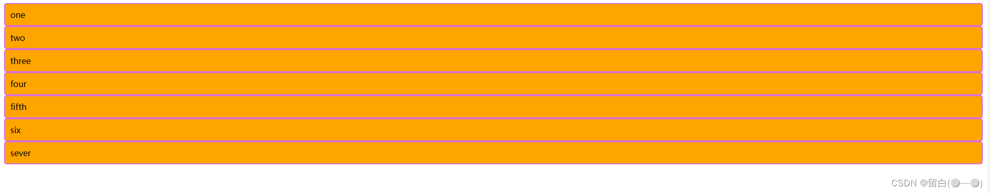
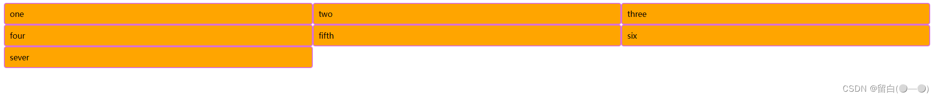
给box盒子开启网格布局,页面没有变化,这是正常的,因为我们还没有对它的列和行进行操作。
.box{


  display: grid;
}
如果想要单独设置每一列的大小,可以这样写
.box{


  display: grid;
  grid-template-columns: 300px 200px 100px;
}
如果想要三列平均分,我们会想到用百分比来设置
.box{


  display: grid;
  grid-template-columns: 33% 33% 33%;
}
但其实百分比没有那么好用,因为这三份加起来不等于100%,如果想要真的刚好三列平均分,占满整个父元素,我们可以用fr作为单位
.box{


  display: grid;
  grid-template-columns: 1fr 1fr 1fr;
  /* 类似于 1x + 1x + 1x = 父元素宽度  */
}
而如果需要平均分100列,难道我们要写100个1fr吗,当然不是,我们可以简写成:grid-template-columns: repeat(100,1fr); ,所以,上面的例子也可以简写成:

.box{


  display: grid;
  grid-template-columns: repeat(3,1fr);
}
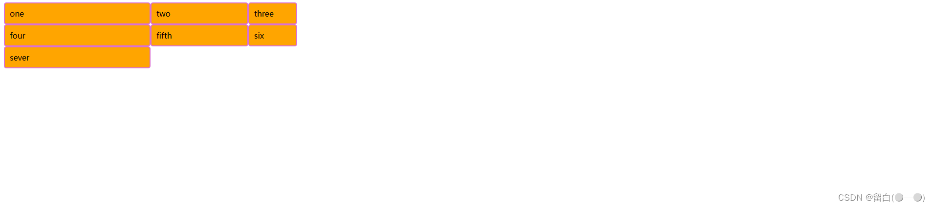
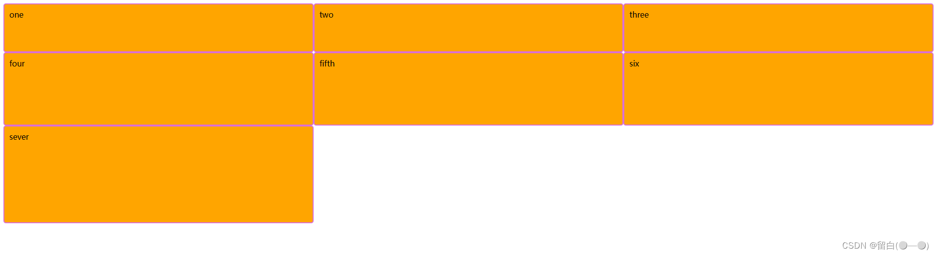
同样,可以设置每一行的大小
.box{


  display: grid;
  grid-template-columns: repeat(3,1fr);
  grid-template-rows: 100px 150px 200px;
}
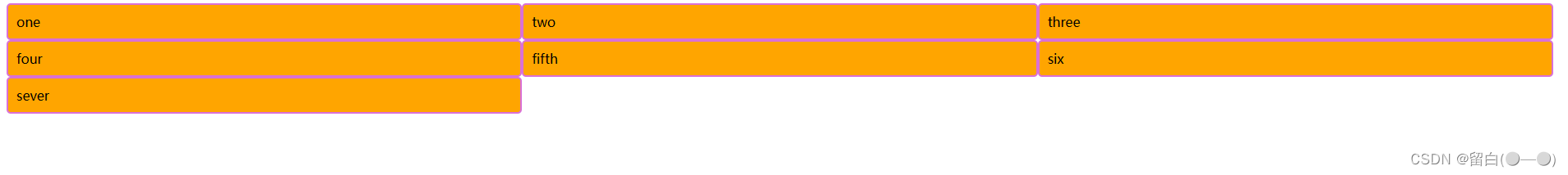
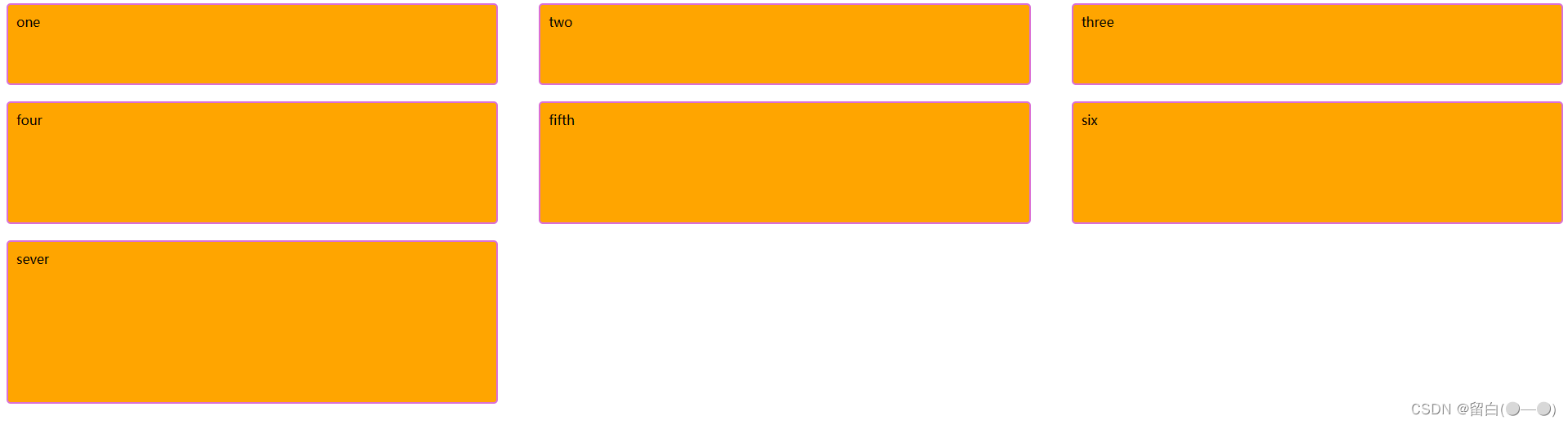
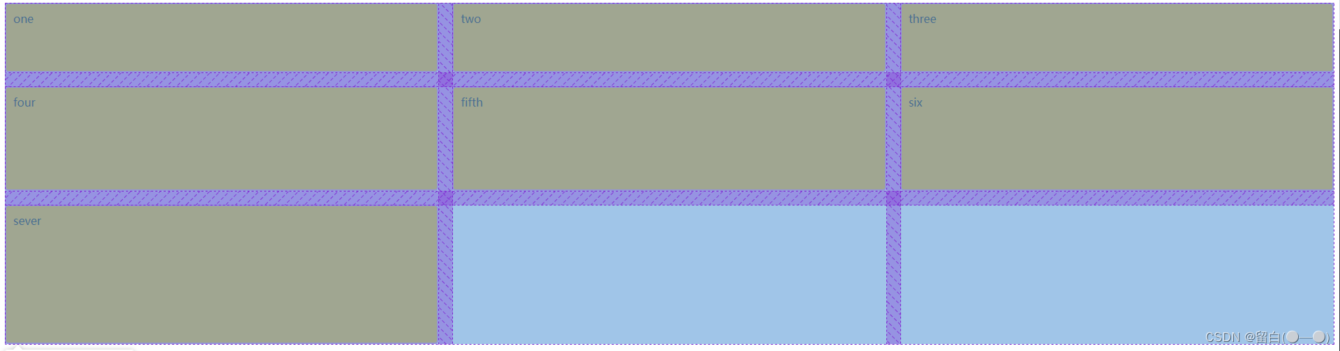
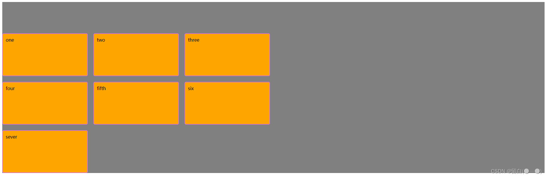
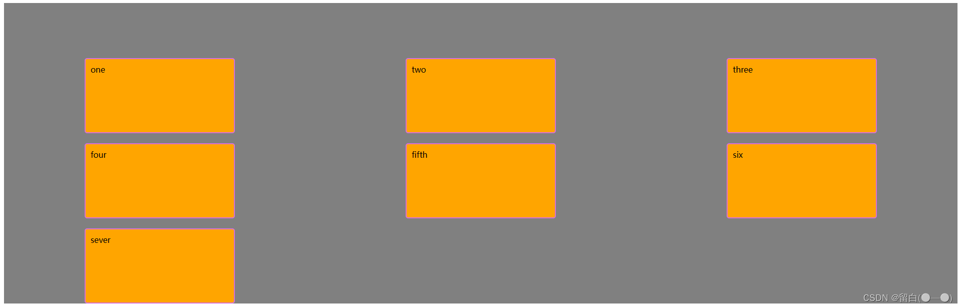
如果想要给每一行或每一列之间设置间距,则可以用到row-gap 和column-gap 属性,这里的gap就是“间距”的意思*
.box{


  display: grid;
  grid-template-columns: repeat(3,1fr);
  grid-template-rows: 100px 150px 200px;
  row-gap: 20px;
  column-gap: 50px;
}
当然,如果行和列的间距相同,也可以简写成一个gap属性
.box{


  display: grid;
  grid-template-columns: repeat(3,1fr);
  grid-template-rows: 100px 150px 200px;
  gap: 20px;
}
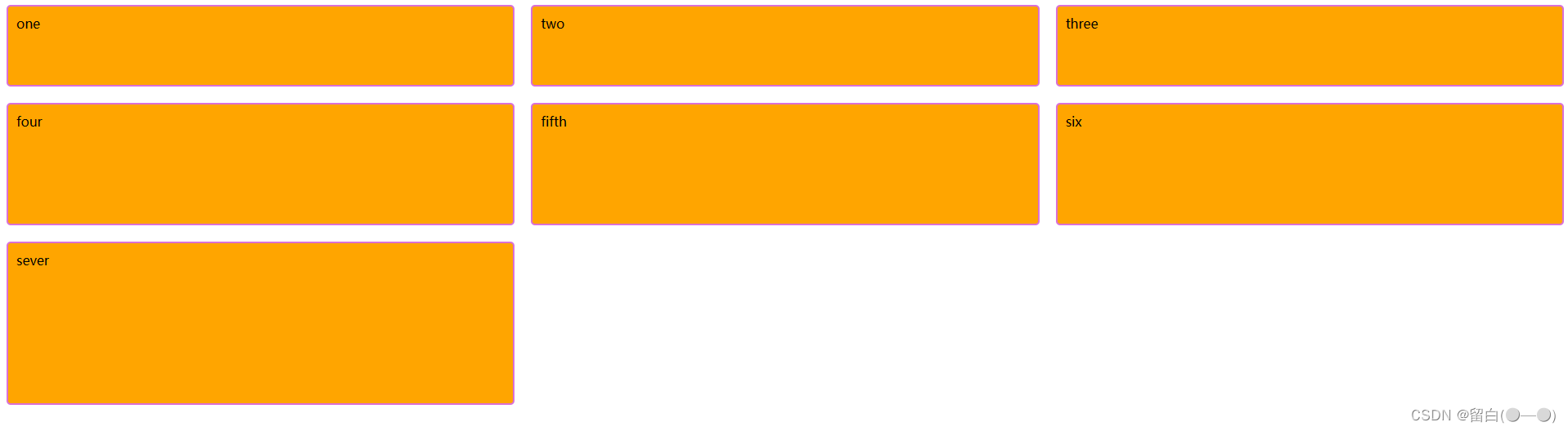
我们可以打开浏览器,使用ctrl+shift+c,移动鼠标,查看box元素的布局。可以发现,就像网格一样,所以也叫网格布局。
入门用法(grid-template-areas和grid-area)
开启grid布局,可以像切蛋糕一样快速排列元素。下面举另一个例子。
<!DOCTYPE html>
<html lang="en">
<head>
  <meta charset="UTF-8">
  <meta http-equiv="X-UA-Compatible" content="IE=edge">
  <meta name="viewport" content="width=device-width, initial-scale=1.0">
  <title>Document</title>
  <style>
    header{


      height: 100px;
      background-color: orange;
    }
    aside{


      height: 300px;
      background-color: orangered;
    }
    main{


      height: 300px;
      background-color: orchid;
    }
    footer{


      height: 100px;
      background-color: olivedrab;
    }
  </style>
</head>
<body>
  <div class="layout">
    <header>头部</header>
    <aside>侧边栏</aside>
    <main>内容</main>
    <footer>底部</footer>
  </div>
</body>
</html>
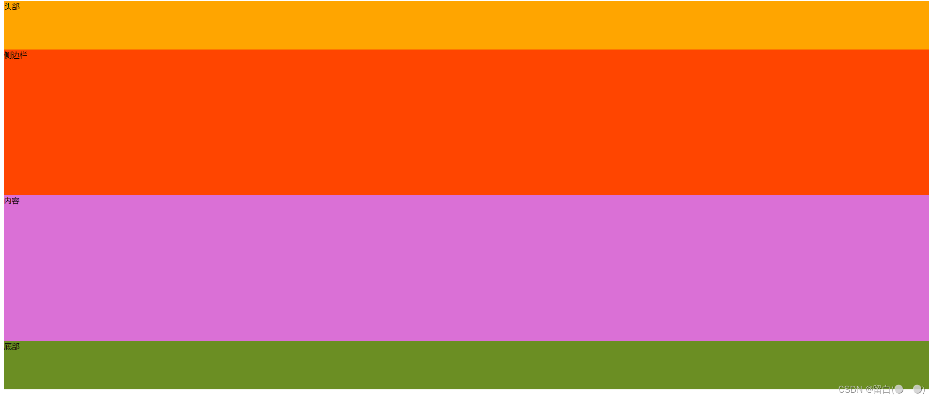
如果我们想要实现头部和尾部独占一行,而侧边栏占1/3,内容占2/3。我们可以用grid布局的grid-template-areas 属性来实现。注意:需要用grid-area 属性给每个区域做标记
header{


  grid-area: header;
  height: 100px;
  background-color: orange;
}
aside{


  grid-area: aside;
  height: 300px;
  background-color: orangered;
}
main{


  grid-area: main;
  height: 300px;
  background-color: orchid;
}
footer{


  grid-area: footer;
  height: 100px;
  background-color: olivedrab;
}

.layout{


  display: grid;
  grid-template-areas:
  "header header header"
  "aside  main main"
  "footer footer footer"
  ;
  gap: 20px;
}

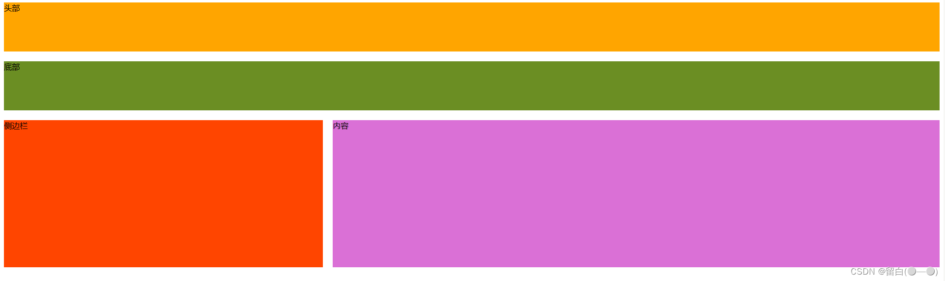
那有人可能就会说了,我直接给侧边栏和内容在外层嵌套个div,再用百分比或者flex布局不是更快实现吗?确实,但是还是用grid-template-areas 香,因为它不仅能直观看出元素的布局,还可以随意调整元素的排列。
例如:我们可以轻易把footer放在中间,只需要稍微改一下grid-template-areas 中的代码
.layout{


  display: grid;
  grid-template-areas:
  "header header header"
  "footer footer footer"
  "aside  main main"
  ;
  gap: 20px;
}
进阶用法
align-content和justify-content
如果grid元素没有撑满整个grid容器,则还可以设置子元素的对齐方式。例如:
<!DOCTYPE html>
<html lang="en">
<head>
  <meta charset="UTF-8">
  <meta http-equiv="X-UA-Compatible" content="IE=edge">
  <meta name="viewport" content="width=device-width, initial-scale=1.0">
  <title>Document</title>
  <style>
    .box div{


      background-color: orange;
      border-radius: 5px;
      border: 2px solid orchid;
      padding: 10px;
    }
    .box{


      display: grid;
      height: 600px;
      grid-template-columns: repeat(3,300px);
      grid-template-rows: 150px 150px 150px;
      gap: 20px;
      background-color: gray;
    }
  </style>
</head>
<body>
  <div class="box">
    <div>one</div>
    <div>two</div>
    <div>three</div>
    <div>four</div>
    <div>fifth</div>
    <div>six</div>
    <div>sever</div>
  </div>
</body>
</html>
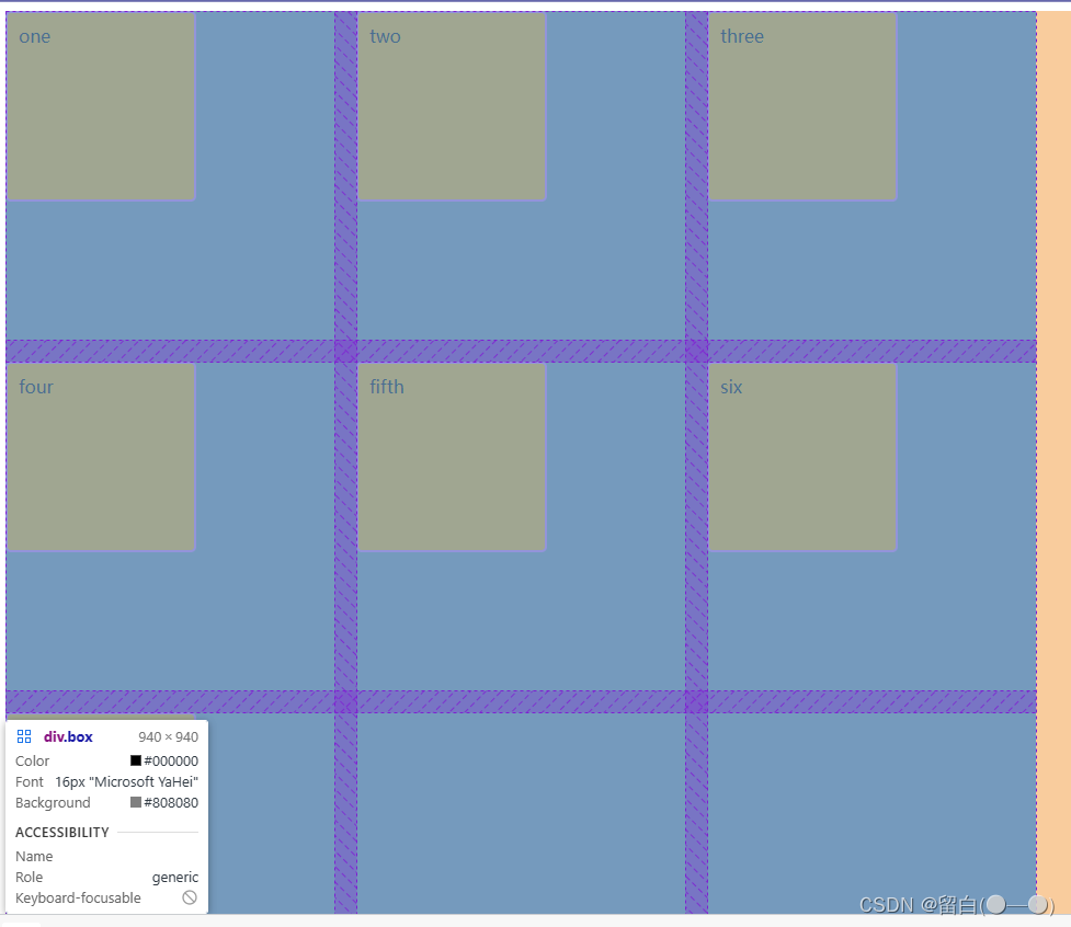
我们给grid容器设置了高度,页面布局如下
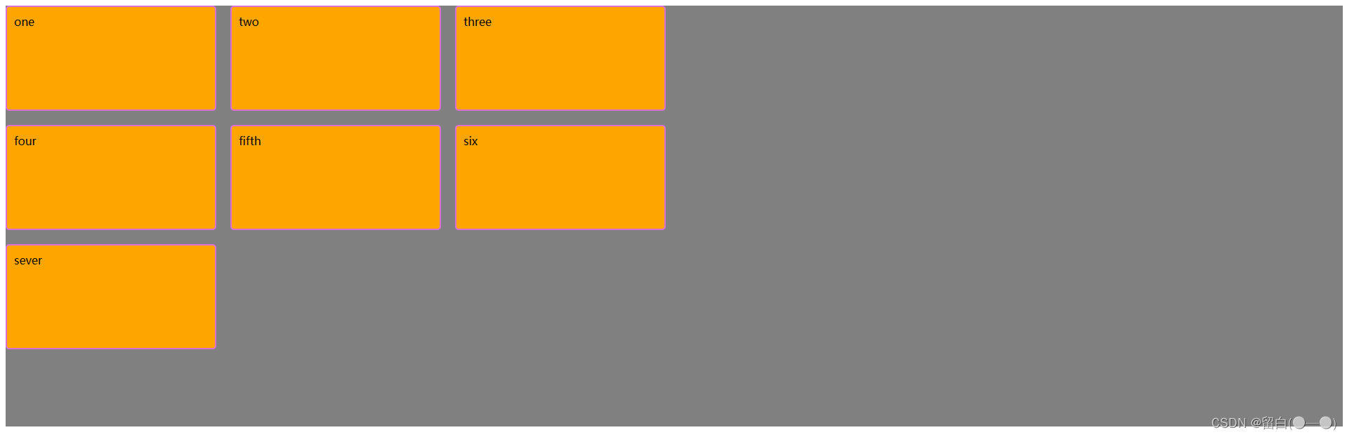
我们可以像flex布局一样设置子元素的分布。align-content 用于设置辅轴方向上的元素排列,end则表示所有元素放在底部。还有可以设置space-between,space-around等属性值。
.box{


  display: grid;
  height: 600px;
  align-content: end;
  grid-template-columns: repeat(3,300px);
  grid-template-rows: 150px 150px 150px;
  gap: 20px;
  background-color: gray;
}
而justify-content 用于设置主轴方向上的元素排列,”space-around“就是给每个元素分配大小相等左右空间
.box{


  display: grid;
  height: 600px;
  align-content: end;
  justify-content: space-around;
  grid-template-columns: repeat(3,300px);
  grid-template-rows: 150px 150px 150px;
  gap: 20px;
  background-color: gray;
}
align-items和justify-items
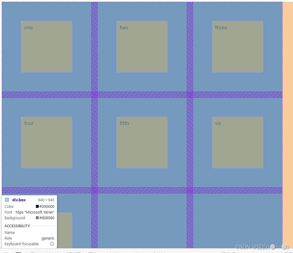
之前的案例都是没有设置子元素的宽和高,则子元素会自动撑满整个网格,而如果给子元素设置了宽和高,并且小于网格的大小,会发生什么有趣的事呢?
例如:我们给设置每个网格设置为正方形,边长是300px;给网格里面的元素也设置为正方形,边长是150px
<!DOCTYPE html>
<html lang="en">
<head>
  <meta charset="UTF-8">
  <meta http-equiv="X-UA-Compatible" content="IE=edge">
  <meta name="viewport" content="width=device-width, initial-scale=1.0">
  <title>Document</title>
  <style>
    .box div{


      width: 150px;
      height: 150px;
      background-color: orange;
      border-radius: 5px;
      border: 2px solid orchid;
      padding: 10px;
    }
    .box{


      width: 940px;
      height: 940px;
      display: grid;
      grid-template-columns: repeat(3,300px);
      grid-template-rows: repeat(3,300px);
      gap: 20px;
      background-color: gray;
    }
  </style>
</head>
<body>
  <div class="box">
    <div>one</div>
    <div>two</div>
    <div>three</div>
    <div>four</div>
    <div>fifth</div>
    <div>six</div>
    <div>sever</div>
  </div>
</body>
</html>
如果我们想要每个子元素在网格中都是居中的,则可以分别给align-items和justify-items设置值为center。(还可以设置为flex-end,flex-start等)
.box{


  align-items: center;
  justify-items: center;
  width: 940px;
  height: 940px;
  display: grid;
  grid-template-columns: repeat(3,300px);
  grid-template-rows: repeat(3,300px);
  gap: 20px;
  background-color: gray;
}