可自定义设置以下属性:
-
选项数据(options),类型:Array<{label?: string, value?: any, disabled?: boolean}>,默认值[]
-
选择器字典项的文本字段名(label),类型:string,默认 'label'
-
选择器字典项的值字段名(value),类型:string,默认 'value'
-
选择框默认文字(placeholder),类型:string,默认 '请选择'
-
是否禁用下拉(disabled),类型:boolean,默认 false
-
是否支持清除(allowClear),类型:boolean,默认false
-
选择框宽度(width),类型:number,默认200px
-
选择框高度(height),类型:number,默认36px
-
下拉面板最多能展示的下拉项数,超过后滚动显示(num),类型:number,默认 6
-
当前选中的option条目(v-model:selectedValue),类型:string | number,默认 null
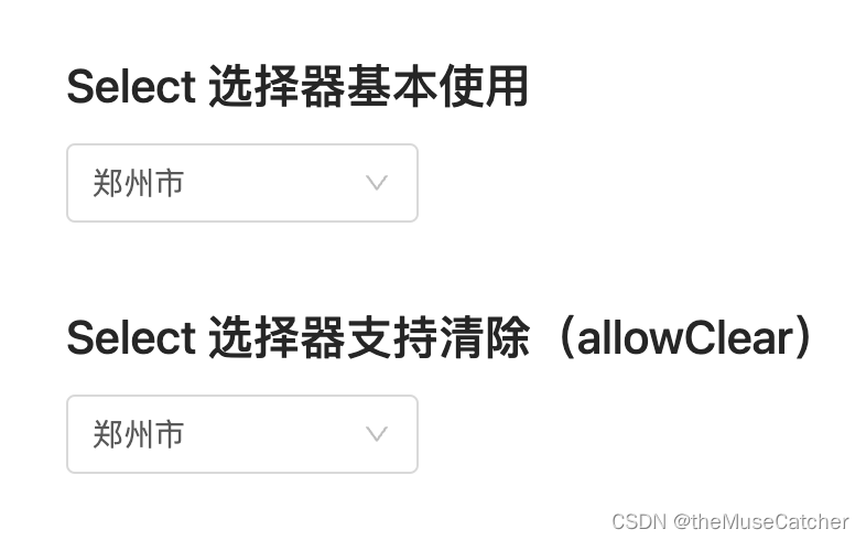
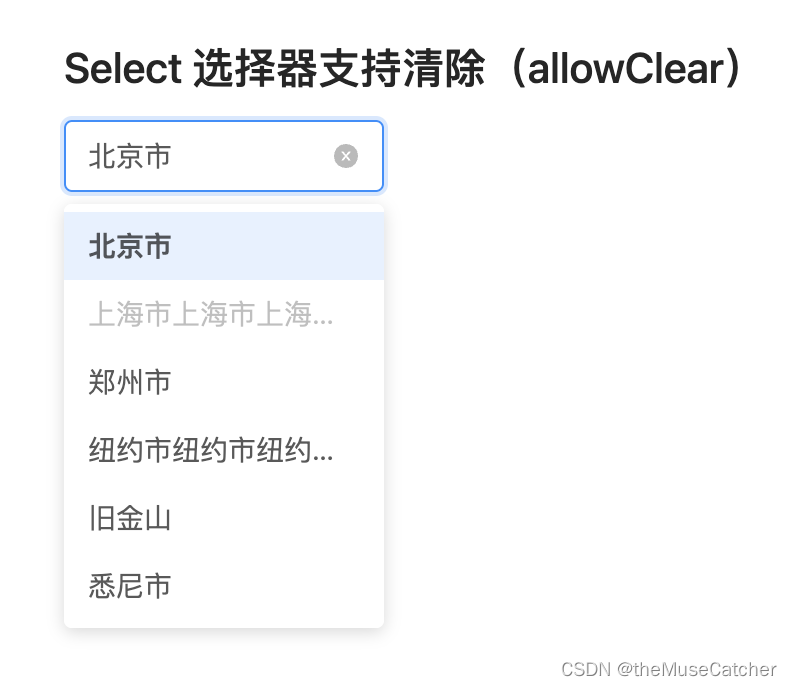
效果如下图:
①创新选择器组件Select.vue:
<script setup lang="ts">
import { ref, watch, onMounted } from 'vue'
const props = defineProps({
    options: { // 选项数据
      type: Array<any>,
      default: () => []
    },
    label: { // 选择器字典项的文本字段名
      type: String,
      default: 'label'
    },
    value: { // 选择器字典项的值字段名
      type: String,
      default: 'value'
    },
    placeholder: { // 选择框默认文字
      type: String,
      default: '请选择'
    },
    disabled: { // 是否禁用下拉
      type: Boolean,
      default: false
    },
    allowClear: { // 是否支持清除
      type: Boolean,
      default: false
    },
    width: { // 选择框宽度
      type: Number,
      default: 200
    },
    height: { // 选择框高度
      type: Number,
      default: 36
    },
    num: { // 下拉面板最多能展示的下拉项数,超过后滚动显示
      type: Number,
      default: 6
    },
    selectedValue: { // 当前选中的option条目(v-model)
      type: [Number, String],
      default: null
    }
  })
const selectedName = ref()
const hoverValue = ref() // 鼠标悬浮项的value值
const showOptions = ref(false) // options面板
const activeBlur = ref(true) // 是否激活blur事件
const showClose = ref(false) // 清除按钮显隐
watch(
  () => props.options,
  (to) => {
  initSelector()
  // console.log('options:', to)
})
watch(
  () => props.selectedValue,
  (to) => {
  initSelector()
  // console.log('selectedValue:', to)
})
onMounted(() => {
  initSelector()
})
const emits = defineEmits(['update:selectedValue', 'change'])
function initSelector () {
  if (props.selectedValue) {
    const target = props.options.find(option => option[props.value] === props.selectedValue)
    if (target) {
      selectedName.value = target[props.label]
      hoverValue.value = target[props.value]
    } else {
      selectedName.value = props.selectedValue
      hoverValue.value = null
    }
  } else {
    selectedName.value = null
    hoverValue.value = null
  }
}
function onBlur () {
  // console.log('blur')
  if (showOptions.value) {
    showOptions.value = false
  }
}
function onInputEnter () {
  // console.log('input enter')
  if (props.allowClear && selectedName.value) {
    showClose.value = true
  }
}
function onInputLeave () {
  // console.log('input leave')
  if (props.allowClear && showClose.value) {
    showClose.value = false
  }
}
function onHover (value: string|number) {
  hoverValue.value = value
}
function onEnter () {
  activeBlur.value = false
}
function onLeave () {
  hoverValue.value = null
  activeBlur.value = true
}
function openSelect () {
  showOptions.value = !showOptions.value
  if (!hoverValue.value && selectedName.value) {
    const target = props.options.find(option => option[props.label] === selectedName.value)
    hoverValue.value = target ? target[props.value] : null
  }
}
function onClear () {
  showClose.value = false
  selectedName.value = null
  hoverValue.value = null
}
function onChange (value: string|number, label: string, index: number) { // 选中下拉项后的回调
  if (props.selectedValue !== value) {
    selectedName.value = label
    hoverValue.value = value
    emits('update:selectedValue', value)
    emits('change', value, label, index)
  }
  showOptions.value = false
}
</script>
<template>
  <div class="m-select" :style="`height: ${height}px;`">
    <div
      :class="['m-select-wrap', {'hover': !disabled, 'focus': showOptions, 'disabled': disabled}]"
      :style="`width: ${width - 2}px; height: ${height - 2}px;`"
      tabindex="0"
      @mouseenter="onInputEnter"
      @mouseleave="onInputLeave"
      @blur="activeBlur && !disabled ? onBlur() : (e: Event) => e.preventDefault()"
      @click="disabled ? (e: Event) => e.preventDefault() : openSelect()">
      <div
        :class="['u-select-input', {'placeholder': !selectedName}]"
        :style="`line-height: ${height - 2}px;width: ${width - 37}px; height: ${height - 2}px;`"
        :title="selectedName"
      >{

   { selectedName || placeholder }}</div>
      <svg :class="['triangle', {'rotate': showOptions, 'show': !showClose}]" viewBox="64 64 896 896" data-icon="down" aria-hidden="true" focusable="false"><path d="M884 256h-75c-5.1 0-9.9 2.5-12.9 6.6L512 654.2 227.9 262.6c-3-4.1-7.8-6.6-12.9-6.6h-75c-6.5 0-10.3 7.4-6.5 12.7l352.6 486.1c12.8 17.6 39 17.6 51.7 0l352.6-486.1c3.9-5.3.1-12.7-6.4-12.7z"></path></svg>
      <svg @click.stop="onClear" :class="['close', {'show': showClose}]" focusable="false" data-icon="close-circle" aria-hidden="true" viewBox="64 64 896 896"><path d="M512 64C264.6 64 64 264.6 64 512s200.6 448 448 448 448-200.6 448-448S759.4 64 512 64zm165.4 618.2l-66-.3L512 563.4l-99.3 118.4-66.1.3c-4.4 0-8-3.5-8-8 0-1.9.7-3.7 1.9-5.2l130.1-155L340.5 359a8.32 8.32 0 01-1.9-5.2c0-4.4 3.6-8 8-8l66.1.3L512 464.6l99.3-118.4 66-.3c4.4 0 8 3.5 8 8 0 1.9-.7 3.7-1.9 5.2L553.5 514l130 155c1.2 1.5 1.9 3.3 1.9 5.2 0 4.4-3.6 8-8 8z"></path></svg>
    </div>
    <Transition name="fade">
      <div
        v-show="showOptions"
        class="m-options-panel"
        @mouseenter="onEnter"
        @mouseleave="onLeave"
        :style="`top: ${height + 6}px; line-height: ${height - 12}px; max-height: ${ num * (height - 2) }px; width: ${width}px;`">
        <p
          v-for="(option, index) in options" :key="index"
          :class="['u-option', {'option-selected': option[label]===selectedName, 'option-hover': !option.disabled&&option[value]===hoverValue, 'option-disabled': option.disabled }]"
          :title="option[label]"
          @mouseenter="onHover(option[value])"
          @click="option.disabled ? (e: Event) => e.preventDefault() : onChange(option[value], option[label], index)">
          {

   { option[label] }}
        </p>
      </div>
    </Transition>
  </div>
</template>
<style lang="less" scoped>
.m-select {
  position: relative;
  display: inline-block;
  font-size: 14px;
  font-weight: 400;
  color: rgba(0,0,0,.65);
}
.fade-enter-active, .fade-leave-active {
  transform: scaleY(1);
  transform-origin: 0% 0%;
  opacity: 1;
  transition: all .3s;
}
.fade-enter-from {
  transform: scaleY(0.8);
  transform-origin: 0% 0%;
  opacity: 0;
}
.fade-leave-to {
  transform: scaleY(1);
  opacity: 0;
}
.m-select-wrap {
  position: relative;
  display: inline-block;
  border: 1px solid #d9d9d9;
  border-radius: 4px;
  cursor: pointer;
  transition: all .3s cubic-bezier(.645,.045,.355,1);
  .u-select-input {
    display: block;
    text-align: left;
    margin-left: 11px;
    margin-right: 24px;
    overflow: hidden;
    text-overflow: ellipsis;
    white-space: nowrap;
  }
  .placeholder {
    color: #bfbfbf;
  }
  .triangle {
    position: absolute;
    top: 0;
    bottom: 0;
    margin: auto 0;
    right: 12px;
    width: 12px;
    height: 12px;
    fill: rgba(0,0,0,.25);
    opacity: 0;
    pointer-events: none;
    transition: all 0.3s ease-in-out;
  }
  .rotate {
    transform: rotate(180deg);
    -webkit-transform: rotate(180deg);
  }
  .close {
    opacity: 0;
    pointer-events: none;
    transition: all 0.3s ease-in-out;
    position: absolute;
    top: 0;
    bottom: 0;
    margin: auto 0;
    right: 12px;
    width: 12px;
    height: 12px;
    fill: rgba(140, 140, 140, 0.6);
    &:hover {
      fill: rgba(100, 100, 100,.8);
    }
  }
  .show {
    opacity: 1;
    pointer-events: auto;
  }
}
.hover { // 悬浮时样式
  &:hover {
    border-color: @themeColor;
  }
}
.focus { // 激活时样式
  border-color: @themeColor;
  box-shadow: 0 0 0 2px fade(@themeColor, 20%);
}
.disabled { // 下拉禁用样式
  color: rgba(0,0,0,.25);
  background: #f5f5f5;
  user-select: none;
  cursor: not-allowed;
}
.m-options-panel {
  position: absolute;
  z-index: 999;
  overflow: auto;
  background: #FFF;
  padding: 4px 0;
  border-radius: 4px;
  box-shadow: 0 2px 8px rgba(0,0,0,15%);
  .u-option { // 下拉项默认样式
    text-align: left;
    position: relative;
    display: block;
    padding: 5px 12px;
    font-weight: 400;
    overflow: hidden;
    white-space: nowrap;
    text-overflow: ellipsis;
    cursor: pointer;
    transition: background .3s ease;
  }
  .option-selected { // 被选中的下拉项样式
    font-weight: 600;
    background: #fafafa;
  }
  .option-hover { // 悬浮时的下拉项样式
    // background: #e6f7ff;
    background: saturate(fade(@themeColor, 12%), 30%);
  }
  .option-disabled { // 禁用某个下拉选项时的样式
    color: rgba(0,0,0,.25);
    user-select: none;
    cursor: not-allowed;
  }
}
</style>
②在要使用的页面引入:
<script setup lang="ts">
import { Select } from './Select.vue'
import { ref, watch, onMounted } from 'vue'
import { rafTimeout } from '../../packages' // 使用requestAnimationFrame封装的等效setTimeout

const options = ref([
      {
        label: '北京市',
        value: 1
      },
      {
        label: '上海市上海市上海市上海市',
        value: 2,
        disabled: true
      },
      {
        label: '郑州市',
        value: 3
      },
      {
        label: '纽约市纽约市纽约市纽约市',
        value: 4
      },
      {
        label: '旧金山',
        value: 5
      },
      {
        label: '悉尼市',
        value: 6
      },
      {
        label: '伦敦市',
        value: 7
      },
      {
        label: '巴黎市',
        value: 8
      }
    ])
const selectedValue = ref(1)

watch(selectedValue, (to) => {
  console.log('selectedValue:', to)
})
onMounted(() => {
  rafTimeout(() => { // 模拟接口调用
    selectedValue.value = 3
  }, 1000)
})
function onChange (value: string|number, label: string,  index: number) {
  console.log('item:', value, label, index)
}
</script>
<template>
  <div>
    <h2 class="mb10">Select 选择器基本使用</h2>
    <Select
      :options="options"
      label="label"
      value="value"
      placeholder="请选择城市"
      :disabled="false"
      :width="160"
      :height="36"
      :num="6"
      v-model:selectedValue="selectedValue"
      @change="onChange" />
    <h2 class="mt30 mb10">Select 选择器支持清除(allowClear)</h2>
    <Select
      :options="options"
      label="label"
      value="value"
      placeholder="请选择城市"
      :disabled="false"
      :width="160"
      :height="36"
      :num="6"
      allowClear
      v-model:selectedValue="selectedValue"
      @change="onChange" />
  </div>
</template>
<style lang="less" scoped>
</style>