可自定义设置以下属性:
-
复选元素数据(options),必传,类型:Array<{label: string, value: any, disabled?: boolean}>
-
是否禁用所有复选框(disabled),可选,默认false
-
是否垂直排列(vertical),可选,默认false
-
当前选中的值(v-model:value),默认any[]
-
多个单选框之间的间距(gap),单位px,默认8px
-
全选时的样式控制(indeterminate),默认false
-
是否全选(v-model:checked),默认false
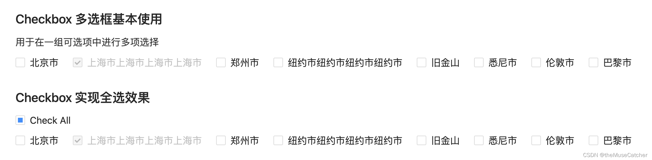
效果如下图:
①创建多选框组件Checkbox.vue
扫描二维码关注公众号,回复: 14864680 查看本文章
<script setup lang="ts">
import { ref, computed, watch } from 'vue'

interface Option {
  label: string,
  value: any,
  disabled?: boolean // 是否禁用单个复选框
}
interface Props {
  options?: Array<Option>, // 复选元素数据
  disabled?: boolean, // 是否禁用所有复选框
  vertical?: boolean, // 是否垂直排列
  value?: any[], // 当前选中的值(v-model)
  gap?: number, // 多个单选框之间的间距,单位px
  indeterminate?: boolean, // 全选时的样式控制
  checked?: boolean // 是否全选(v-model)
}
const props = withDefaults(defineProps<Props>(), {
  options: () => [],
  disabled: false,
  vertical: false,
  value: () => [],
  gap: 8,
  indeterminate: false,
  checked: false
})
const sum = computed(() => {
  return props.options.length
})
const checkedValue = ref(props.value)
watch(
  () => props.value,
  (to) => {
    checkedValue.value = to
  }
)
const styleObject = computed(() => {
  if (props.vertical) {
    return {
      marginBottom: props.gap + 'px'
    }
  } else {
    return {
      marginRight: props.gap + 'px'
    }
  }
})
const emits = defineEmits(['update:value', 'update:checked', 'change'])
function onClick (value: any) {
  if (props.value.includes(value)) { // 已选中
    const newVal = checkedValue.value.filter(target => target !== value)
    emits('update:value', newVal)
    emits('change', newVal)
  } else { // 未选中
    const newVal = [...checkedValue.value, value]
    emits('update:value', newVal)
    emits('change', newVal)
  }
}
function onCheckAll () { // 全选切换
  emits('update:checked', !props.checked)
}
</script>
<template>
  <div class="m-checkbox" :class="{'vertical': vertical}">
    <div
      v-if="sum"
      class="m-checkbox-wrap"
      :class="{'disabled': disabled || option.disabled}"
      :style="sum !== index + 1 ? styleObject: ''"
      @click="(disabled || option.disabled) ? (e: Event) => e.preventDefault() : onClick(option.value)" v-for="(option, index) in options" :key="index">
      <span class="u-checkbox" :class="{'u-checkbox-checked': checkedValue.includes(option.value) }"></span>
      <span class="u-label">
        <slot :label="option.label">{

   { option.label }}</slot>
      </span>
    </div>
    <div
      v-else
      class="m-checkbox-wrap"
      :class="{'disabled': disabled}"
      @click="onCheckAll">
      <span class="u-checkbox" :class="{'u-checkbox-checked': checked && !indeterminate, 'indeterminate': indeterminate }"></span>
      <span class="u-label">
        <slot>Check all</slot>
      </span>
    </div>
  </div>
</template>
<style lang="less" scoped>
.m-checkbox {
  display: inline-flex;
  height: 24px;
  .m-checkbox-wrap {
    color: #000000d9;
    font-size: 14px;
    height: 24px;
    line-height: 24px;
    cursor: pointer;
    &:hover {
      .u-checkbox {
        border-color: @themeColor;
      }
    }
    .u-checkbox {
      position: relative;
      display: inline-block;
      width: 14px;
      height: 14px;
      background: #fff;
      border: 1px solid #d9d9d9;
      border-radius: 2px;
      transition: all .3s;
      vertical-align: top;
      top: 4px;
      &:after {
        position: absolute;
        top: 50%;
        left: 21.5%;
        width: 3.71428571px;
        height: 7.14285714px;
        border: 2px solid #fff;
        border-top: 0;
        border-left: 0;
        transform: rotate(45deg) scale(0) translate(-50%, -50%);
        opacity: 0;
        transition: all 0.1s cubic-bezier(0.71, -0.46, 0.88, 0.6), opacity 0.1s;
        content: '';
      }
    }
    .u-checkbox-checked {
      background-color: @themeColor;
      border-color: @themeColor;
      &:after {
        position: absolute;
        border: 2px solid #fff;
        border-top: 0;
        border-left: 0;
        transform: rotate(45deg) scale(1) translate(-50%, -50%);
        opacity: 1;
        transition: all 0.2s cubic-bezier(0.12, 0.4, 0.29, 1.46) 0.1s;
        content: '';
      }
    }
    .indeterminate {
      &:after {
        top: 50%;
        left: 50%;
        width: 8px;
        height: 8px;
        background-color: @themeColor;
        border: 0;
        transform: translate(-50%, -50%) scale(1);
        opacity: 1;
      }
    }
    .u-label {
      padding: 0 8px;
      font-size: 16px;
      display: inline-block;
      line-height: 24px;
    }
  }
  .disabled {
    color: #00000040;
    cursor: not-allowed;
    &:hover {
      .u-checkbox {
        border-color: #d9d9d9;
      }
    }
    .u-checkbox {
      border-color: #d9d9d9;
      background-color: #f5f5f5;
      &:after {
        border-color: rgba(0, 0, 0, 0.25);
        animation-name: none;
      }
    }
  }
}
.vertical {
  display: inline-block;
}
</style>
②在要使用的页面引入:
<script setup lang="ts">
import { Checkbox } from './Checkbox.vue'
import { ref, watch, computed } from 'vue'

const options = ref([
      {
        label: '北京市',
        value: 1
      },
      {
        label: '上海市上海市上海市上海市',
        value: 2,
        disabled: true
      },
      {
        label: '郑州市',
        value: 3
      },
      {
        label: '纽约市纽约市纽约市纽约市',
        value: 4
      },
      {
        label: '旧金山',
        value: 5
      },
      {
        label: '悉尼市',
        value: 6
      },
      {
        label: '伦敦市',
        value: 7
      },
      {
        label: '巴黎市',
        value: 8
      }
    ])

const value = ref([2]) // 多选框v-model
watch(value, (to) => {
  console.log('p to:', to)
})
function onChange (value: any[]) {
  console.log('change:', value)
}

const checkAll = ref(false) // 全选v-model
const indeterminate = computed(() => {
  if (value.value.length > 0 && value.value.length < options.value.length) {
    return true
  } else {
    false
  }
}) // 全选样式控制
watch(checkAll, (to) => {
  console.log('p to:', to)
  if (to) {
    value.value = options.value.map(option => option.value)
  } else {
    value.value = []
  }
})
</script>
<template>
  <div>
    <h2 class="mb10">Checkbox 多选框基本使用</h2>
    <p class="u-intro">用于在一组可选项中进行多项选择</p>
    <Checkbox
      :options="options"
      :gap="16"
      :vertical="false"
      @change="onChange"
      v-model:value="value"/>
    <h2 class="mt30 mb10">Checkbox 实现全选效果</h2>
    <Checkbox
      class="mb10"
      :indeterminate="indeterminate"
      v-model:checked="checkAll">
      Check All
    </Checkbox>
    <br/>
    <Checkbox
      :options="options"
      :gap="16"
      :vertical="false"
      @change="onChange"
      v-model:value="value" />
    <a-divider />
  </div>
</template>
<style lang="less" scoped>
</style>