淘宝焦点图布局
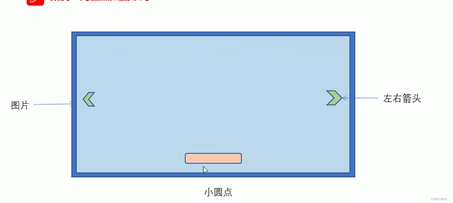
1.大盒子我们类名为:tb-promo 淘宝广告
2.里面放一张图片。
3.左右两个按钮 用链接,左箭头 prev 右箭头 next
4.底侧小圆点ul继续做。类名为 promo-nav
<!DOCTYPE html>
<html lang="en">

<head>
    <meta charset="UTF-8">
    <meta http-equiv="X-UA-Compatible" content="IE=edge">
    <meta name="viewport" content="width=device-width, initial-scale=1.0">
    <title>Document</title>
    <style>
        * {
            margin: 0;
            padding: 0;
        }

        li {
            list-style: none;
        }

        .tb-promo {
            position: relative;
            width: 520px;
            height: 280px;
            background-color: pink;
            margin: 100px auto;
        }

        .tb-promo {
            width: 520px;
            height: 280px;
        }
        /* 并集选择器可以集体声名相同的样式 */

        .prev,
        .next {
            position: absolute;
            top: 50%;
            margin-top: -15px;
            width: 20px;
            height: 30px;
            background: rgb(0, 0, 0, .3);
            text-align: center;
            line-height: 30px;
            color: #fff;
            text-decoration: none;
        }

        .prev {
            left: 0;
            /* 加了绝对定位的盒子可以直接设置盒子高度和宽度  */
            border-top-right-radius: 15px;
            border-bottom-right-radius: 15px;
        }

        .next {
            /* 如果一个盒子既有left又有right属性,则默认会执行left属性,如果有top和buttom 属性,则会执行top熟悉 */
            right: 0;
            /* 加了绝对定位的盒子可以直接设置盒子高度和宽度 */
            border-top-left-radius: 15px;
            border-bottom-left-radius: 15px;
        }

        .promo-nav {
            position: absolute;
            bottom: 15px;
            left: 0;
            width: 70px;
            height: 13px;
            left: 50%;
            margin-left: -35px;
            background-color: rgba(255, 255, 255, .3);
            border-radius: 7px;
        }

        .promo-nav li {
            float: left;
            width: 8px;
            height: 8px;
            background-color: #fff;
            border-radius: 50%;
            margin: 3px;
        }
        /* 注意权重的问题 */

        .promo-nav .selected {
            background-color: #ff5000;
        }
    </style>
</head>

<body>
    <div class="tb-promo">
        <img src="images/tb.jpg" alt="">
        <!-- 左侧按钮箭头 -->
        <a href="#" class="prev">
            <</a>
                <!-- 右侧箭头 -->
                <a href="#" class="next">></a>
                <!-- 小圆点 -->
                <ul class="promo-nav">
                    <li class="selected"></li>
                    <li></li>
                    <li></li>
                    <li></li>
                    <li></li>
                </ul>
    </div>
</body>

</html>
土豆案例
1.练习元素的显示与隐藏
2.练习元素的定位
核心原理: 原来半透明的黑色遮罩看不见,鼠标经过大盒子,就显示出来。
遮罩的盒子不占有位置,就需要用绝对定位和display 配合使用。
当鼠标经过时候遮罩层出现
<!DOCTYPE html>
<html lang="en">

<head>
    <meta charset="UTF-8">
    <meta http-equiv="X-UA-Compatible" content="IE=edge">
    <meta name="viewport" content="width=device-width, initial-scale=1.0">
    <title>Document</title>
    <style>
        .tudou {
            position: relative;
            width: 444px;
            height: 320px;
            background-color: pink;
            margin: 30px auto;
        }

        .tudou img {
            width: 100%;
            height: 100%;
        }

        .mask {
            /* 隐藏遮罩层 */
            display: none;
            position: absolute;
            top: 0;
            height: 0;
            width: 100%;
            height: 100%;
            background: rgba(0, 0, 0, .4) url(images/arr.png) no-repeat center;
        }

        /* 当我们鼠标经过了 土豆这个盒子就让黑色遮罩层显示出来 */

        .tudou:hover .mask {
            display: block;
        }
    </style>
</head>

<body>
    <div class="tudou ">
        <div class="mask"></div>
        <img src="images/tudou.jpg" alt="">
    </div>
</body>

</html>